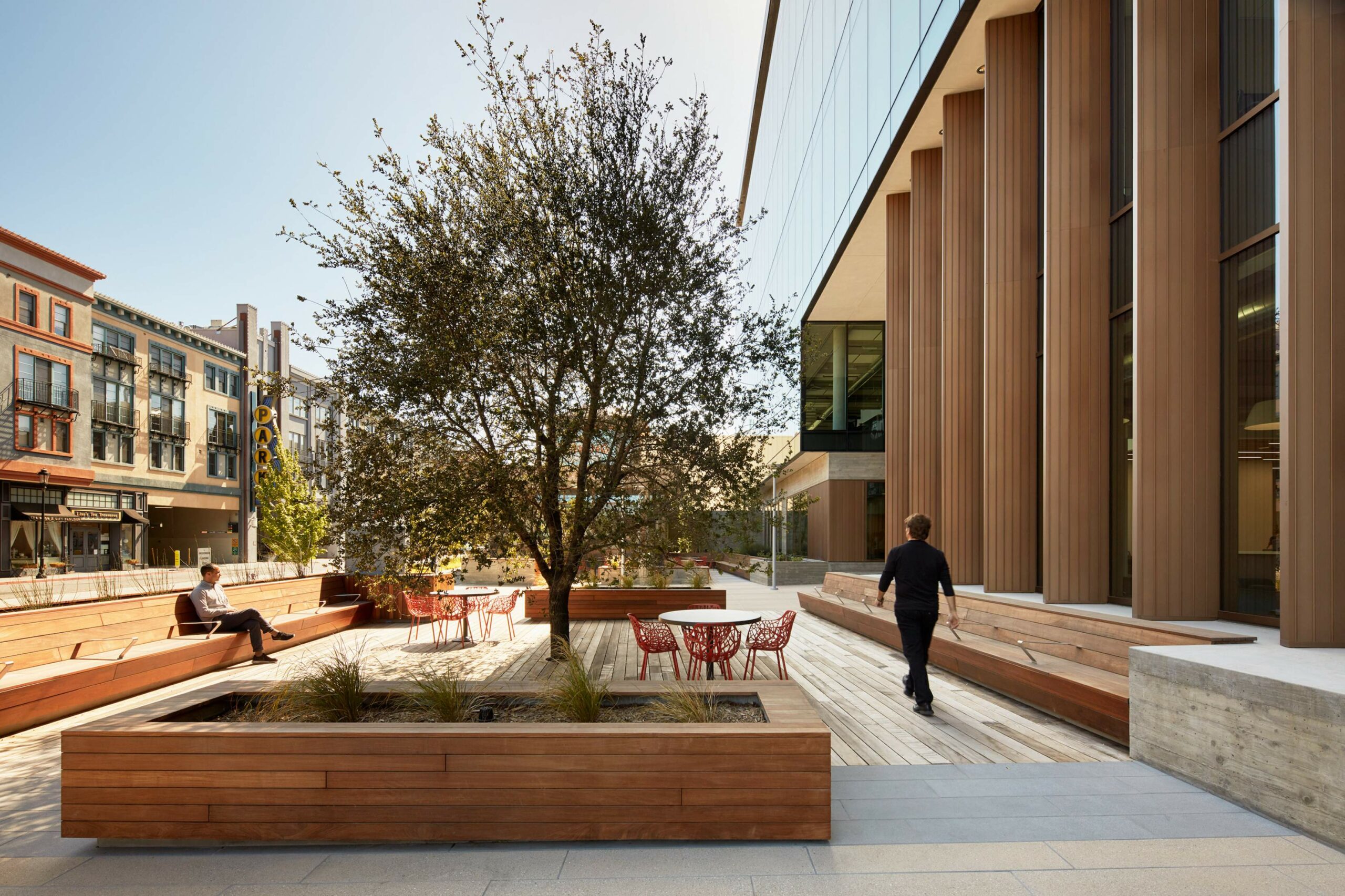
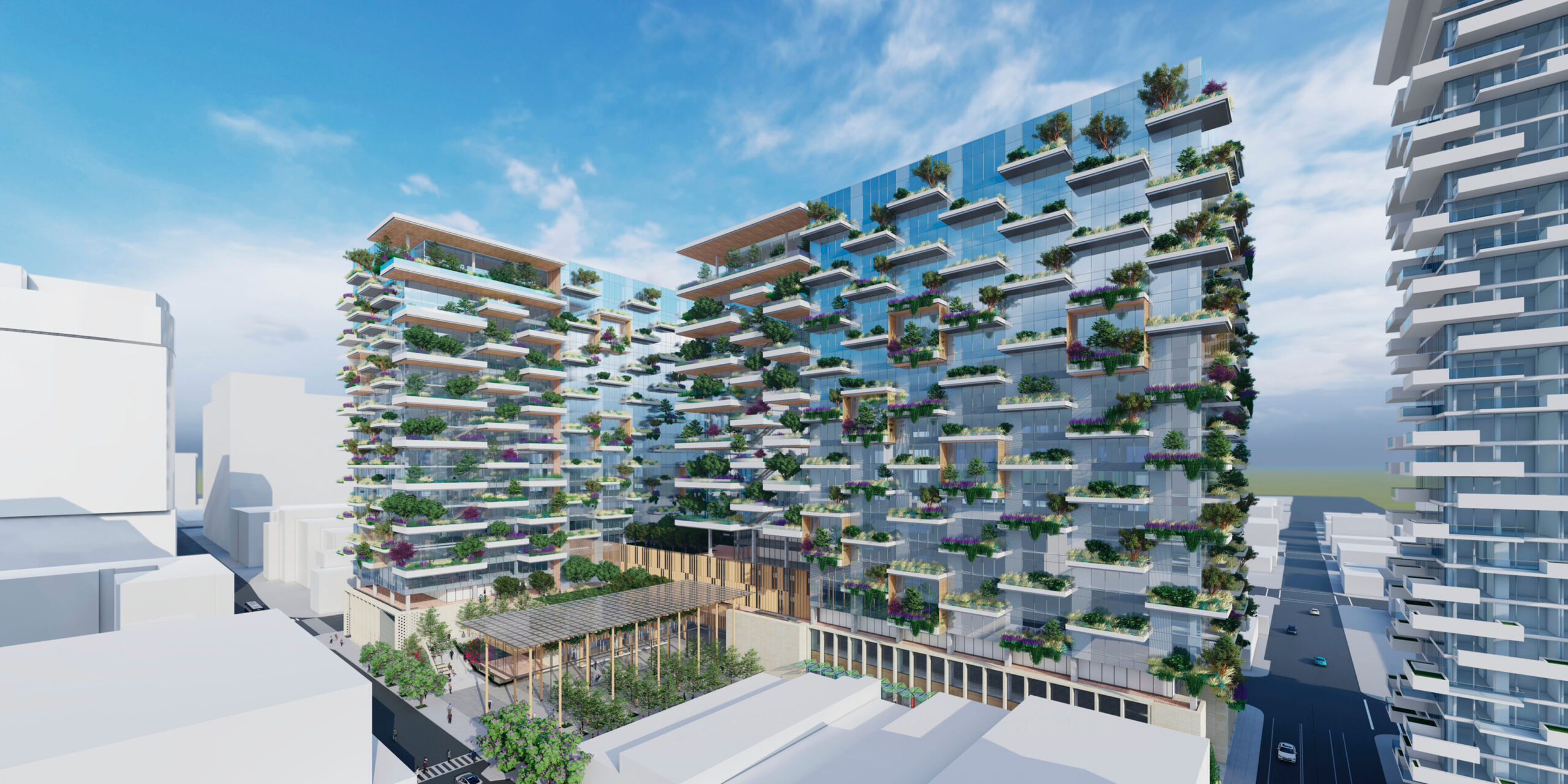
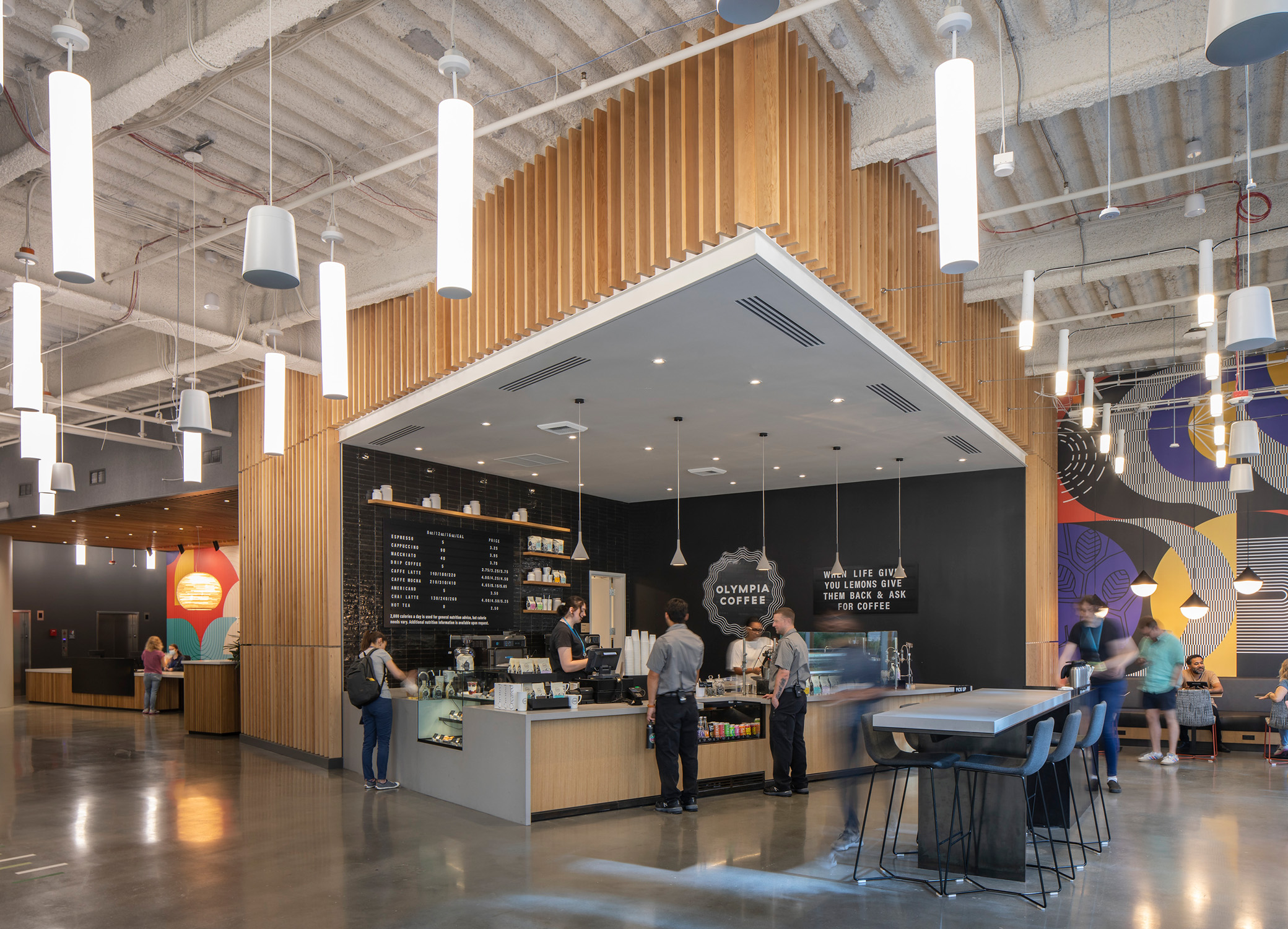
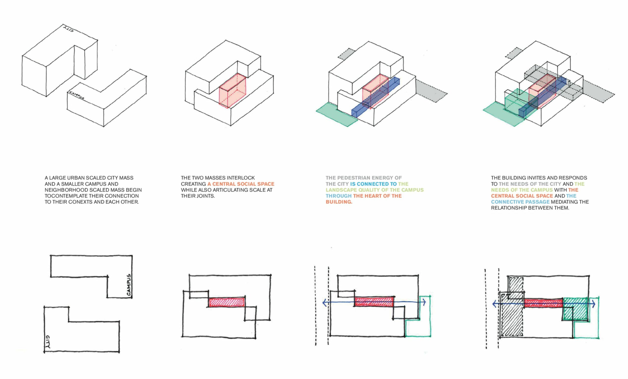
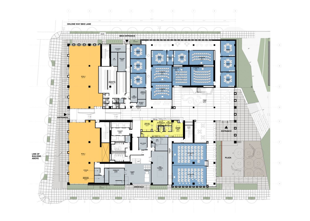
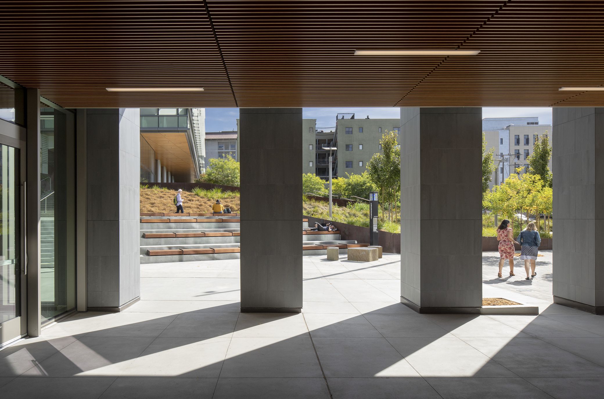
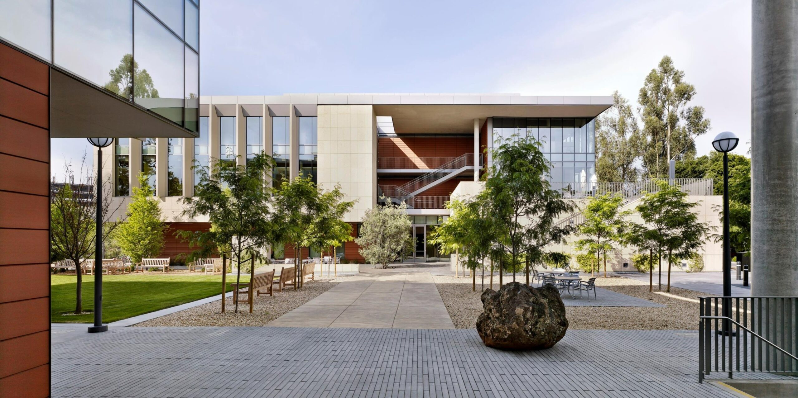
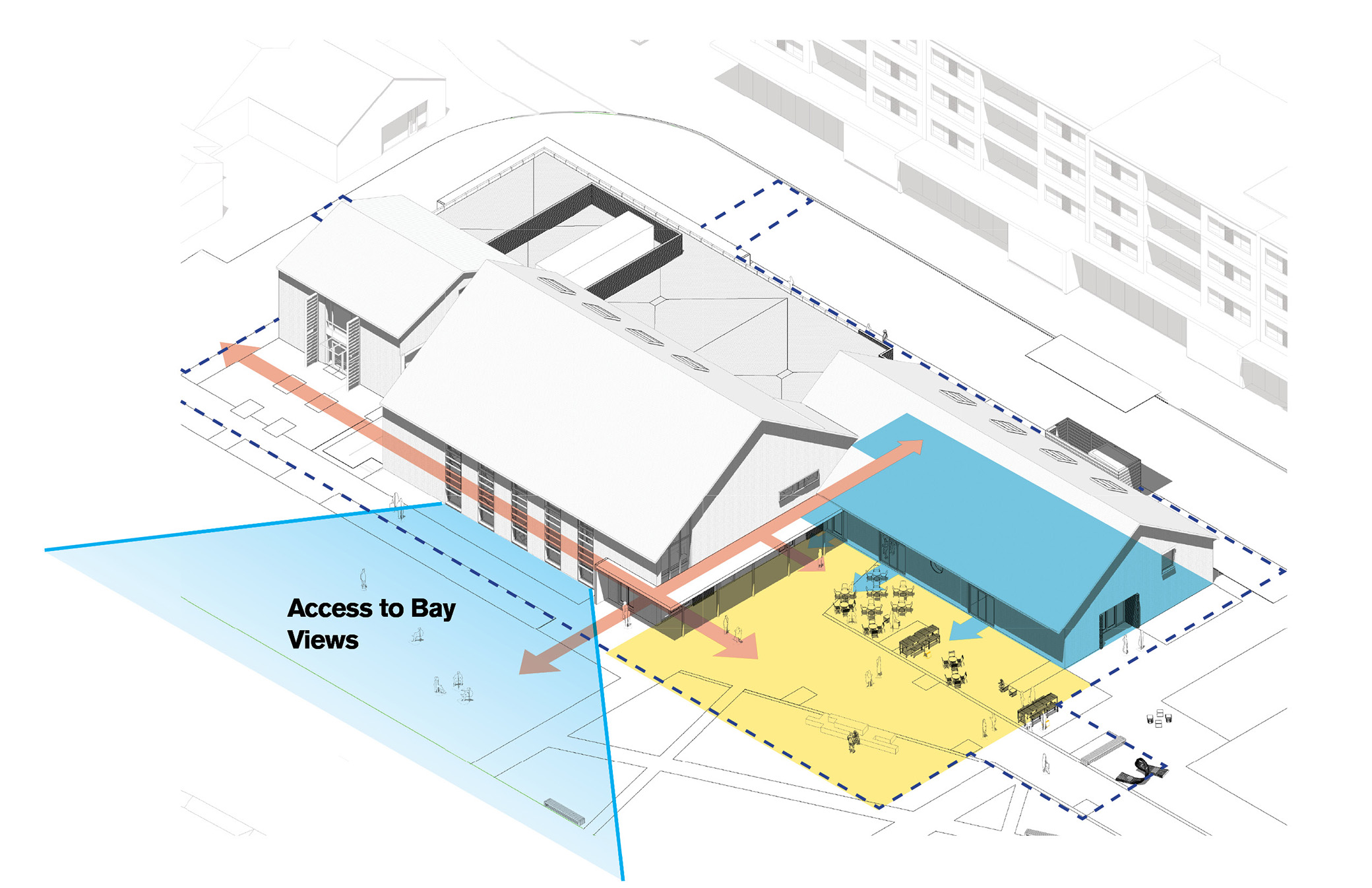
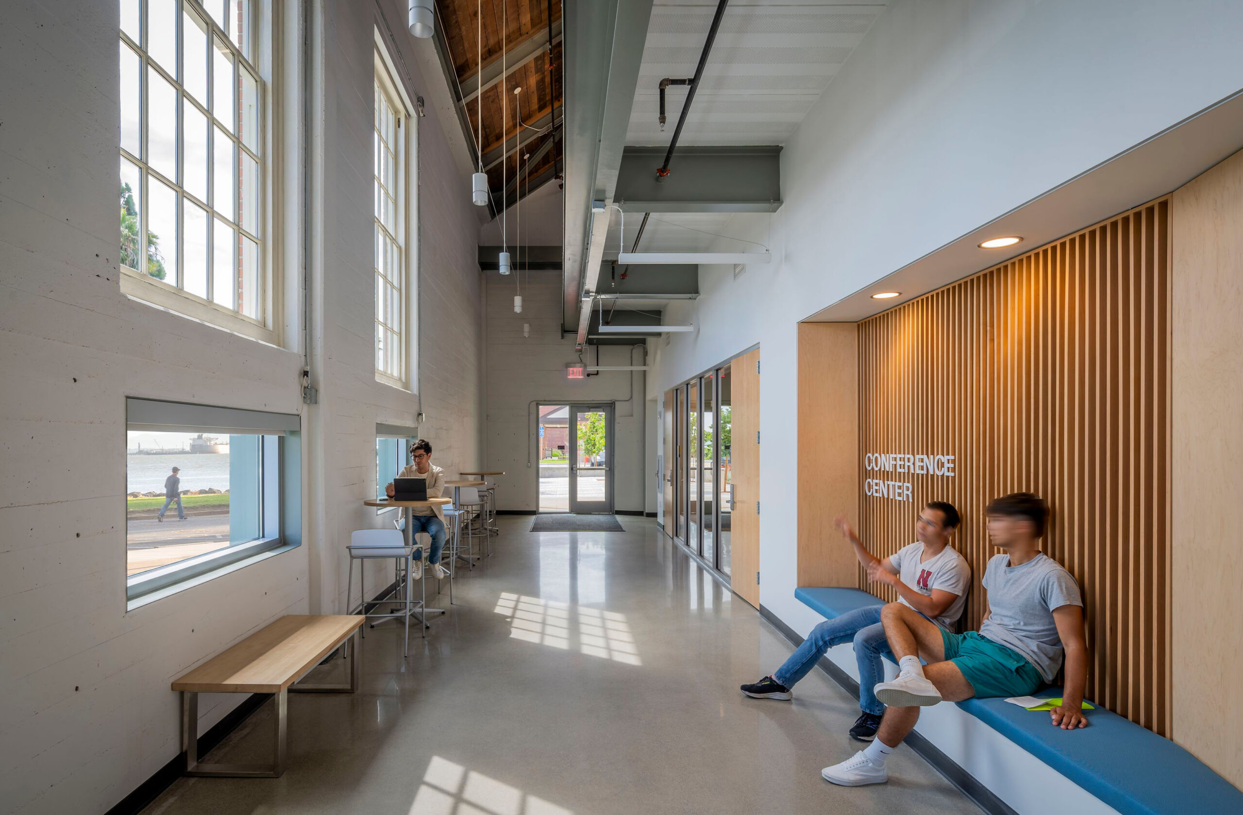
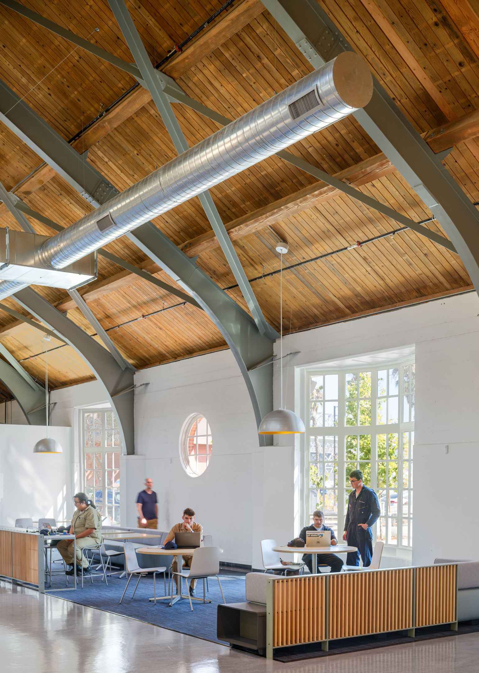
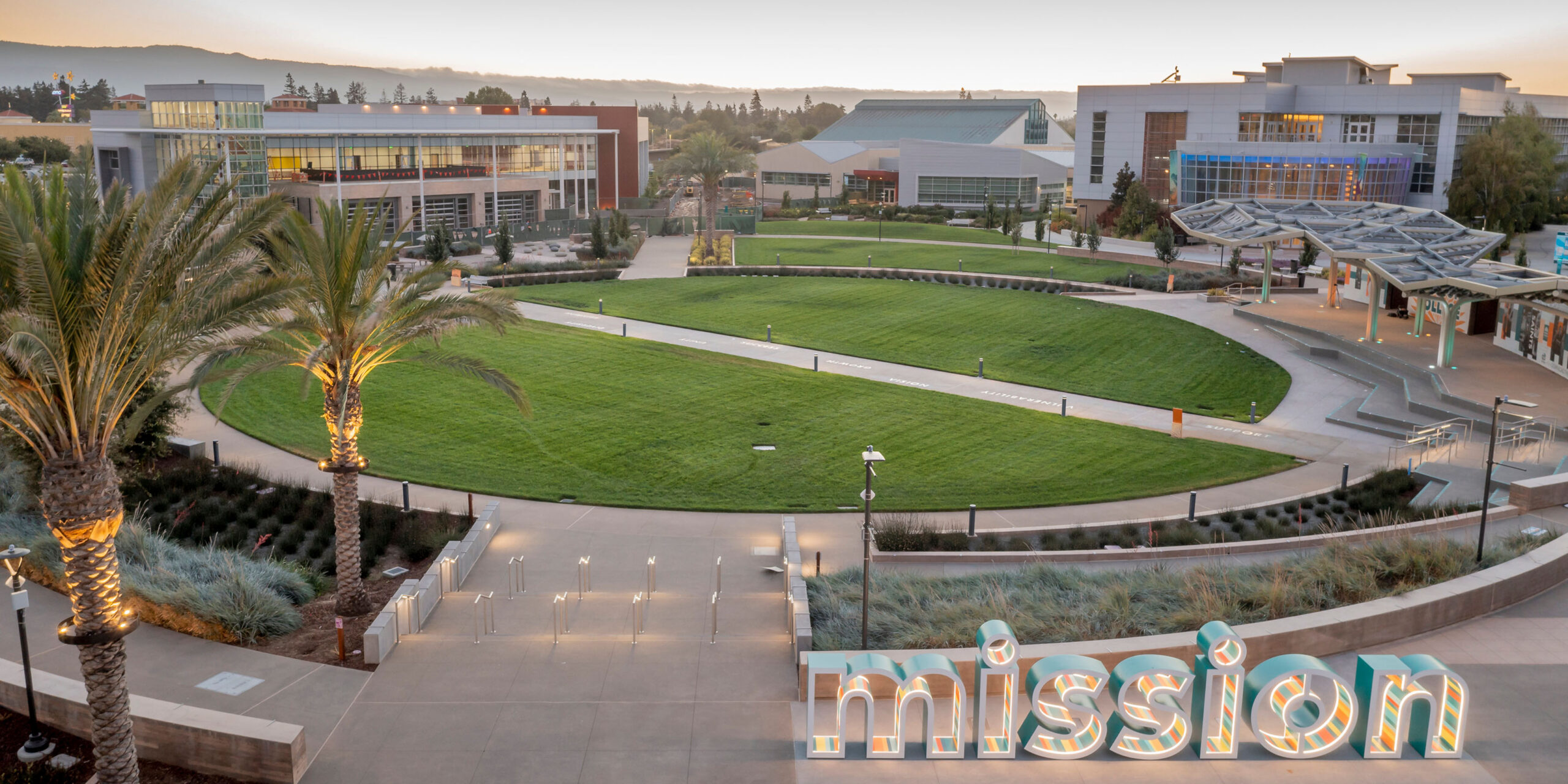
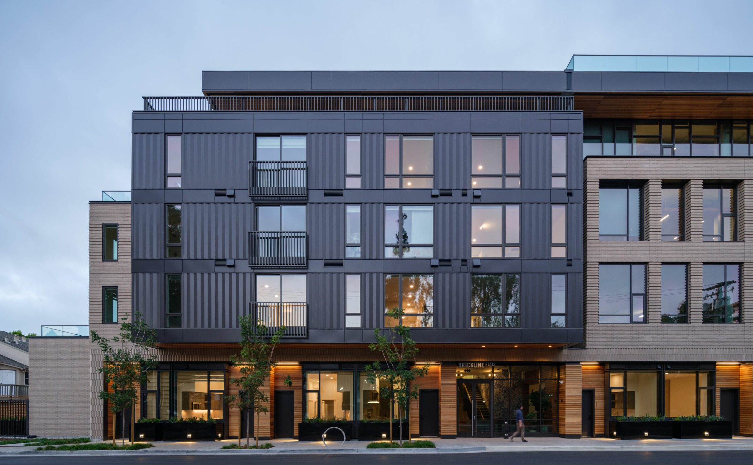
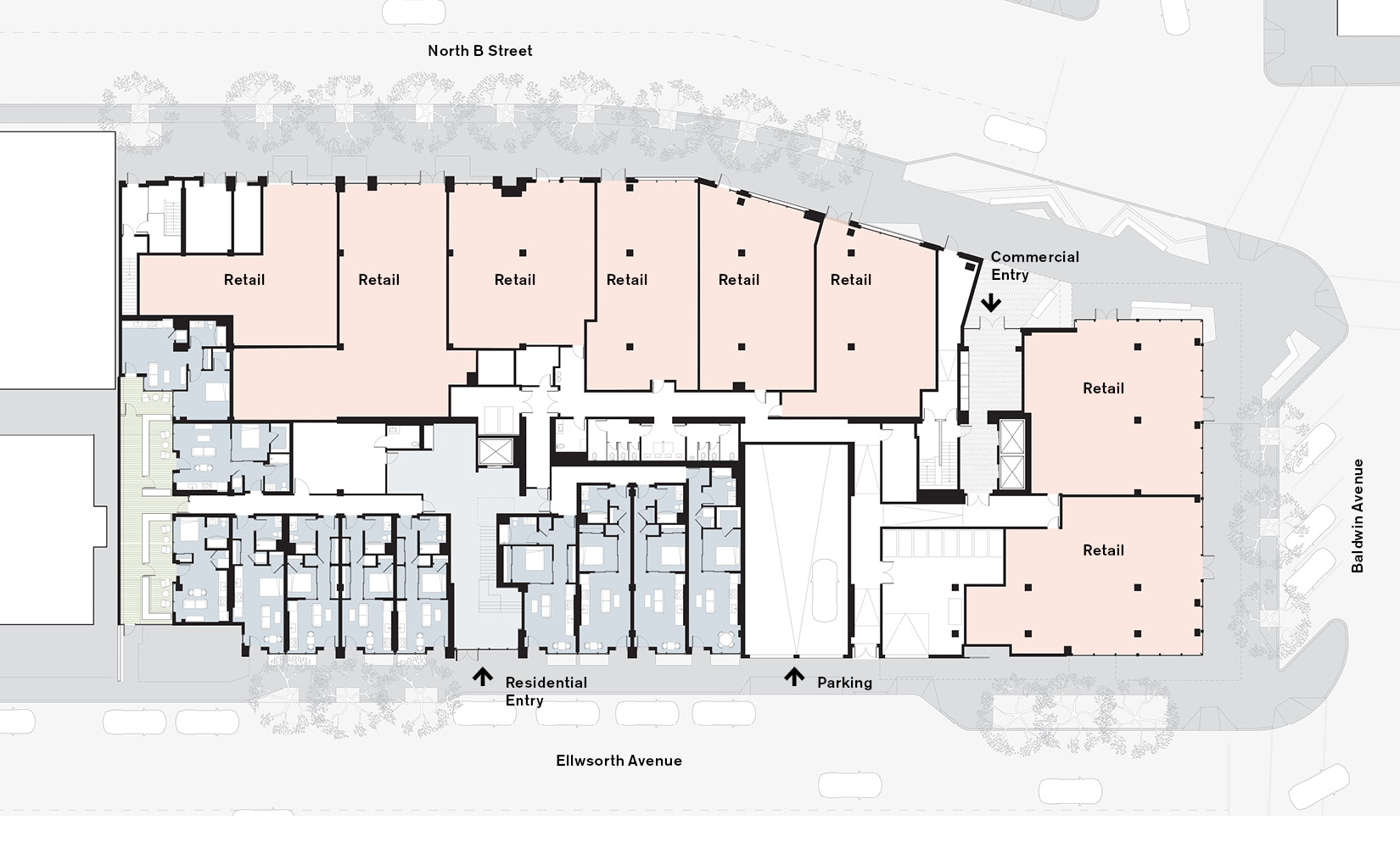
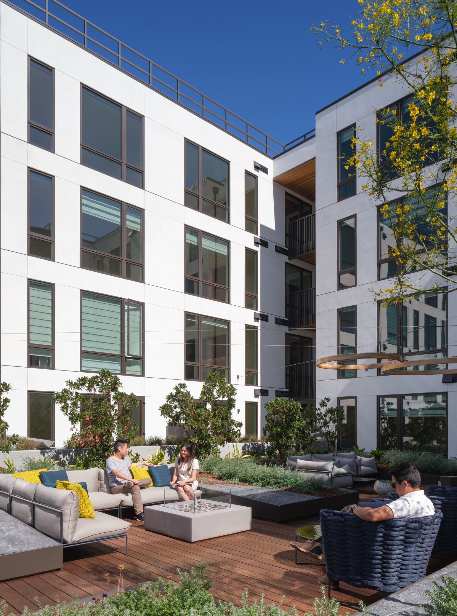
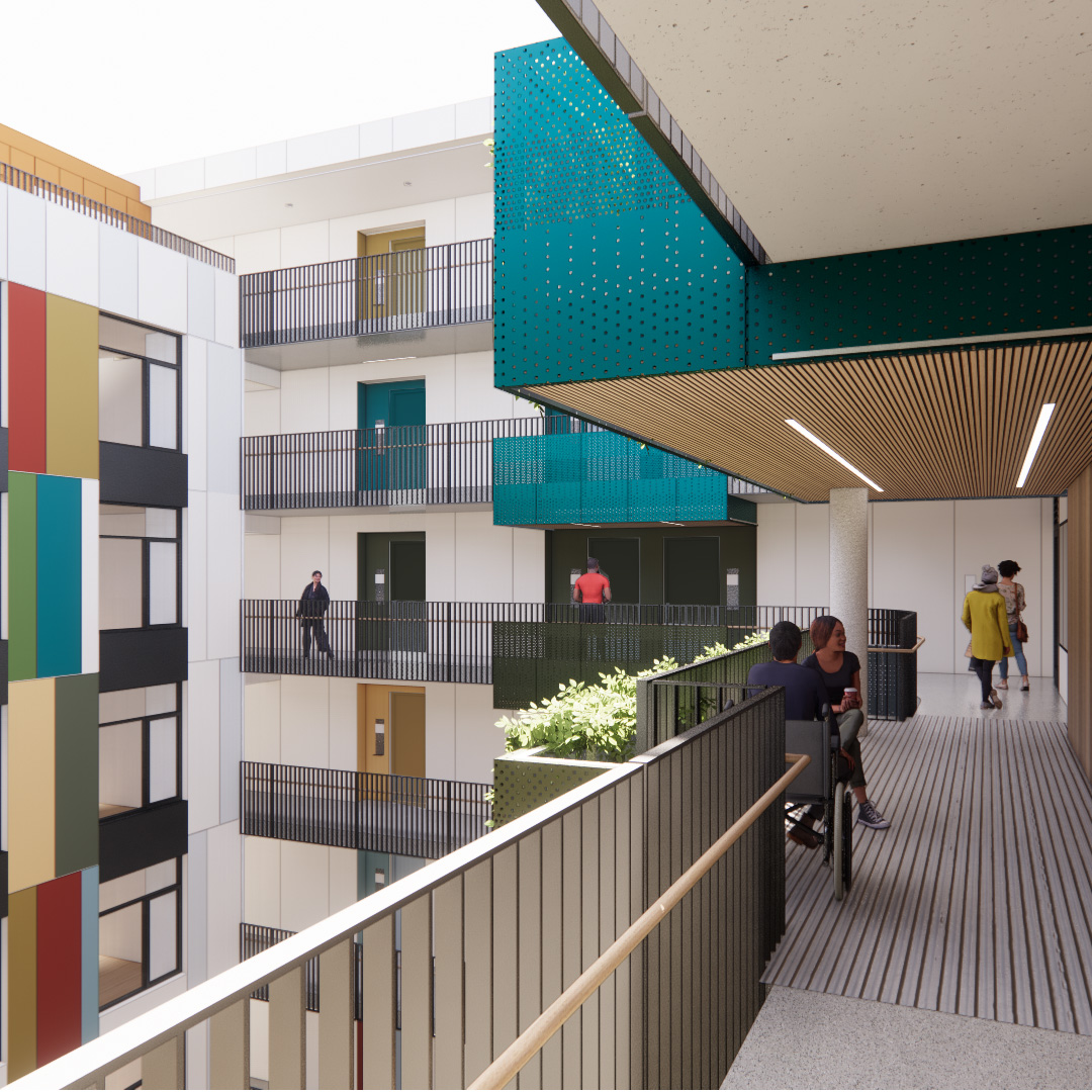
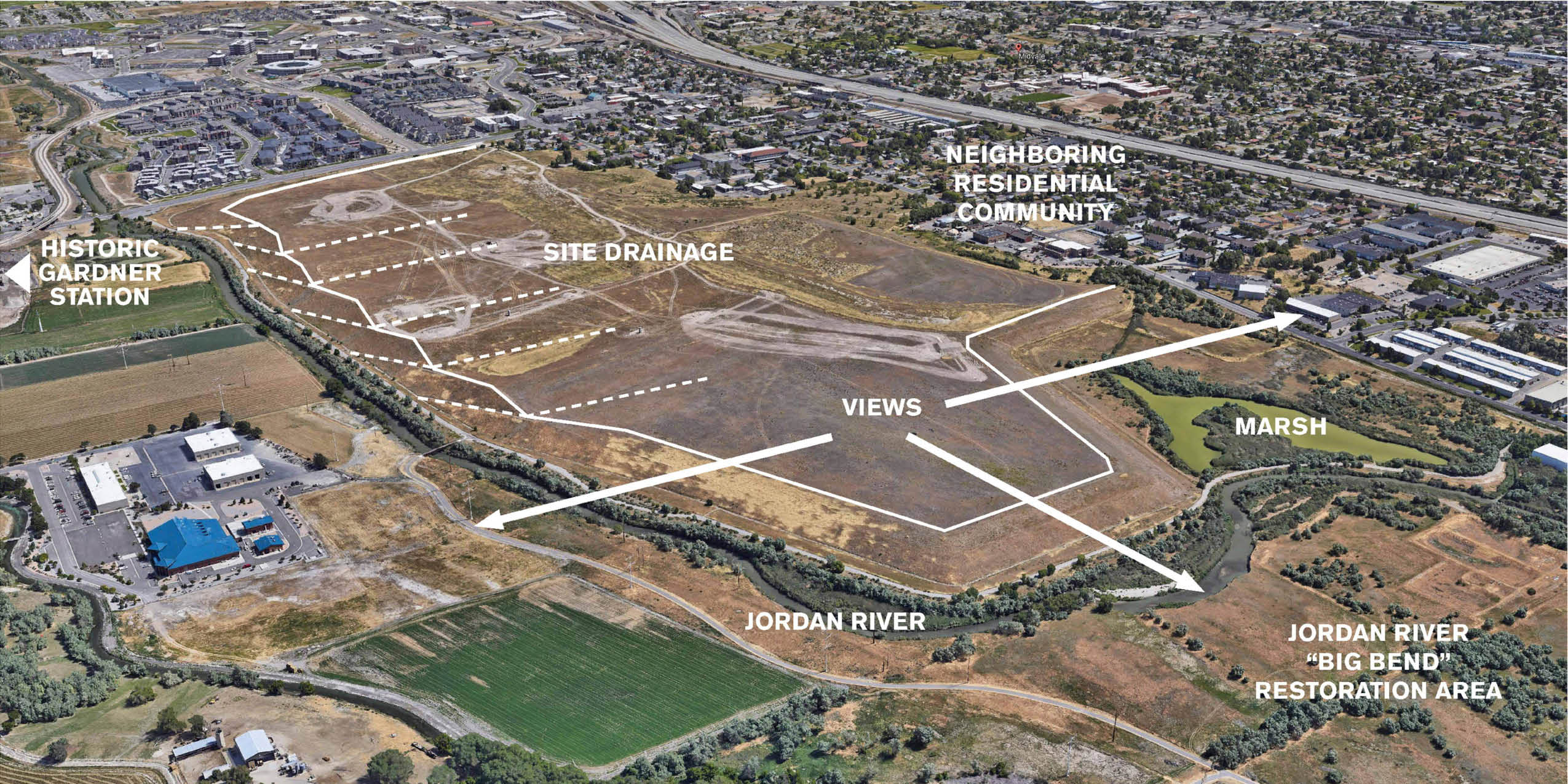
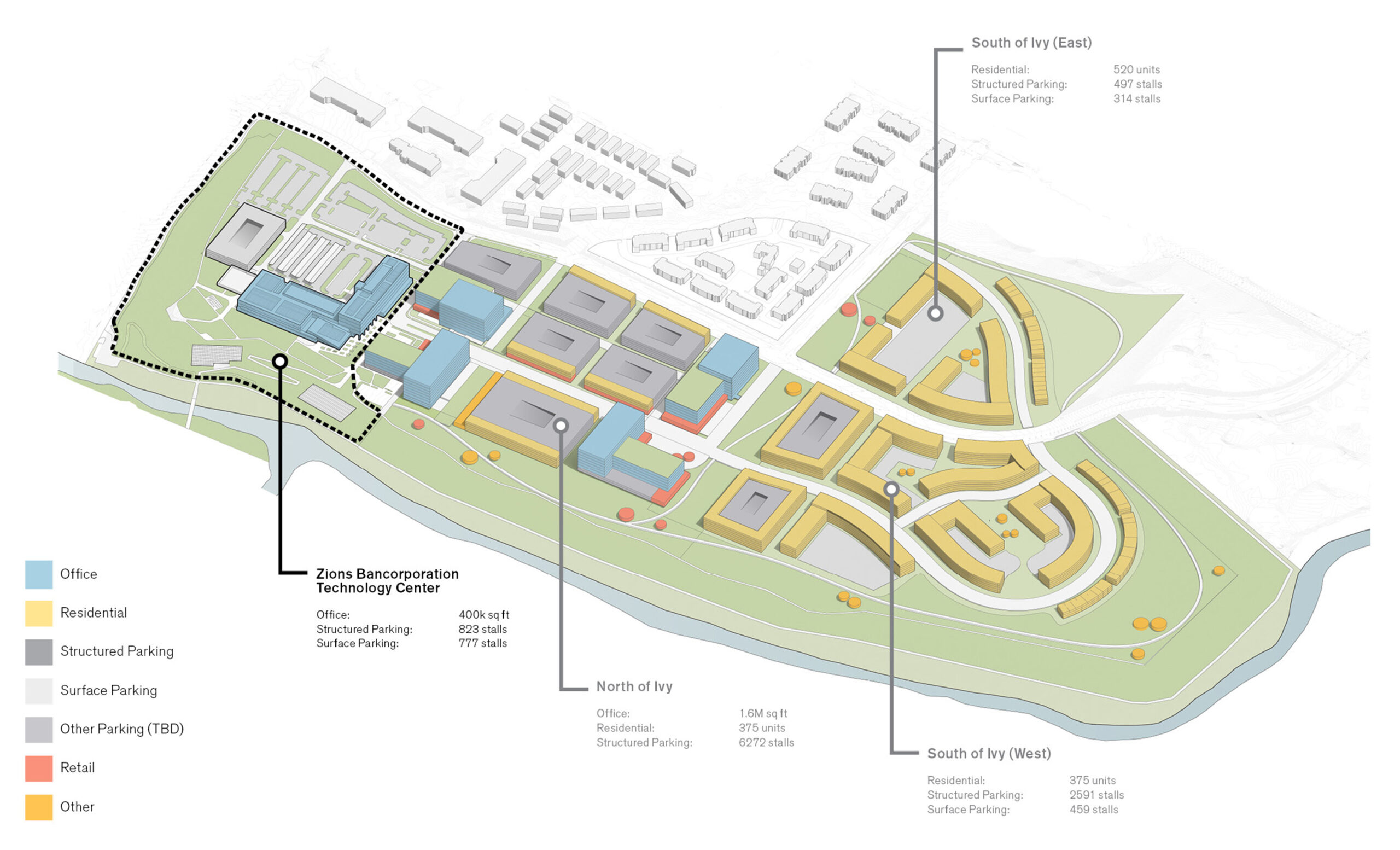
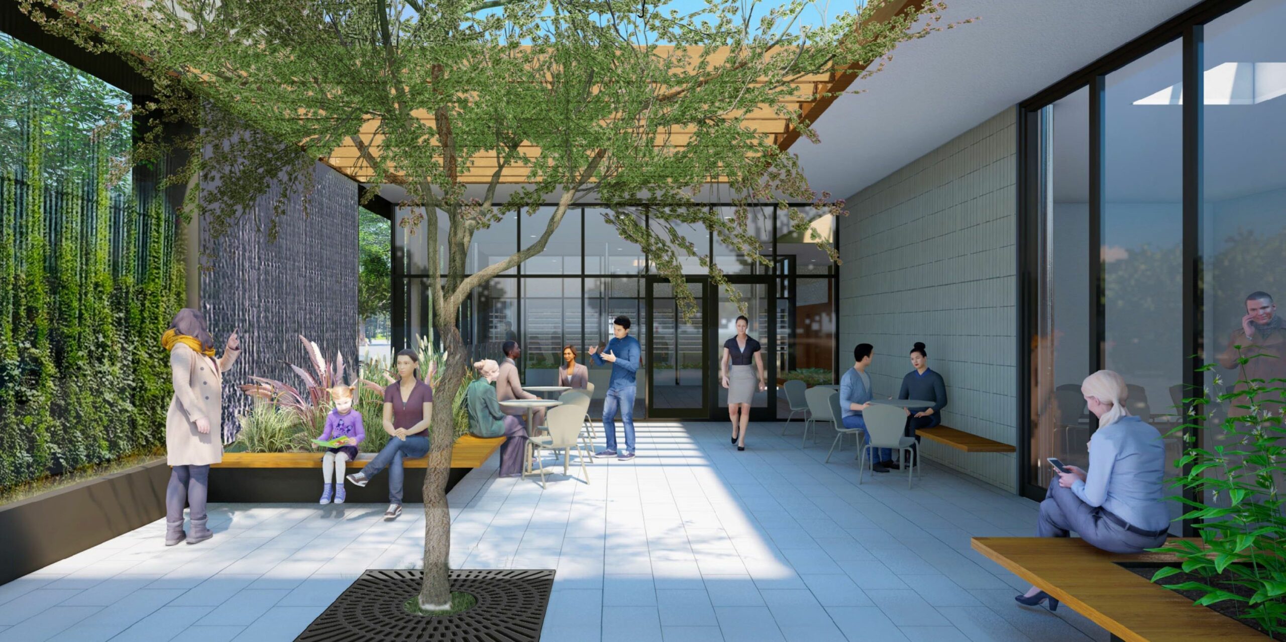
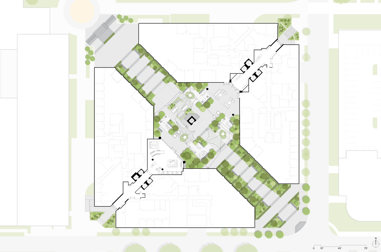
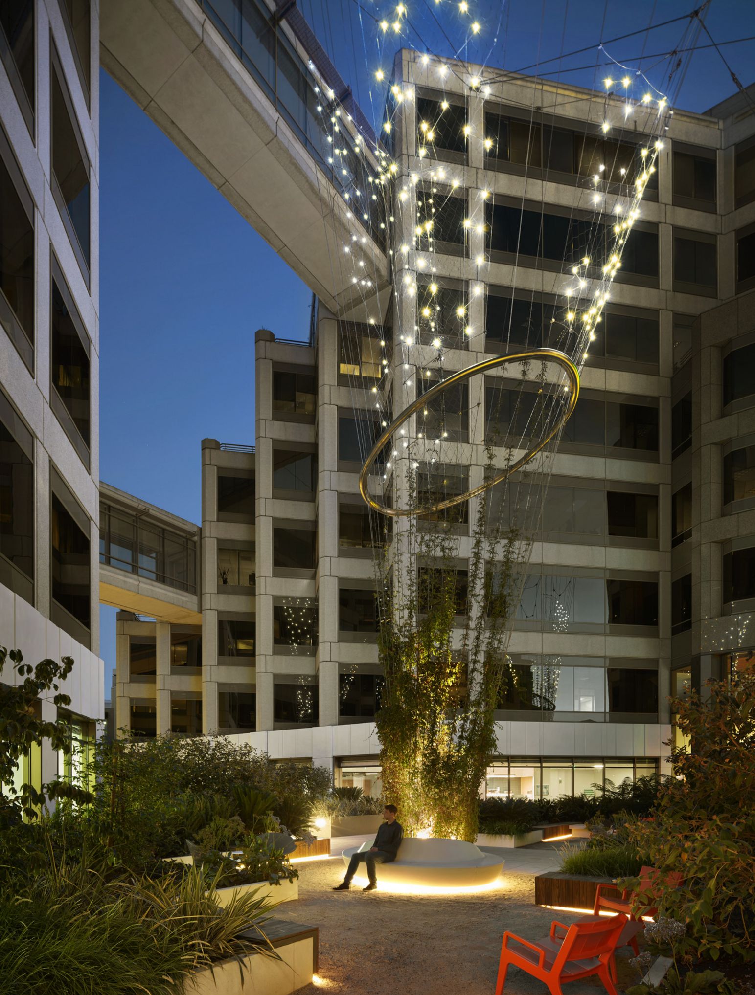
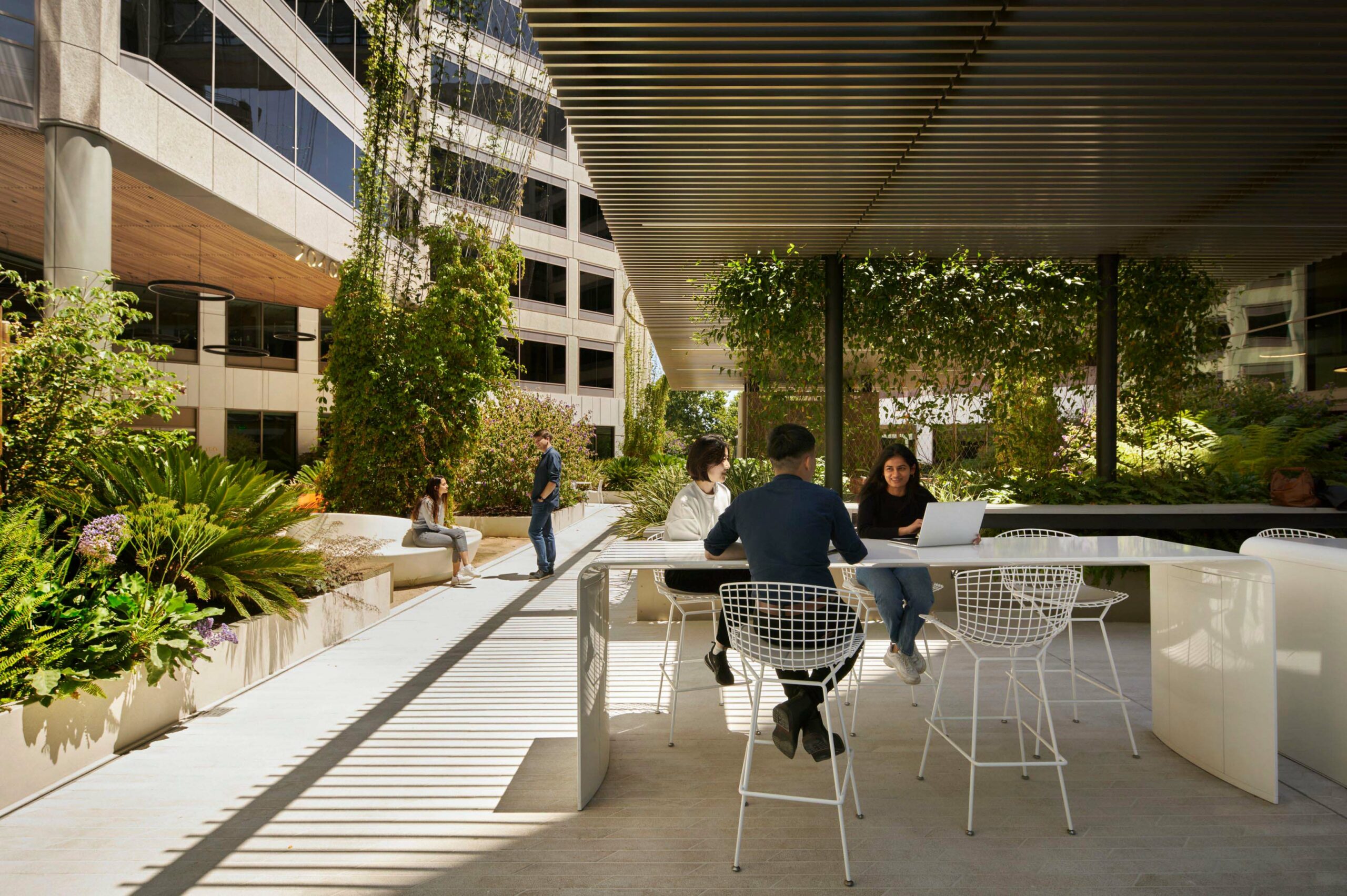
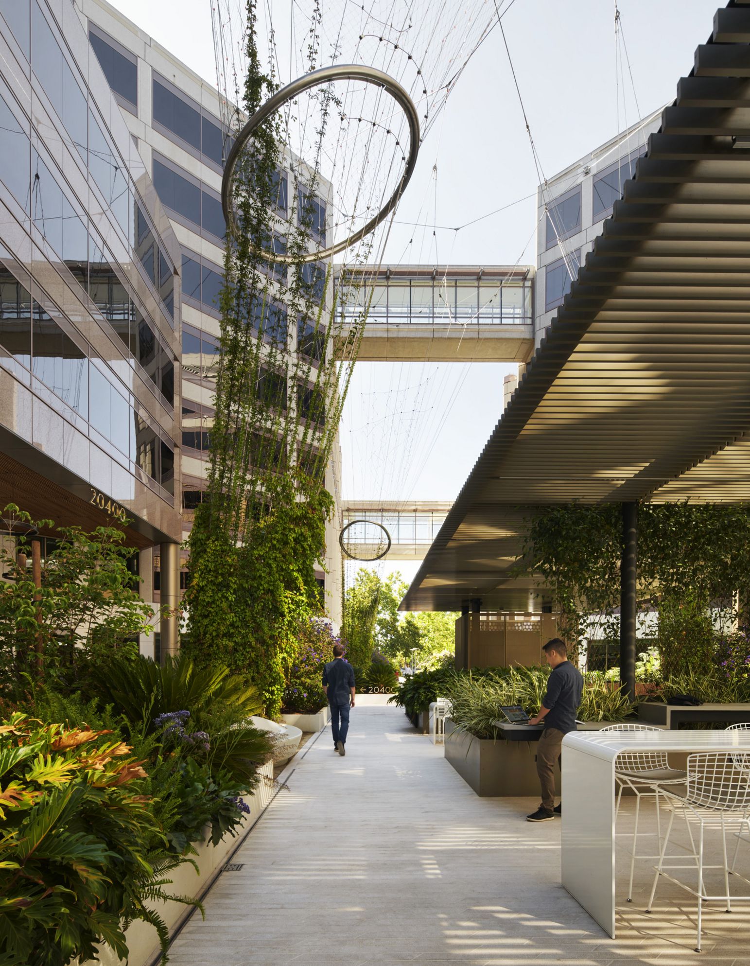
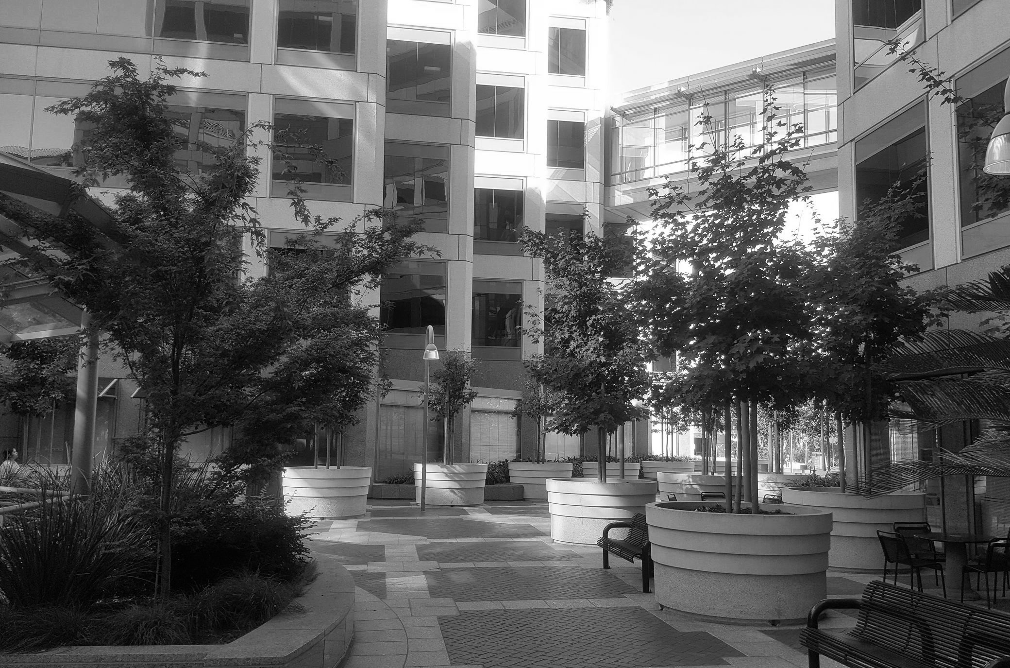
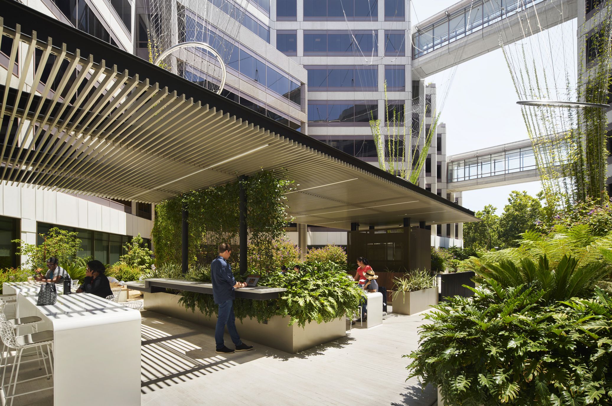
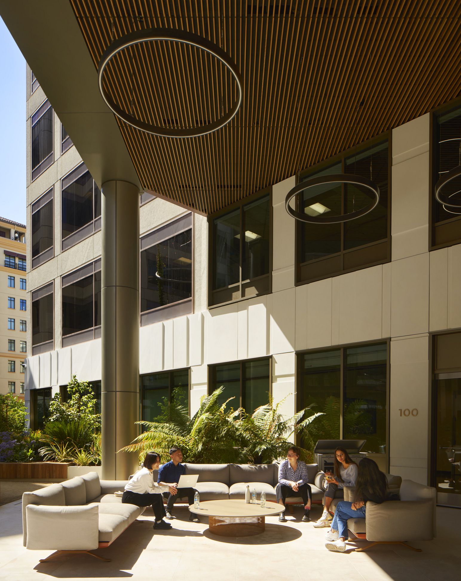
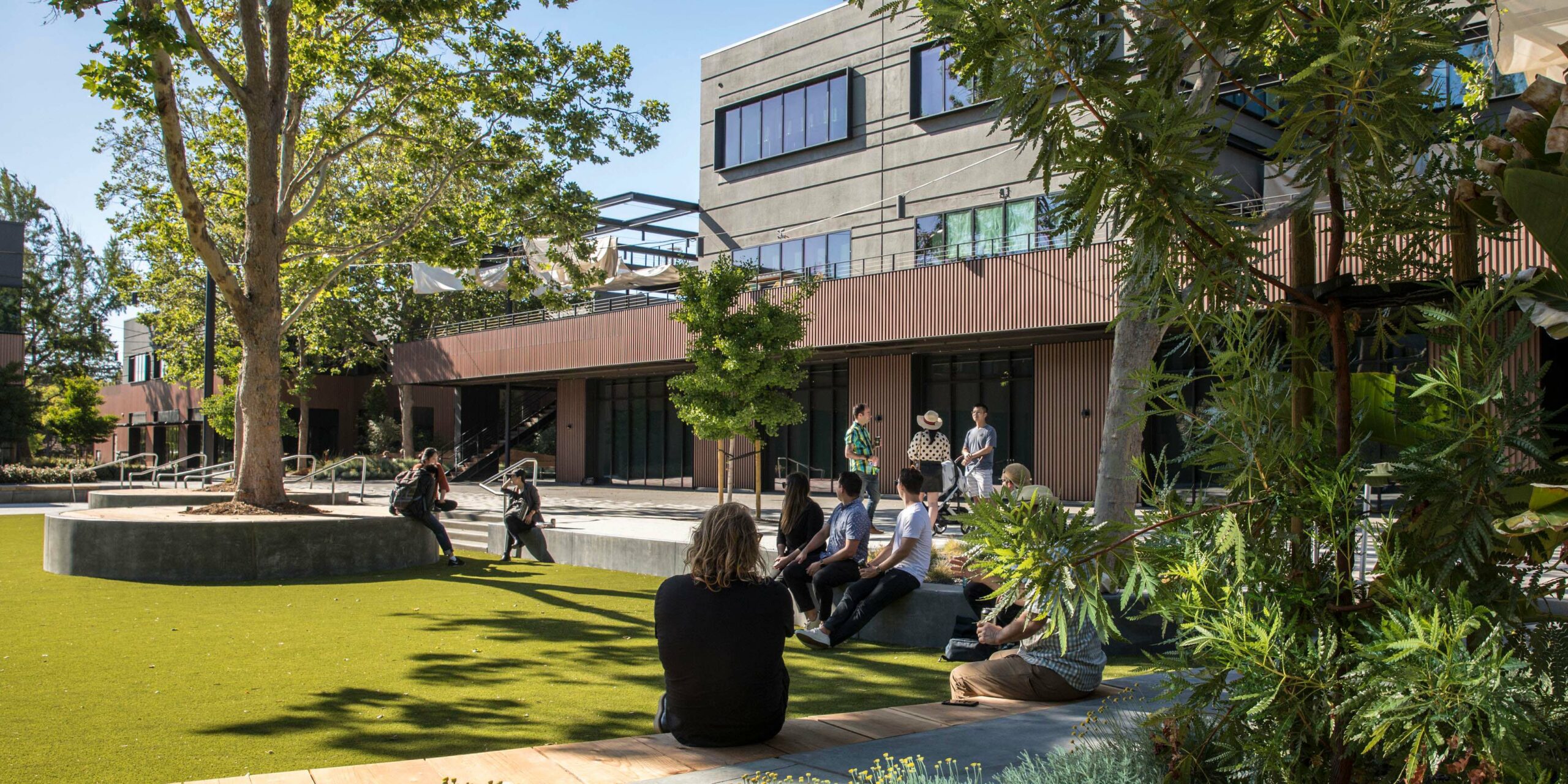
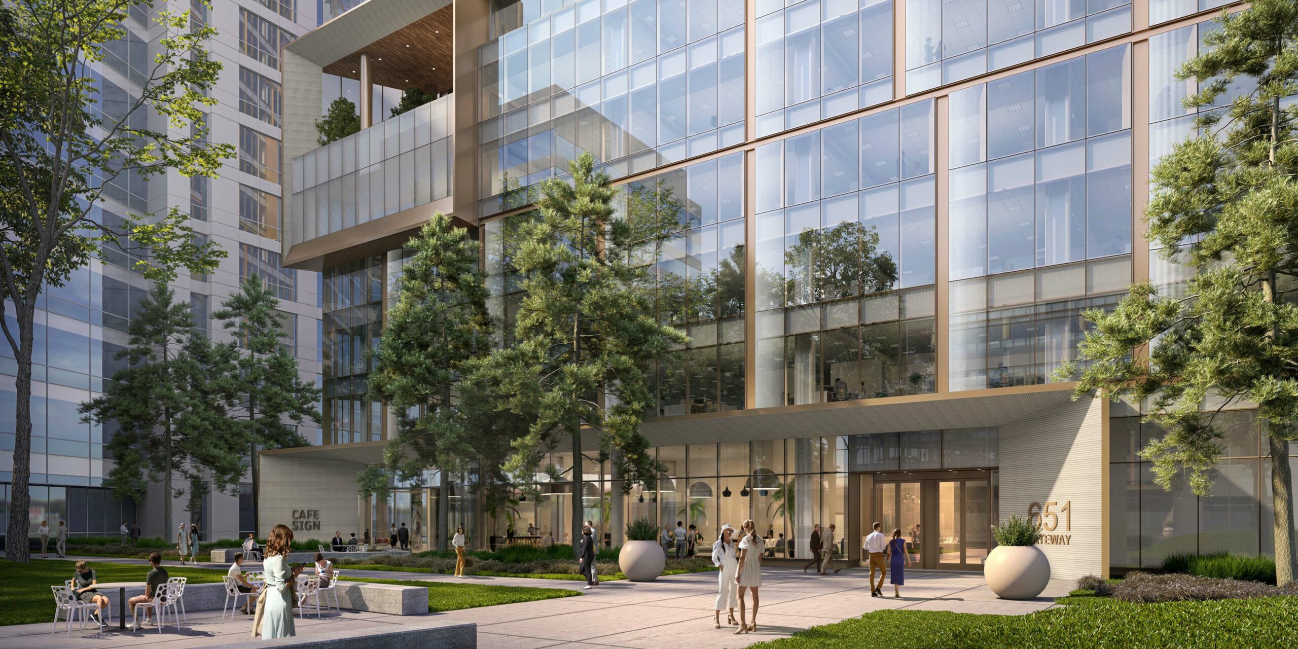
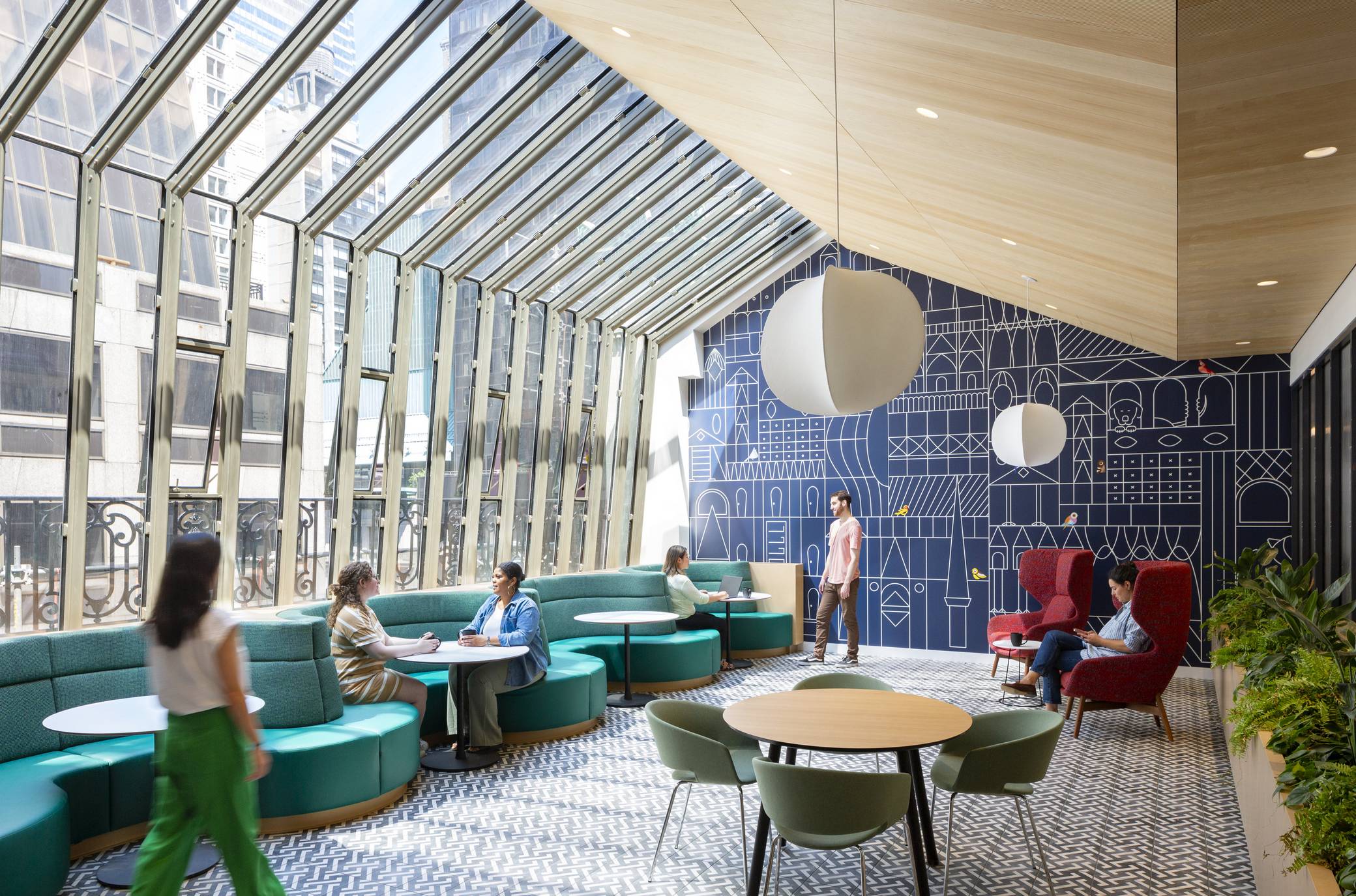
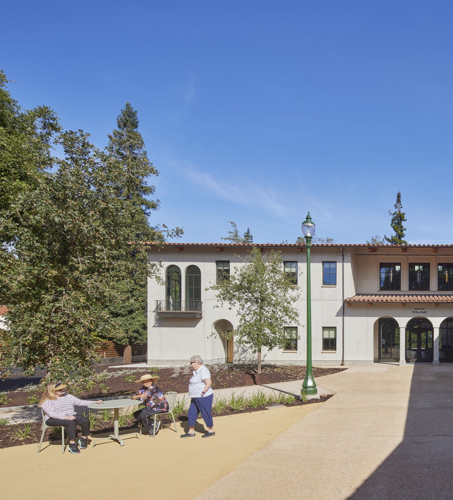
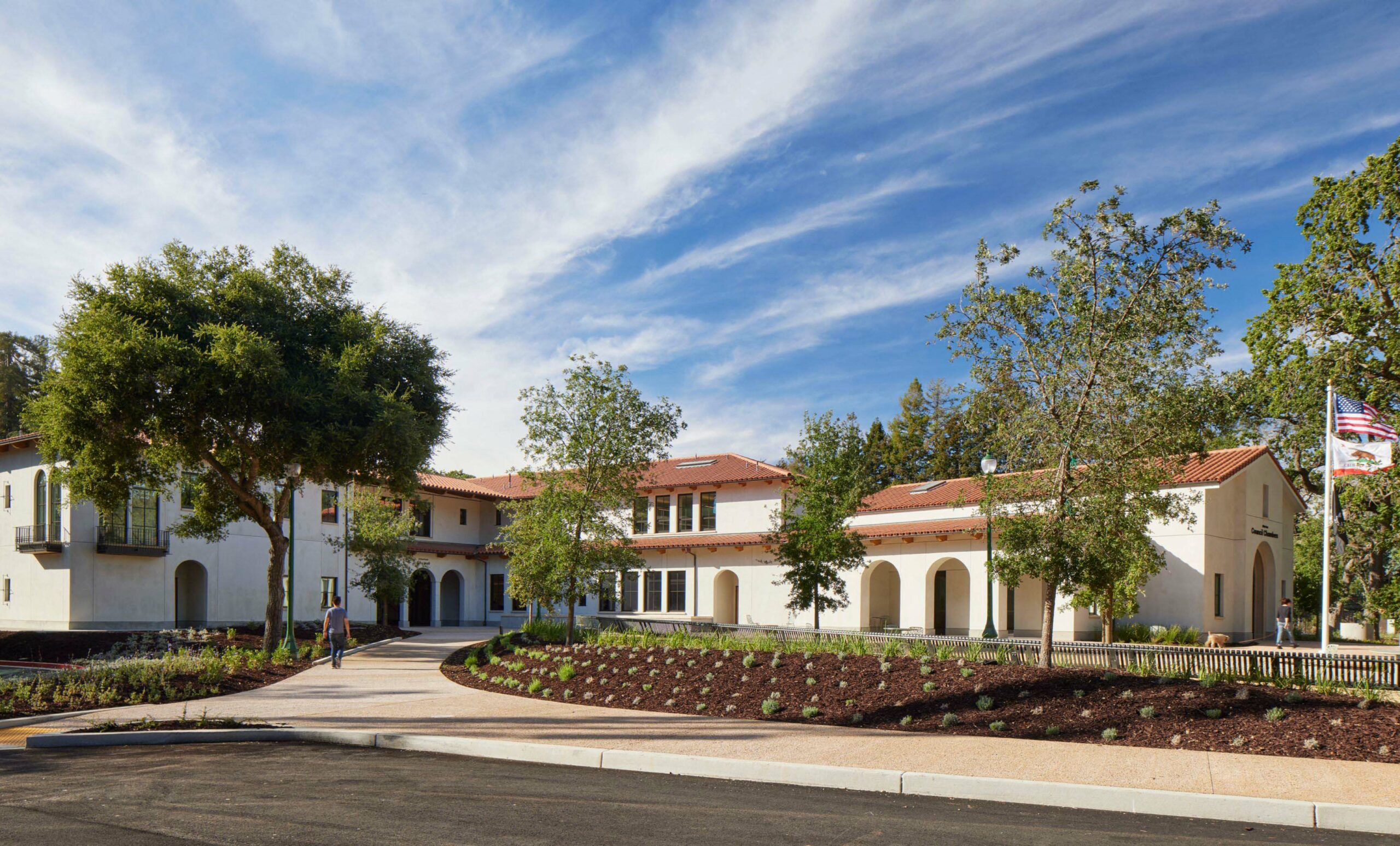
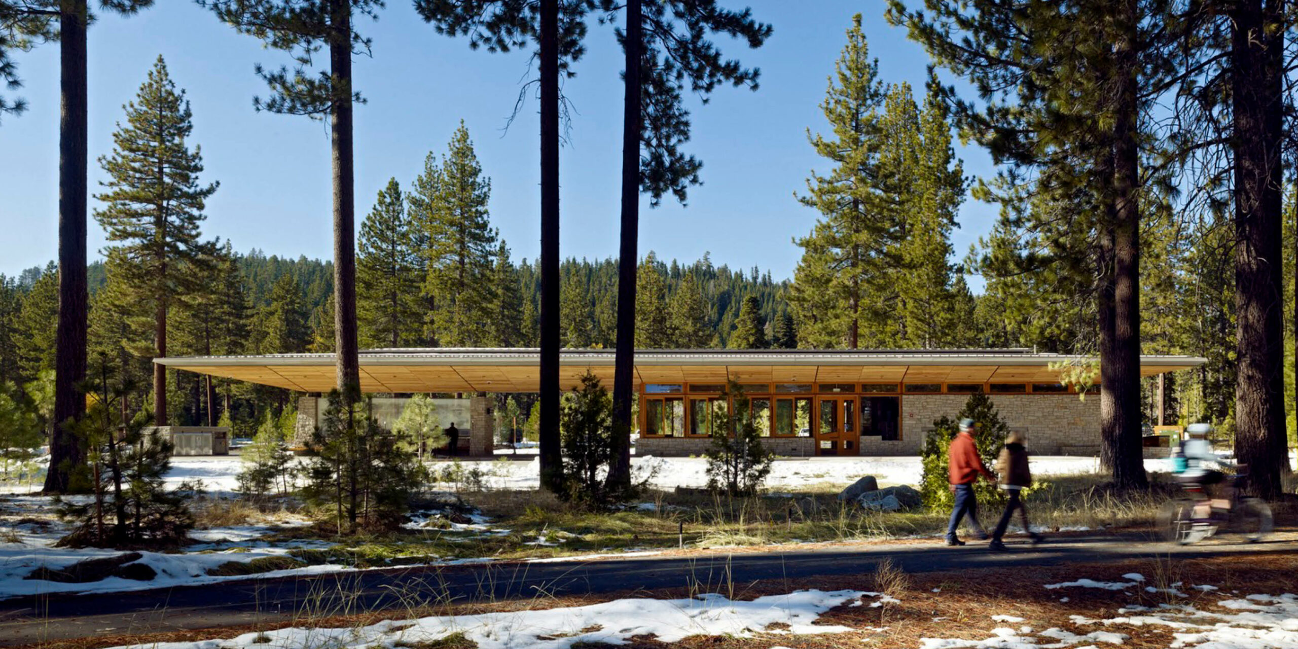
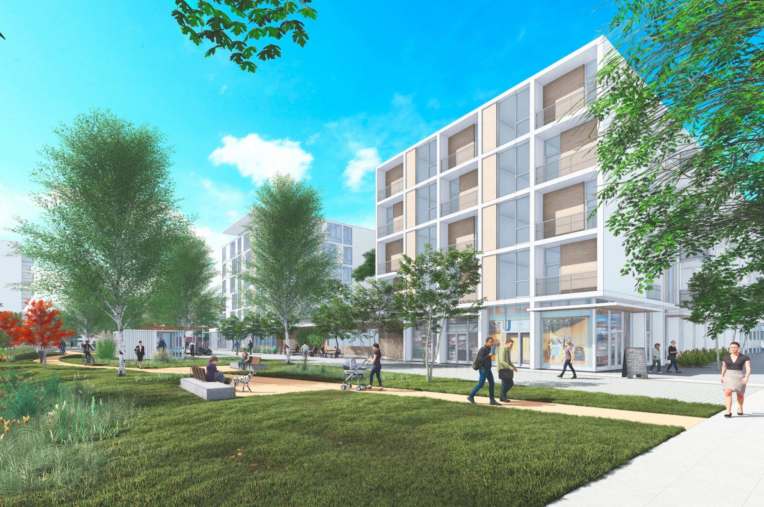
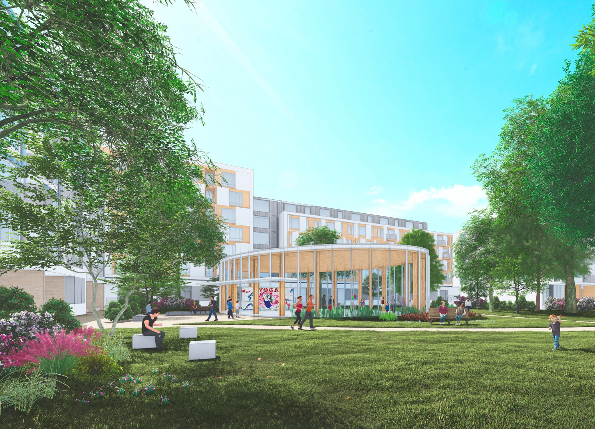
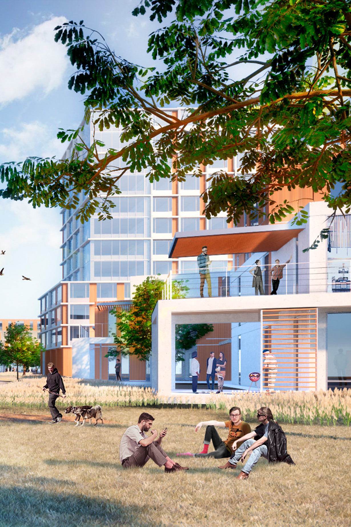
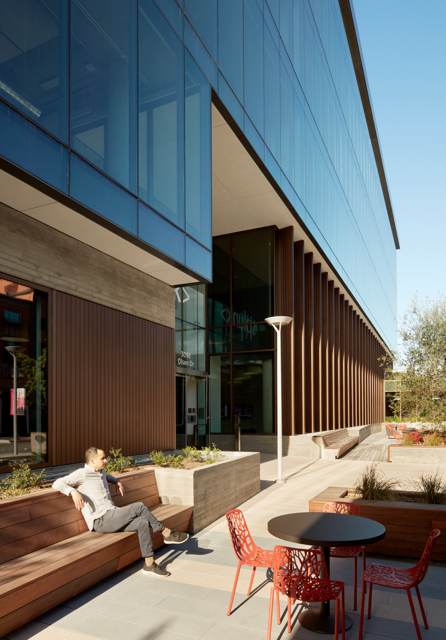
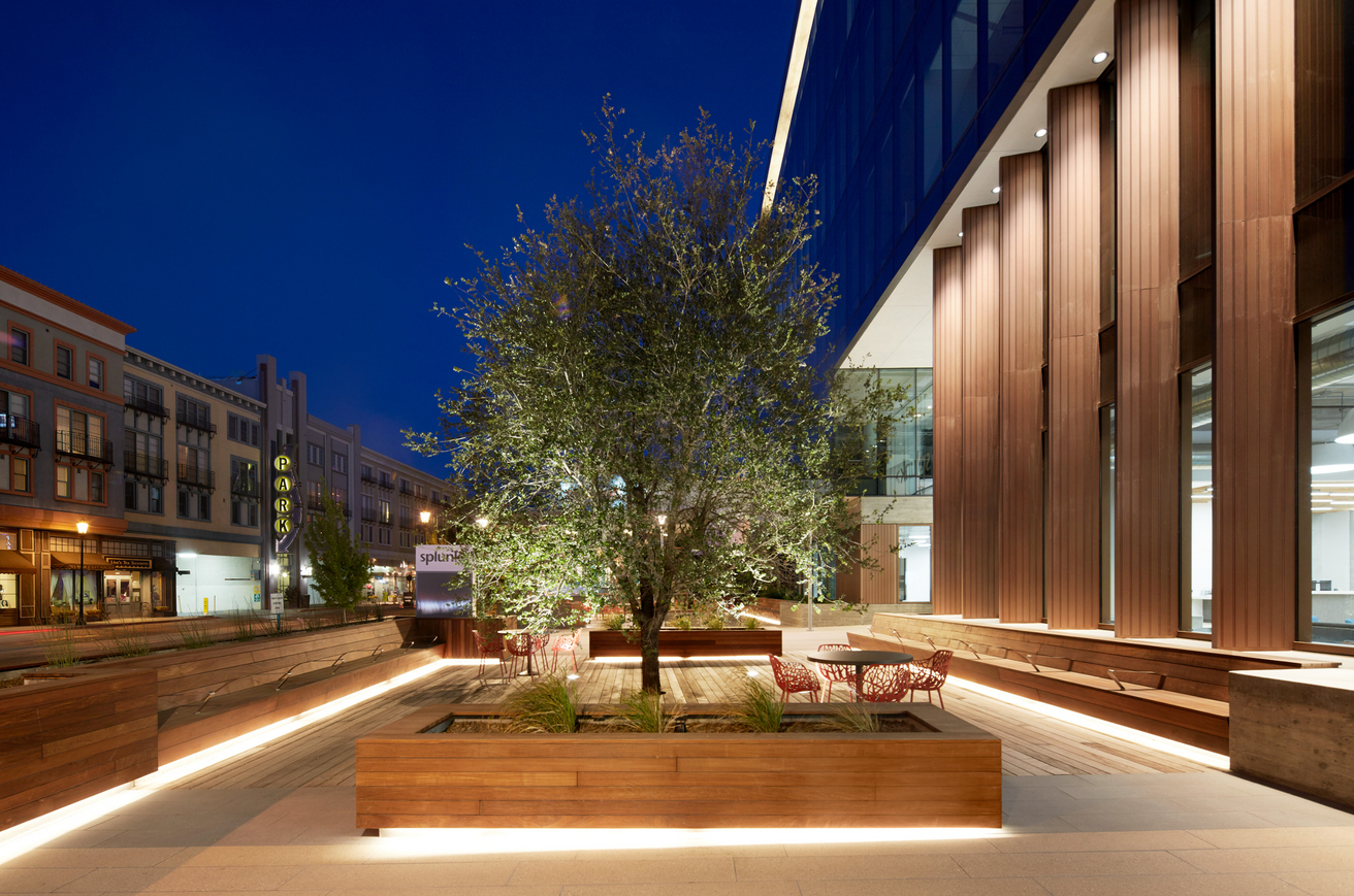
Urban plaza and gathering spaces

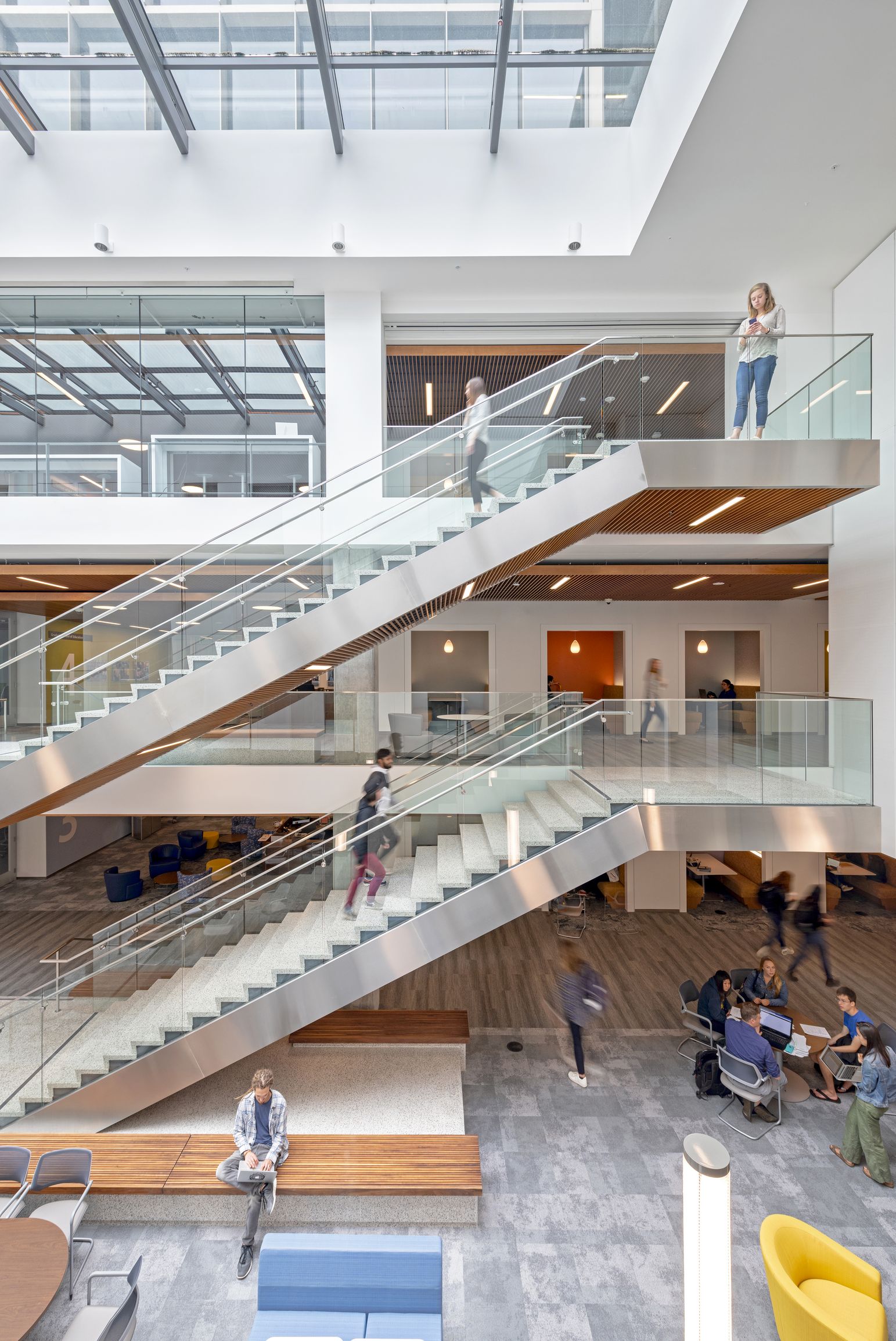
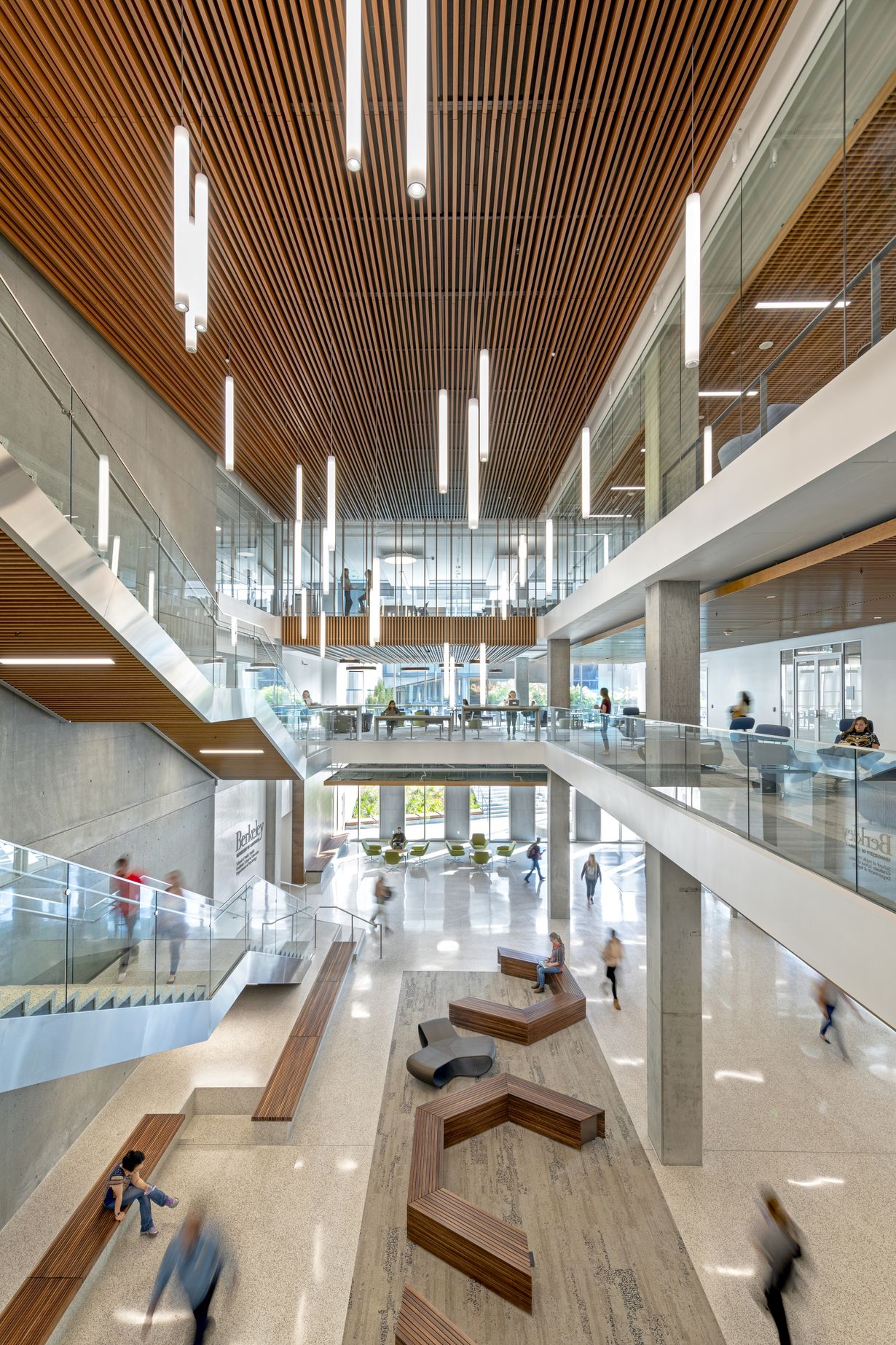
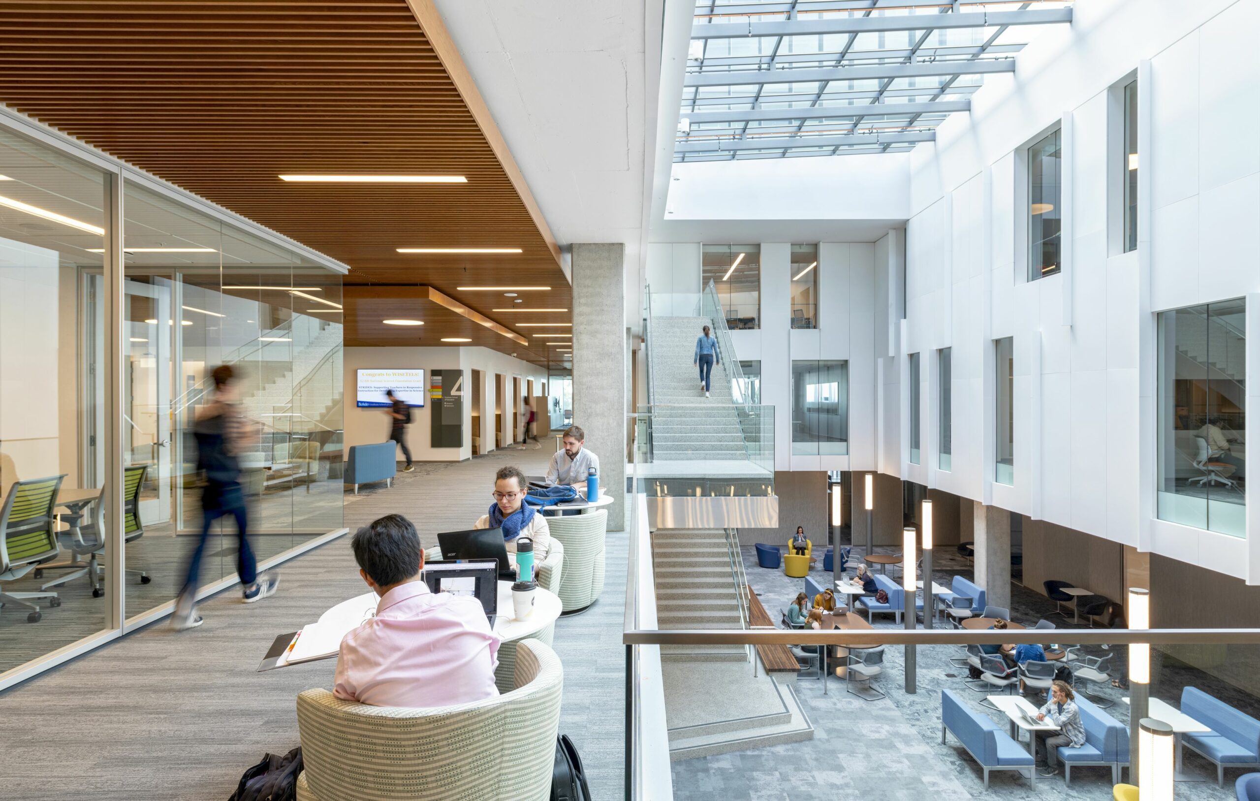
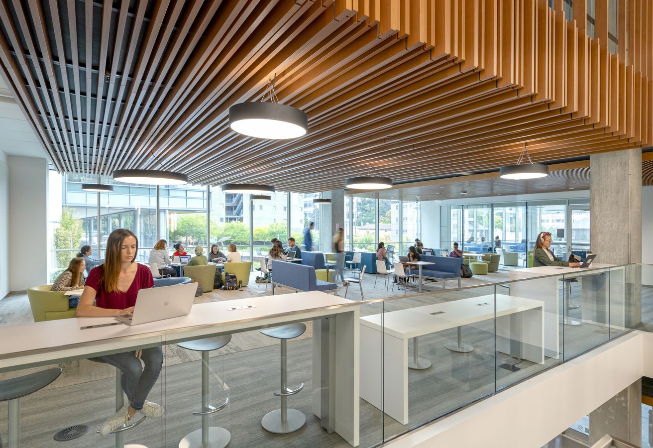
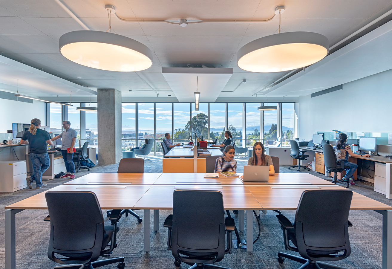
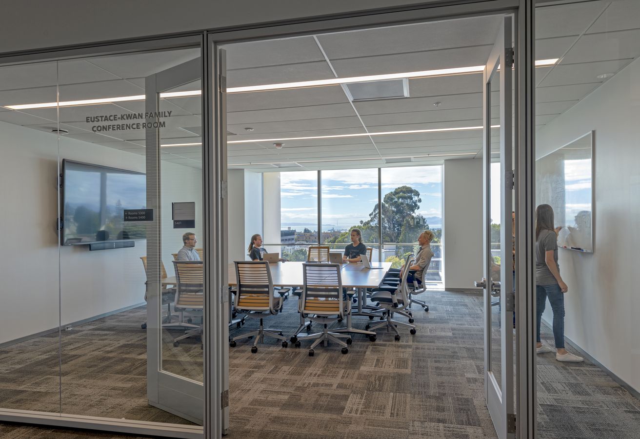
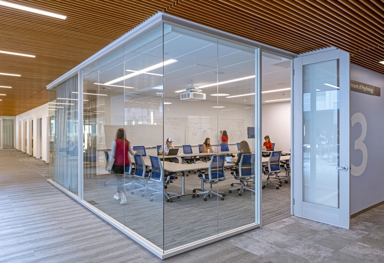
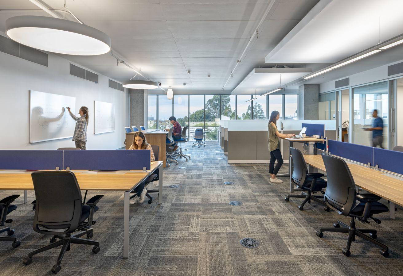
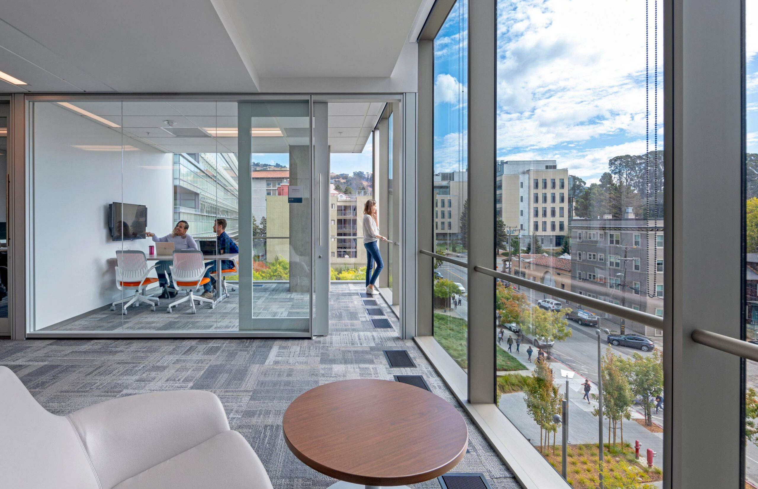
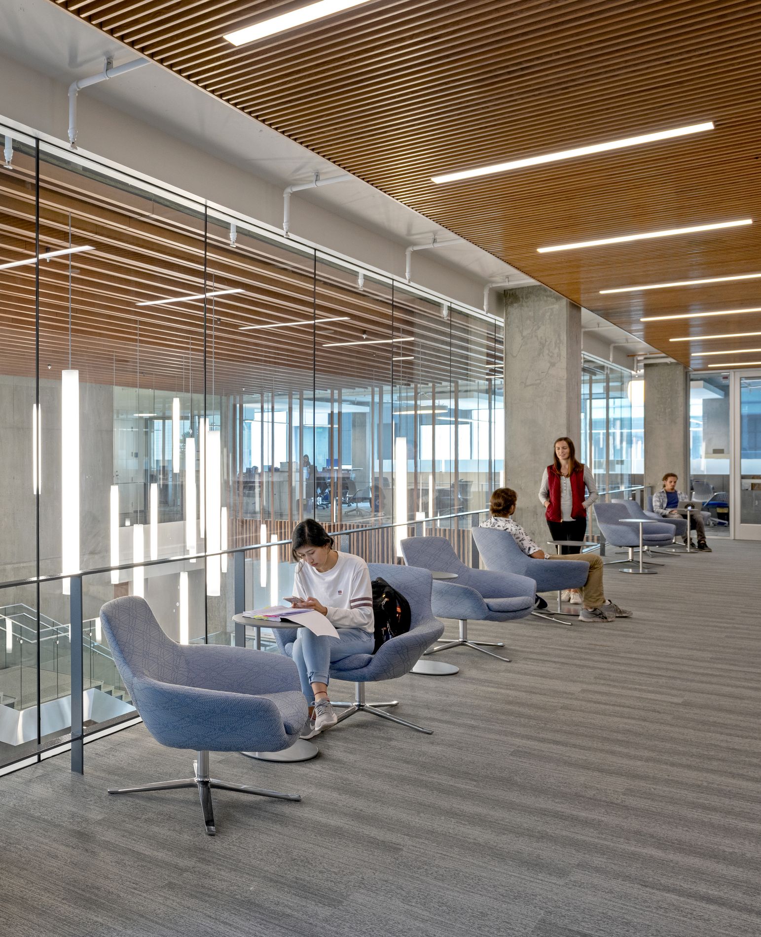
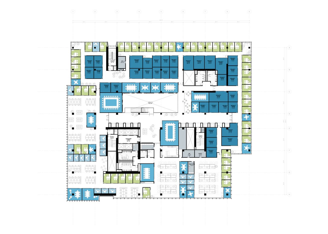
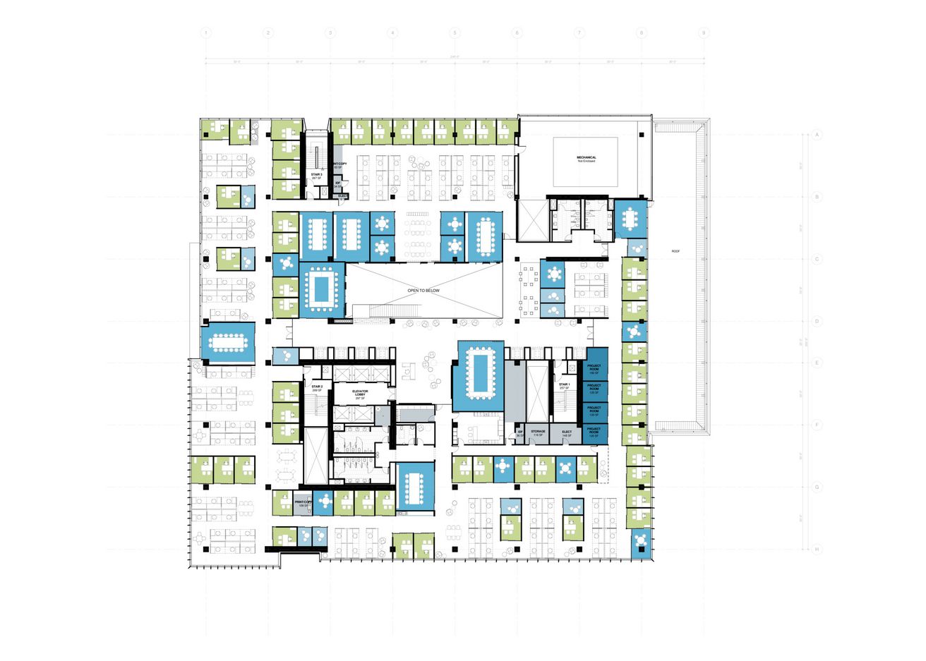
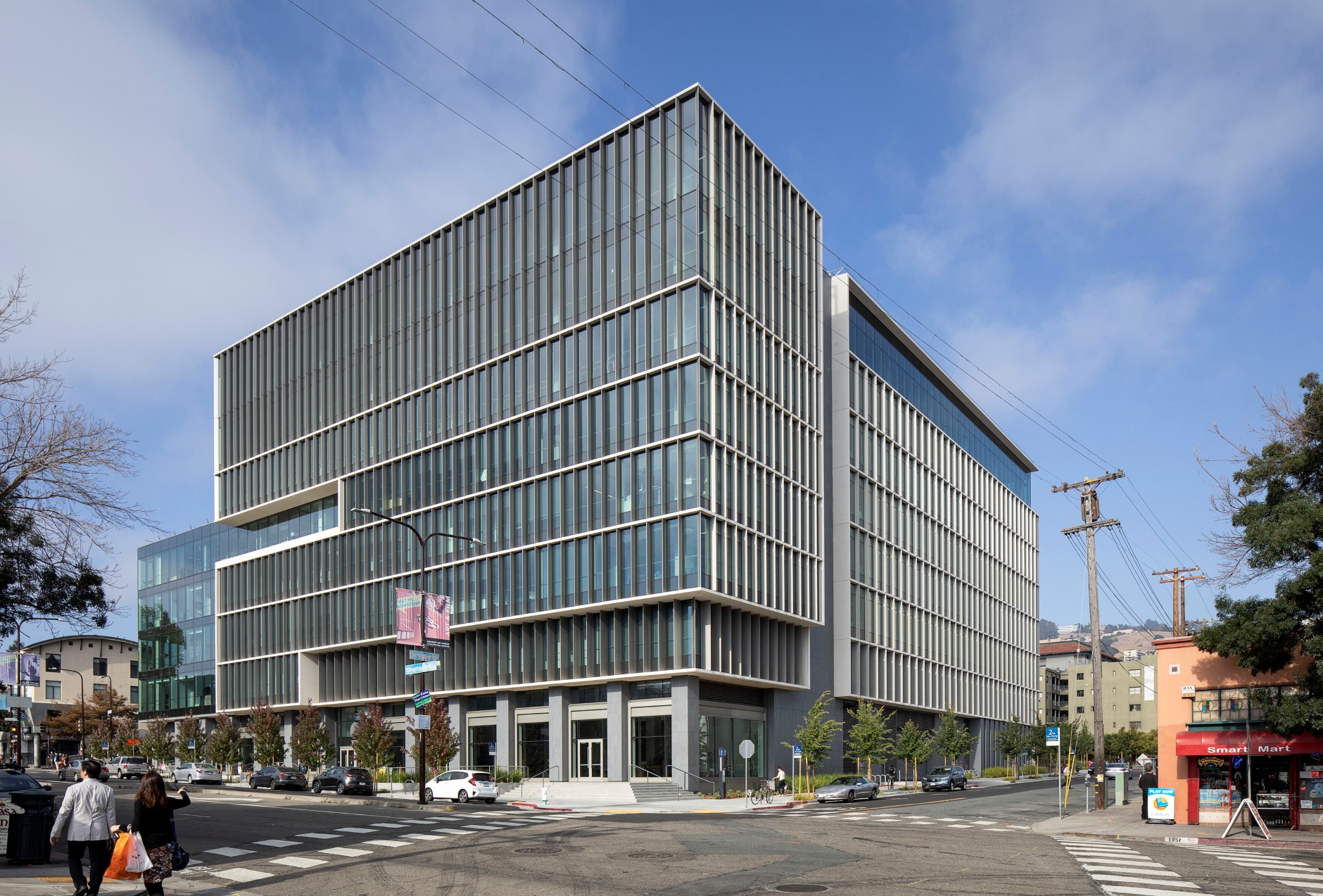
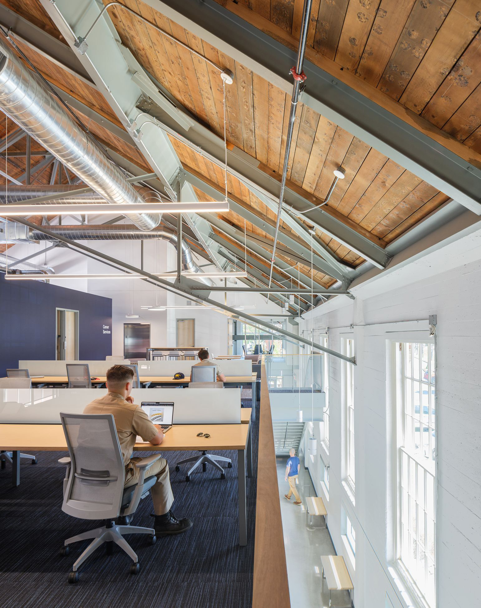
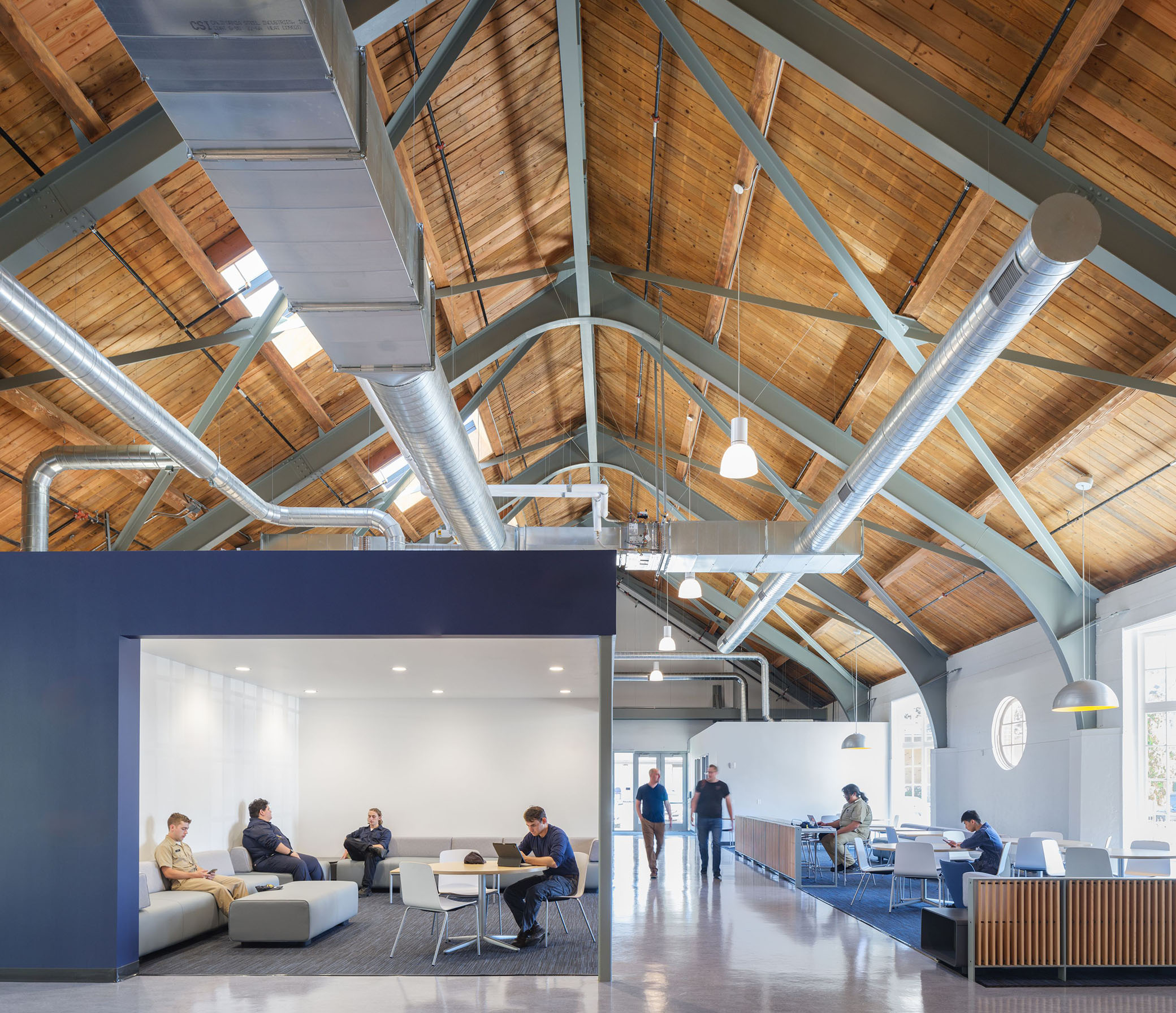
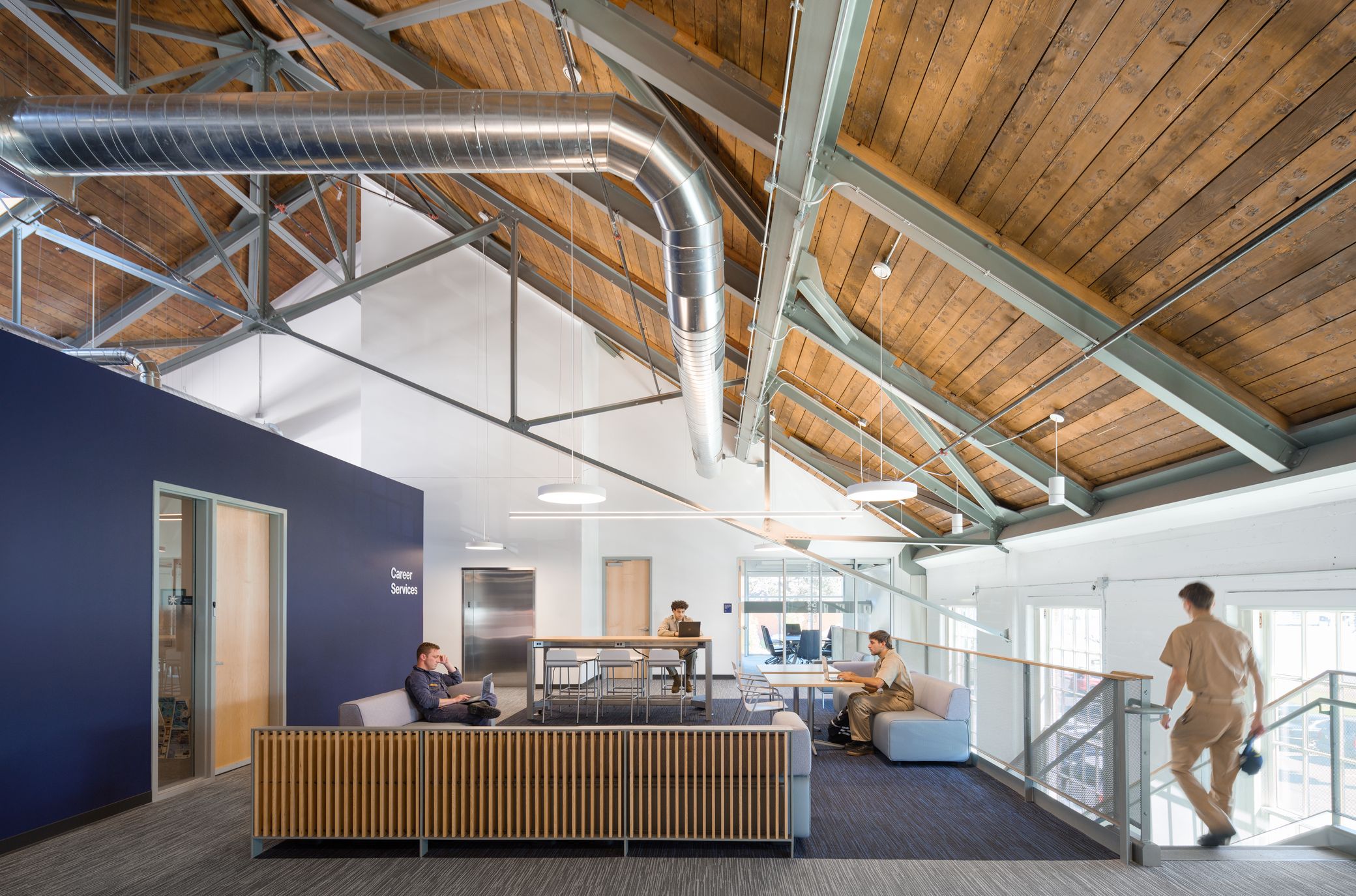
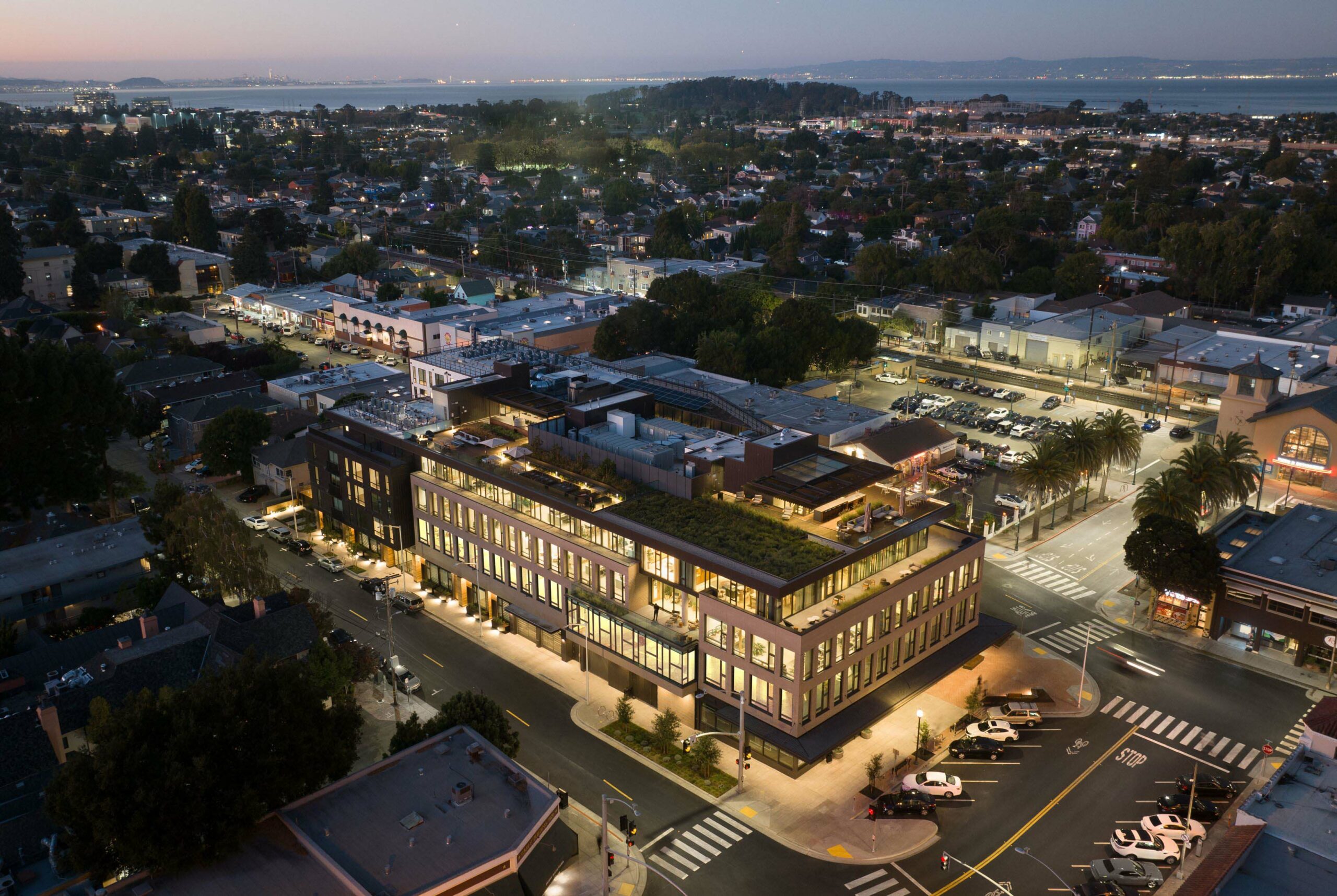
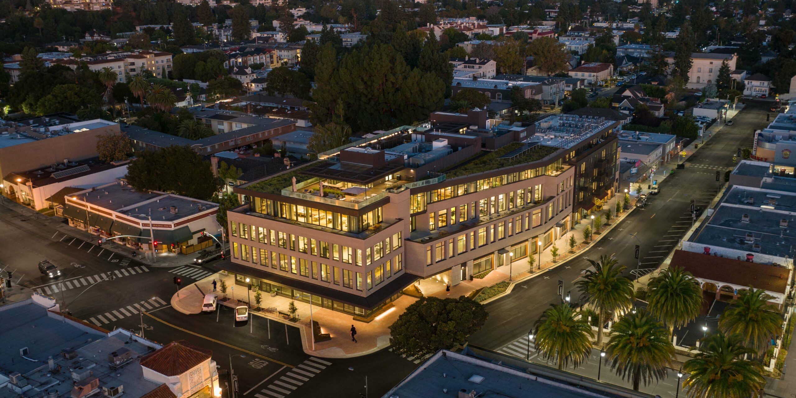
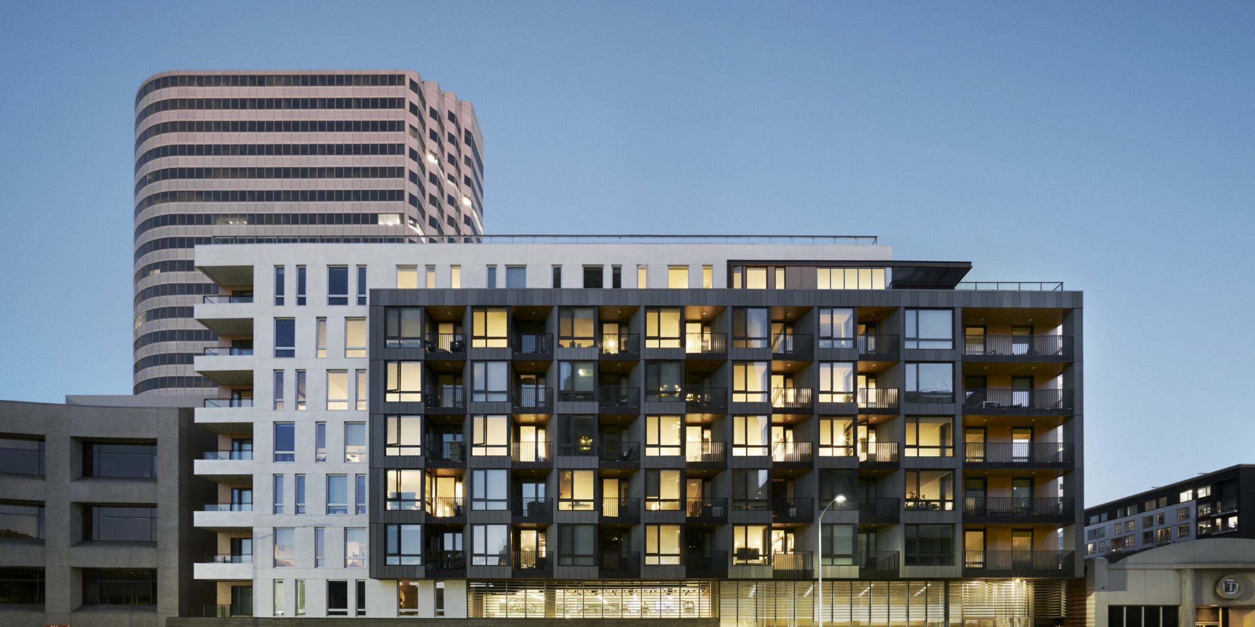
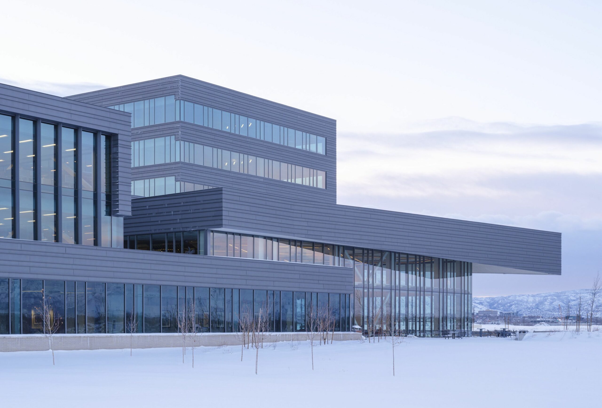
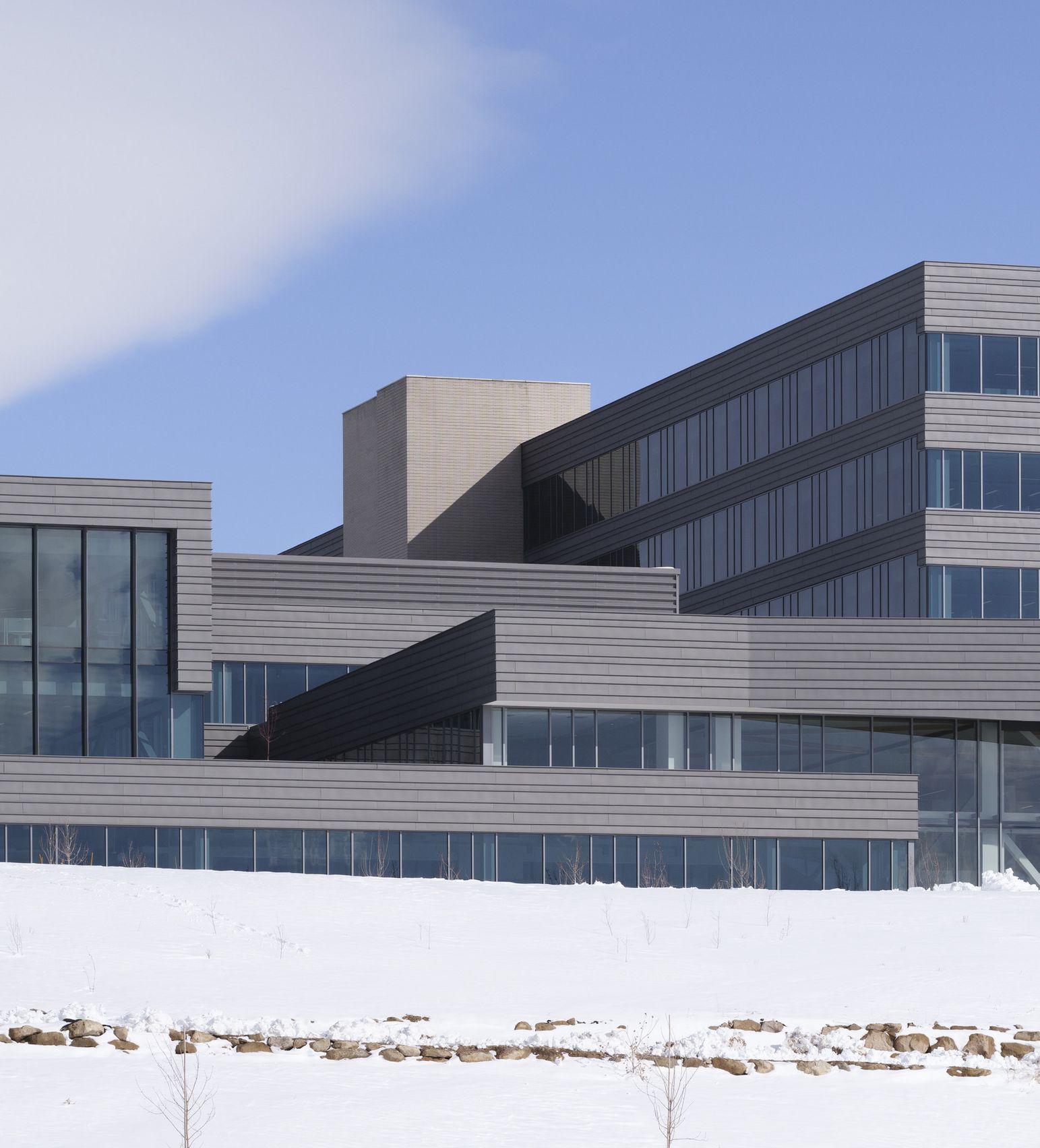
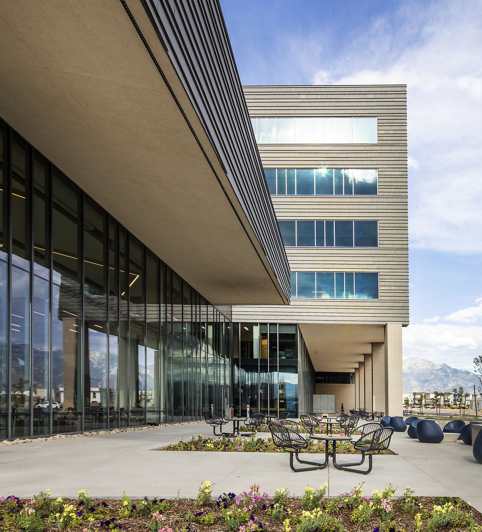
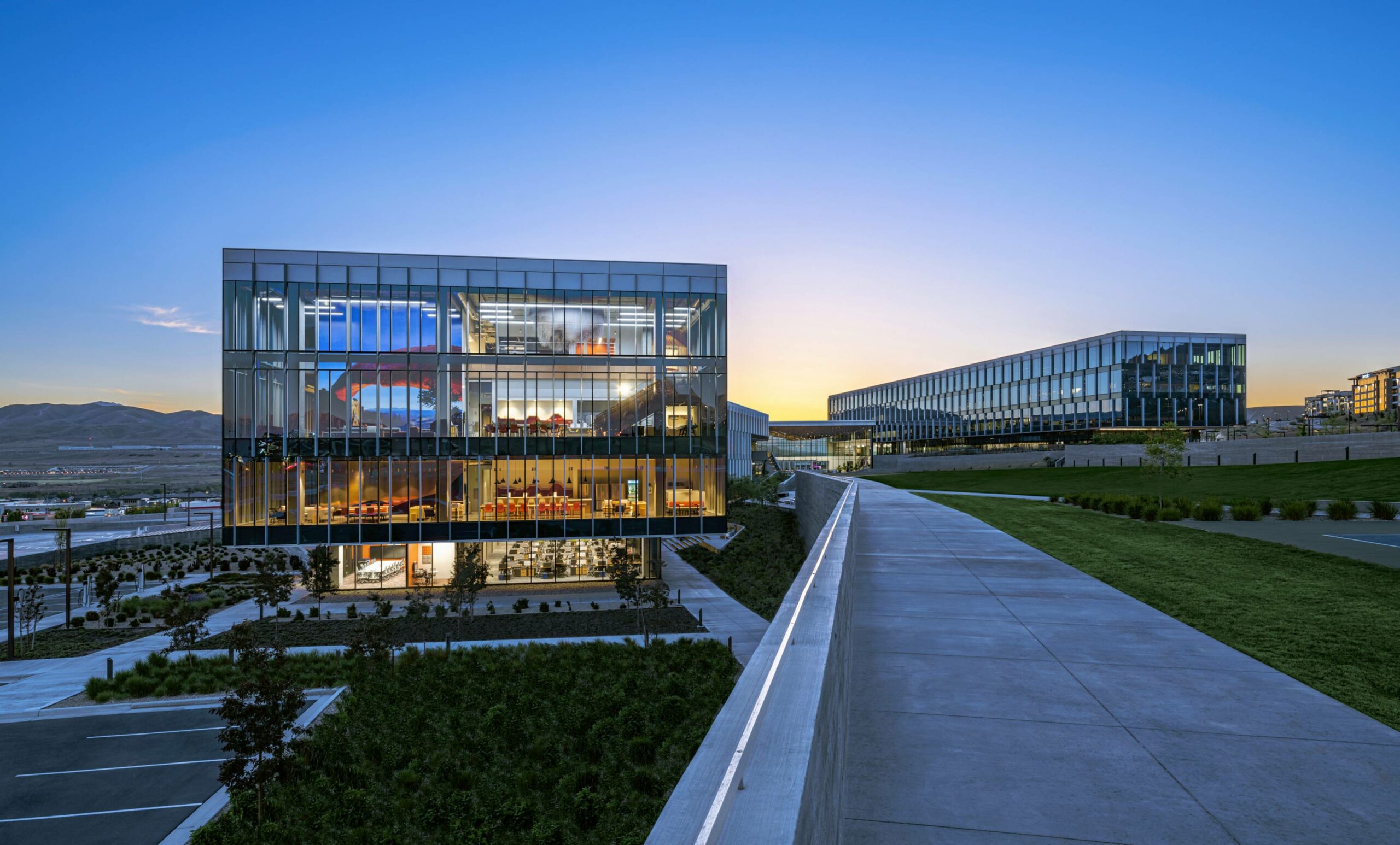
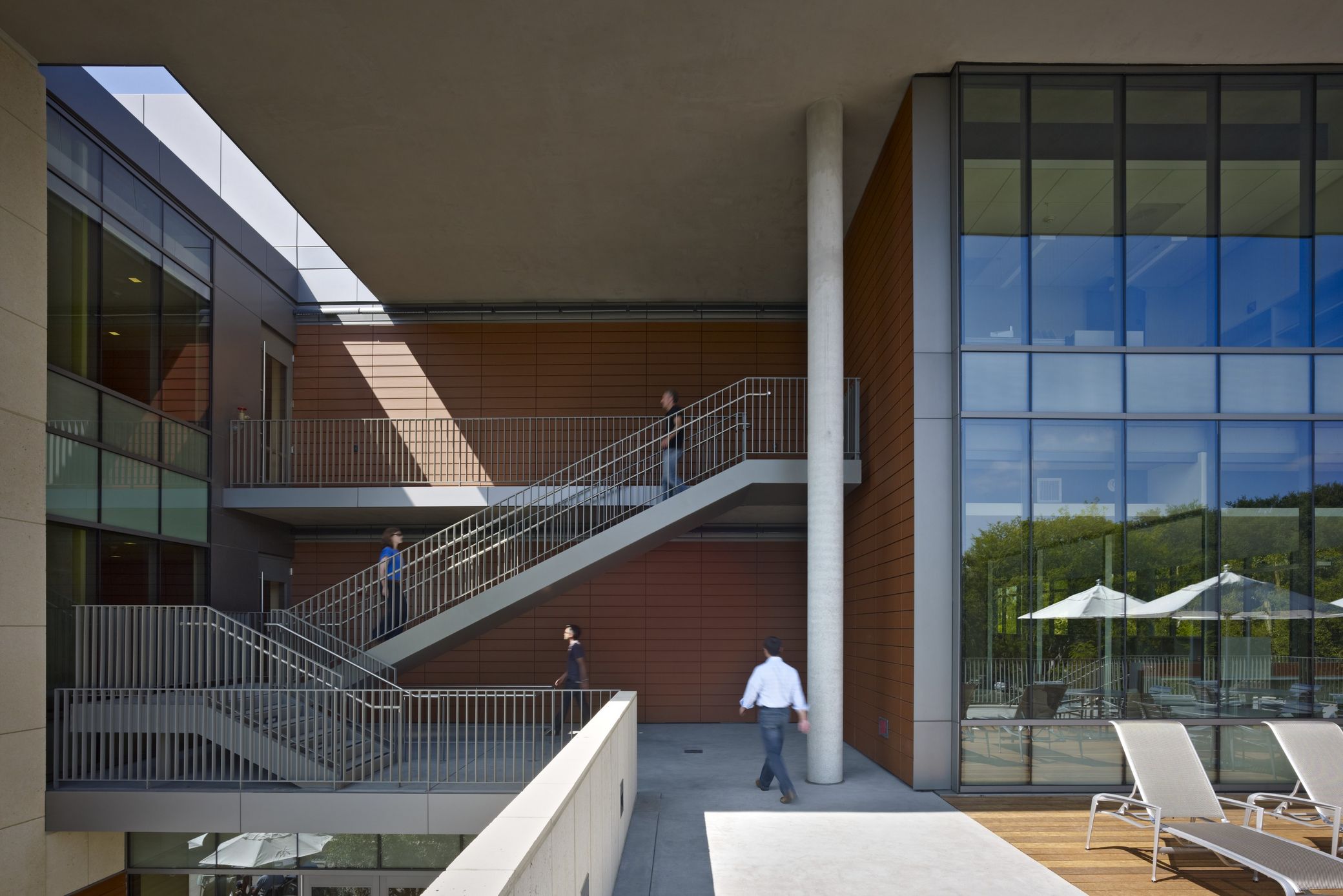
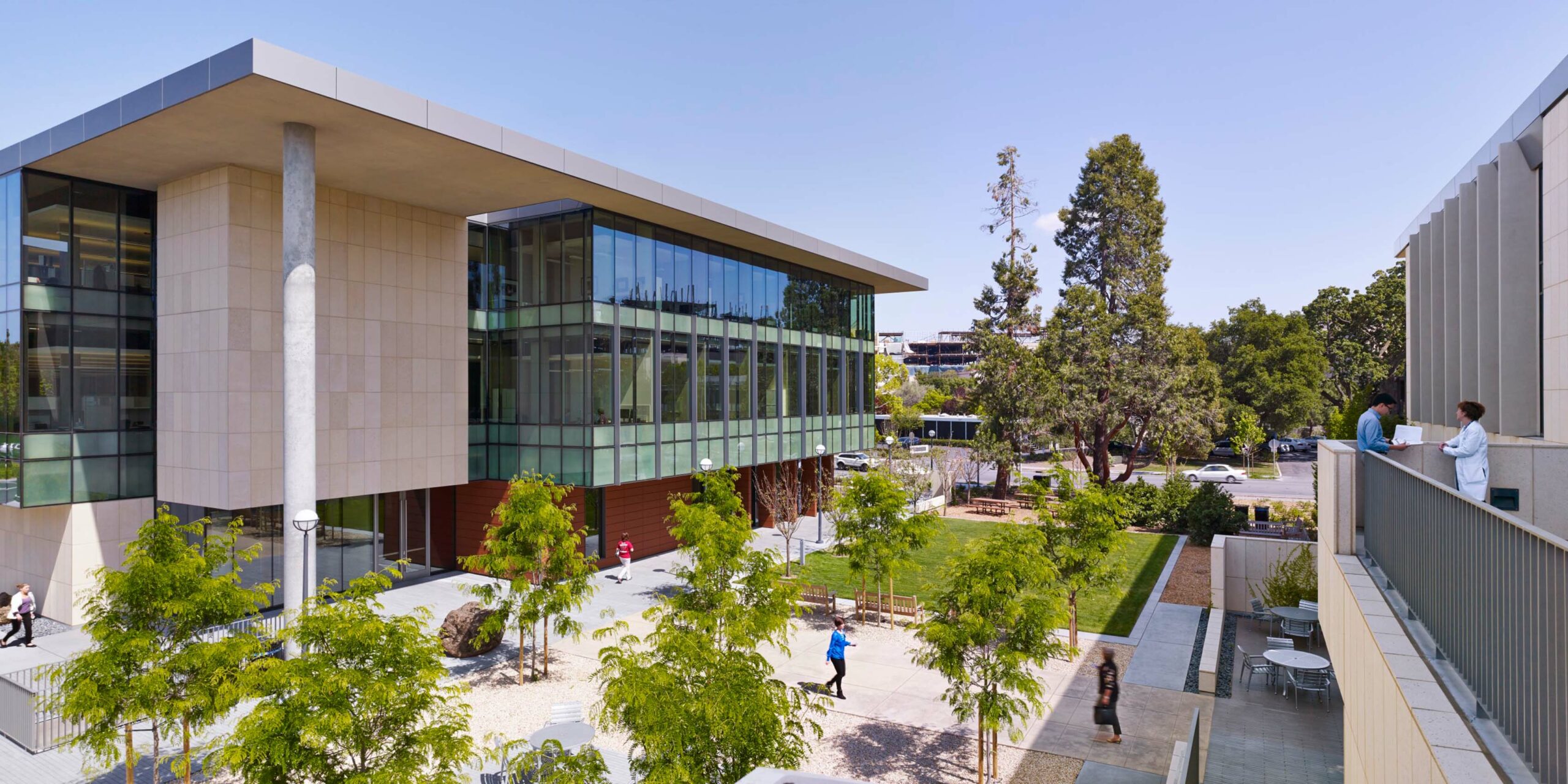
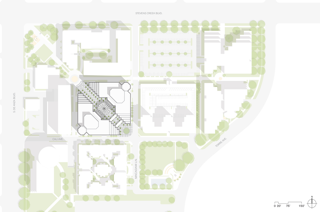
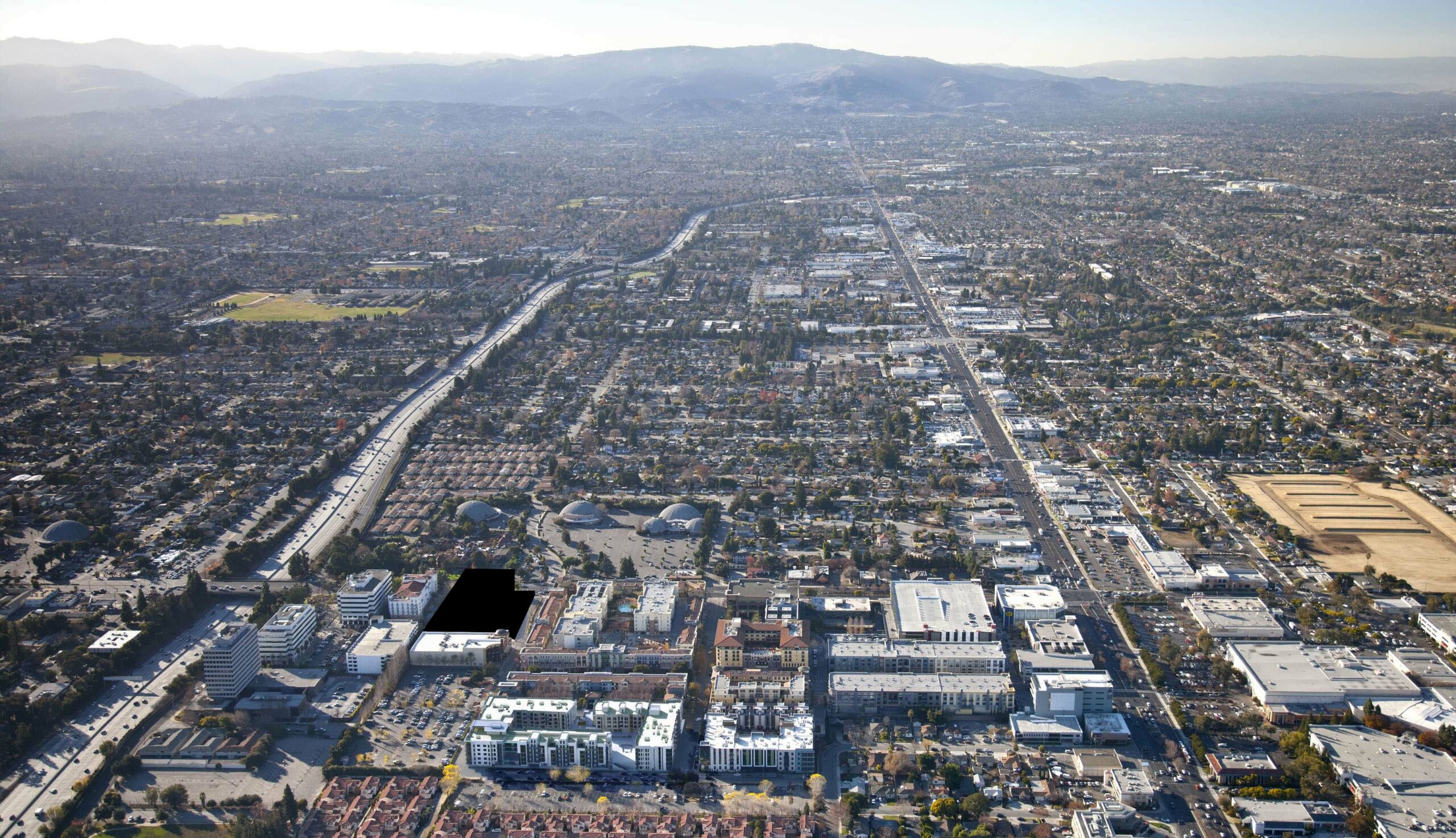
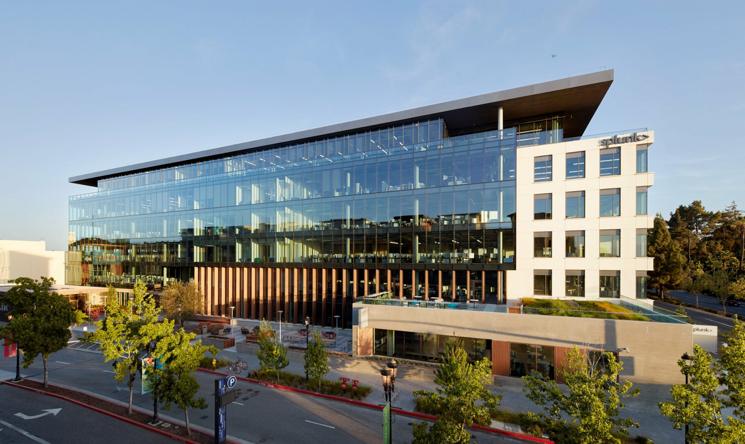
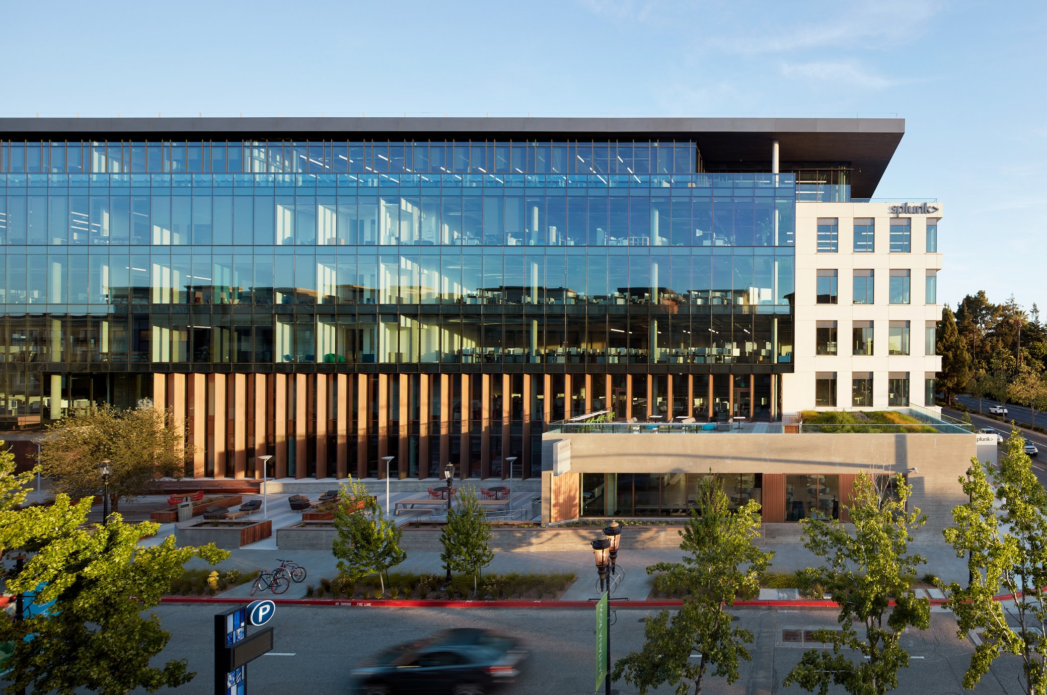
Located on a corner site, the structure pulls back from the north property line, creating an urban plaza with space for a small retail pavilion. The building is organized to take advantage of this plaza, with indoor / outdoor spaces spilling onto it, providing tenants with a vibrant and informal gathering area. The interior office space is designed with large, open 36,000-square-foot floor plates and ceiling heights over 13’ tall to provide extensive natural light and views. 

Collaboration with trade partners 

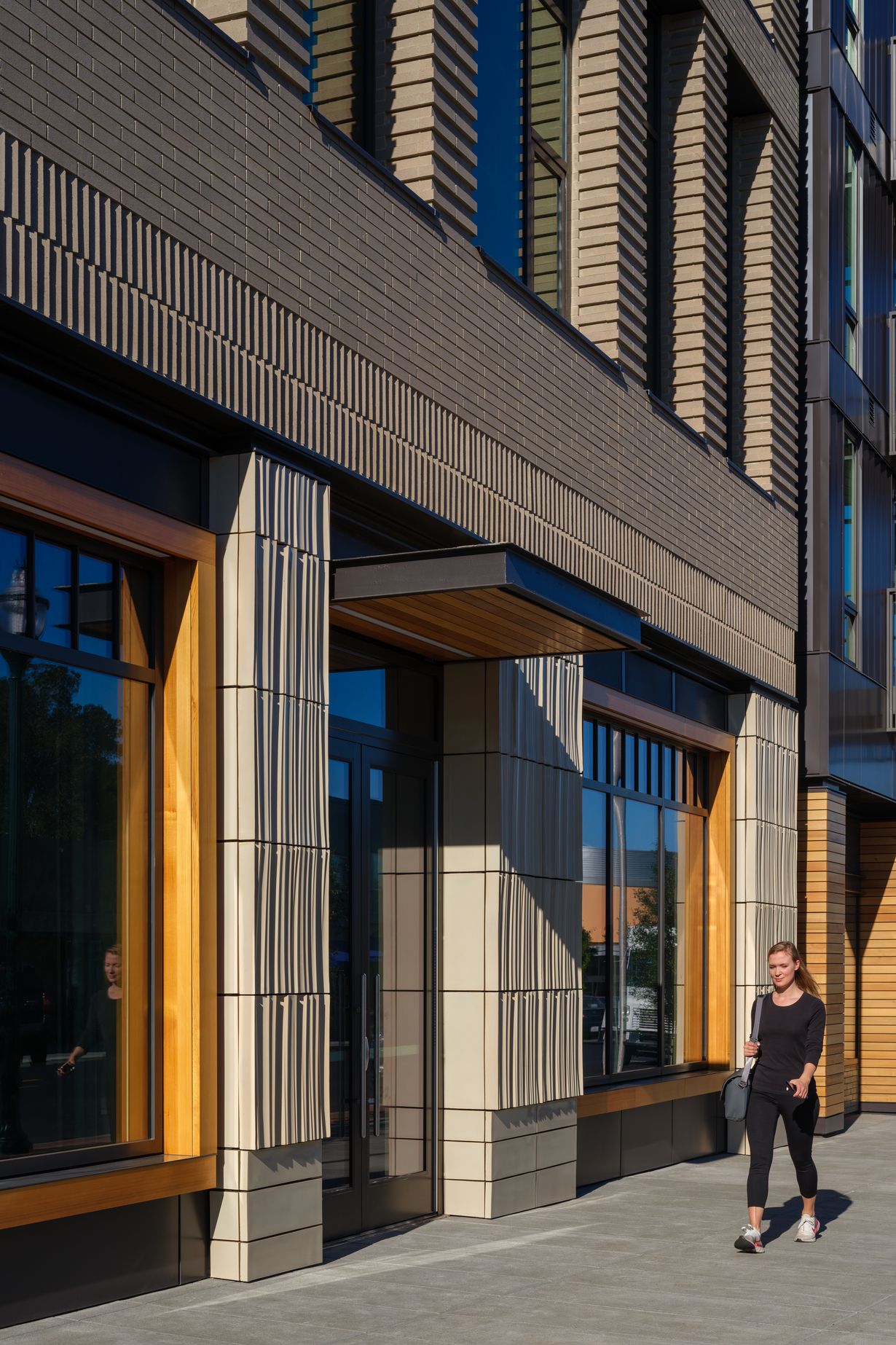
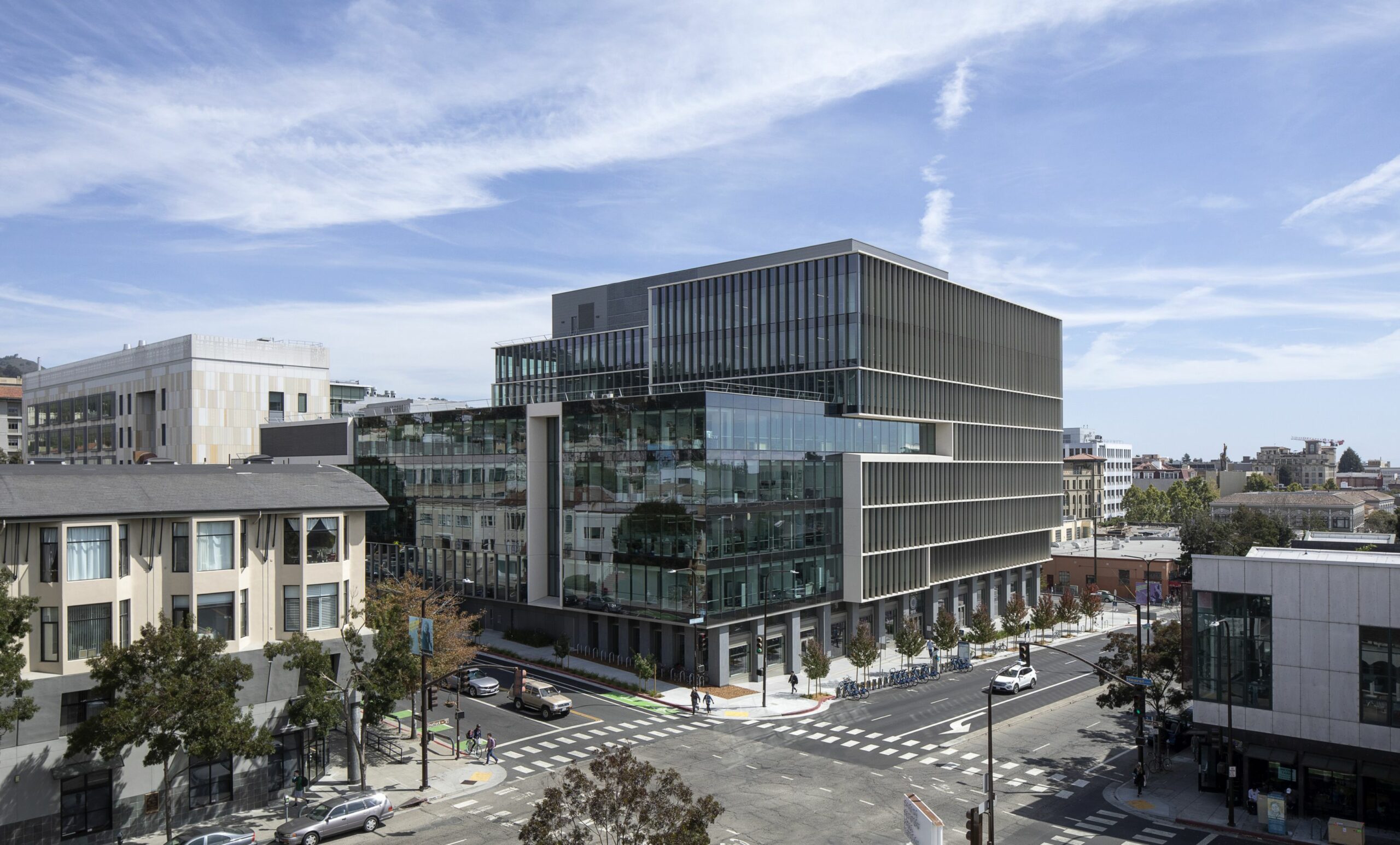
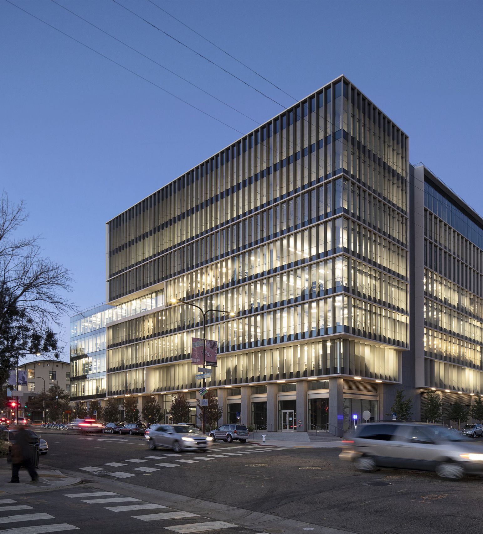
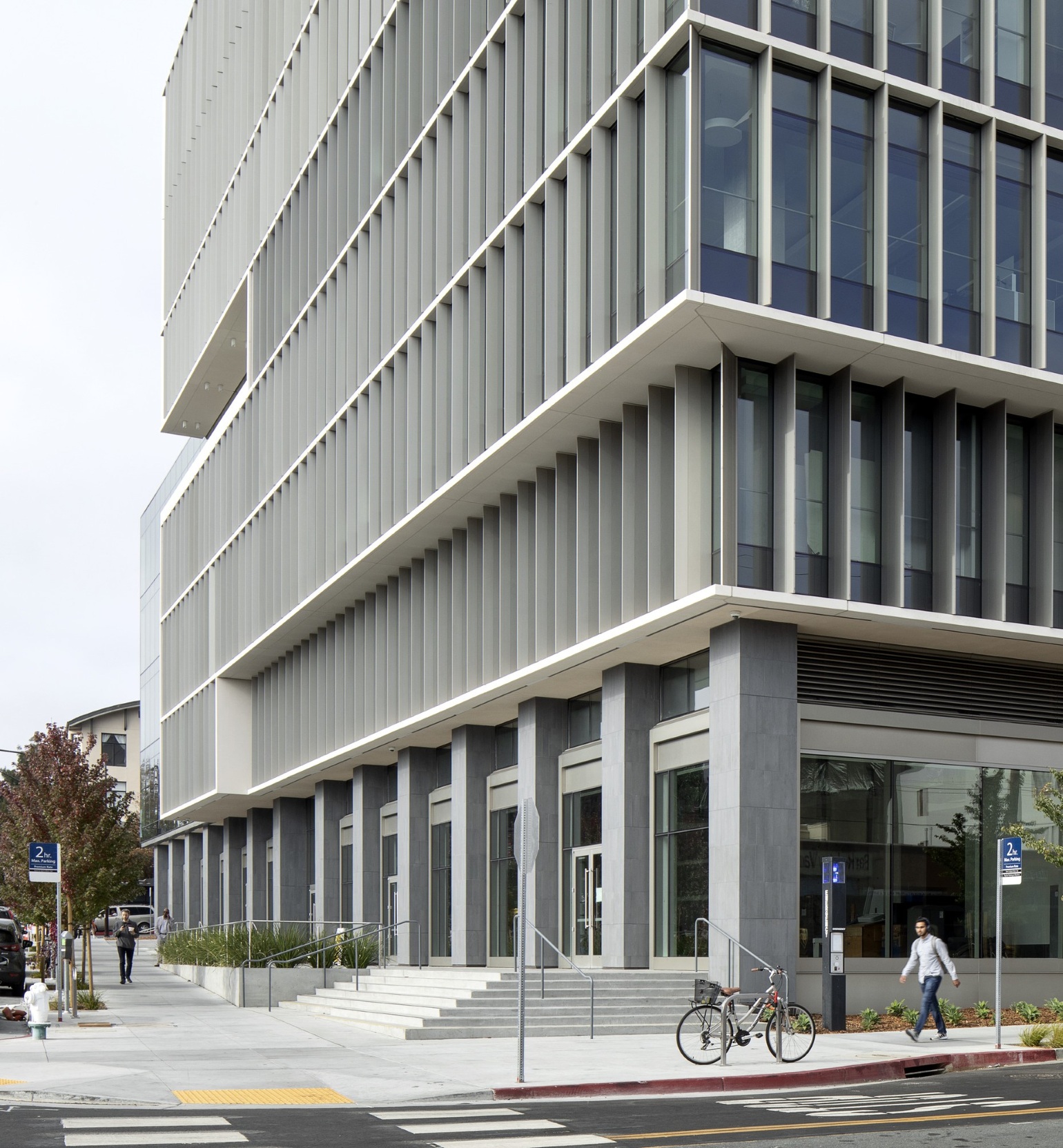
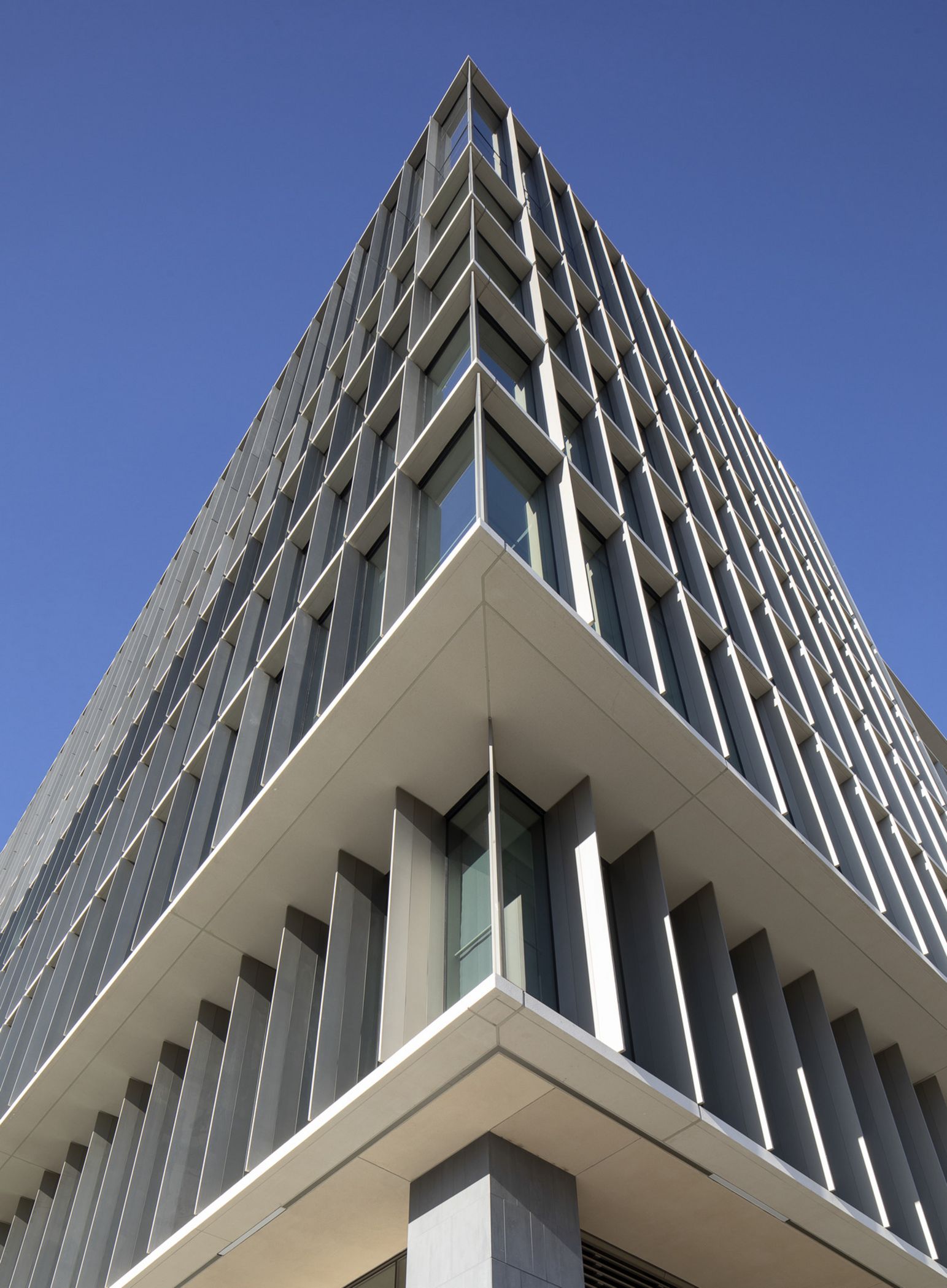
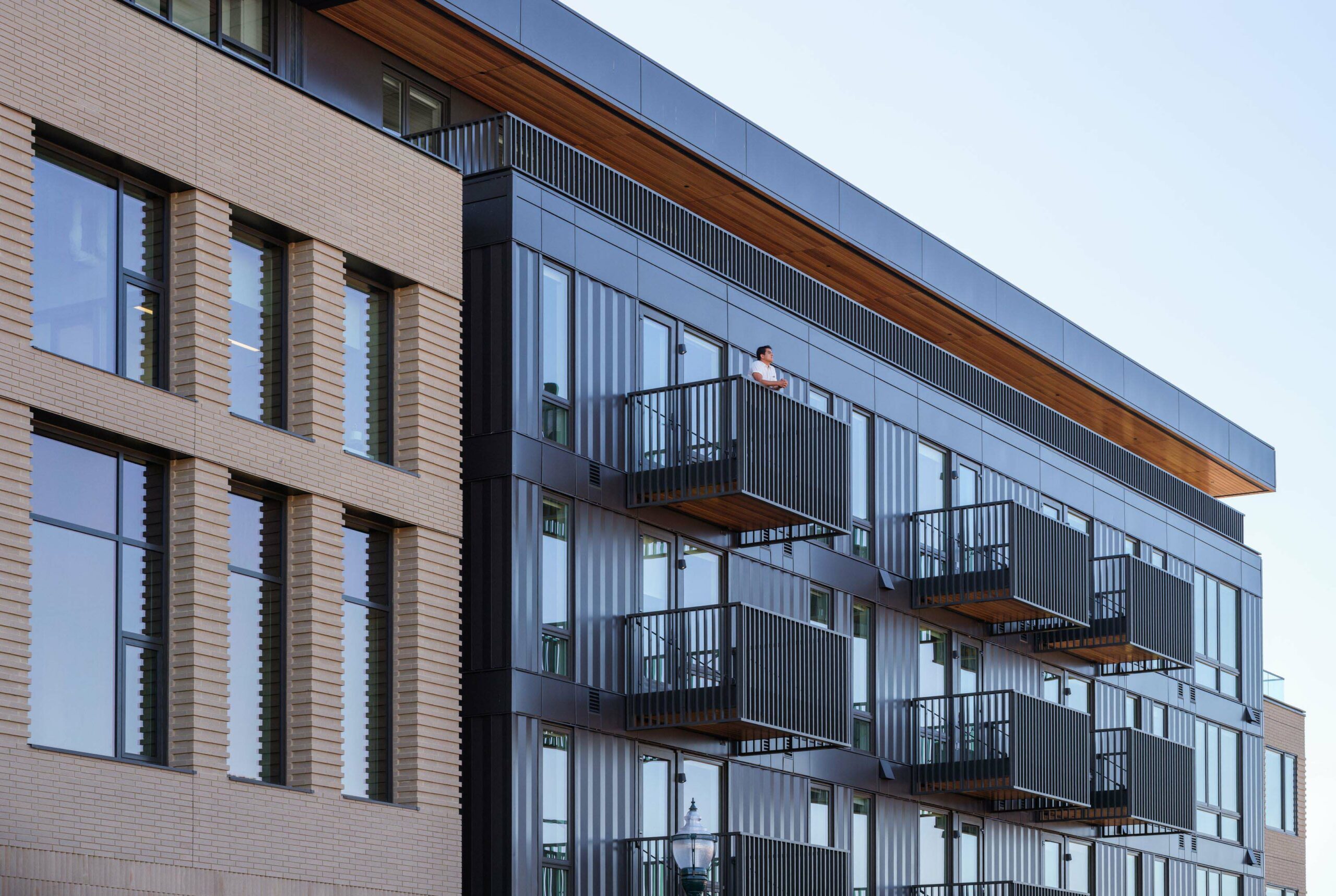
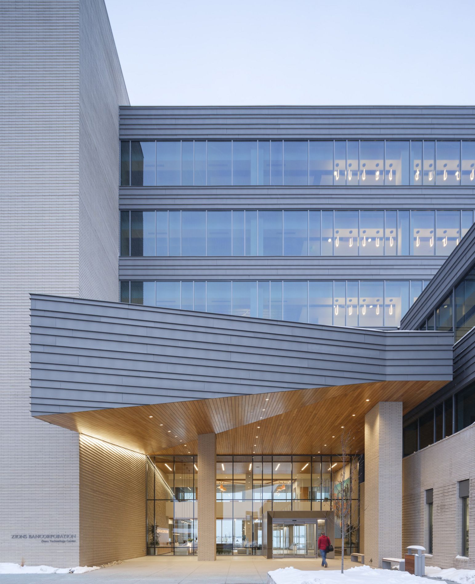
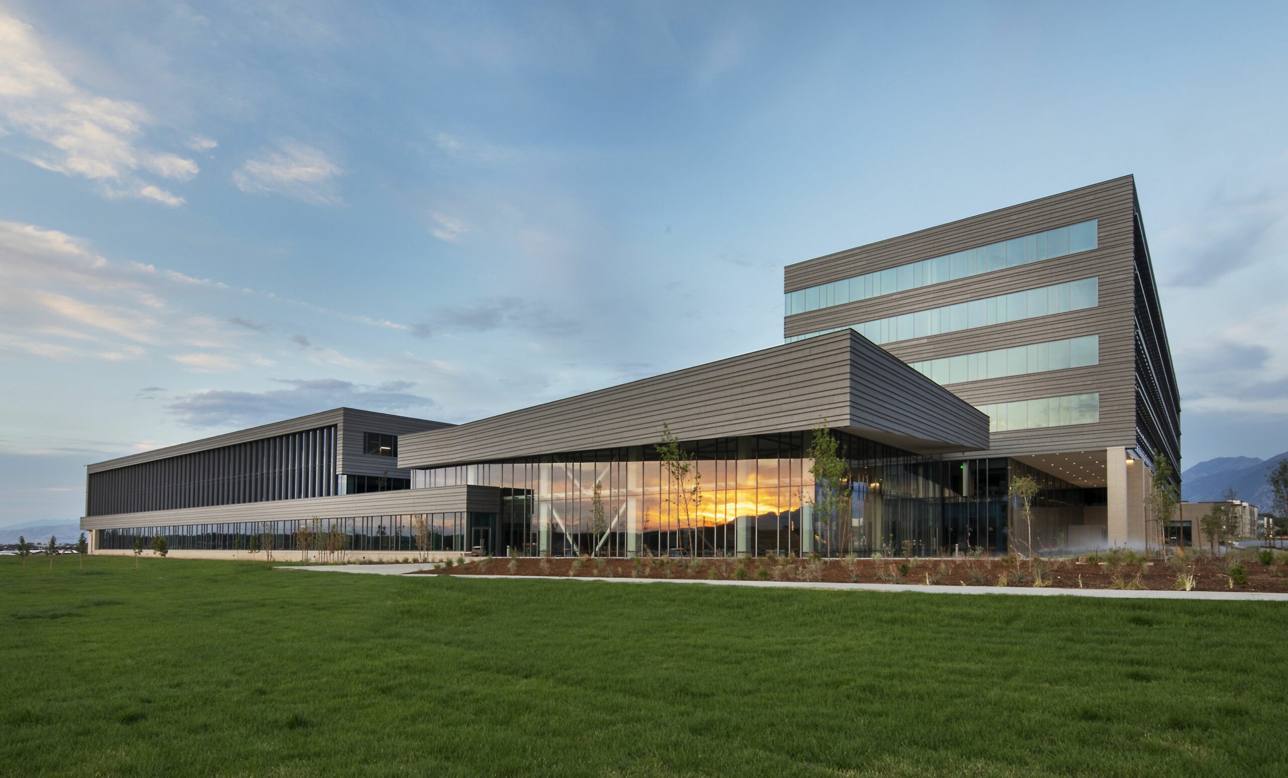
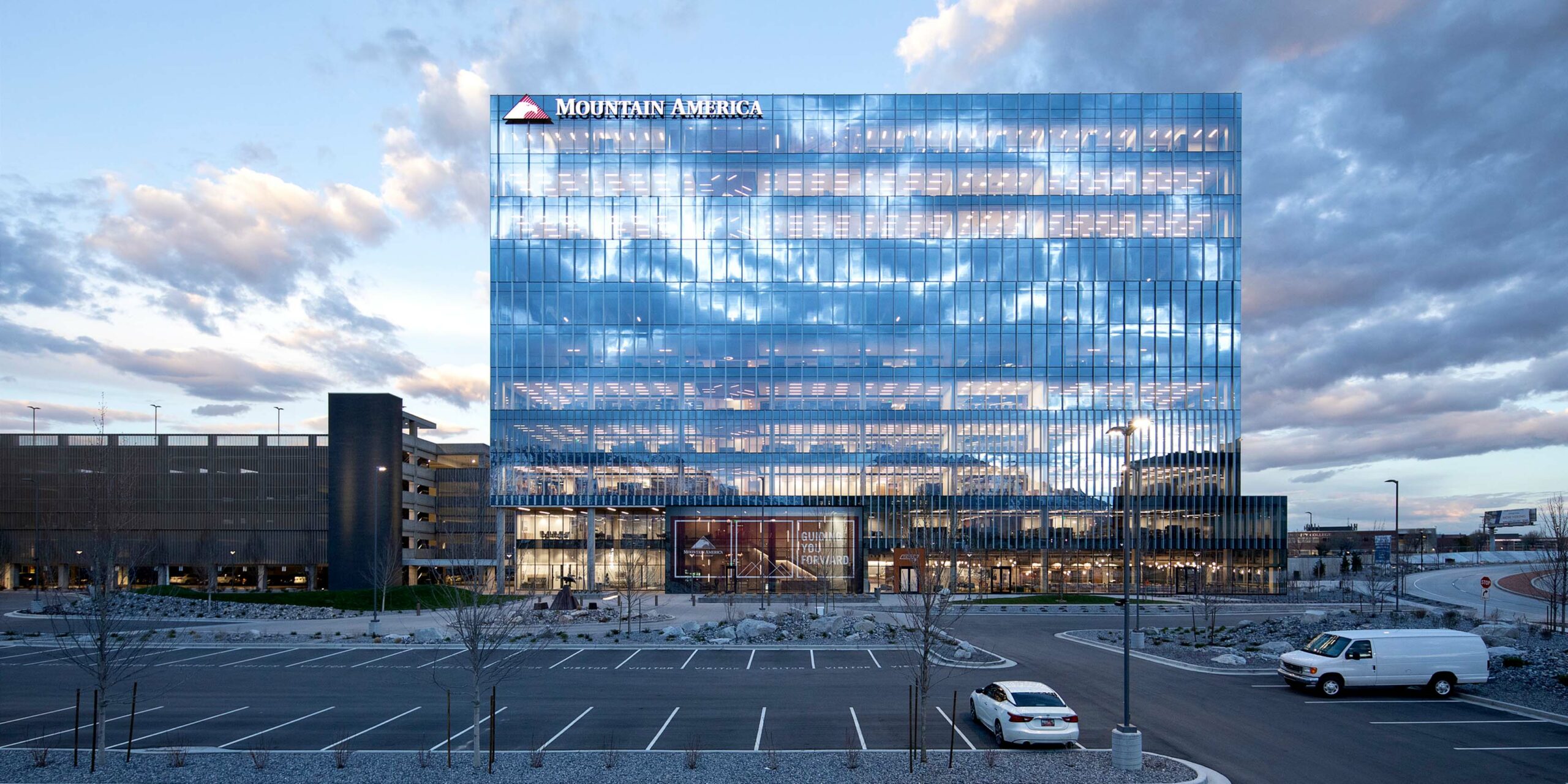
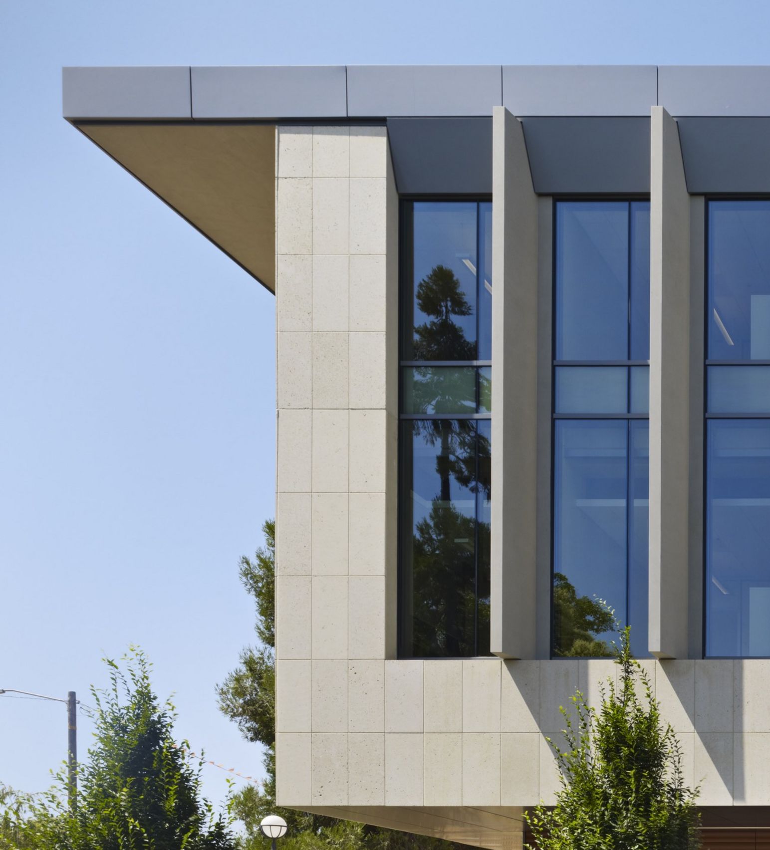
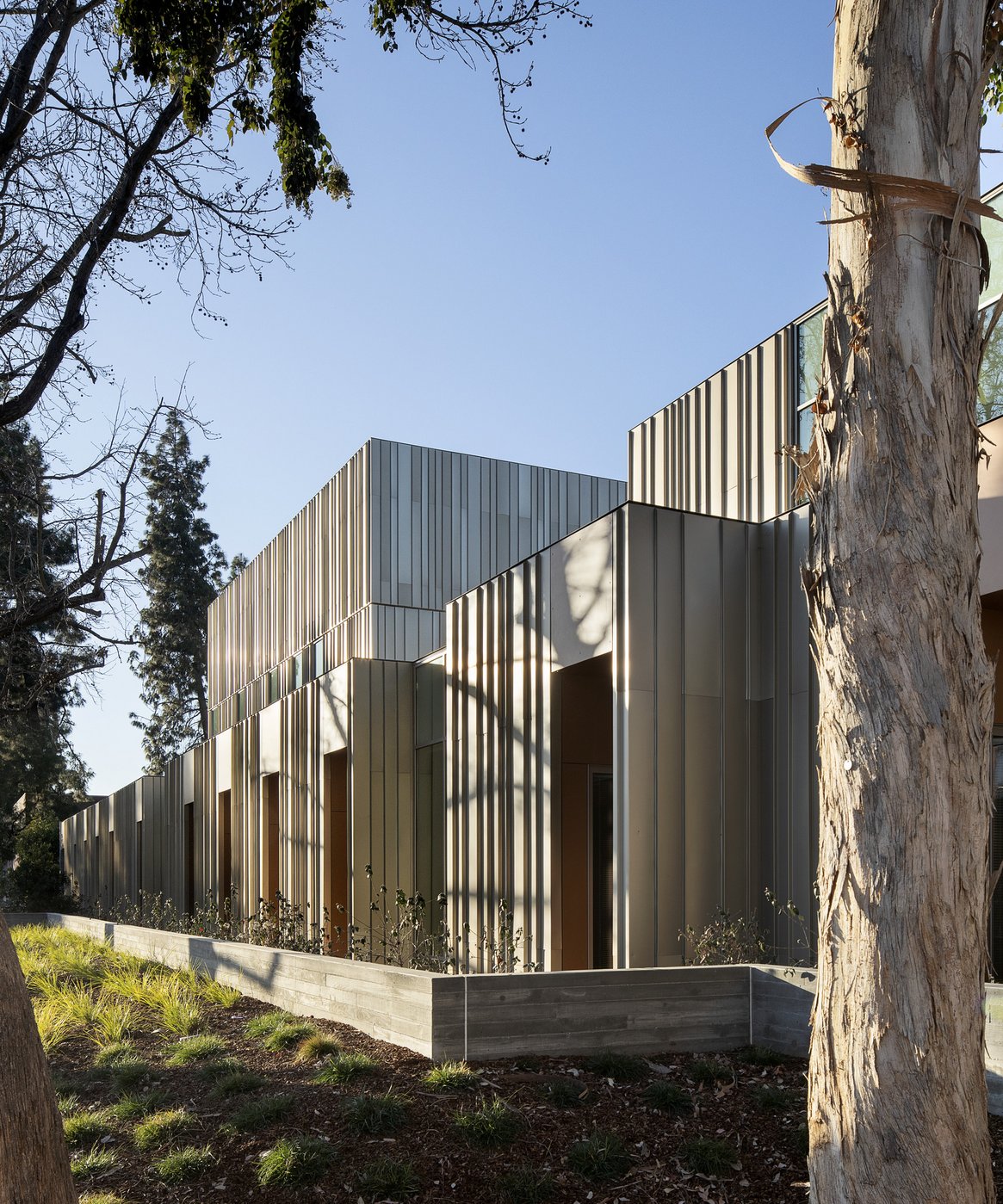
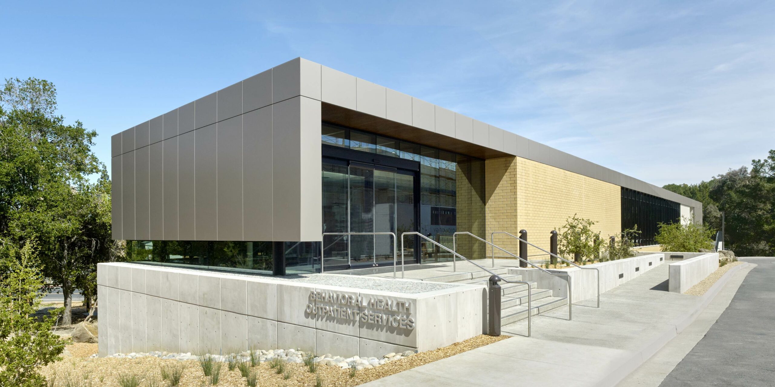
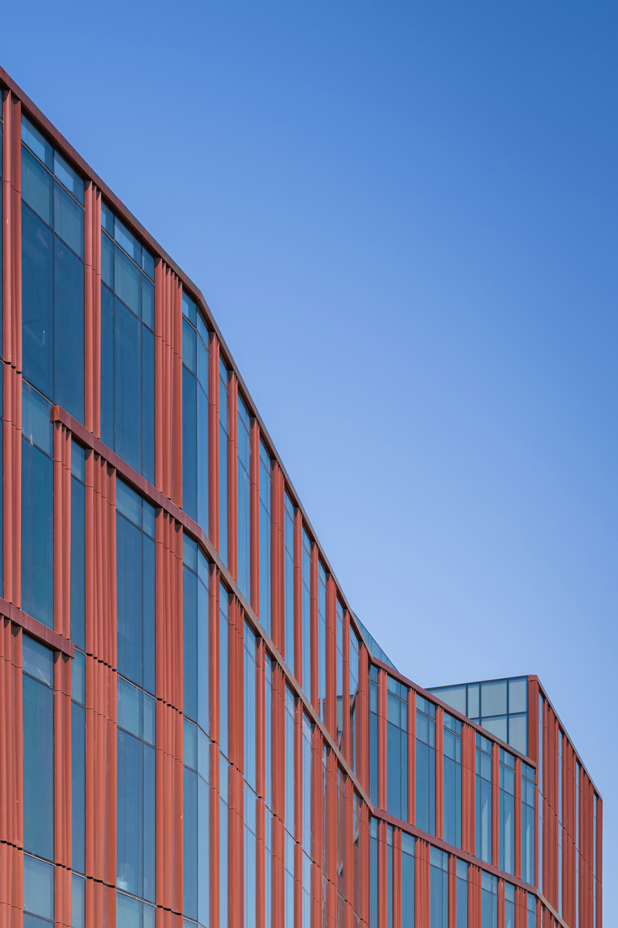
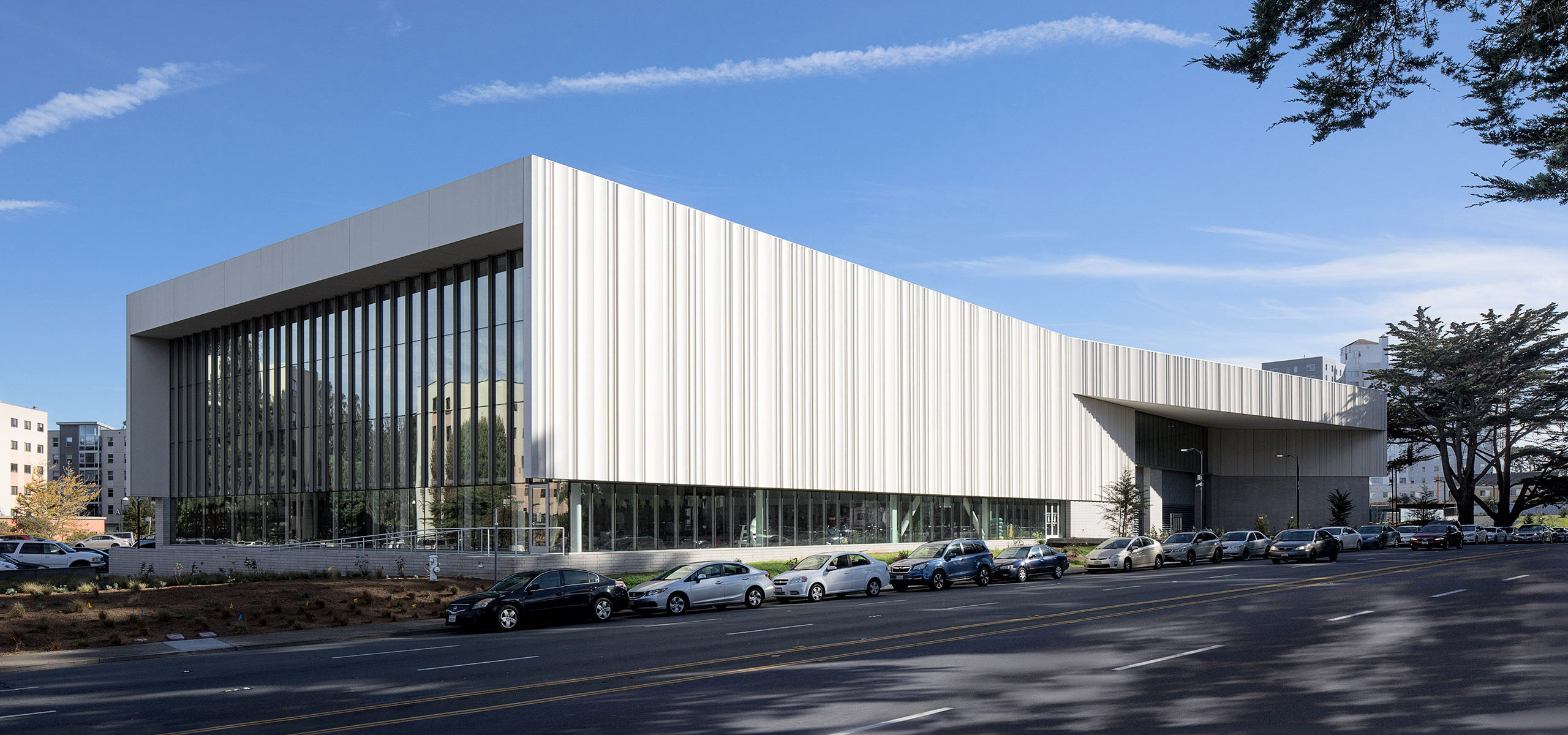
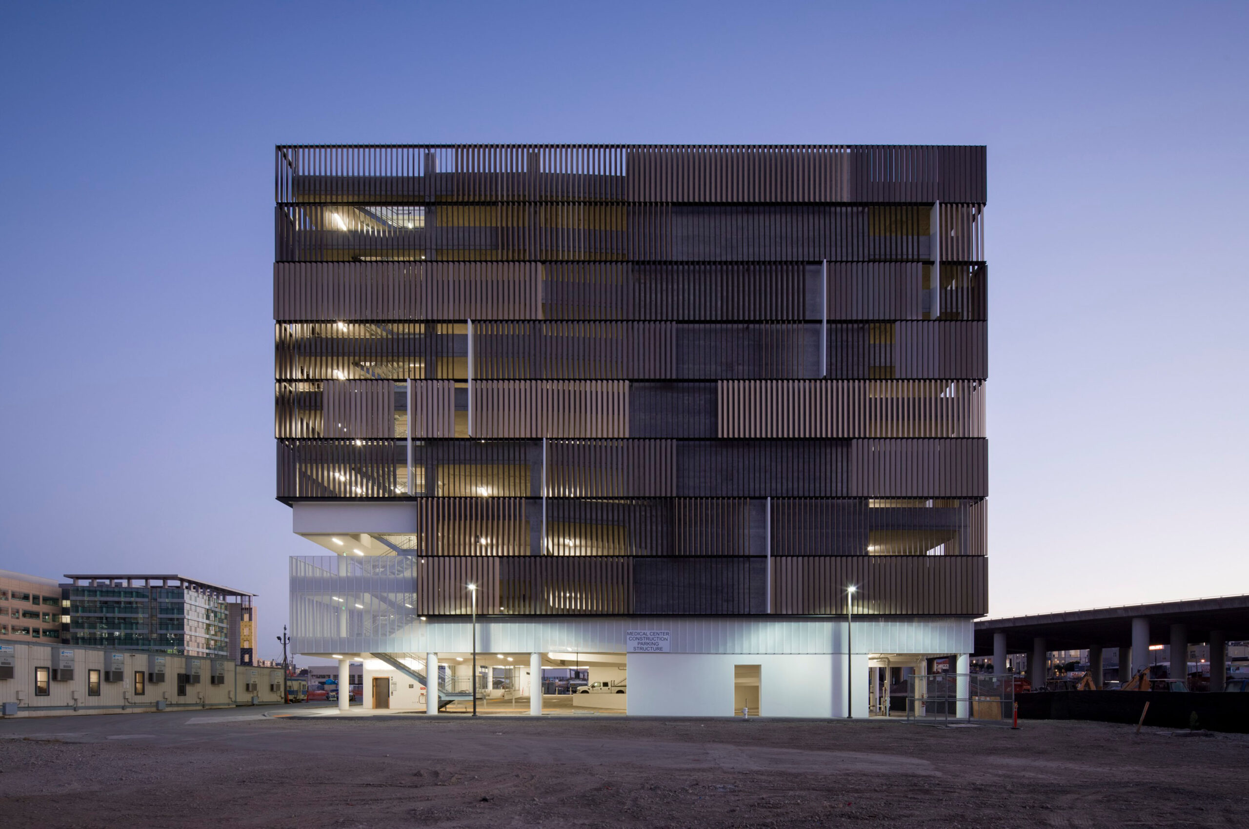
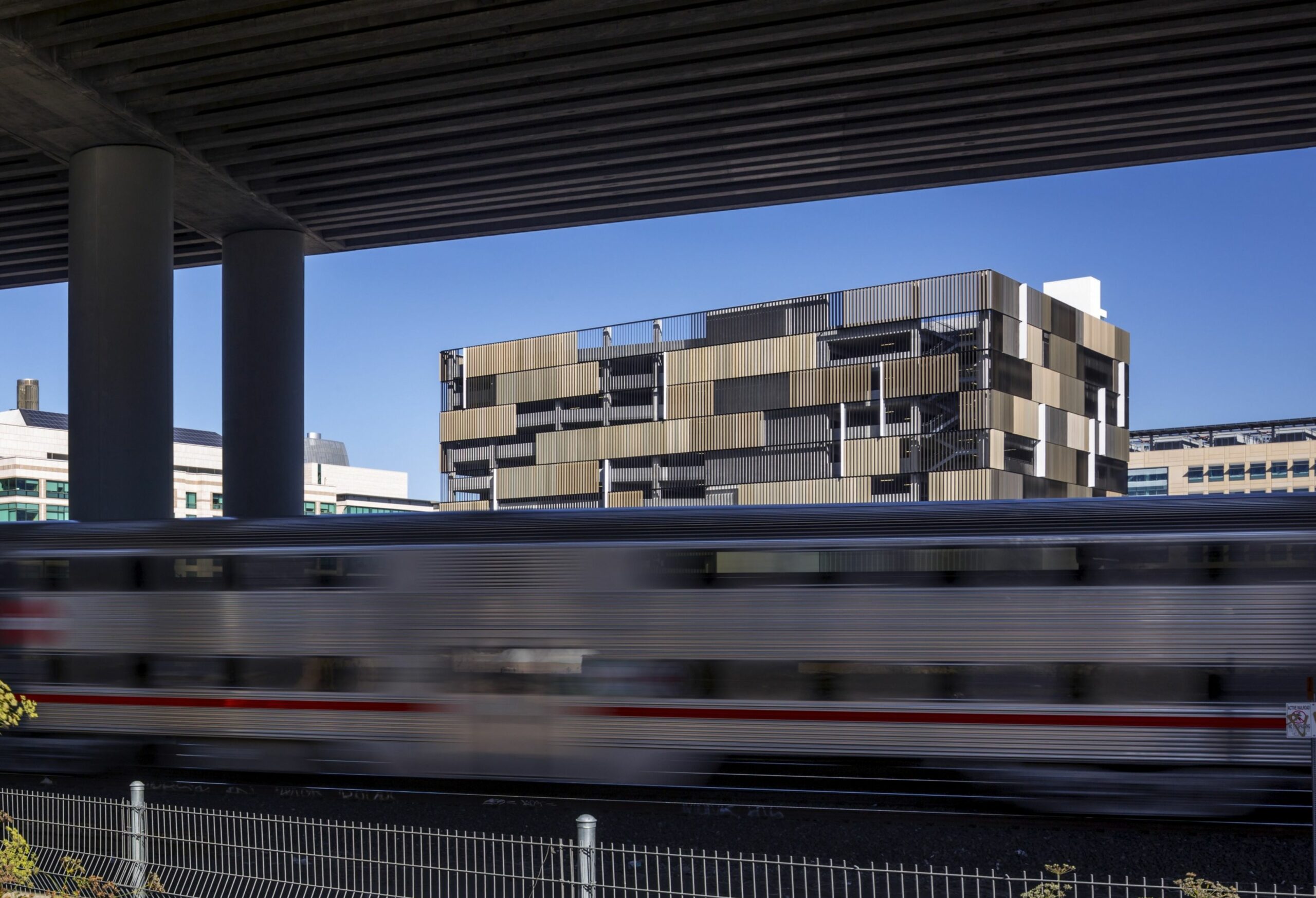
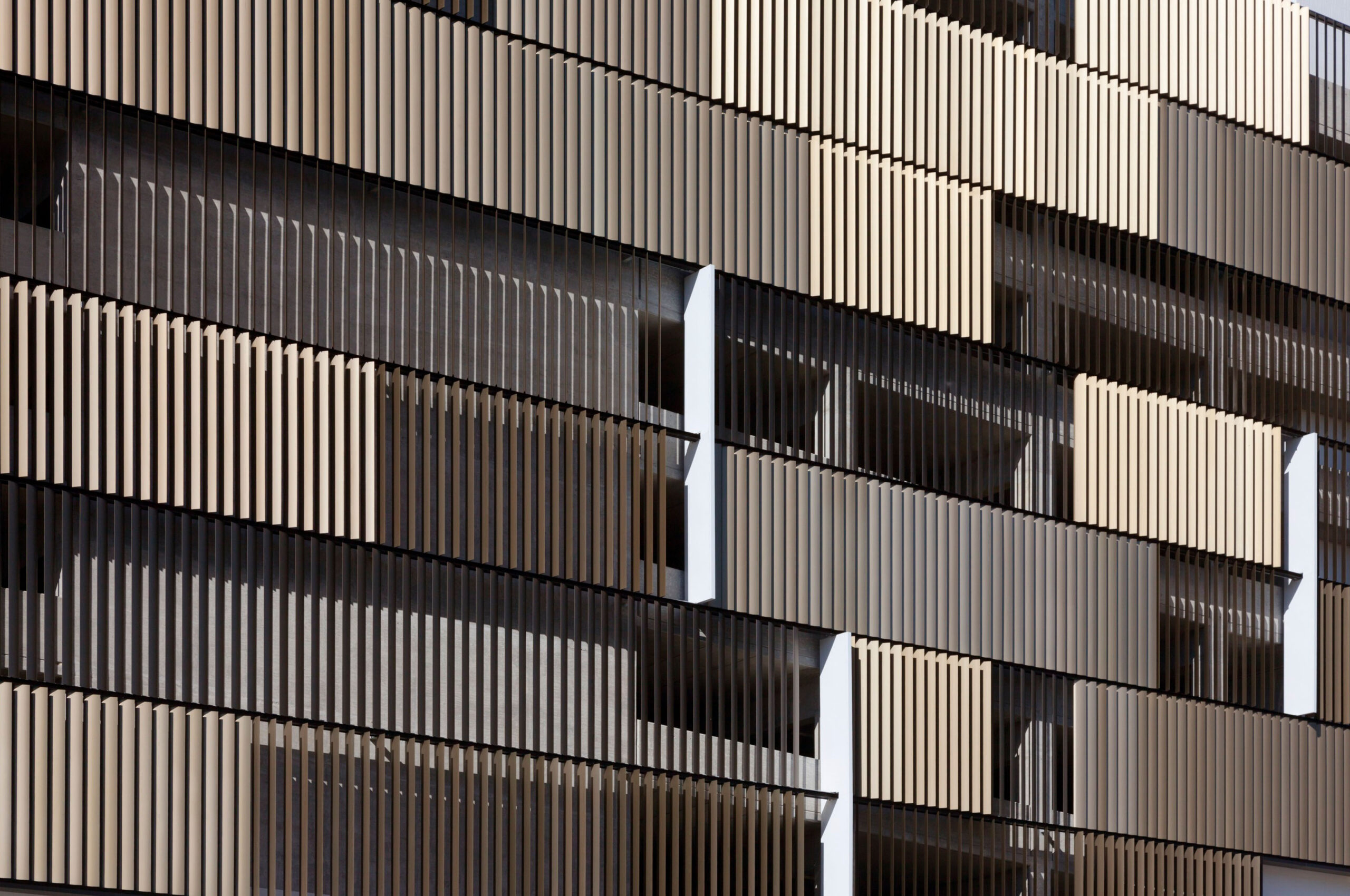
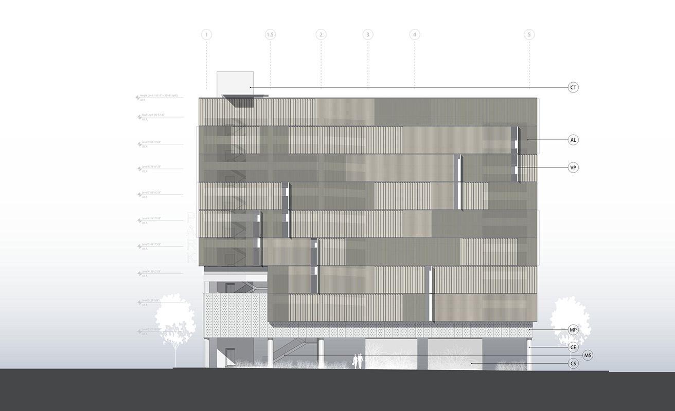
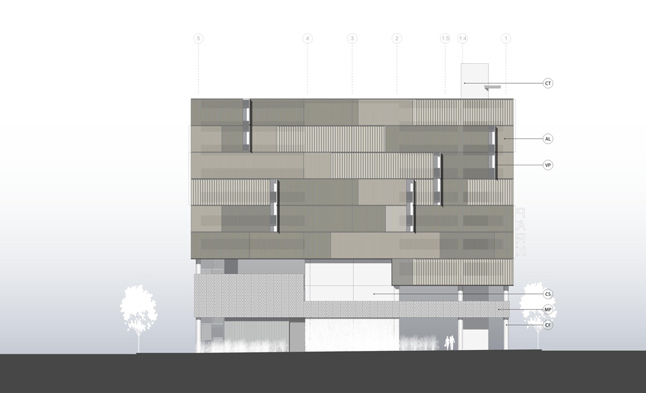
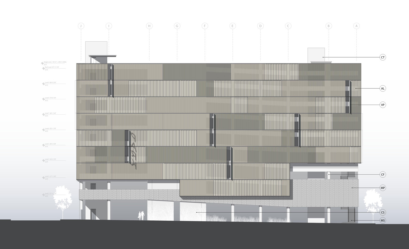
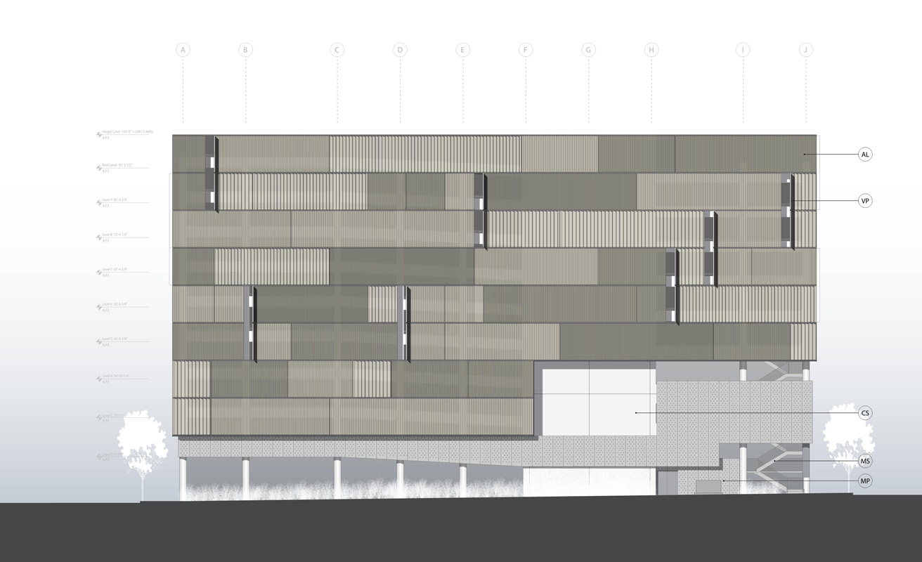
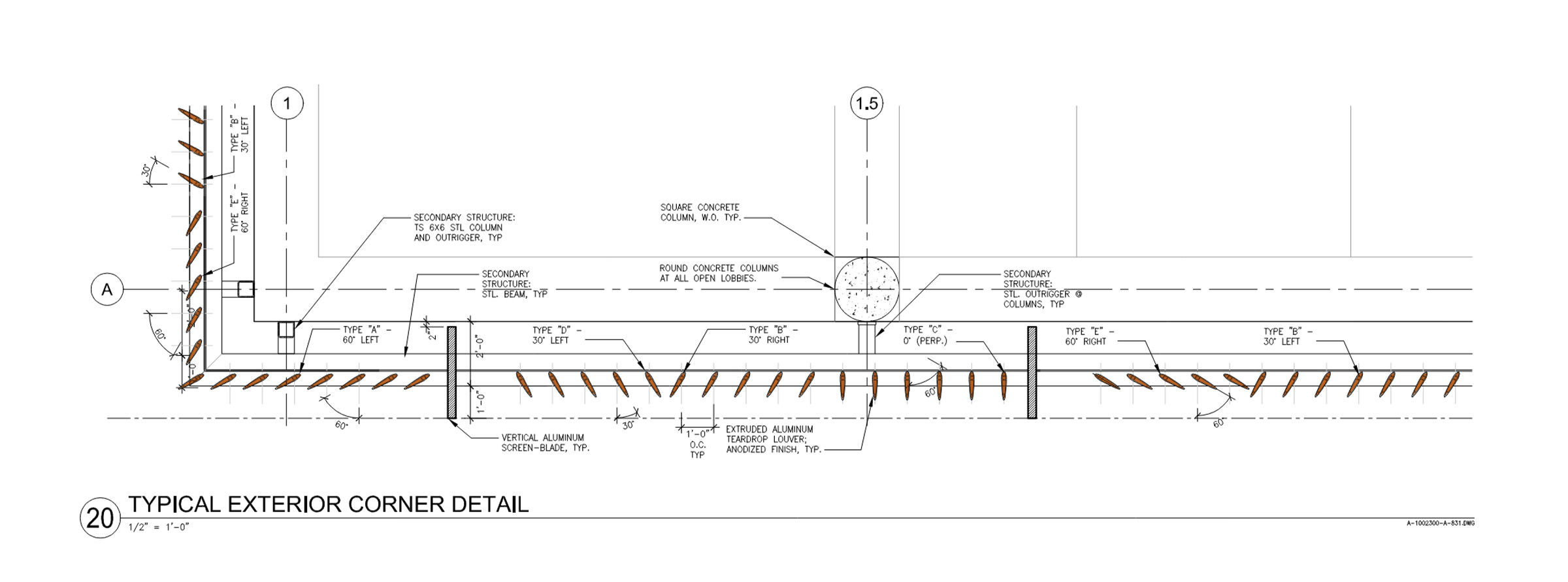
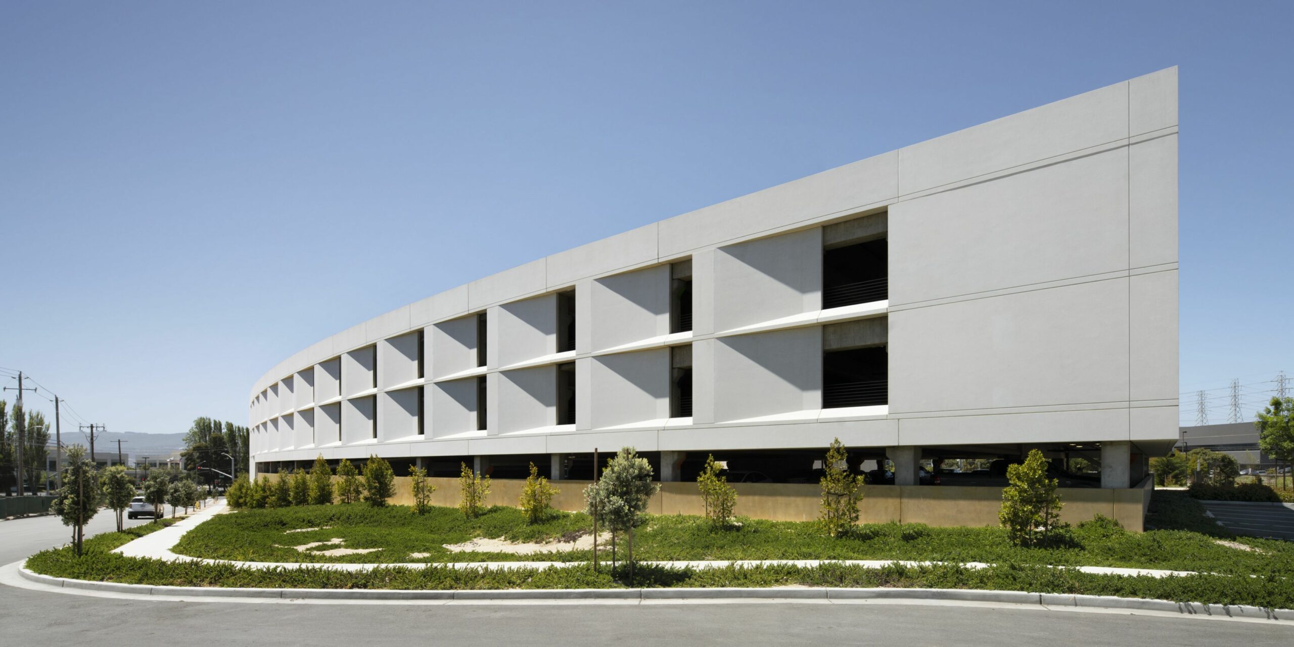
To achieve an aesthetically striking exterior within budget constraints, we collaborated with fabricator Walters & Wolf to explore the use of Glass Fiber Reinforced Concrete (GFRC), adding shadow and depth to create a sculptural and visually captivating facade.

Solar-tuned facades

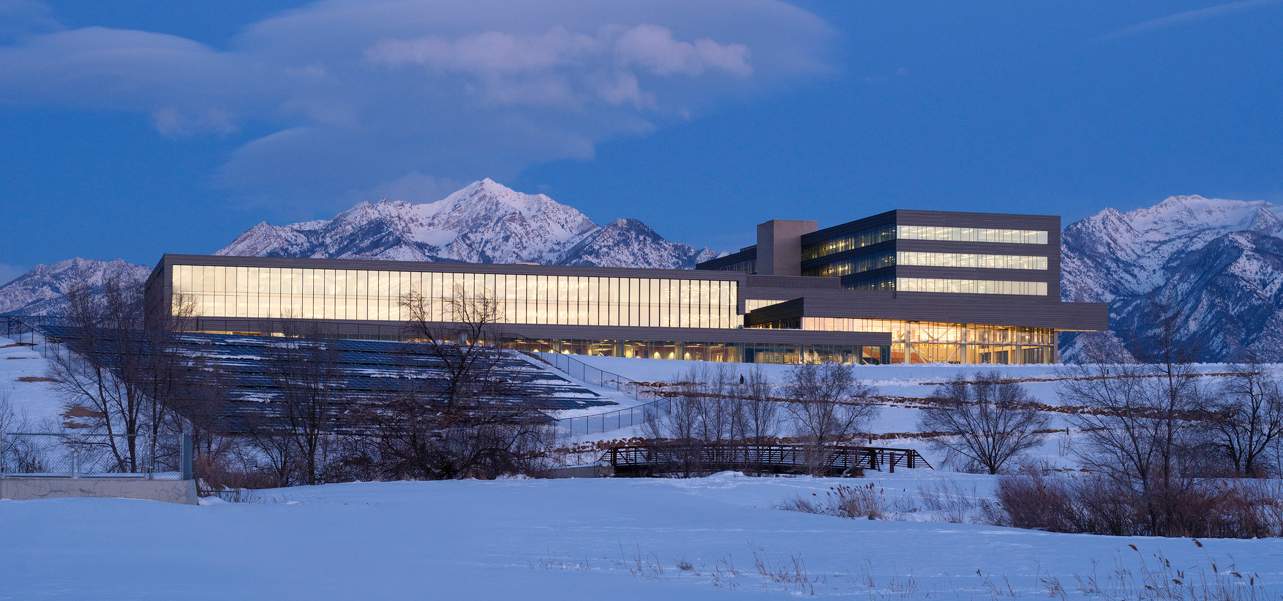
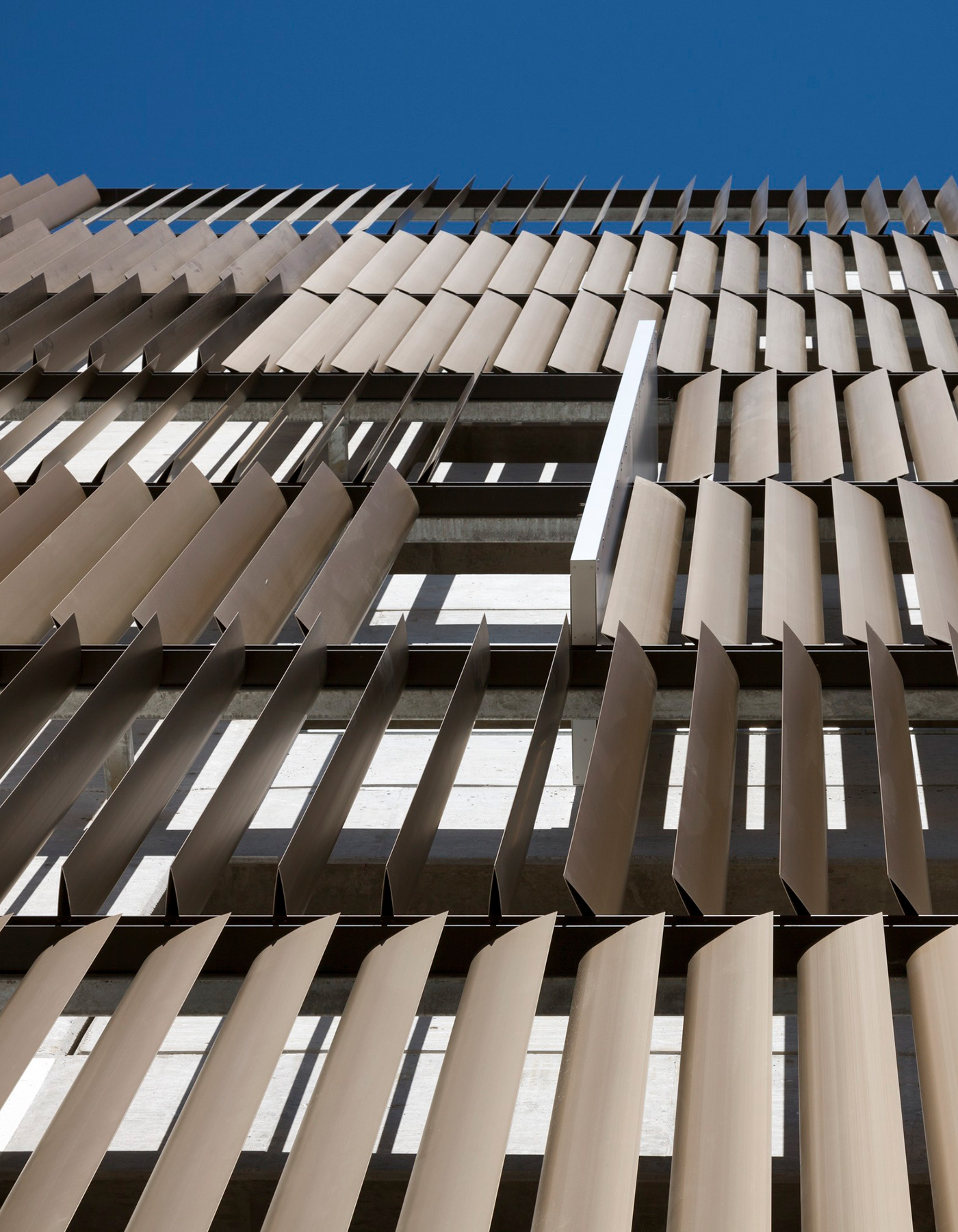
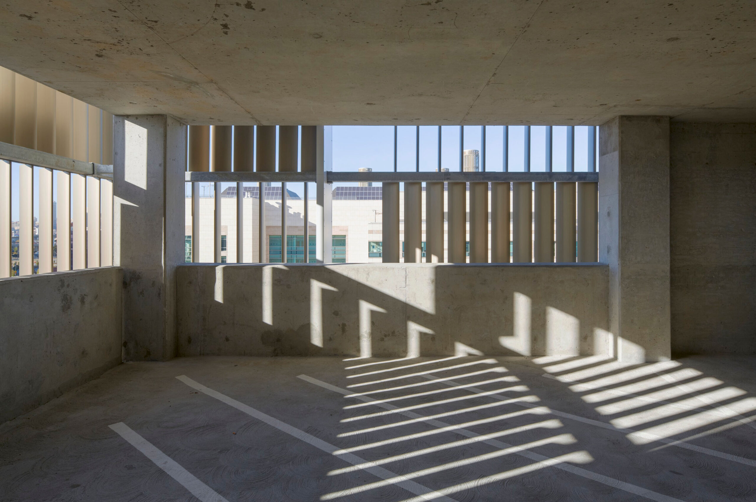
The design employs solar-tuned GFRC on the east, west, and south elevations, each incorporating unique sunshade designs to control heat gain and glare. The west-facing facade, which presented the most challenges with managing these effects, employs both vertical and horizontal recessed sunshades. 

Attracting tenants

Targeting mid-sized companies seeking campus-like amenities, 500 Santana Row was fully leased to a major technology firm before construction was completed.

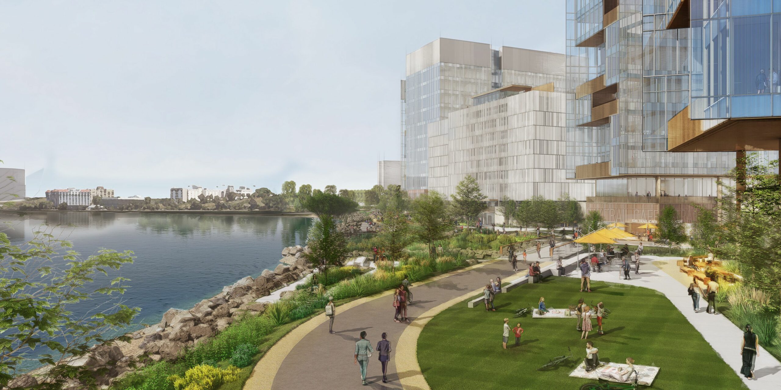
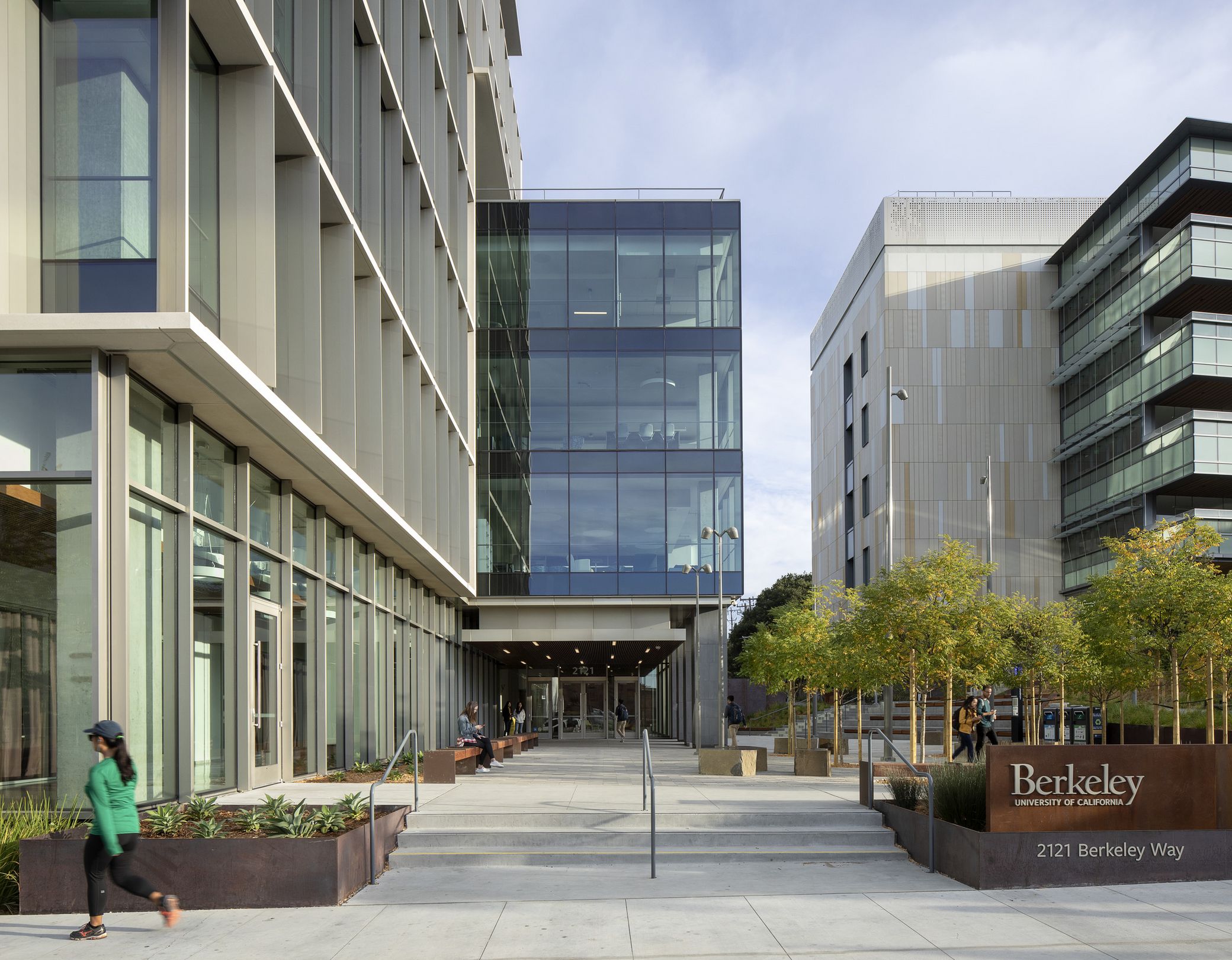
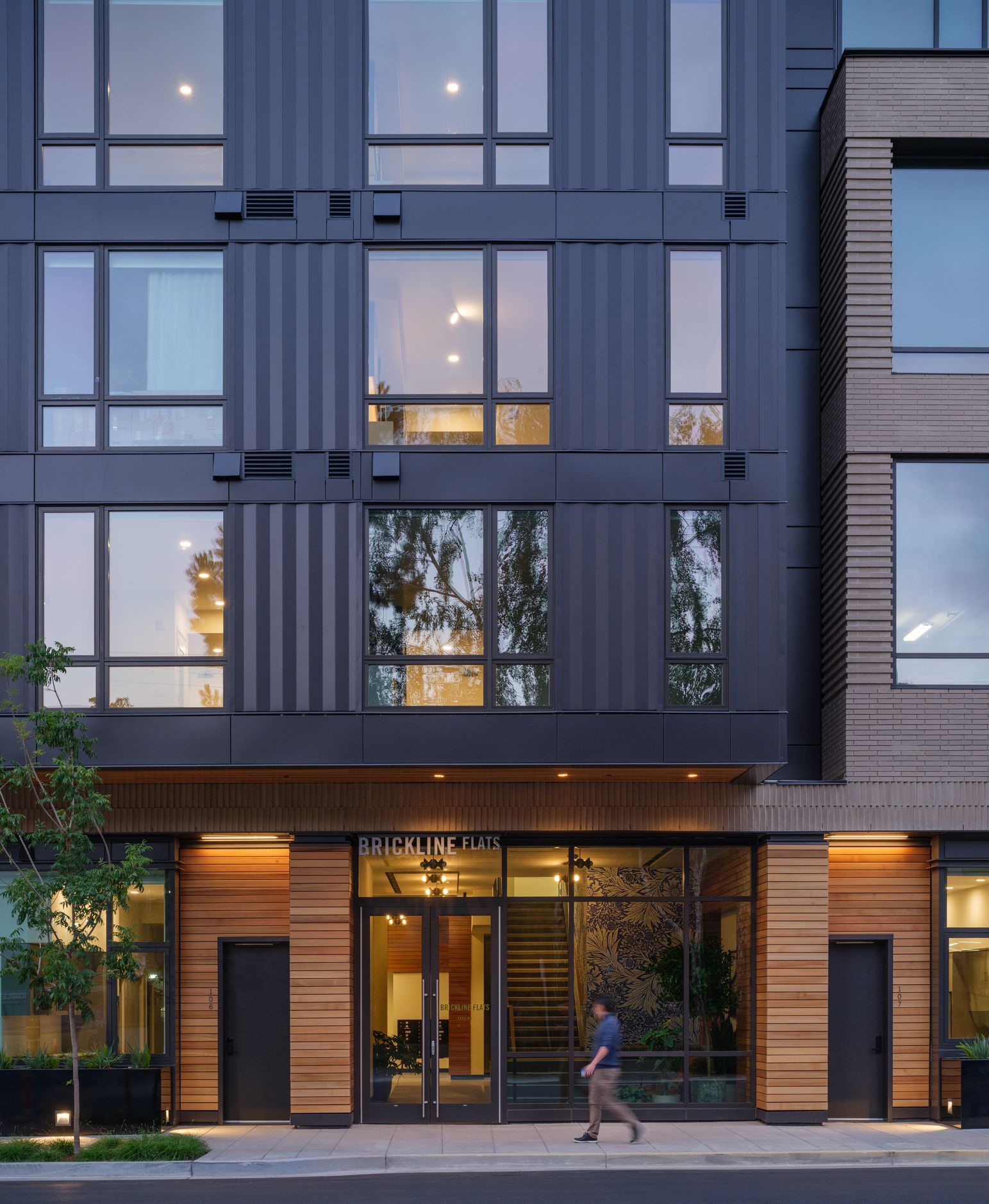
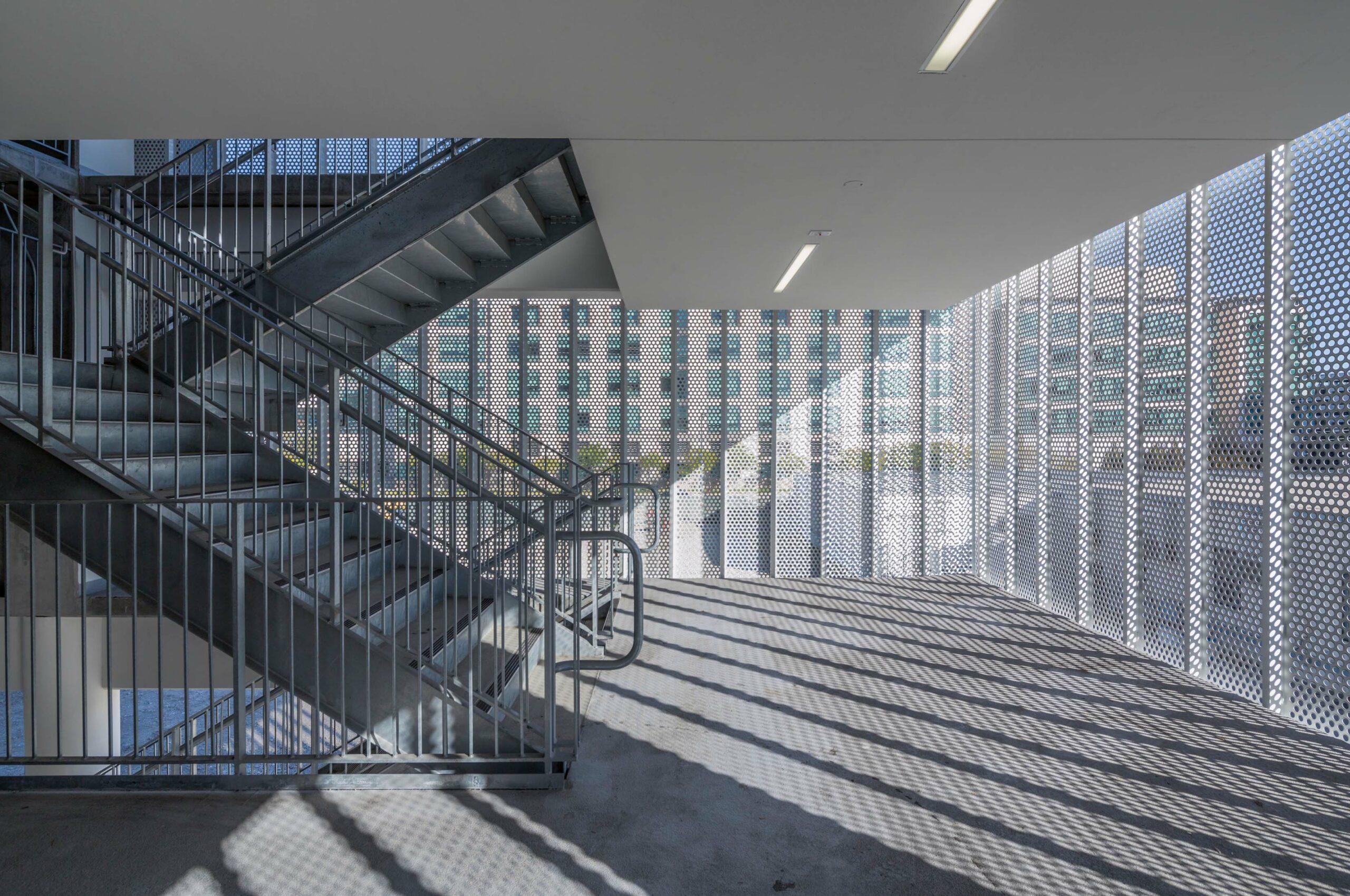
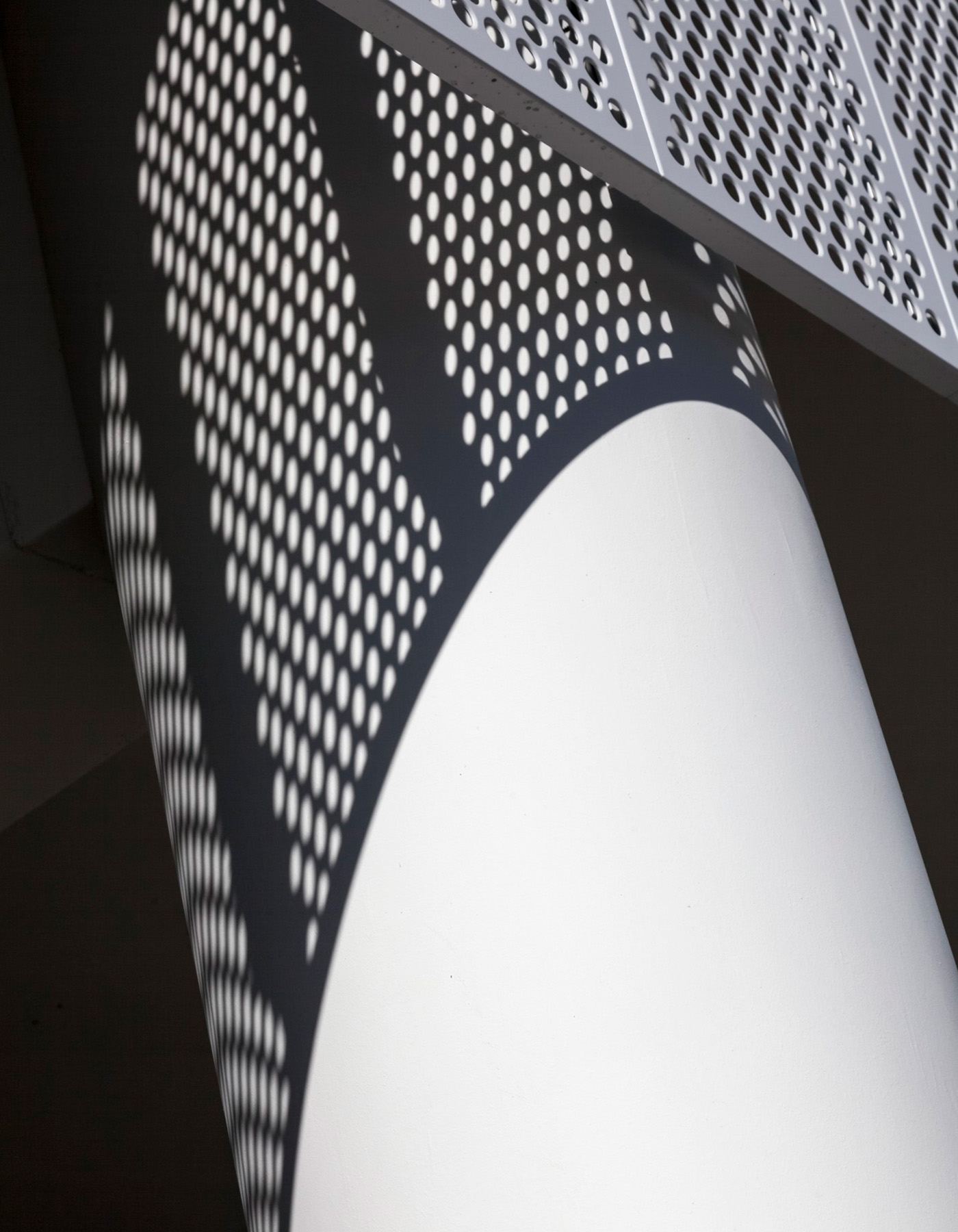
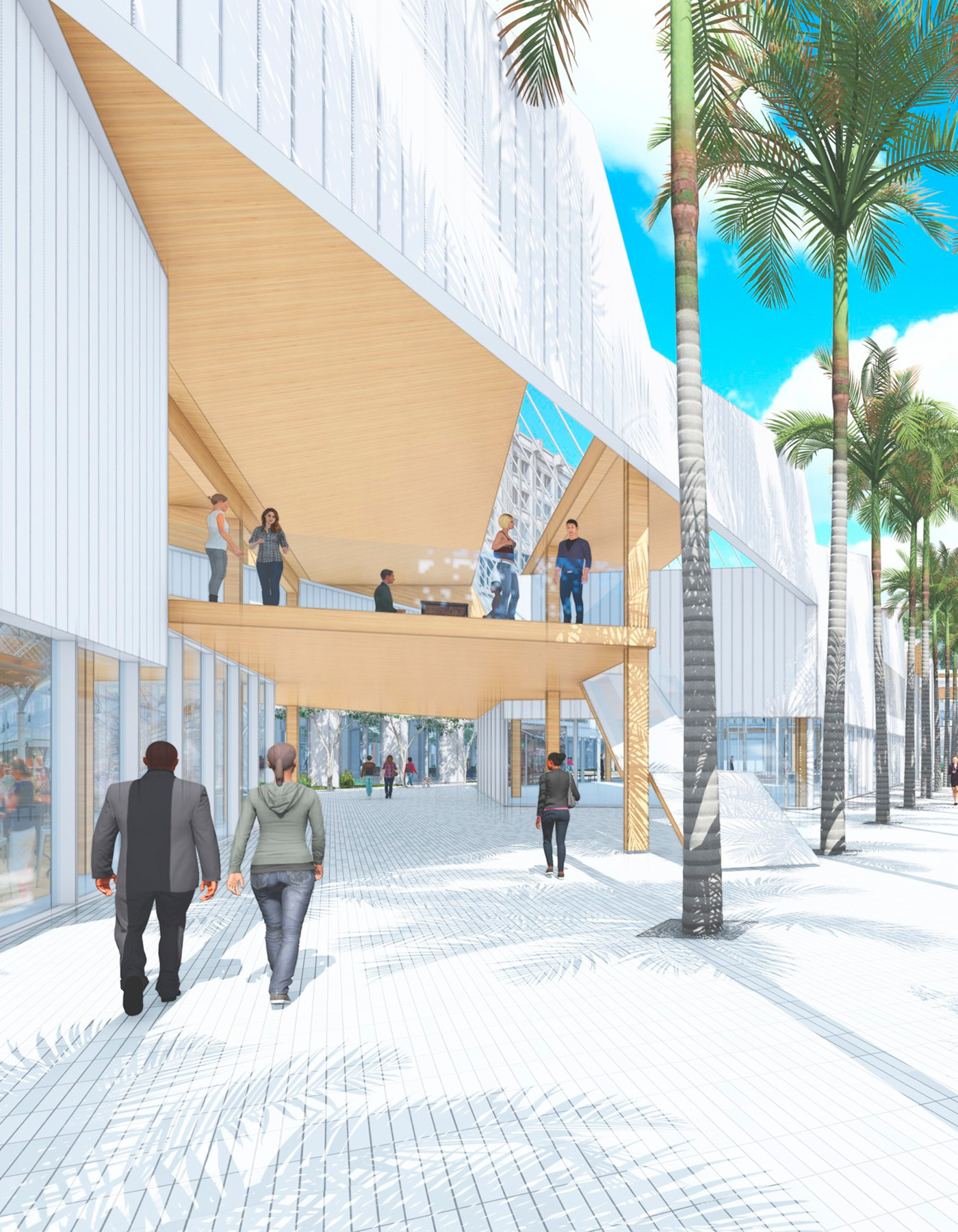
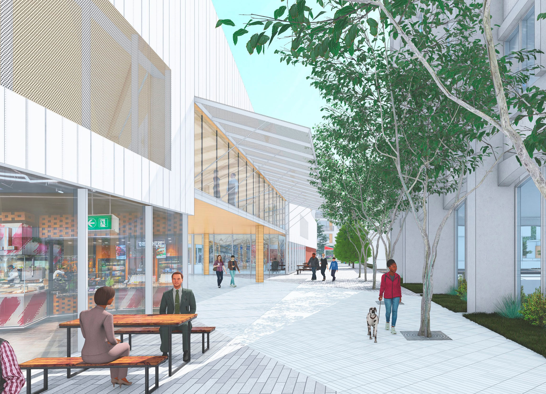
Enhanced exterior experience

Previous Slide
Next Slide
Upper Terraces
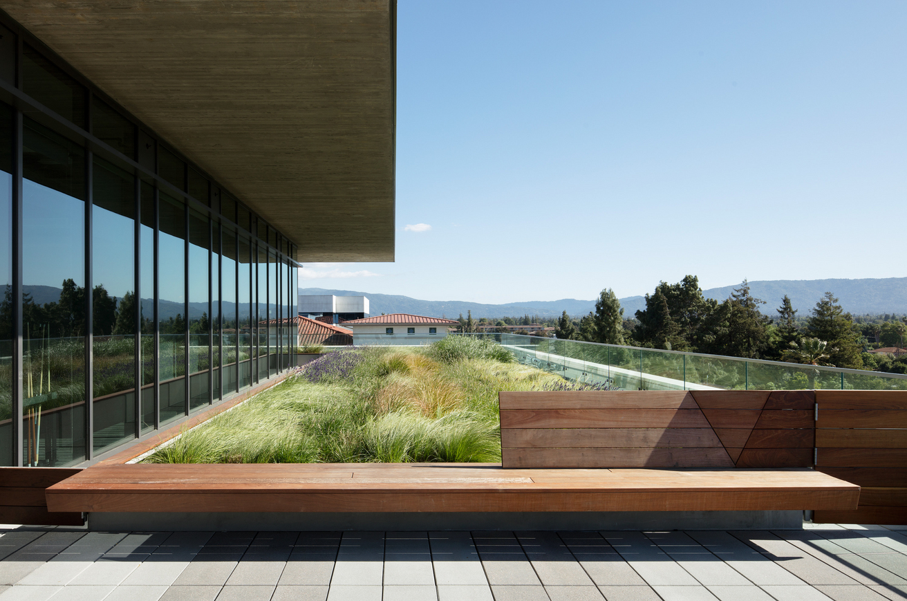
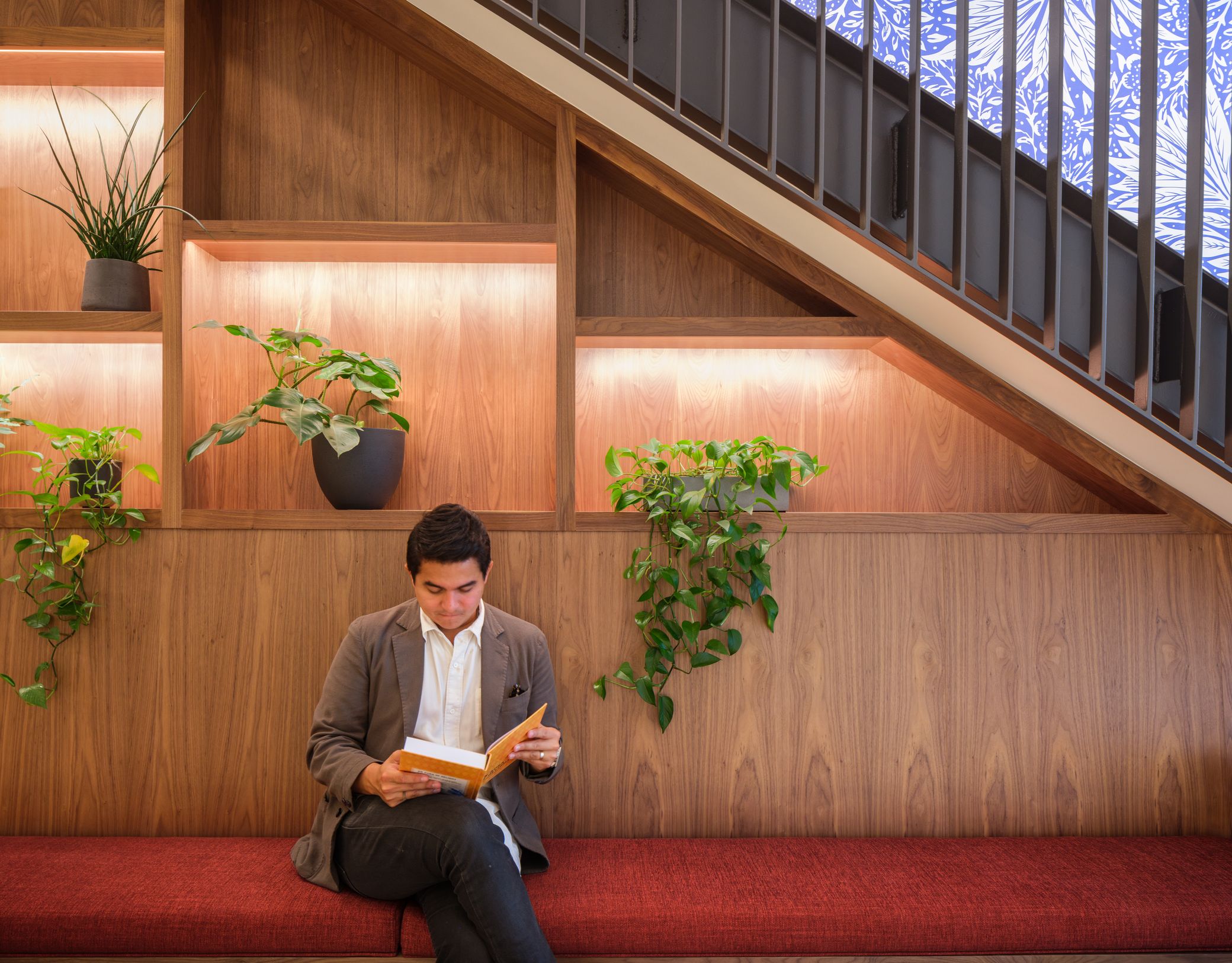
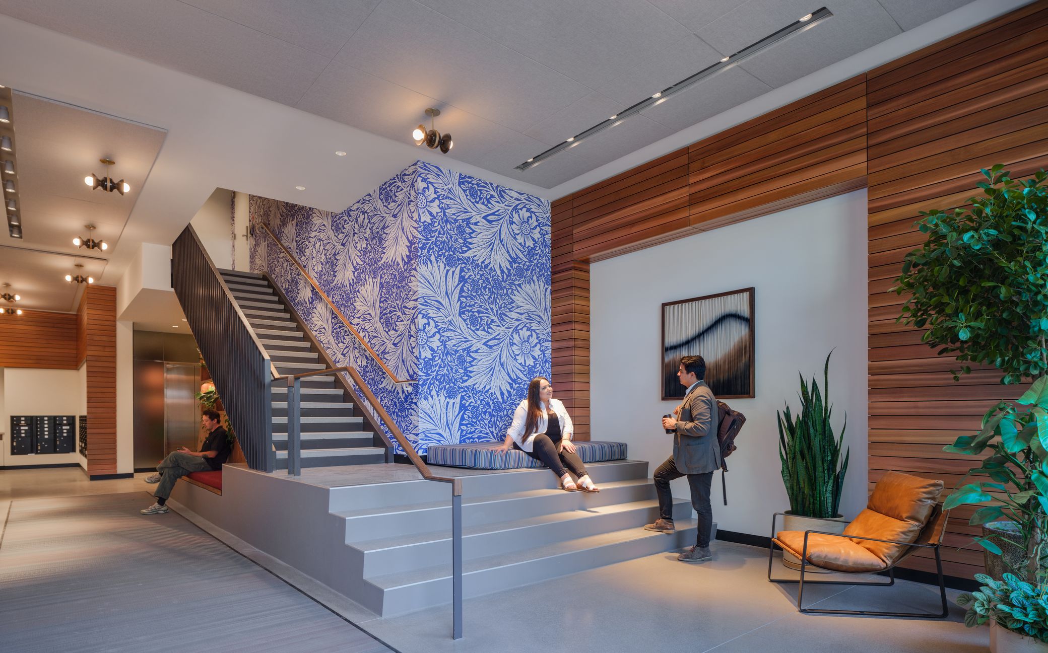
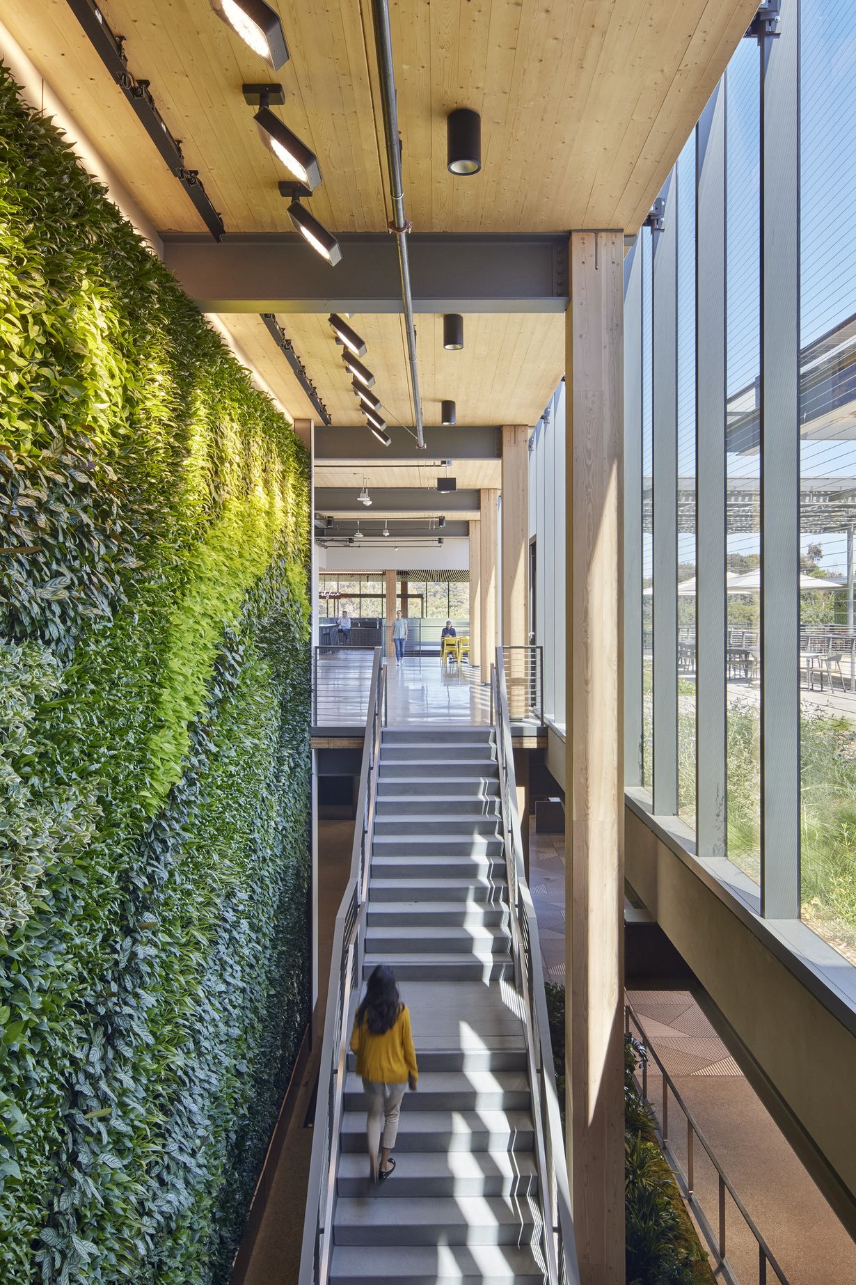
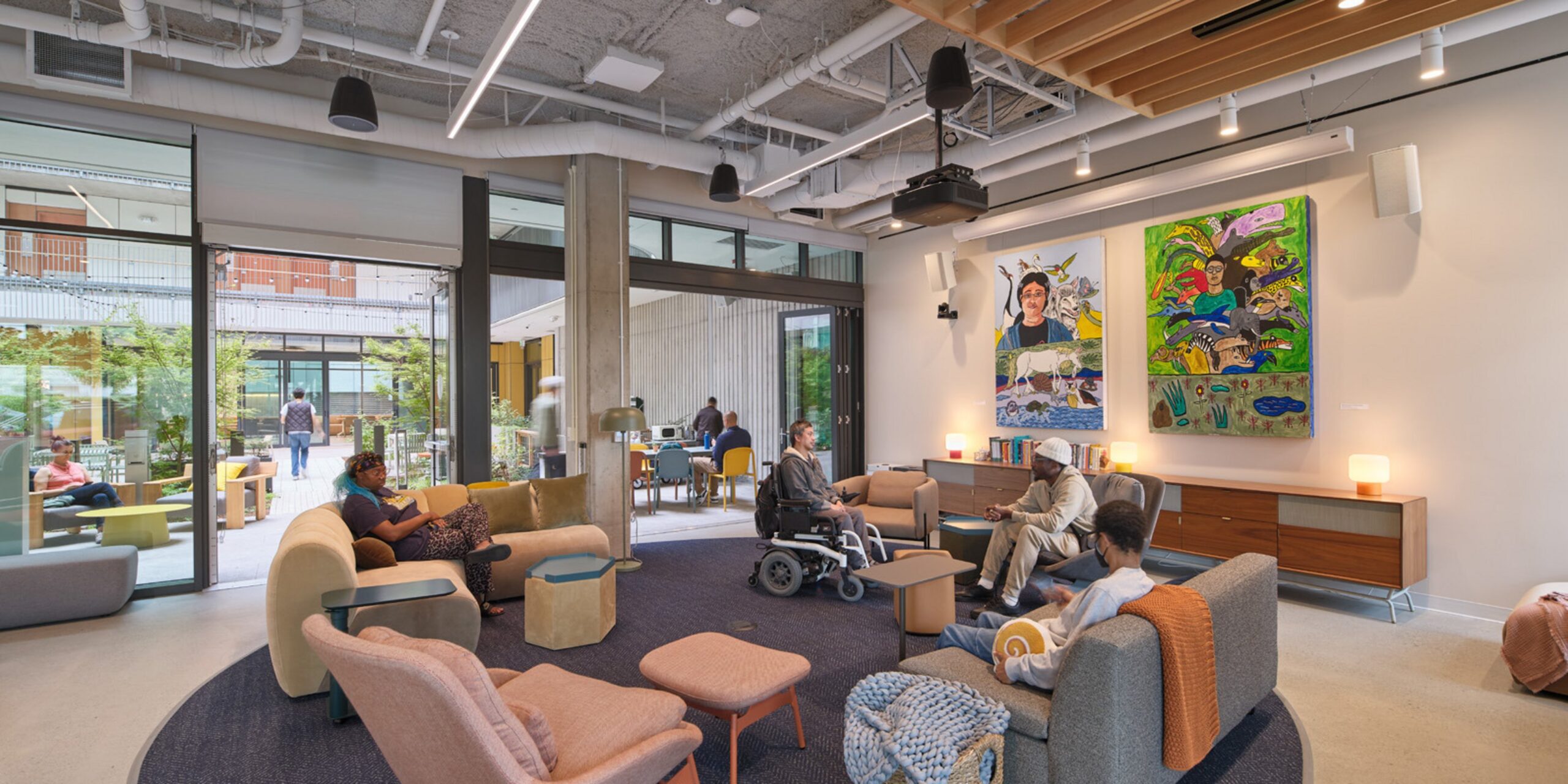
Indoor/outdoor spaces as building amenity
Expansive ceiling heights
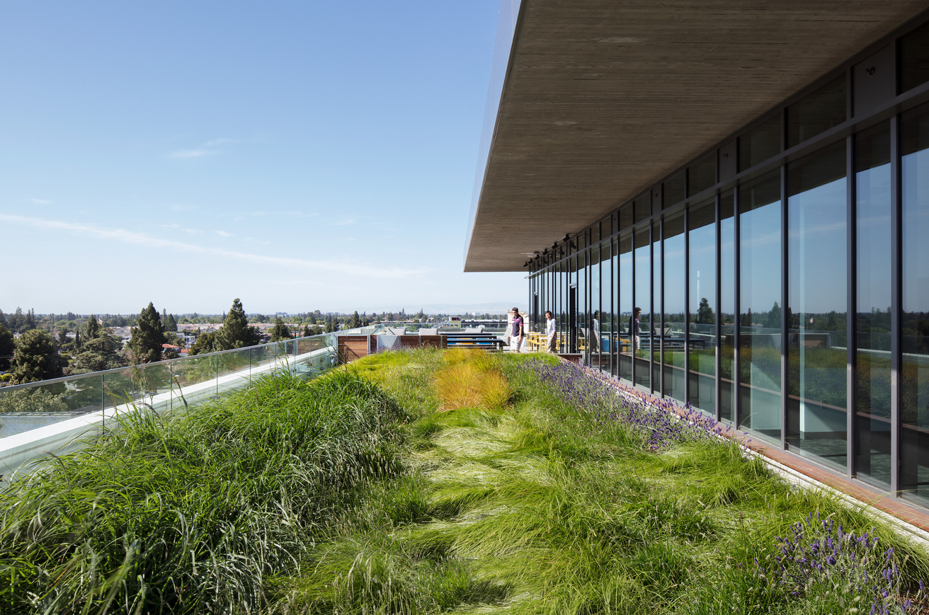
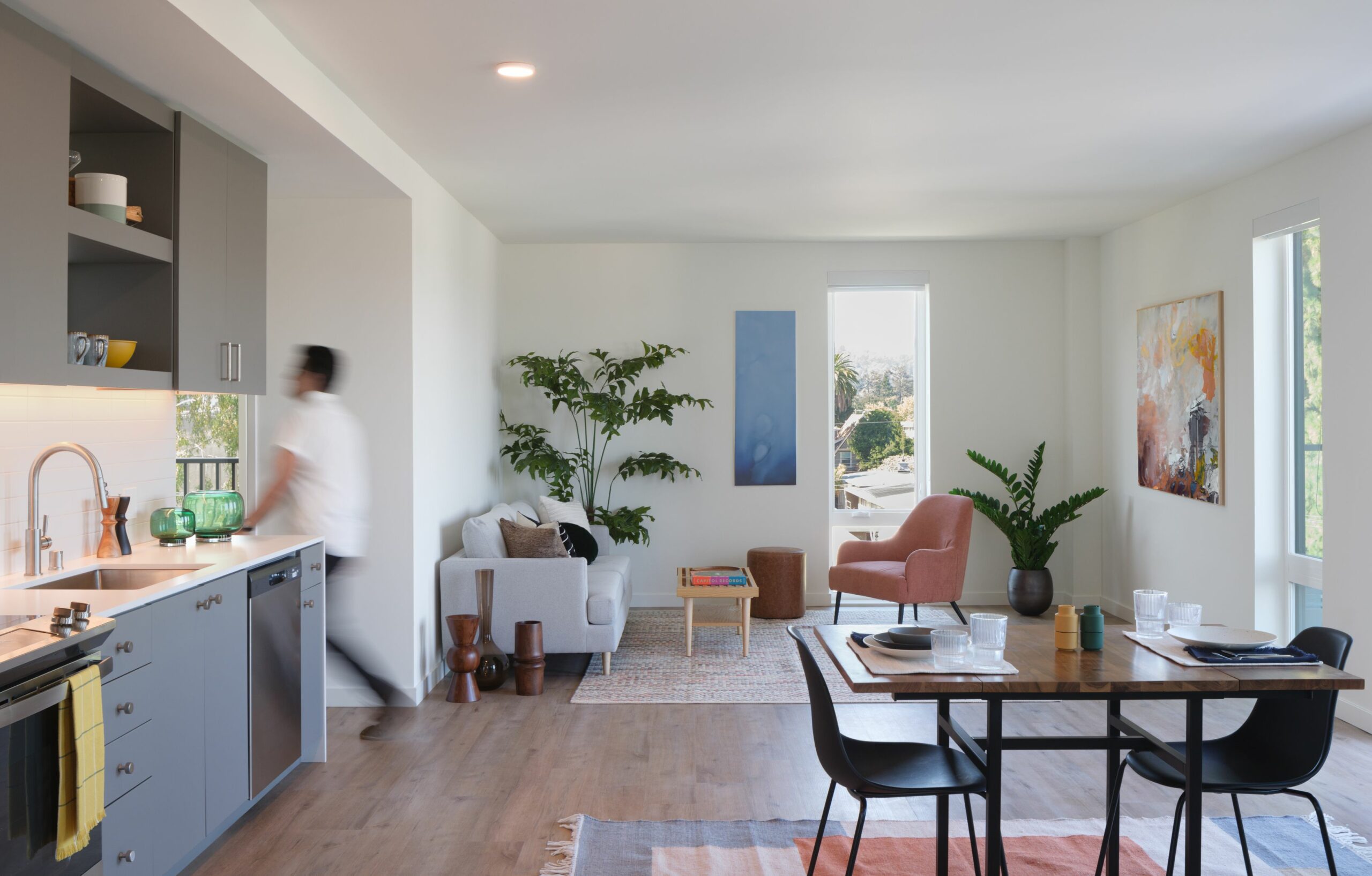
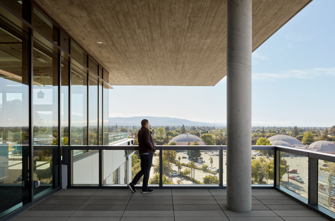
Abundant natural light and sweeping views
A corner site
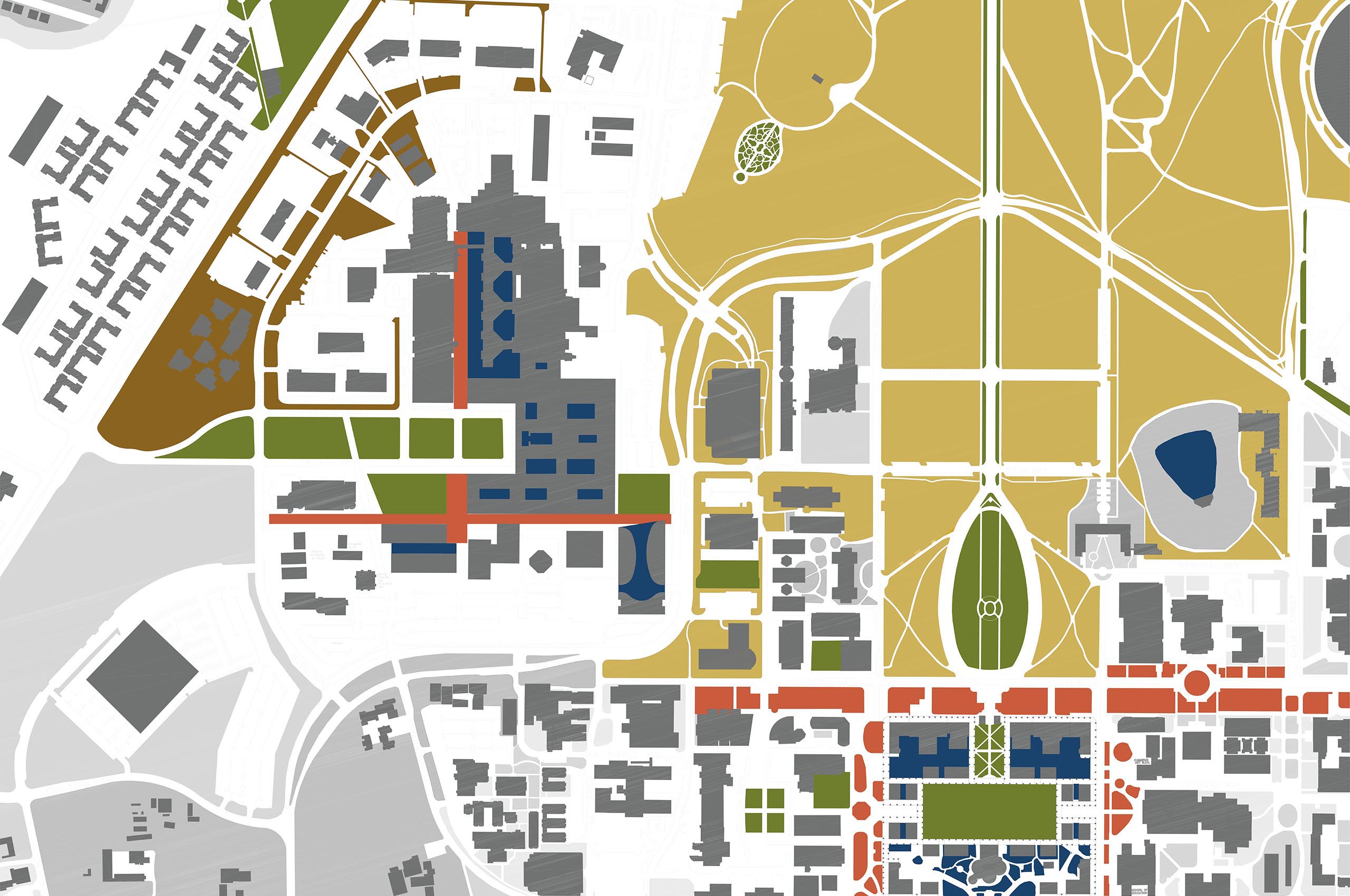
The building pulls back to create an urban plaza
Office balconies
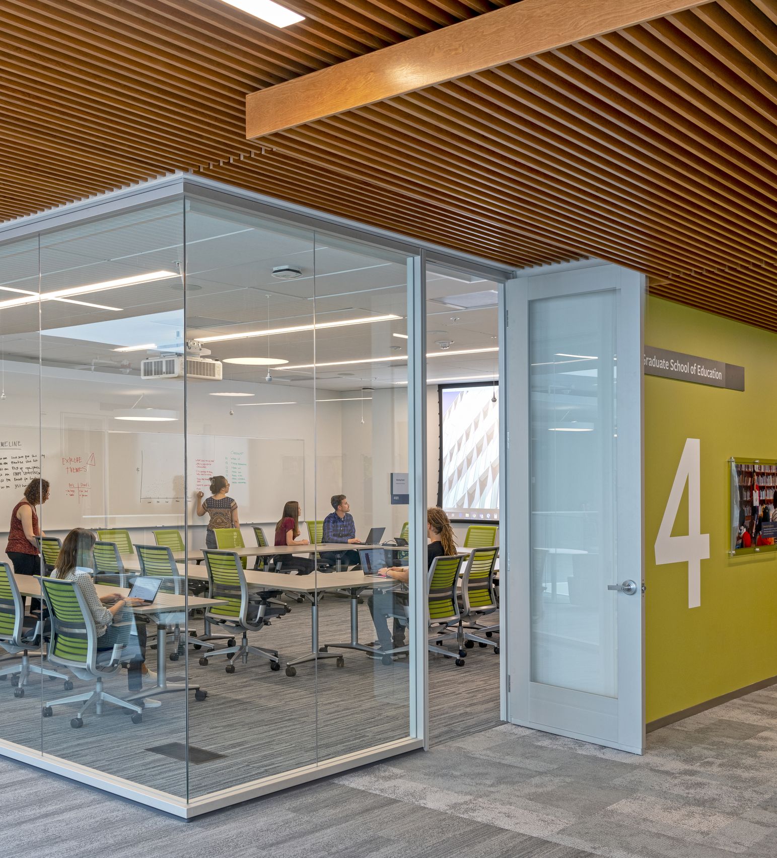
Bespoke and informal gathering spaces

“Projects like 500 Santana Row provide companies …with advantages in employee recruitment and retention, as well as employee productivity and satisfaction.”

Collette Navarrette
Federal Realty Investment Trust

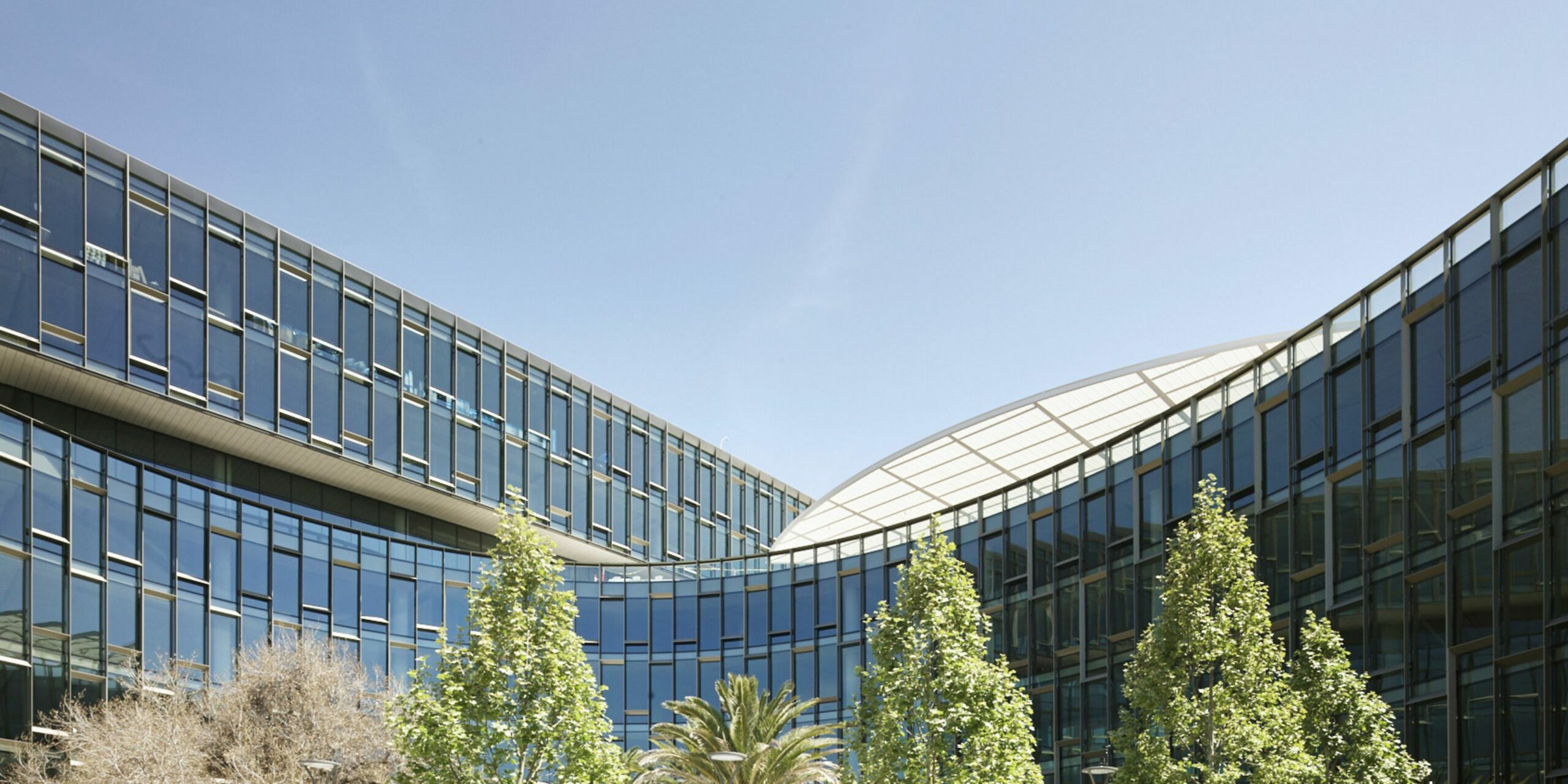
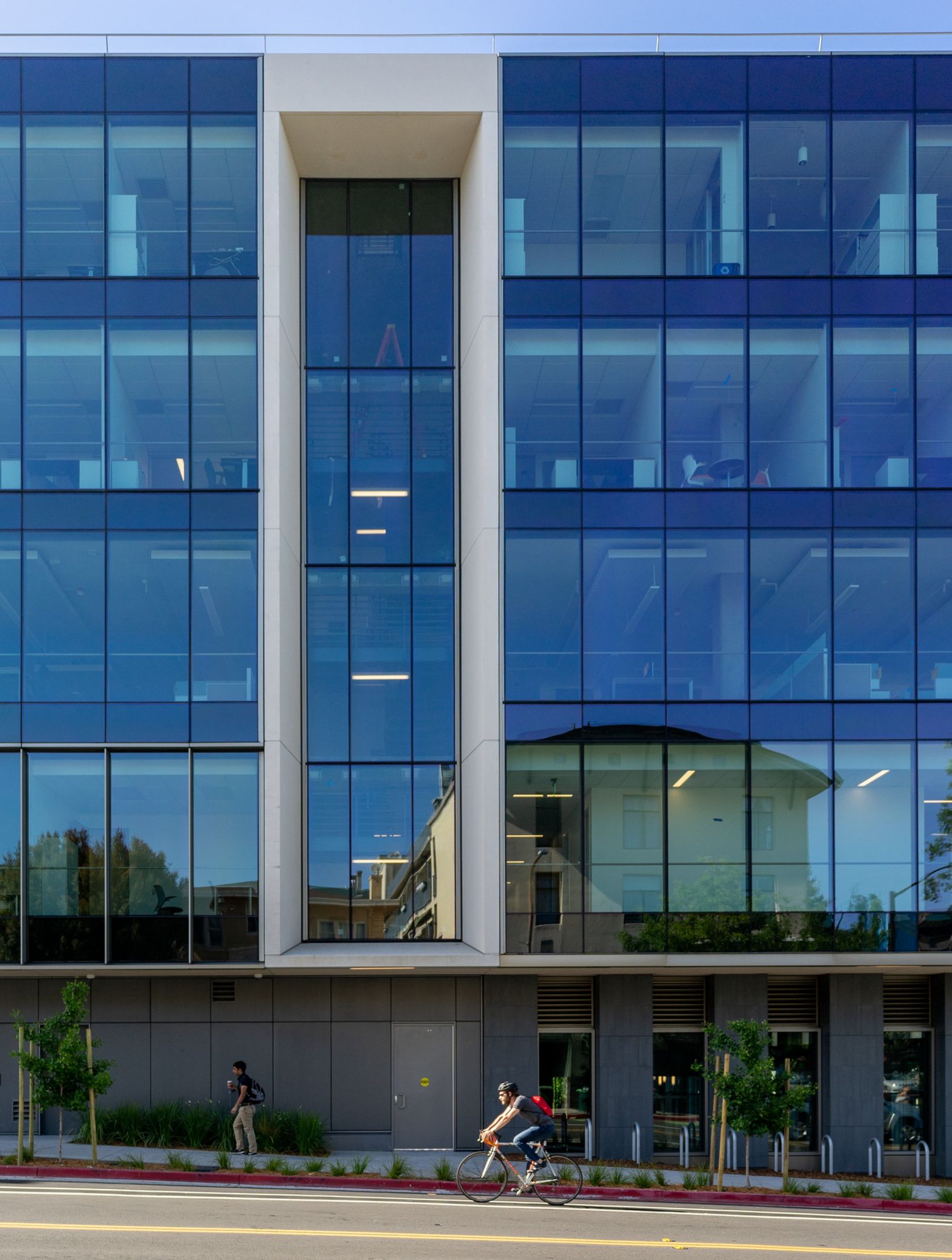
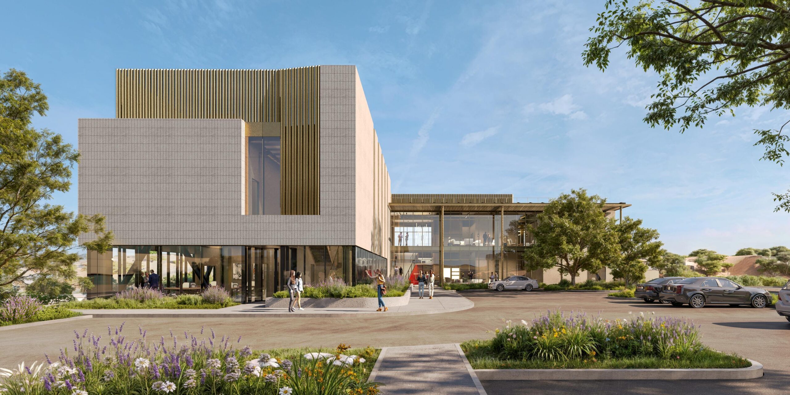
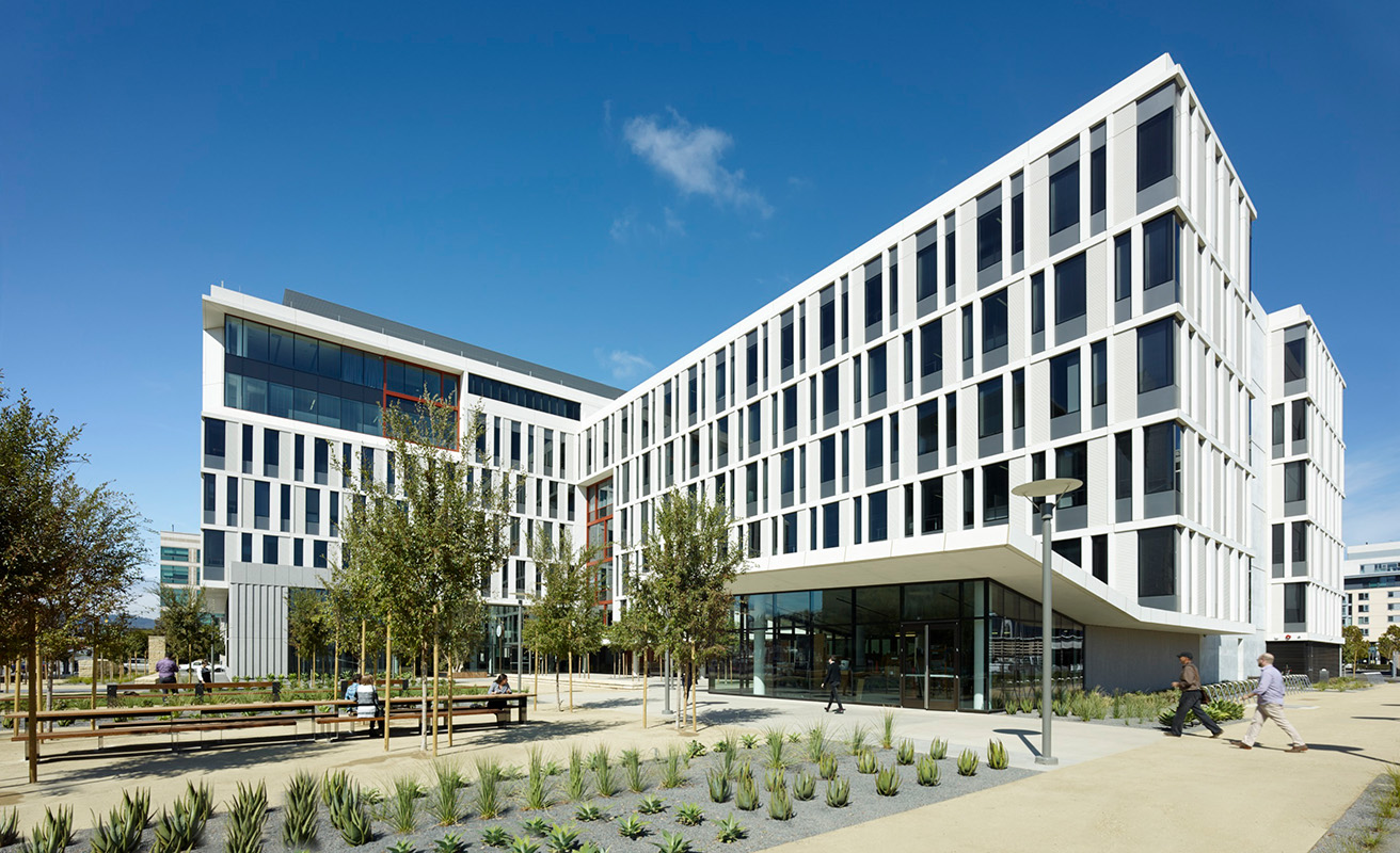
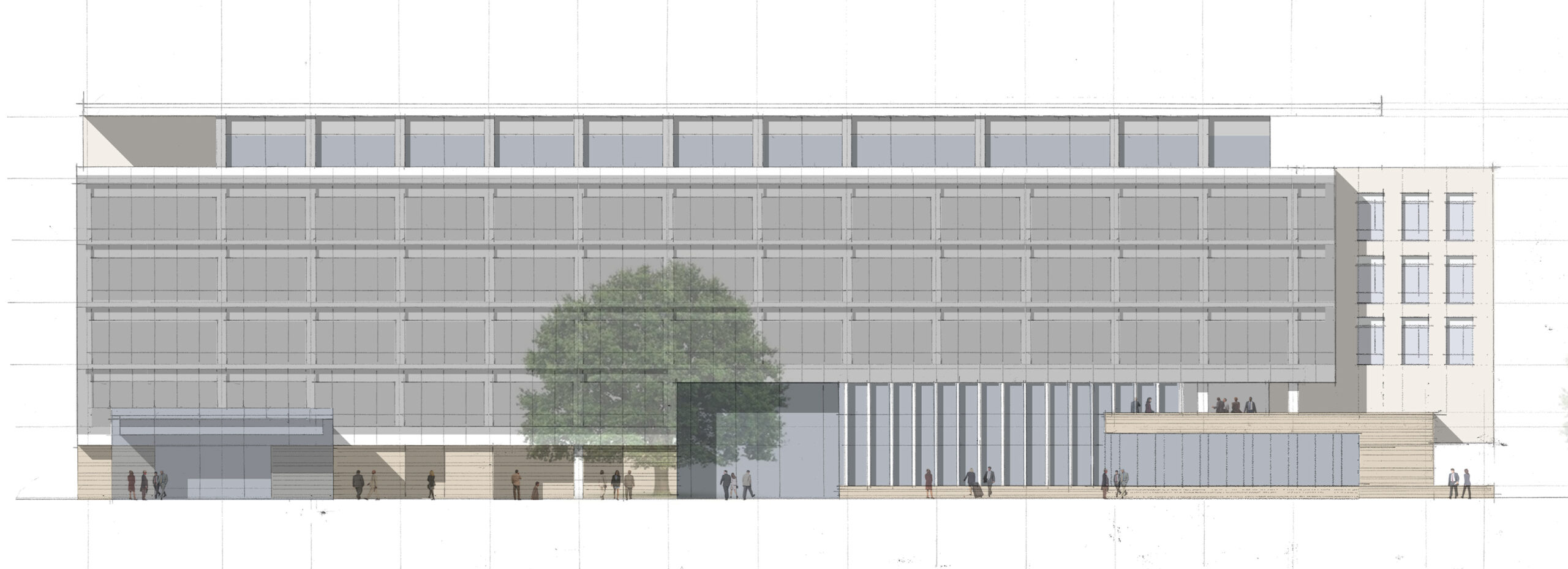
A Wes-Anderson-inspired elevation 

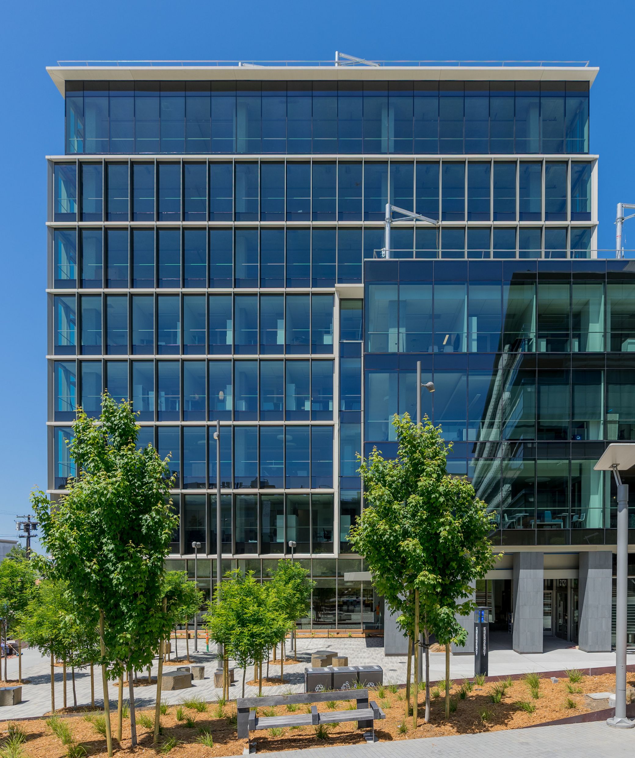
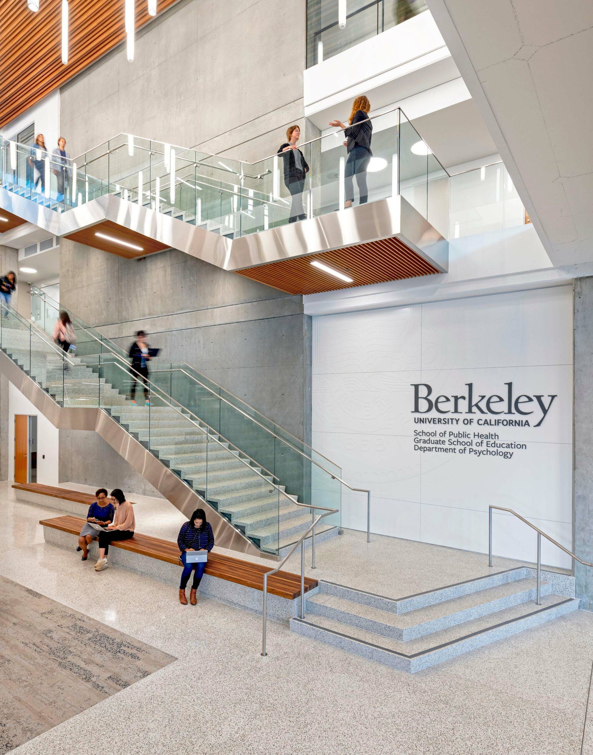
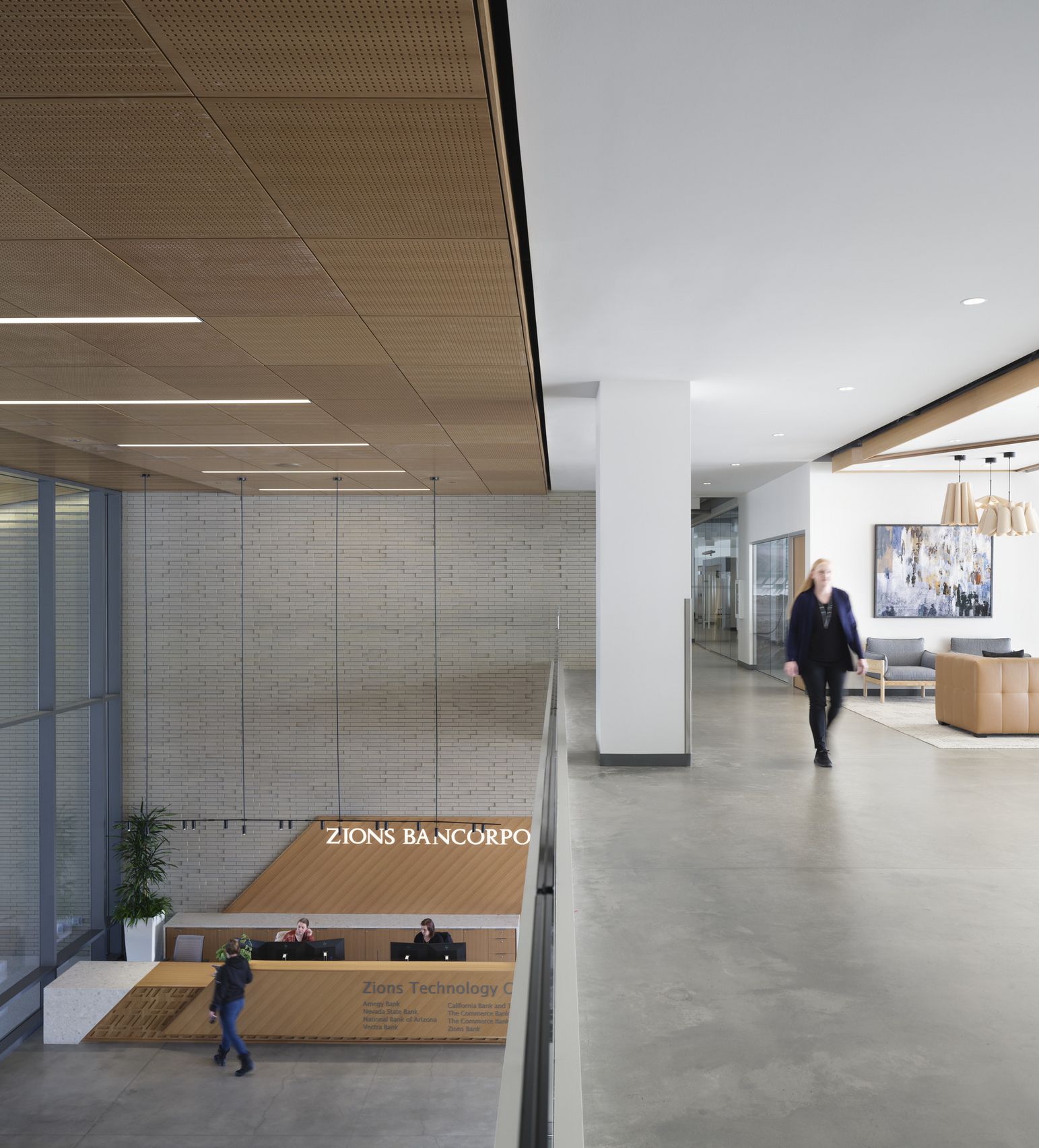
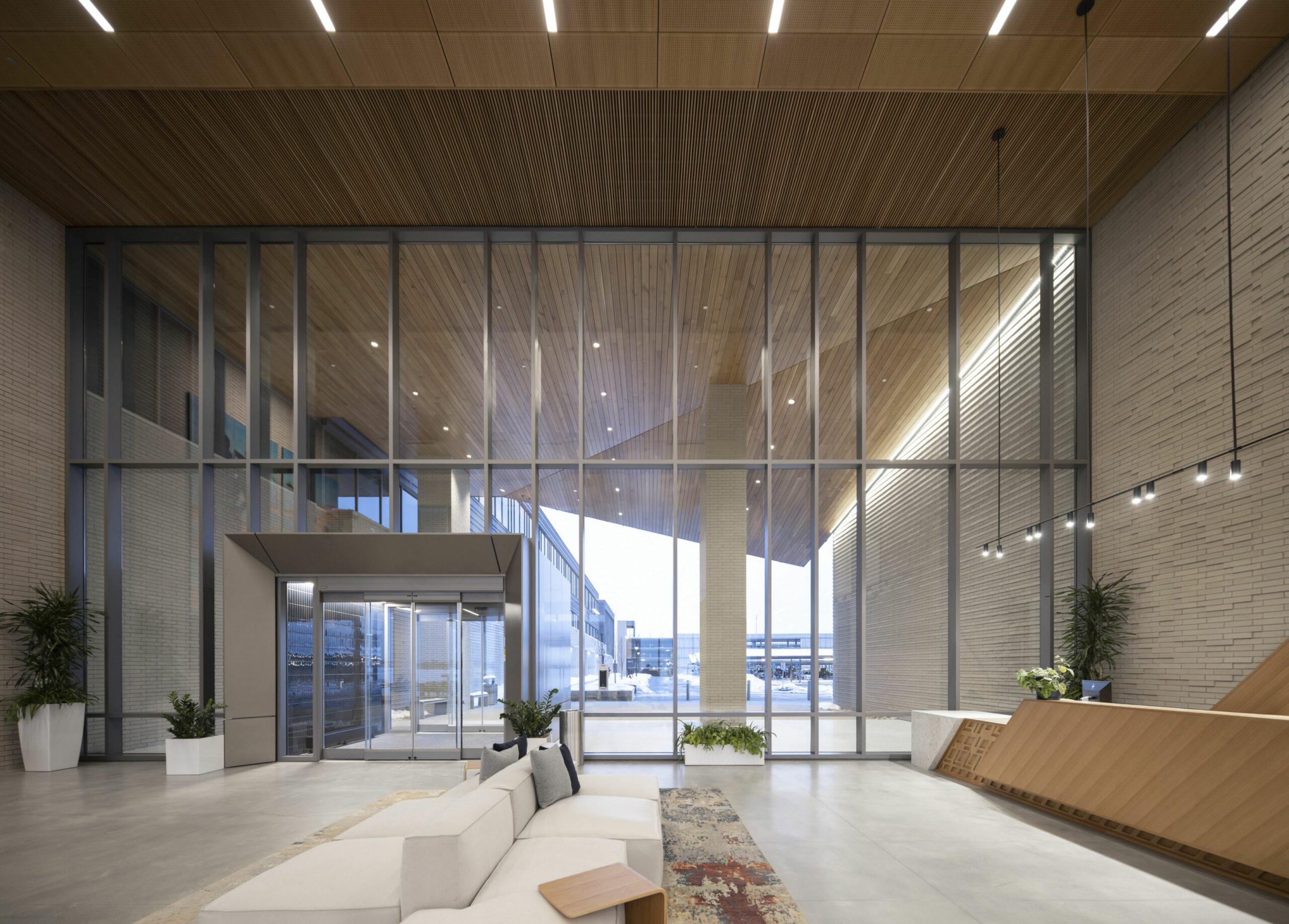
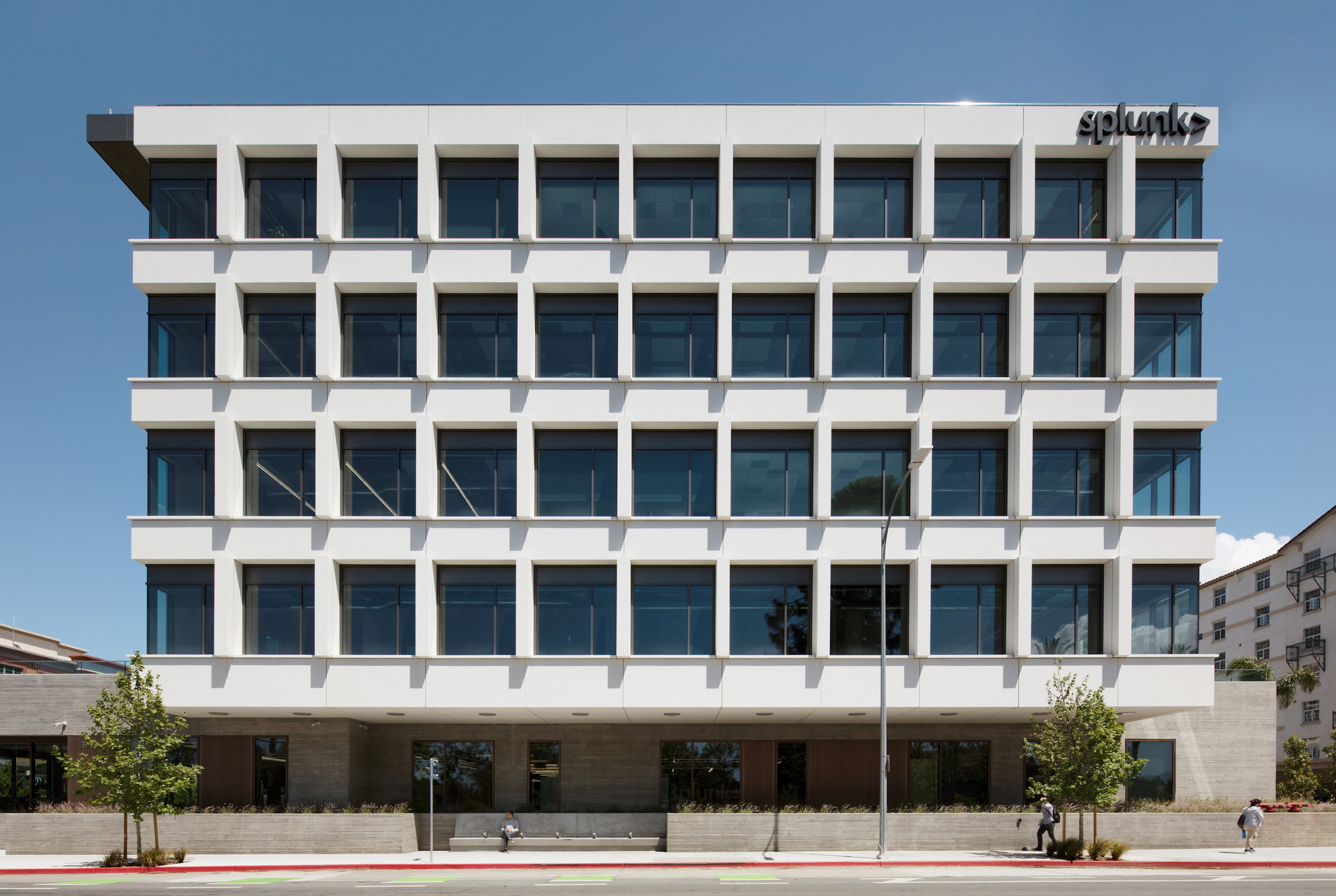
The north elevation’s all-glass curtain wall takes inspiration from Wes Anderson’s one-point perspective, open-section sets, offering a layered view into five levels of workspace activity. Multi-part interlocking aluminum extrusions and a patented copper anodized finish balance aesthetics with cost-effectiveness and reduced maintenance. Copper accents continue along the ground level, adding visual interest and cohesion to the design language.

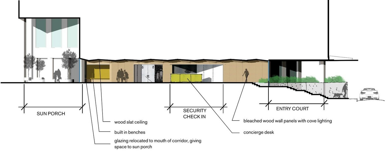
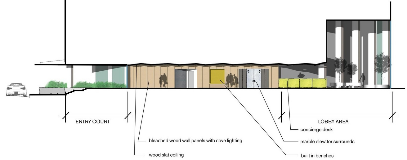
Enhanced indoor comfort 

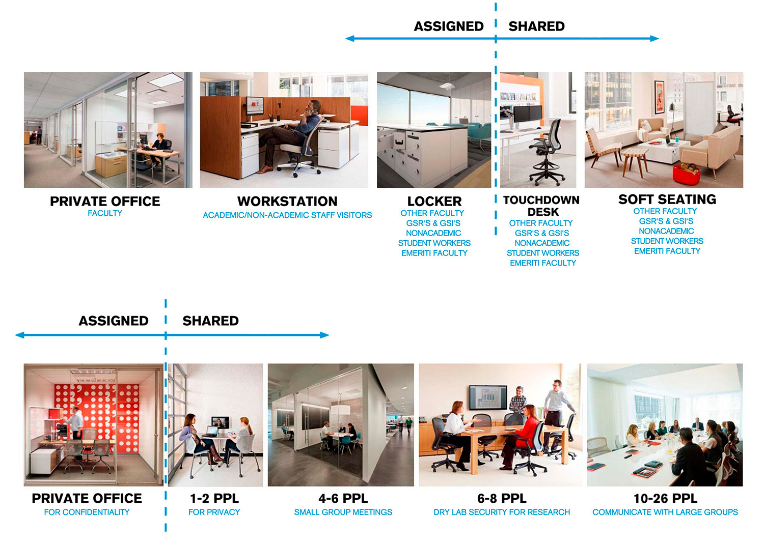
Our core/shell approach profoundly enhances the exterior experience, providing comfort and a bespoke feel, especially in private offices within the individual window boxes. Expansive 36,000-square-foot floor plates and ceiling heights exceeding 13 feet invite abundant natural light and sweeping views.

Fusing urban energy with campus life

Located on a tight urban site at the campus edge, Berkeley Way is composed of two interlocking L-shaped forms, creating the Forum, which consists of two stacked multi-level atrium spaces that serve as the building’s social core. This strategy optimizes space, draws in natural light, and responds to both urban and campus contexts, while maximizing buildable square footage.

Anchored along a major commercial artery to the west, the larger eight-story mass engages the street with ground-floor retail and storefront windows, topped by offices overlooking the city. The lower volume, housing academic classrooms and offices, steps down towards a midblock walkway, pedestrian plaza, and garden that connect directly to UC Berkeley’s campus to the east. Corten steel, raw concrete, and a light, glassy façade articulated with aluminum fins further distinguish Berkeley Way as a building rooted in both campus and city.

white

Building a social core off campus

Design captures the energy of a lively campus quad and extends it beyond campus boundaries. The lower forum of the multi-level atrium, activated by the public realm, seamlessly links the city street to the university plaza with dynamic circulation, retail, and informal social spaces, both indoors and out. 

In contrast, the airy upper forum provides a quieter atmosphere suited for focused work and study, with skylights that bathe the terrazzo interior in soft, indirect light. Ample breakout areas across the forums serve as stand-ins for traditional campus quads, compensating for the site’s limited space.

Departmental identity

UC Berkeley emphasized equal representation for its three academic departments, ensuring their distinct identities were thoughtfully woven into the architecture. Connected to the same multi-level atrium, each department expresses its unique character through signage, color, materials, and workplace types. Each department’s unique character and culture is further highlighted by placing collaborative, public spaces—such as meeting rooms, offices, and learning environments—along the atrium, while more private functions are tucked into the building’s perimeter. The vibrant color palette also lends visual playfulness to the atriums.

Departmental Workspaces

Previous Slide
Next Slide

Balancing efficiency with customization

Berkeley Way introduces a more efficient and thus different—fewer private offices, less square footage per person—way of working and meeting for academics. Careful attention was paid to understanding each department’s culture and needs to help ensure they’d thrive within their new home. For example, Public Health required the ability to draw boundaries around groups writing NIH grants, Psychology favored open and collaborative workspaces, and Education expected private offices with ample windows. 

The design team created a flexible “work canvas,” a customizable kit of parts aligned with UC standards yet tailored to meet the specific needs of each department. This approach resulted in a variety of comfortable, healthy work/learn spaces that democratize access to natural light and stunning views, giving each group a sense of ownership. The speculative office portion followed a similar strategy, allowing tenants to personalize their environments while feeling connected to both the campus community and the city.

The departments and workgroups sought distinct identities, varied work styles, diverse workspace needs, and differing levels of privacy and security, presenting a complex planning challenge. Three distinct workplace strategies were studied, each balancing efficiency, territorial clarity, flexibility, and qualitative factors like natural light, views, and acoustic separation. The Market Stalls strategy uses a cellular layout with self-contained suites, offering strong privacy but less efficiency and adaptability. Neighborhoods provides a balanced solution, offering clear territory and flexibility for growth, with work areas that were scaled to foster a sense of community. The Parklands strategy is the most open and flexible, featuring programmatic islands that encourage interaction, with privacy achieved through creative spatial organization rather than physical barriers.

Floor Plans

Previous Slide
Next Slide
Level 1
Level 2
Level 3
Level 4
Level 5

Catalyzing campus connections

As envisioned in the 2032 Campus Master Plan, also led by WRNS Studio, the renovation and expansion of Mayo Hall was carefully crafted to integrate seamlessly into the campus’s future development. Positioned along a planned thoroughfare linking the main quad with dining and student housing, Mayo Hall’s modern single-story extension, entry canopy, and landscaped plaza create a welcoming gateway while activating the thoroughfare with inviting outdoor gathering spaces. 

The extension, clad in a combination of corrugated and smooth metal panels, complements the historic brick structure with subtle maritime references. Additionally, the design restores up to 40% of the site’s landscape, fostering coastal biodiversity and enhancing the campus’s natural environment.

The concourse: heritage and heart

At the heart of Mayo Hall is a double-height concourse, supporting gathering, pre-function, and break-out activities while providing visual connections to the original gym’s historic structural shell. A time capsule discovered during construction, along with campus relics, is now displayed on a gallery wall in this space. 

Multi-purpose rooms accommodate registration and administration, while the former natatorium has been reimagined as student life and bistro spaces.

 A mezzanine level within the gymnasium shell introduces a loft-style workspace for student leadership and career services, adding efficiency and square footage. Health Services occupies the new addition with its own discreet entrance.

Preserving legacy, enhancing efficiency

The project required a highly calibrated approach to meet carbon and energy goals while complying with the requirements of the Secretary of Interior’s Standards for Historic Rehabilitation and the State Historic Preservation Office. The building’s Colonial Revival motifs—from window patterning and materiality to large-scale structural components–needed to remain intact, maintaining its original character. 

Responding to the damp coastal setting, all new walls were designed with an insulated water-resistant membrane and the exterior hardware is stainless steel to hold up against the cycles of rain, mist, fog, and sun. A rebuilt roof features ridge vents, operable clerestory windows, and high-performance glazing to enhance natural ventilation, solar control, and reduce glare, contributing to an anticipated energy cost savings of 86.5%.

New windows installed below the sill height of the existing windows flood the concourse and conference rooms with natural light and offer views of the immediate harbor and greater bay.

Doing more with less

Performance modeling revealed that the existing concrete and brick walls provided sufficient thermal mass, eliminating the need for additional insulation while achieving energy and waste reduction goals. Approximately 80% of interior finishes retain the original concrete and wood structure. The existing exposed wood deck was preserved, with structurally insulated panels added to the gabled roof for structural integrity and thermal performance. 87% of construction and demolition waste was diverted from landfills.

Collaborative Design-Build in action

Mayo Hall was delivered using Collaborative Design-Build, an integrated process in which WRNS Studio worked seamlessly with our builder partner, Otto Construction, to achieve a functional and cost-effective campus asset.

“WRNS Studio has always been one of my favorite design firms to work with—they take the time to understand CMA’s needs and provide design solutions to meet those needs.”

Meaghan Smith
Principal University Planner / Program Manager
The California State University (CSU)

A vision for community

Paying homage to San Mateo’s distinct sense of place and strong community was important to Prometheus Real Estate Group, a family-owned company dedicated to creating homes and neighborhoods that feel authentic and foster a sense of belonging. The company—which recently opened its new headquarters onsite—was founded upon the vision to transform apartment living by attending to every inch of detail, from site selection to interiors.

brickline-flats-ellsworth

Massing and materiality

Spanning a city block, Brickline is thoughtfully organized into discrete sections to reduce its massing and harmonize with the streetscape. Brick, wood, and ribbed metal panels define the five-story residences, while cream-colored brick and punched windows distinguish the offices, echoing the scale and texture of neighboring brick and terracotta buildings. Fluted glazed terracotta panels, wood cladding, and a pronounced roof overhang add warmth and visual depth to the facades. Ground-floor retail enhances the city’s offerings, while energizing the street.

Privacy and domain

To provide a sense of privacy and domain, residents enter through a quiet, tree-lined street sounded by neighboring homes. Transparent and light, the entry lobby evokes a traditional craftsman with warm wood tones, built-in bookcases, seating nooks, and a central stair. Thoughtful touches, like brass pendants, brushed canvas bench cushions, and a custom wall graphic inspired by William Morris’ Marigold pattern, create a welcoming and homey feel.

Typical Unit Mix

Previous Slide
Next Slide
brickline-flats-studio-plan
Studio
brickline-flats-1bed-plan
1-Bed
brickline-flats-1bd-plan
1-Bed (Alternate)

Community and connection

The studios and one-bedroom apartments surround a second-floor courtyard featuring lounge seating, fire pits, and mountain views. Floor-to-ceiling windows flood the units with natural light and sweeping vistas, enhancing the warm, natural materials and playful color palette. Residents enjoy views of local landmarks like San Mateo’s clock tower and the Santa Cruz Mountains. A rooftop deck, garden, and fully equipped chef’s kitchen encourage residents to “connect with others in a neighborly way,” reflecting Prometheus’ core values of community and connection.

Riverfront revitalization

The adjacent Jordan River and Jordan River Trail are important resources for both the local community and natural habitat. Ecological reclamation efforts support habitat restoration and the health of this regional waterway, healing the site’s industrial legacy. 

Industrial remnants from the site’s former life as the Sharon Steel Mill had long prohibited redevelopment until the EPA designated it a federal superfund site. Following extensive remediation, an embankment was left, dividing the site from the river. 

The plan envisions a public park to soften this divide. The linear park extends the Jordan River Trail, integrating soccer fields, community gardens, and open space. A pedestrian-oriented street lined with retail parallels the river, serving as the new heart of the community while reconnecting residents and workers to the river.

“Covering 7% of Midvale’s total footprint all by itself, the second phase at Jordan Bluffs will bring added employment, vital intellectual capital and accelerated economic growth for the suburban community.”

Robert M. Hale
Mayor at Midvale City

Zions Bancorporation Technology Center

As the inaugural building of Jordan Bluffs, the Zions Bancorporation Technology Center catalyzes this new mixed-use neighborhood. Developed during the pandemic, the Technology Center is an instrumental part of Zions’ retention, recruitment, and return-to-work strategy as one of Utah’s largest technology employers.

The building consolidates numerous departments that were formerly dispersed across smaller offices throughout the Salt Lake Valley, supporting growth and innovation for one of the nation’s leading financial institutions. By concentrating tech employees into a single building, Zions reduces occupancy costs by 15% while advancing new initiatives for its affiliate banks located throughout the Western United States.

Zions Bancorporation Tech Center

Environmental leadership: a net zero energy community

Supporting the plan’s goals for a Net Zero Energy community, the Technology Center is all-electric and LEED Platinum. Over 2,000 photovoltaics help offset 75% of the building’s energy use and are anticipated to save 4.9 million pounds of CO2 annually. The campus also includes 179 electric vehicle charging spots, encouraging personal choices that positively impact the environment.

These strategies reflect Zions Bancorporation’s commitment to environmental stewardship, modeling conservation and resilience in a region challenged by diminishing water supplies and declining air quality, while emphasizing human comfort and well-being.

Reconnecting the community to nature

The project puts a premium on walkability and connection to the landscape, transit, and amenities. Eschewing the typical suburban setup—offices surrounded by a sea of parking—the Technology Center anticipates future density and enhances connections to nature.

The site is thoughtfully designed to preserve open space for habitat restoration while establishing seamless connections to the Jordan River Trail and nearby transit. Aligning with the Jordan Bluff Neighborhood Plan, the project brings to life a new public park and its adjacent pedestrian-friendly street, forming a vibrant community hub for the growing neighborhood.

Open space is further maximized on the ground plane by consolidating half the parking into a single structure, linking the Technology Center to the future district to the south and providing seamless access to exterior amenities like a garden and recreation space.

Attracting talent with comfortable, healthy work environments

In addition to catalyzing a future neighborhood, the Technology Center needed to be a great workplace for Zions’ employees in the here and now. Broad floors support team building and collaboration, while smaller plates accommodate focused work. Courtyards cut into the larger plates provide employees with natural light, views, and access to nature.

Full-height windows bring in daylight and offer mountain views. Amenities on each floor include spaces for rest, meditation, and reflection. E-bikes, bike lockers, pickleball courts, and a yoga room make it easy to socialize and spend time outdoors. A community garden, tended by employees, supplies fresh produce to the café.

The use of zinc and brick—materials not typically found in a suburban context—establishes a sense of timelessness and permanence befitting one of the oldest banks in the West.

Previous Slide
Next Slide

A vibrant public ream

The redesign integrates shared amenities, sheltered outdoor workspaces, and striking five-story green columns. These vertical gardens, illuminated at night, energize the public realm while enhancing pedestrian flow and community engagement.

Seasonal comfort and biophilic design

Solar studies informed the redesign of the lobbies, optimizing comfort year-round. The south lobby now functions as a winter garden with extended glazing, lush interior planting, and sliding glass doors that blur the boundary between indoors and out. The north lobby opens to a sun porch for summer gatherings. Natural materials like bleached wood and marble create a biophilic experience, while patterned pavers unify the entry court and guide users through the site.

Modernization meets maintenance

The repositioning also addressed deferred maintenance, replacing exterior pink granite-clad and GFRC walls with new cladding and punched windows. A new alley loading dock with roll-down doors was added, modernizing the complex while supporting its functional needs.

Streamlined services, thoughtful design

Atherton’s former administrative and public safety functions were scattered across separate facilities, creating inefficiencies for residents and civic leaders. The new City Hall consolidates services—including the post office, planning and building departments, police, and meeting spaces—into a single two-story L-shaped building. Educational services for seniors and toddlers are now conveniently integrated into this civic hub.

At its center, a welcoming public living room fosters community connection, while a new council chamber accommodates 50 people, functioning as a meeting space, conference room, and emergency operations center. By uniting these services, the Town Center enhances accessibility and strengthens civic engagement.

Honoring nature, enhancing connectivity

Preserving mature oak trees—vital to migratory birds along the Coastal Mountain Ridgeline—was a priority, along with expanding native landscaping and introducing pervious paving to manage stormwater. These strategies reduce environmental impact while offering replicable models for sustainable water and land management.

The materials—locally-sourced wood and rammed earth—were selected for their acoustic properties and alignment with a low-carbon future. A redesigned pedestrian plaza replaced a dividing road, connecting City Hall with the Library and other civic spaces, creating a vibrant hub where community and nature converge.

UCSF Parking Structure

Conveniently situated near the I-280 freeway exit, the Owens Street Parking Structure serves as a central hub for the UCSF community, providing easy access to key facilities, including the Medical Center, Benioff Children’s Hospital, Bakar Cancer Hospital, and Betty Irene Moore Women’s Hospital.

The 10-story, 627-vehicle parking structure exemplifies the innovation and design excellence for which the institution is known. As the first interaction many visitors have with the UCSF campus, the structure serves as a welcoming entry point, designed to convey a sense of place and direction while complementing the dynamic character of Mission Bay.

Dynamic facade: form meets function

The upper levels of the parking structure are enveloped in a custom anodized aluminum louver system in warm earth tones. Vertical louvers alternate orientations from panel to panel, creating a quilted pattern that plays with light and shadow throughout the day. This design adds visual interest while facilitating natural ventilation and minimizing light spill at night, reducing its impact on the surrounding neighborhood. Two-story view apertures, framed by vertical fins, transition between the pedestrian scale and the building’s larger volume.

UCSF Parking Structure

UCSF Parking Structure

Facade Composition

Previous Slide
Next Slide
UCSF Parking Structure
North
UCSF Parking Structure
South
UCSF Parking Structure
East
UCSF Parking Structure
West

Making parking easy, safe, and enjoyable

Inside, elevator waiting areas are strategically placed to frame outdoor views, offering moments of connection with the surroundings. At the building’s base, a secure and welcoming pedestrian zone is enriched with cement plaster soffits, a painted white concrete frame, perforated white metal panels, extensive lighting, street trees, and plantings, creating an inviting streetscape.

UCSF Parking Structure

UCSF Parking Structure

Design-Build excellence

This high-performance parking structure, part of a broader transportation strategy for UCSF’s expanding campus, was the result of a successful Design-Build competition. The collaboration between Rudolph and Sletten and WRNS Studio showcases how thoughtful design and functionality can elevate even the most utilitarian of buildings, setting a new standard for infrastructure in Mission Bay.

Design-Build excellence

UCSF Parking Structure

Stanford Research Park

Crafting a cohesive, multifaceted district

Redeveloping this 25-acre site required creating distinct zones that integrate seamlessly into both Stanford Research Park and the surrounding area. The design team segmented the site into zones reflecting major uses: hotel/conferencing, residential, work, parking, and retail. This approach informed a cohesive district plan while honoring the unique needs of each zone.

A hotel and conference center anchor the site’s most prominent corner, at the intersection of El Camino Real and Page Mill Road. Along Page Mill Road, a workplace zone integrates two office towers with Palo Alto Square, maintaining continuity for existing tenants. On the north side, the mixed-use residential zone invites pedestrians with retail spaces on the ground floor and residences above. Garden apartments open to a central courtyard, offering greenspace for families. A parking structure on the south end pulls cars to the perimeter, while the central market plaza—with event spaces and indoor-outdoor retail—brings all zones together, creating a vibrant hub for gathering and connection. The landscape reflects the site’s zoning while enhancing wayfinding and open space.

Stanford Research Park