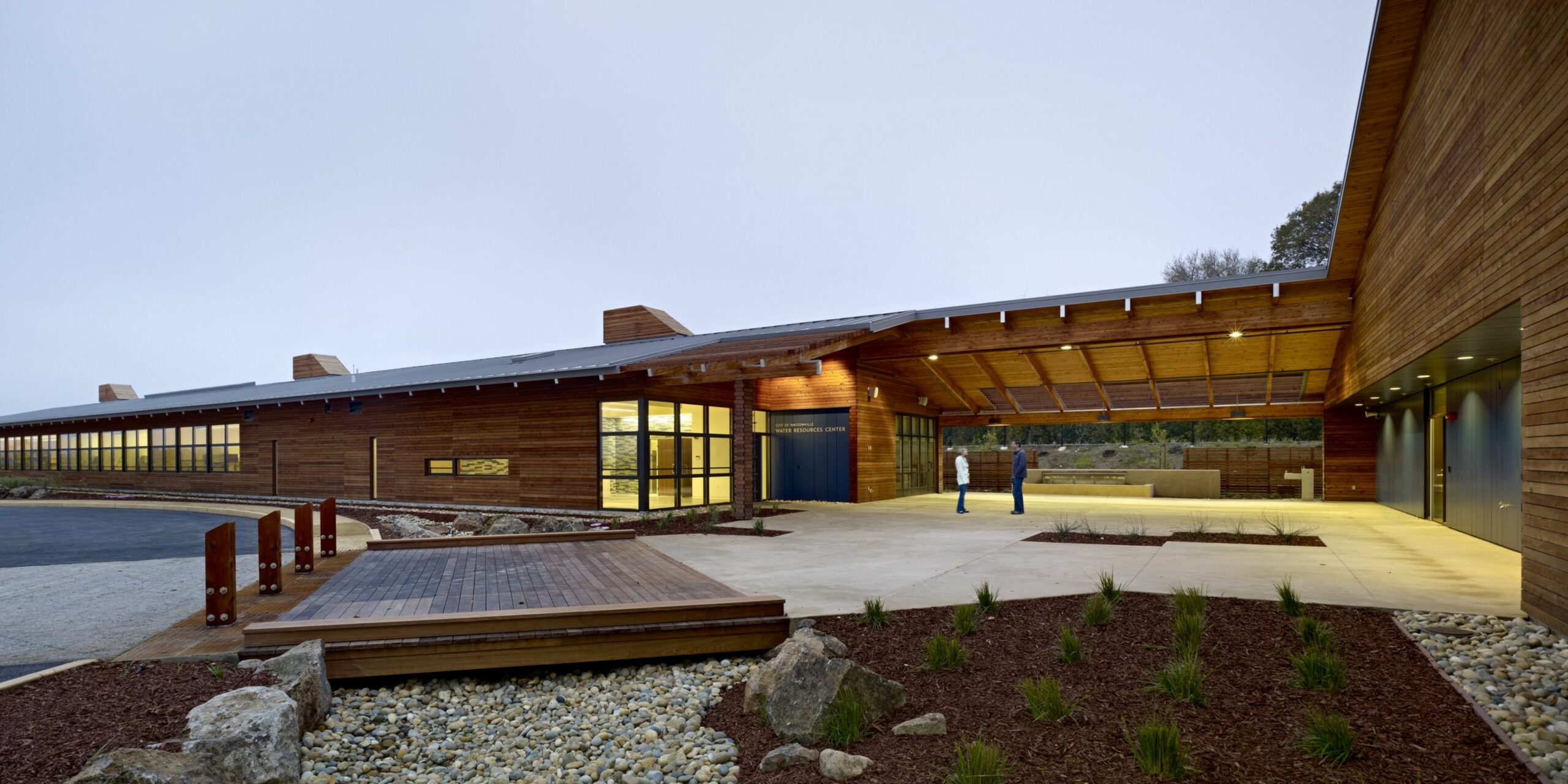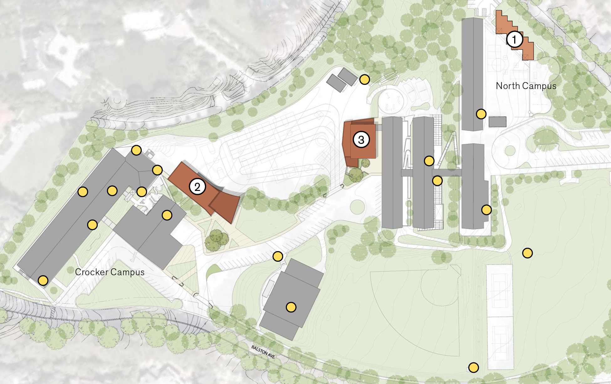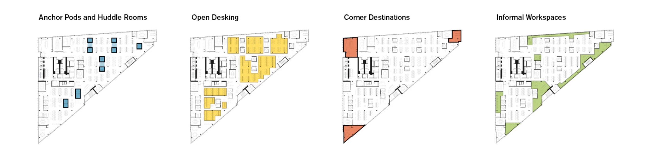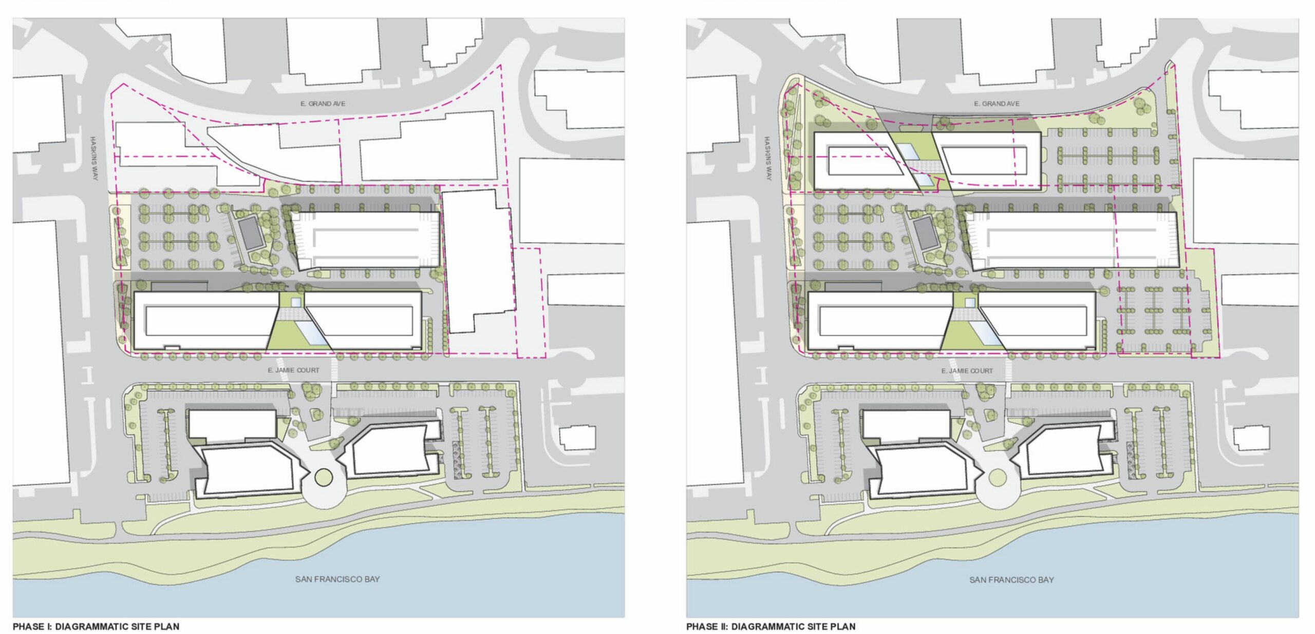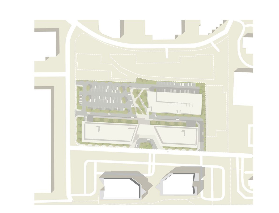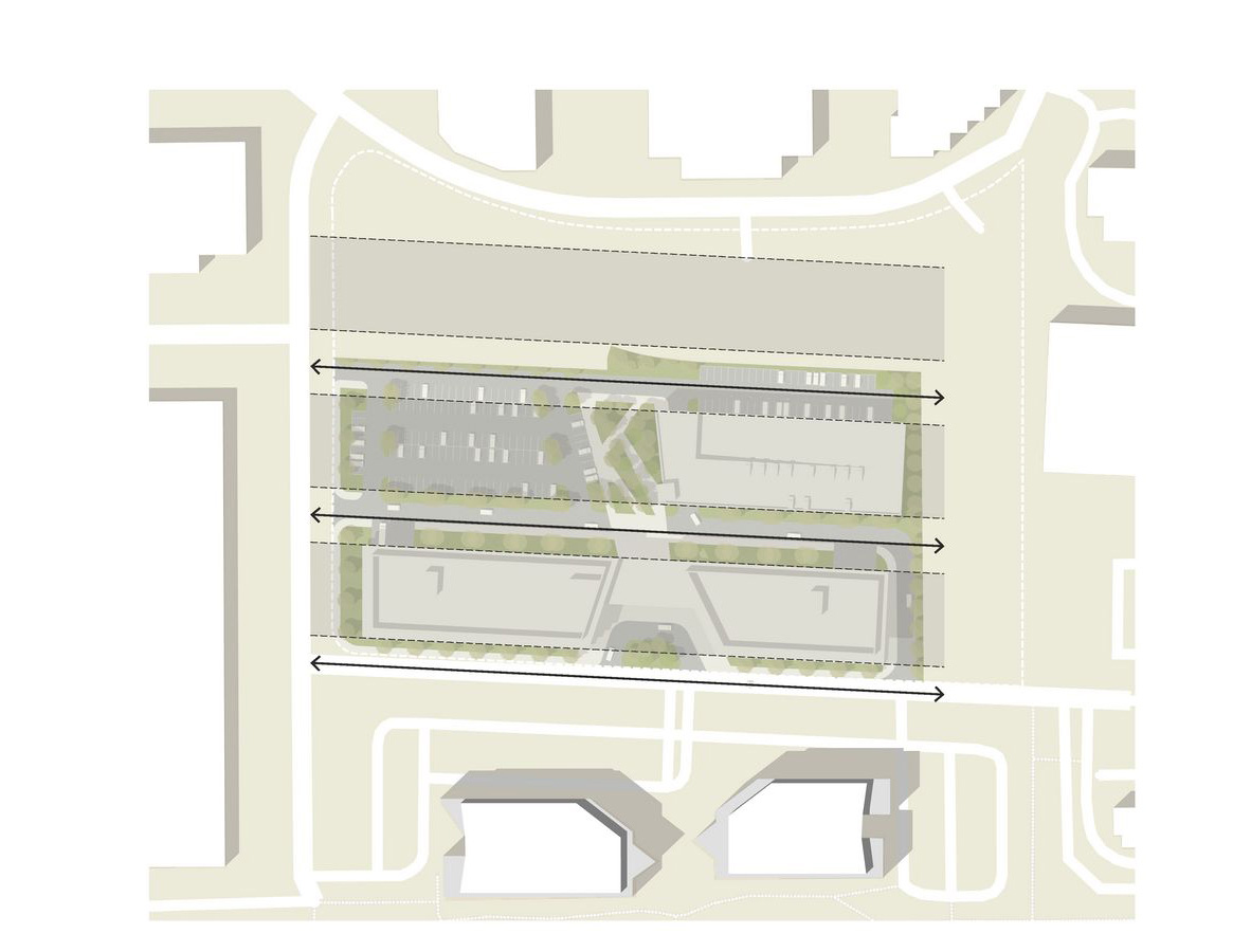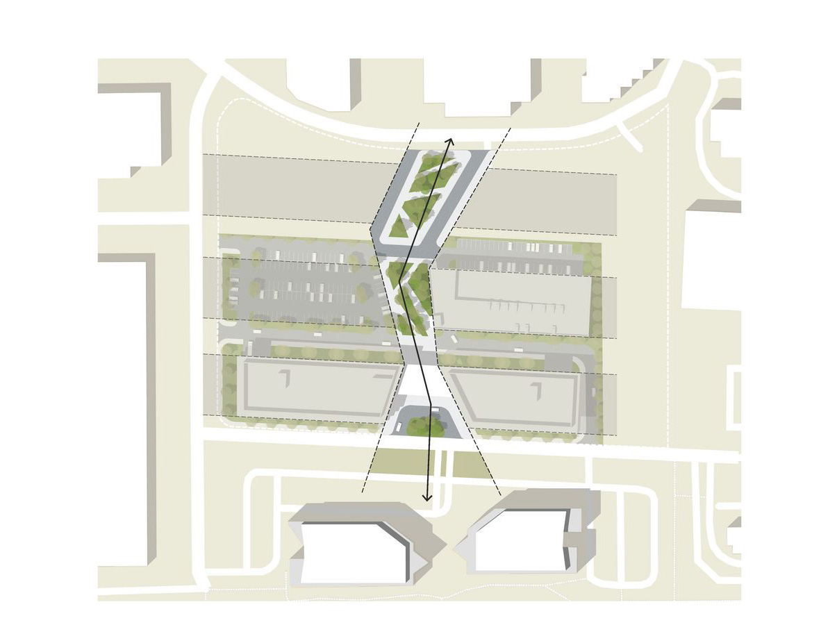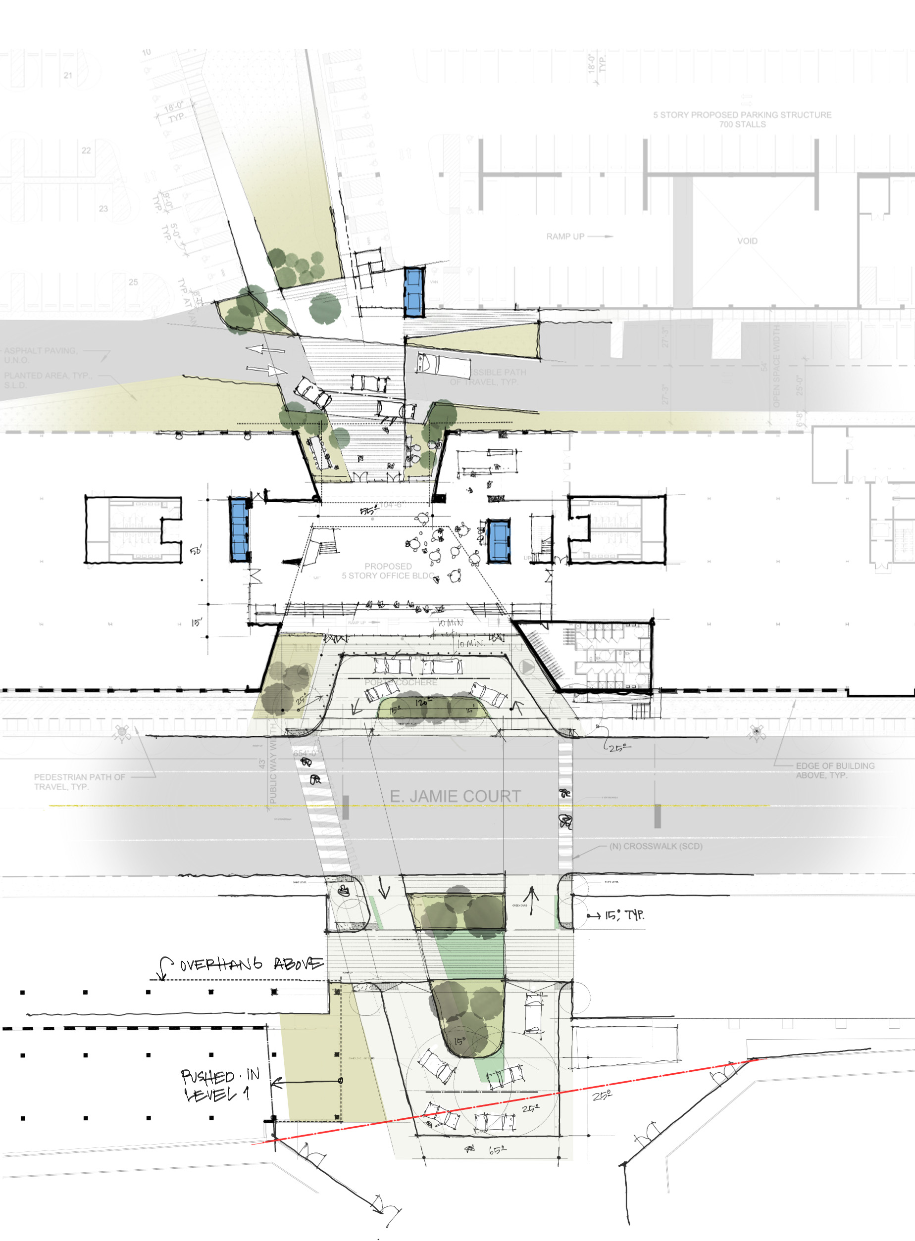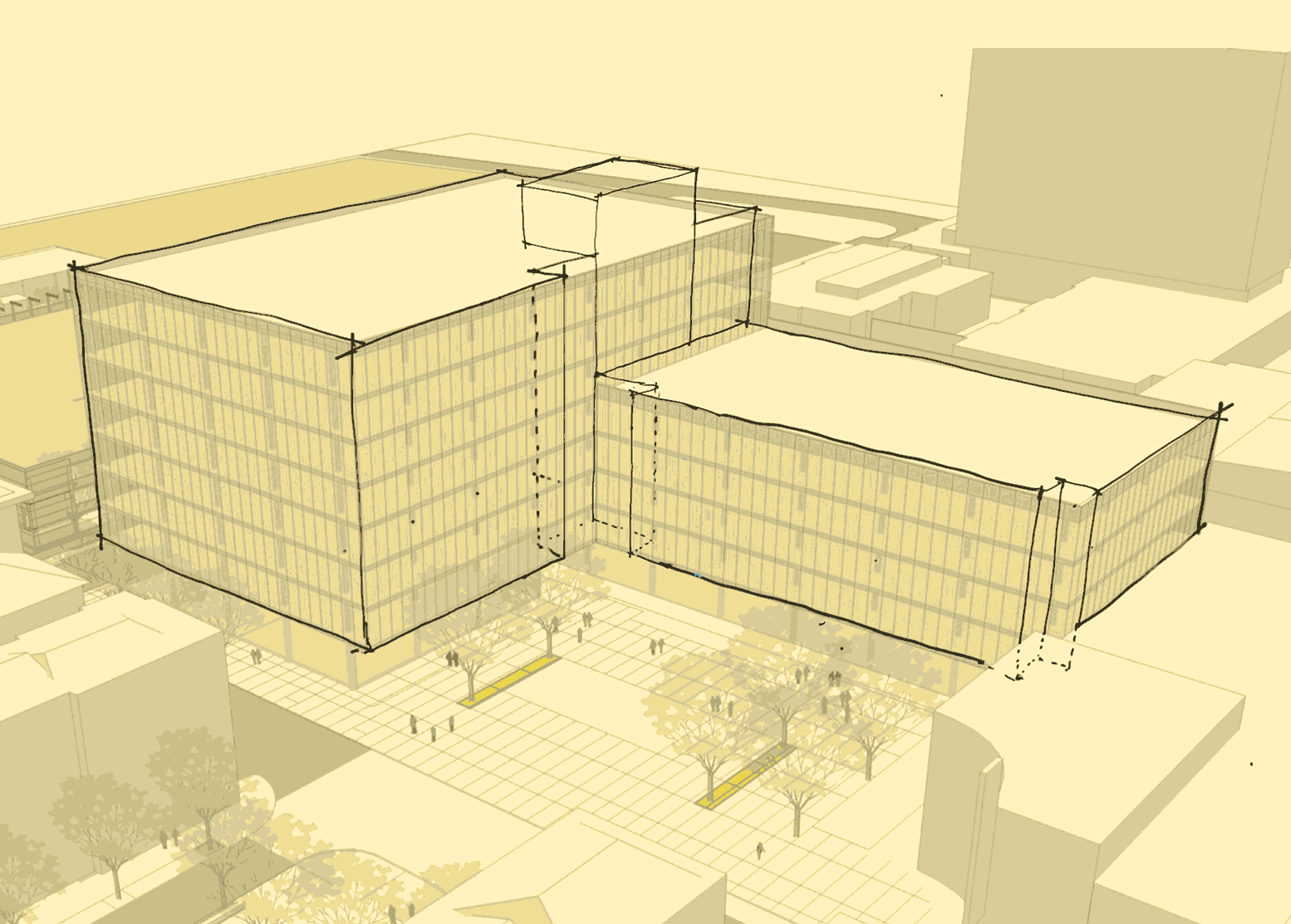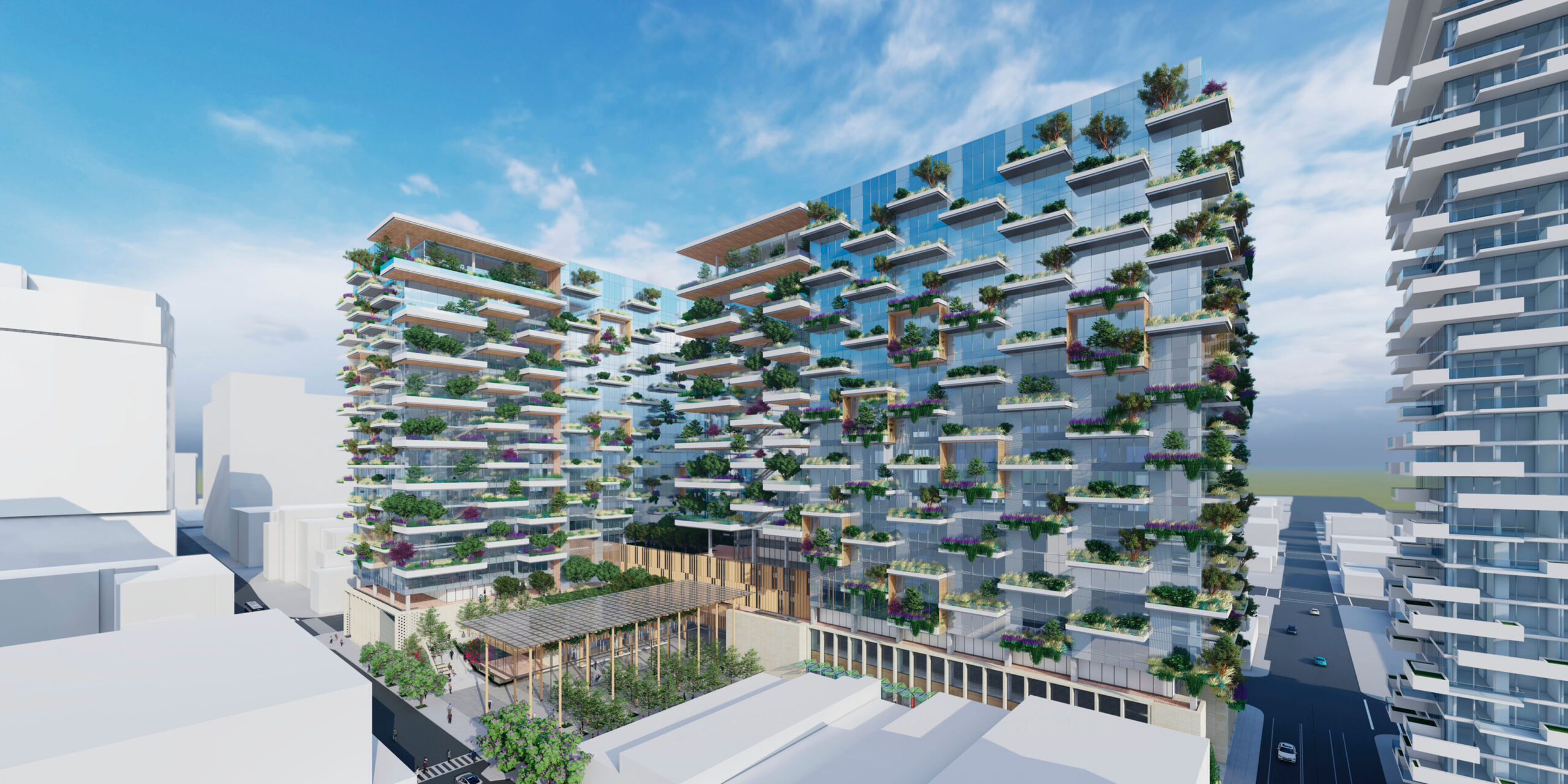
Planning Concepts
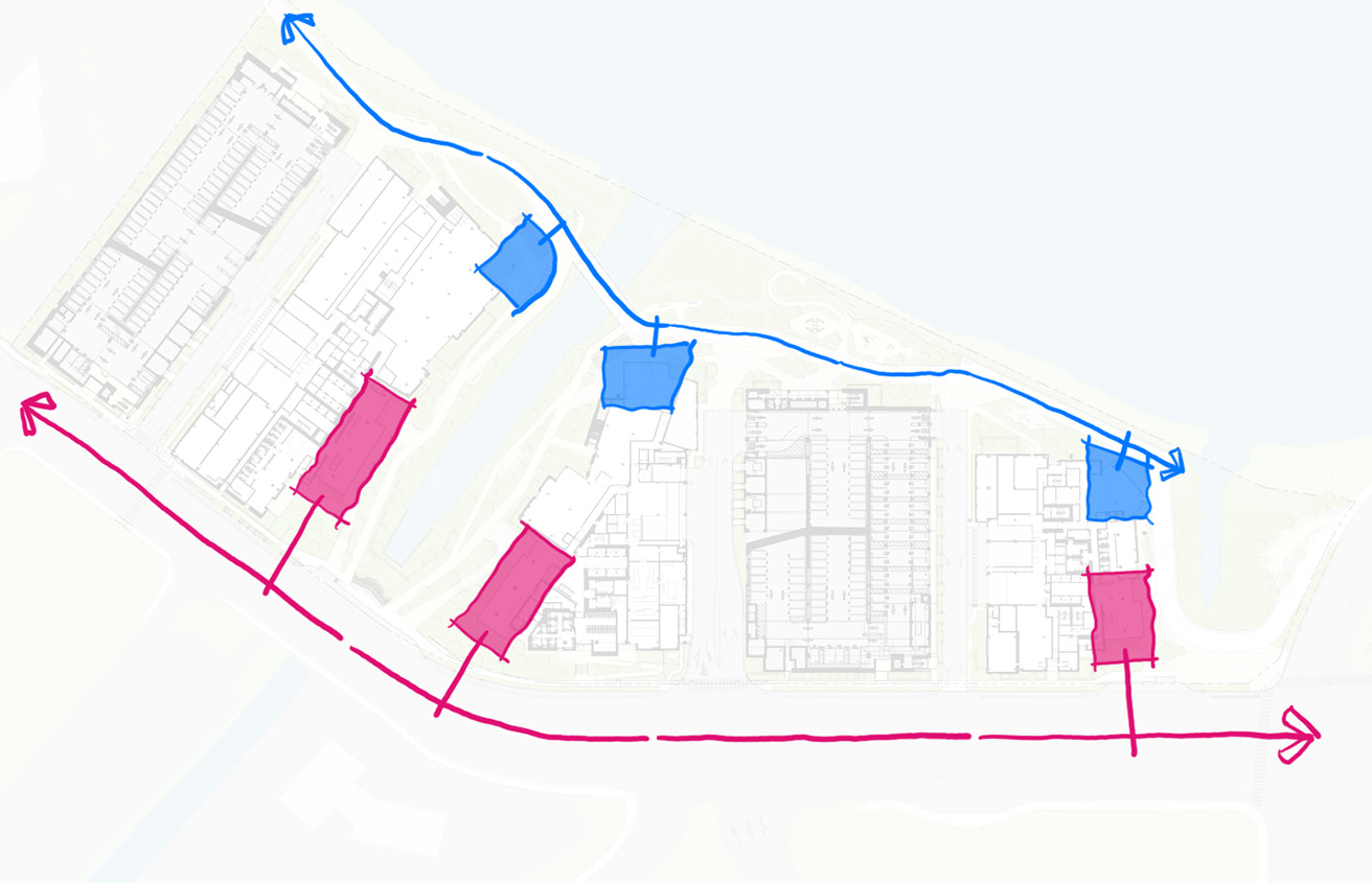
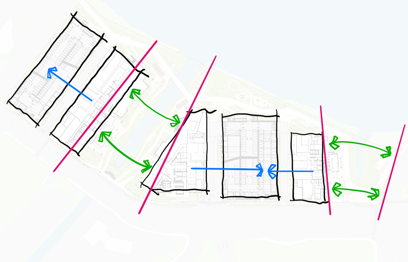
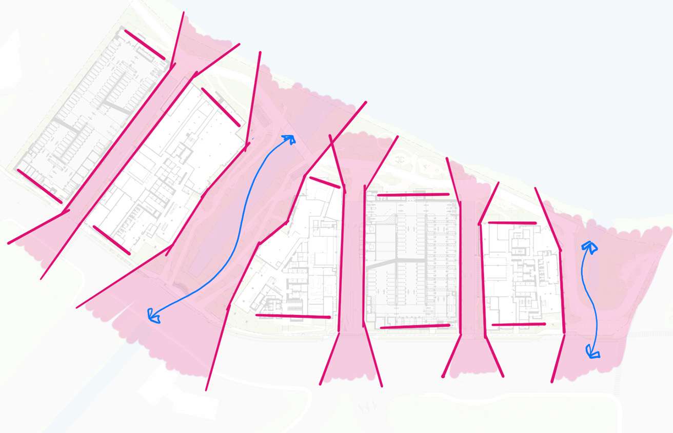

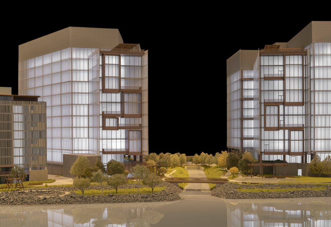
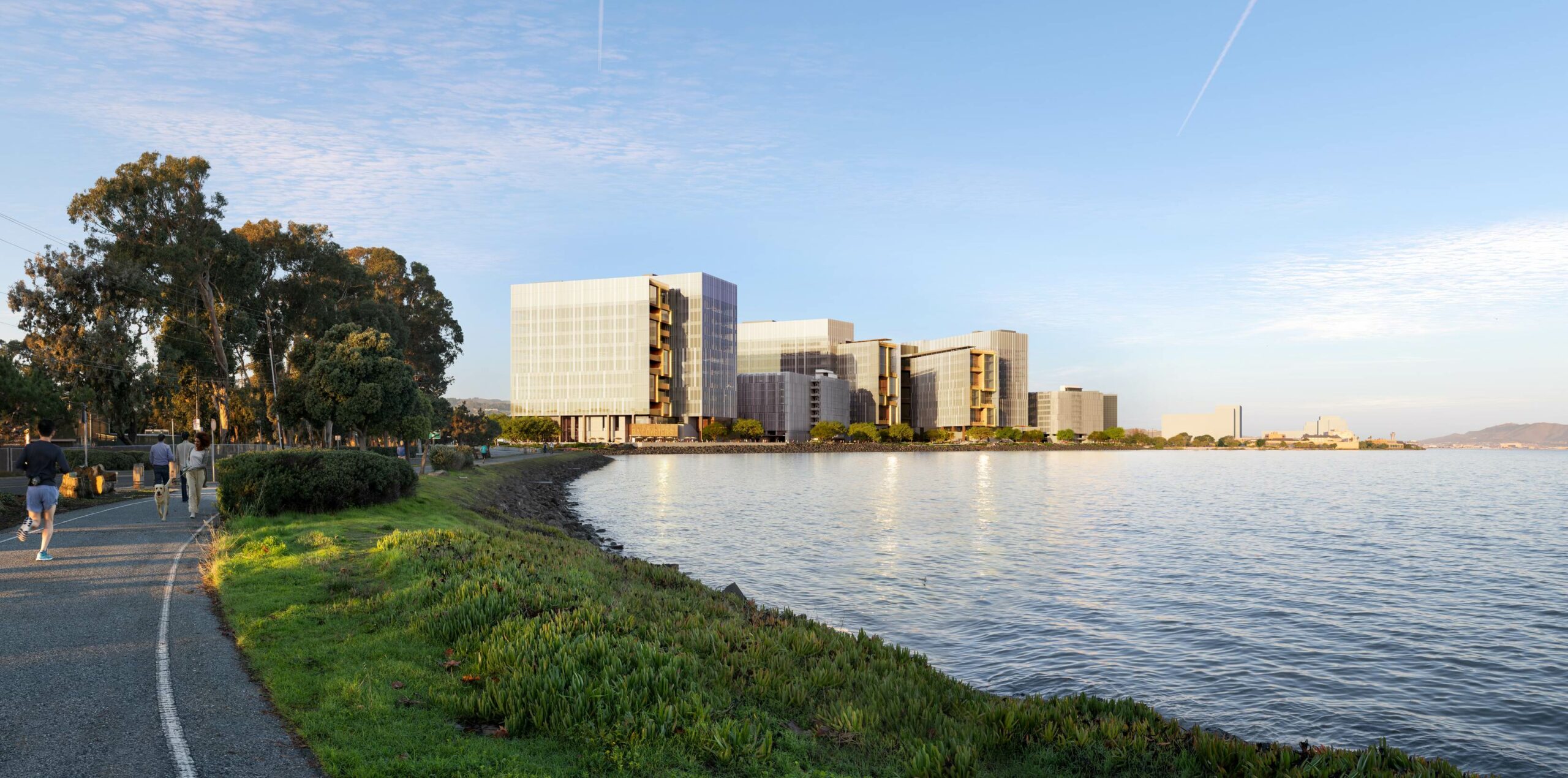
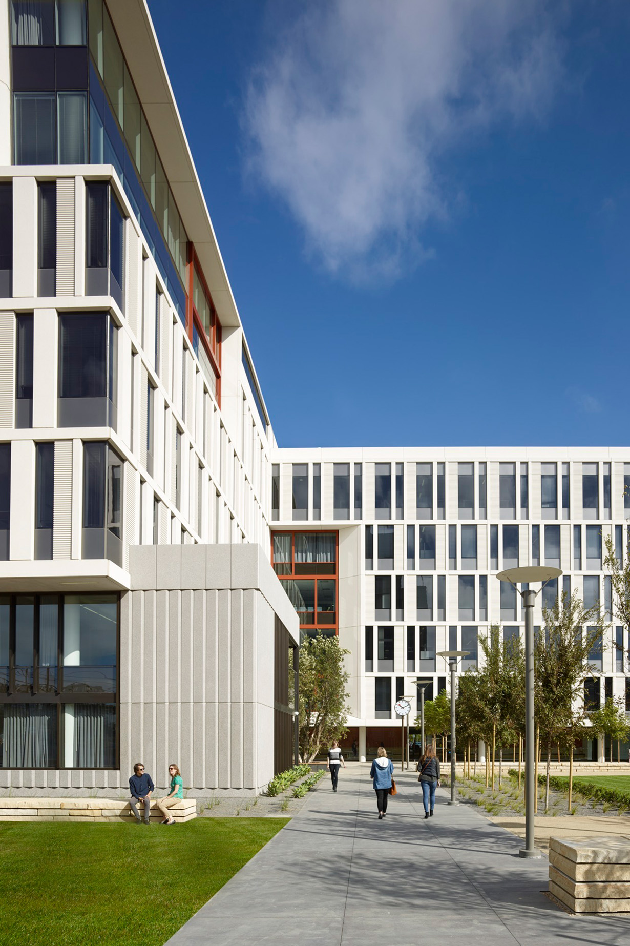
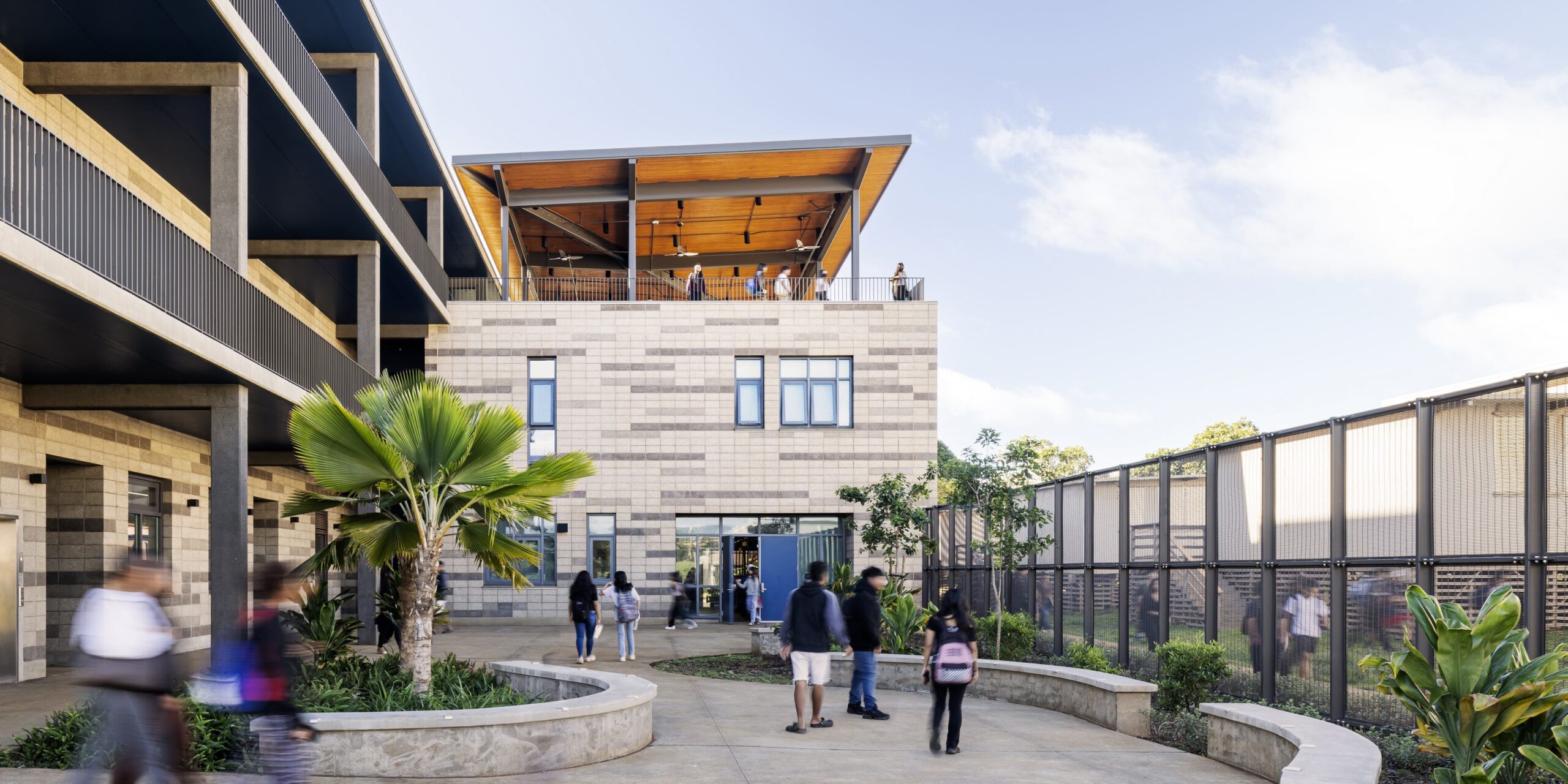
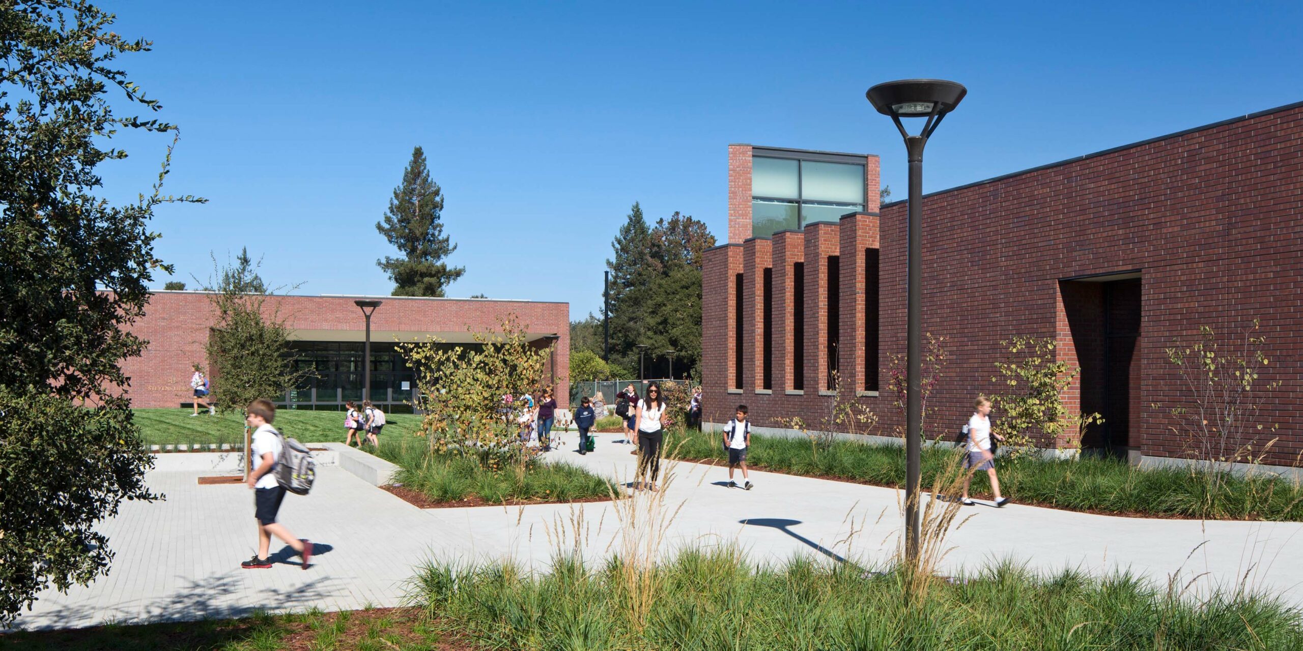
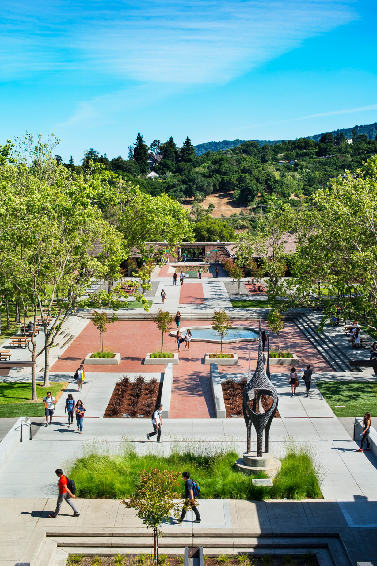
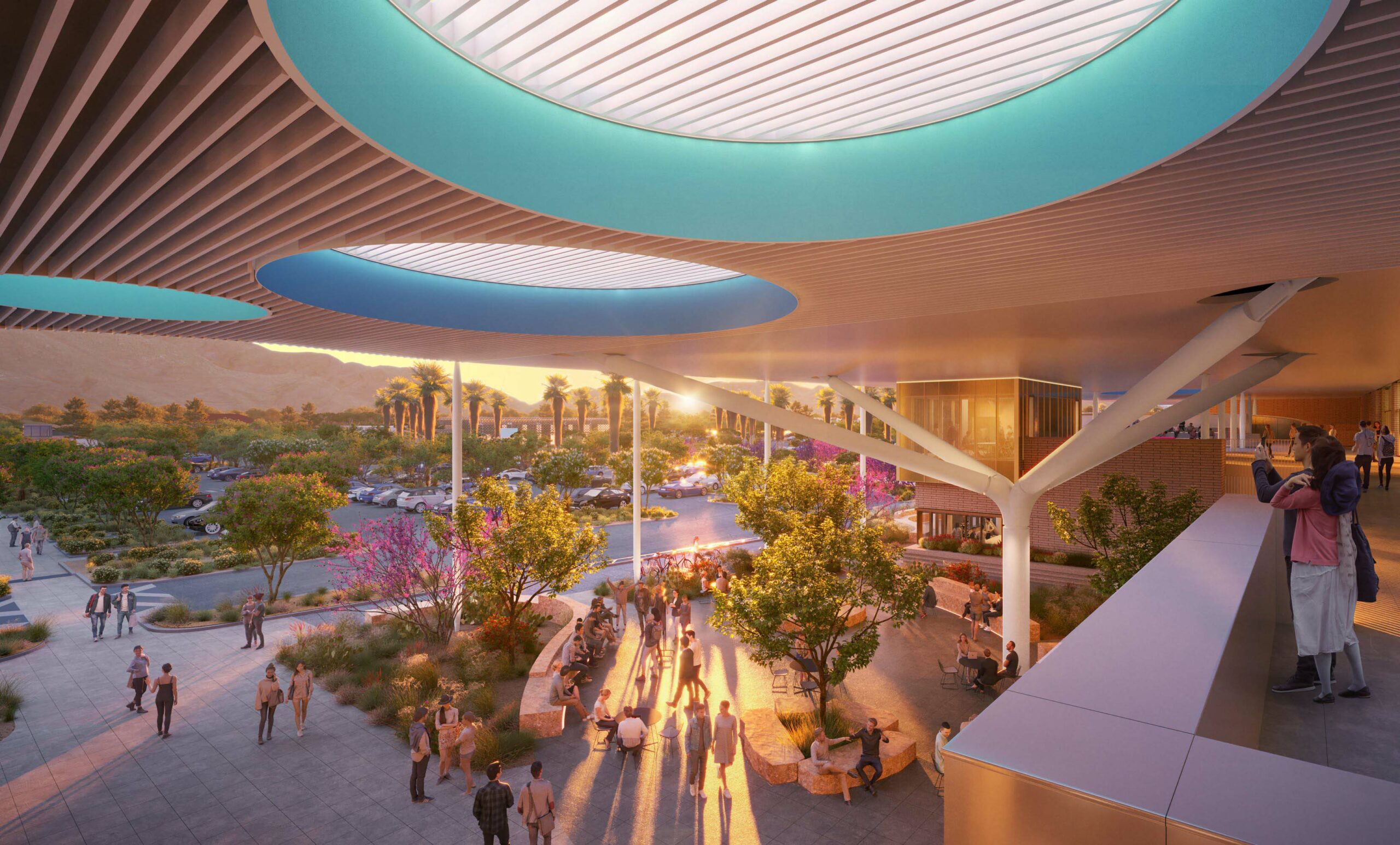
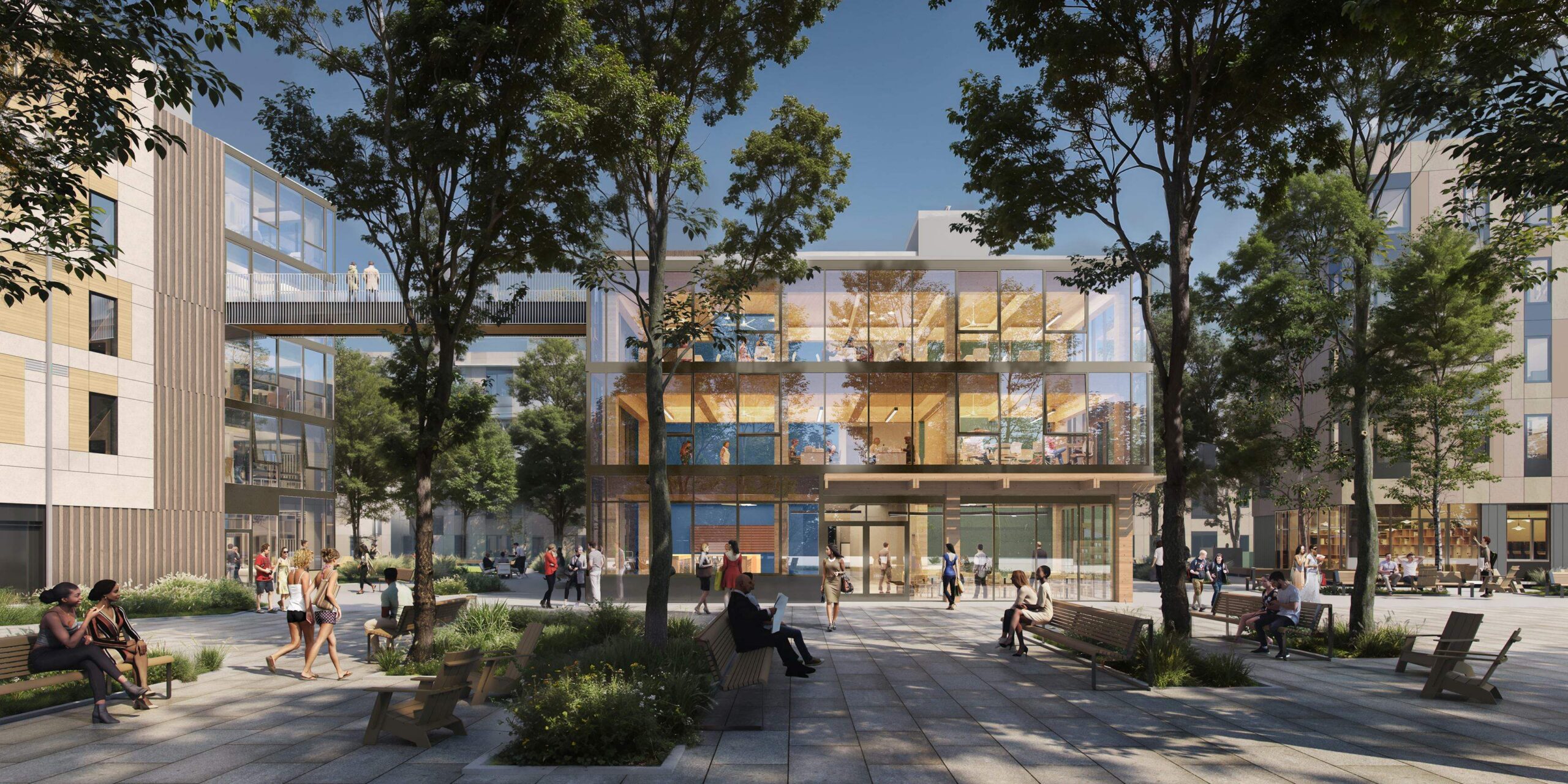
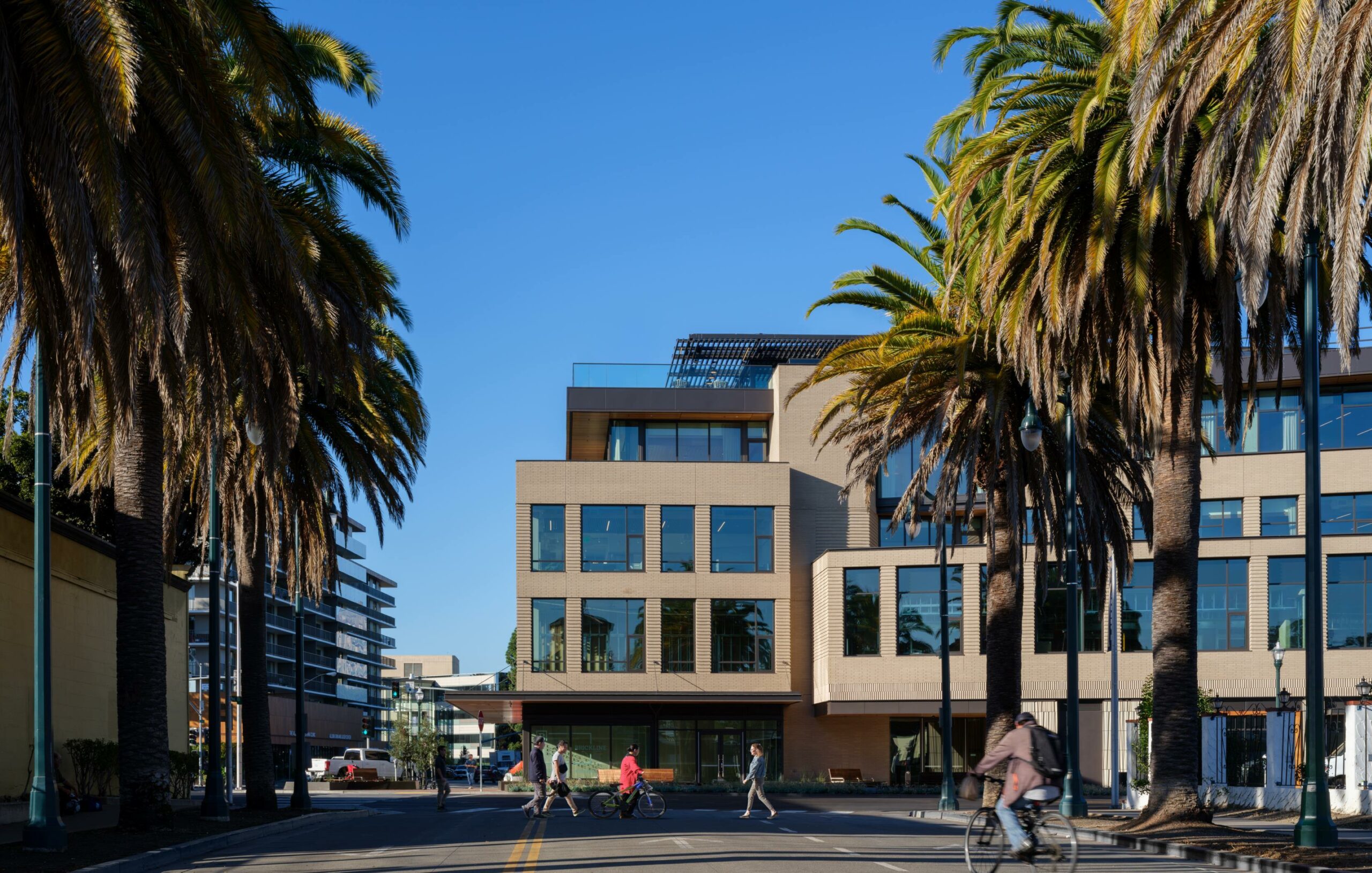
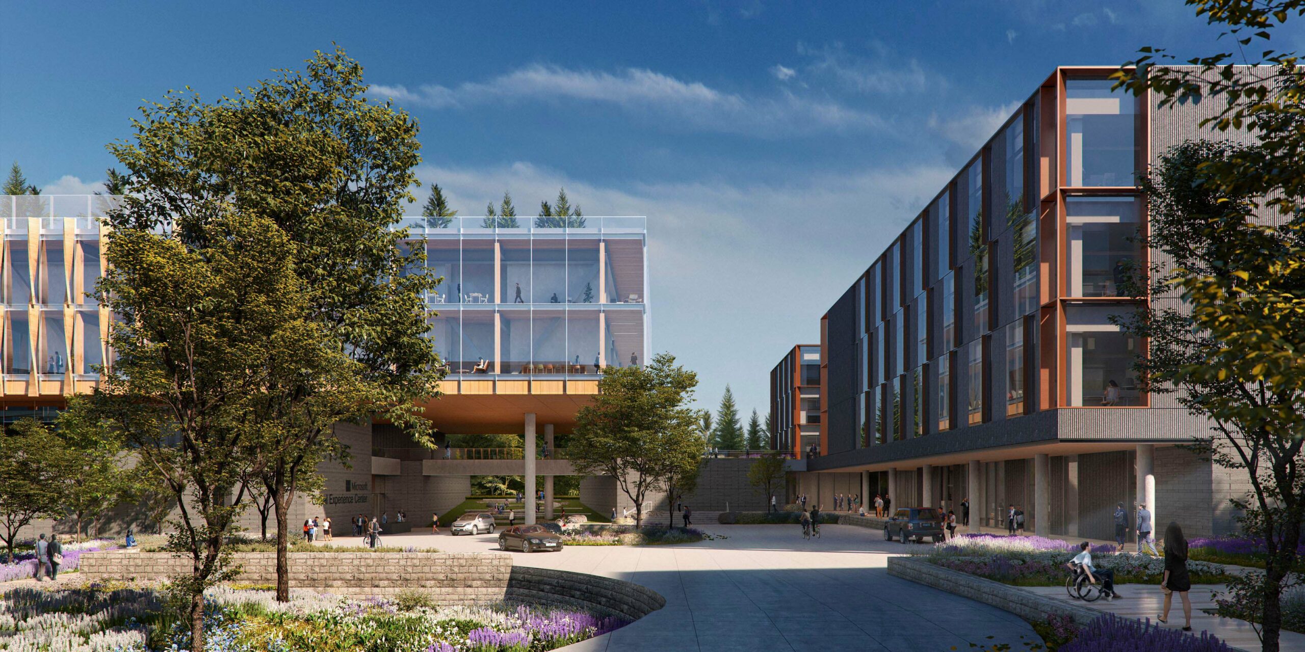
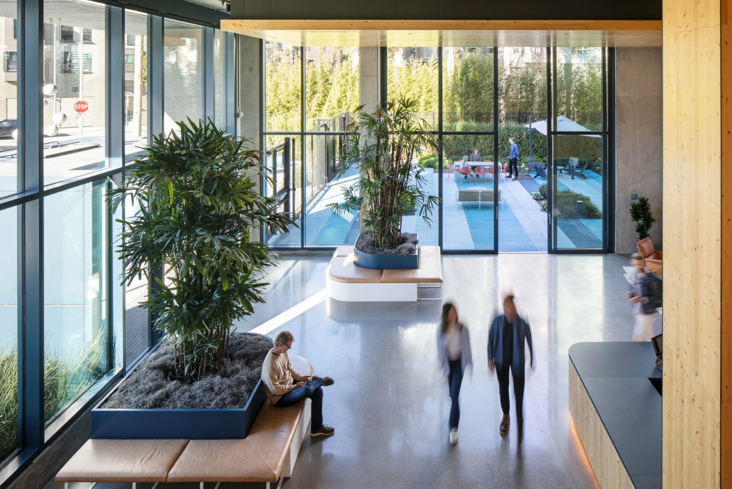
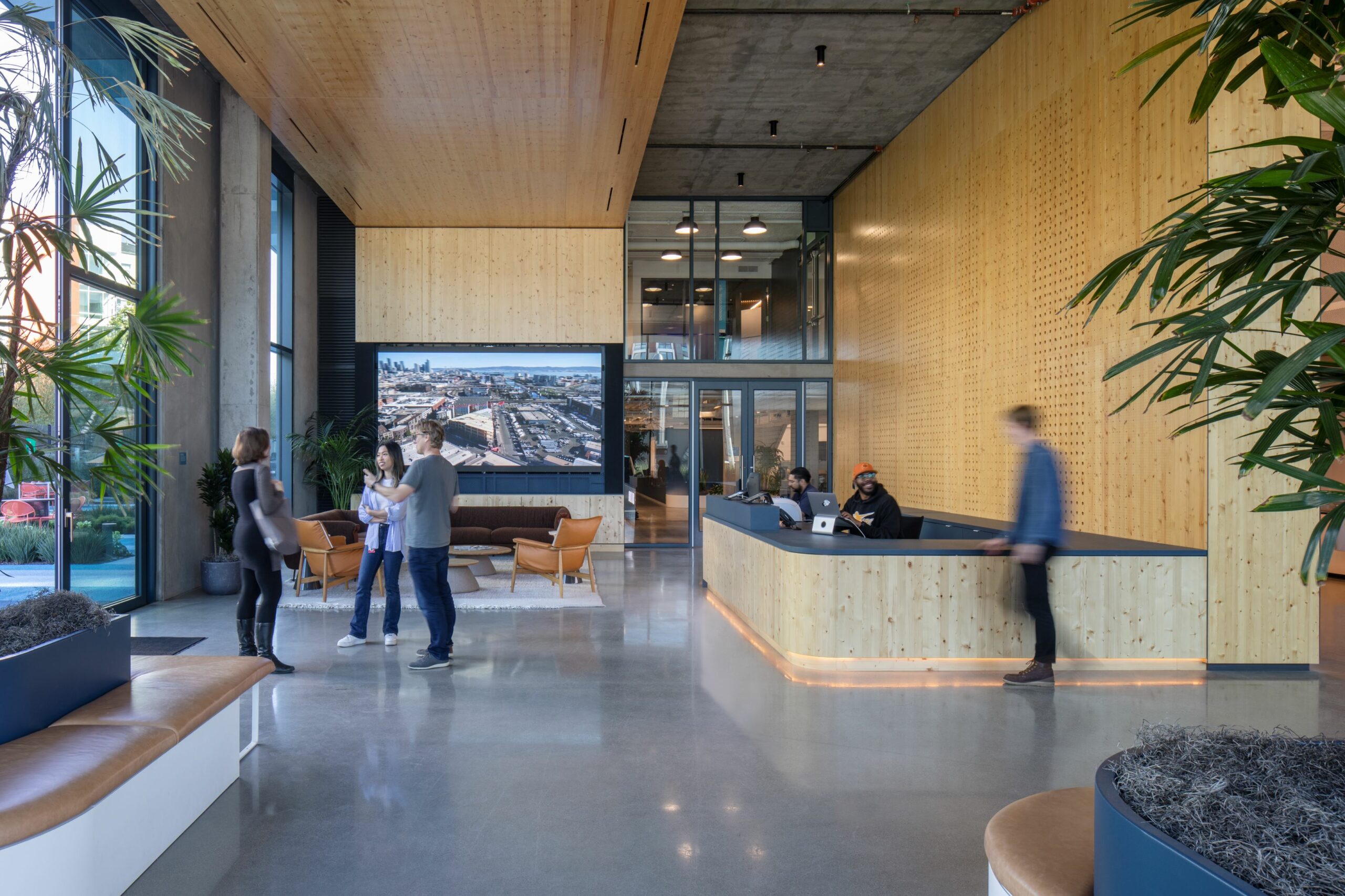
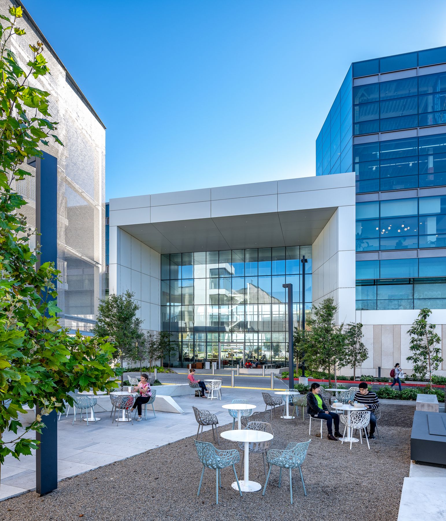
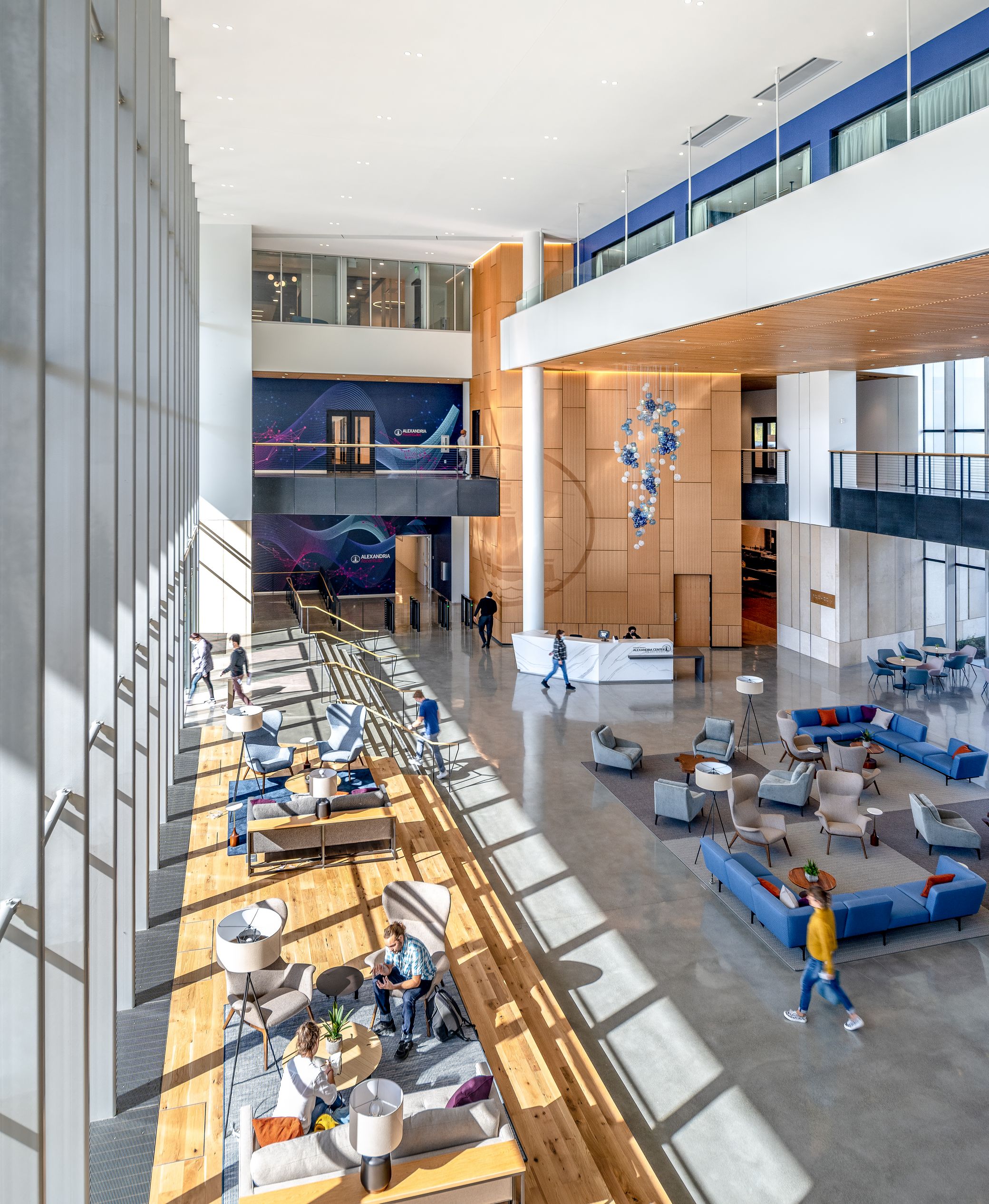
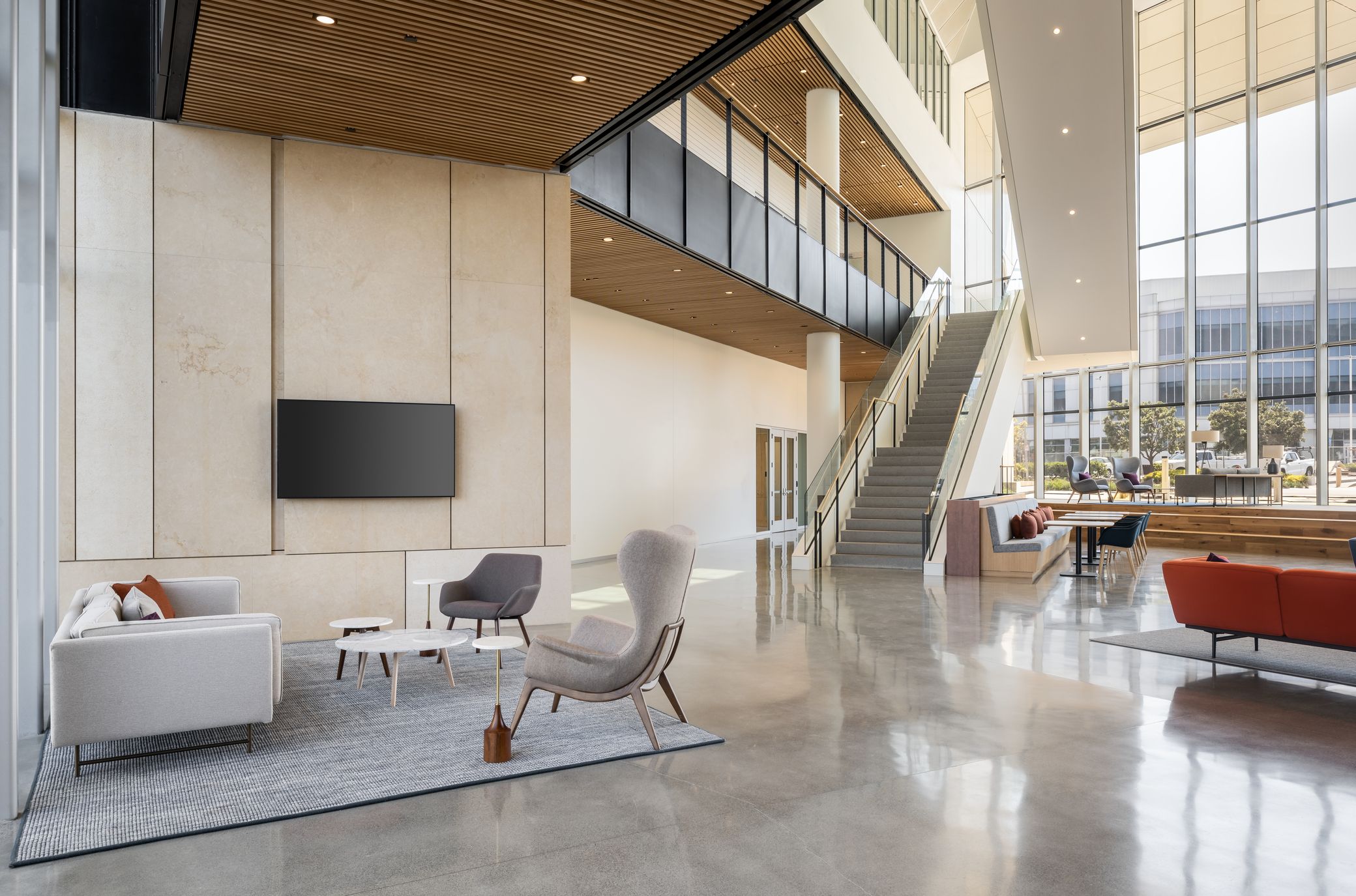
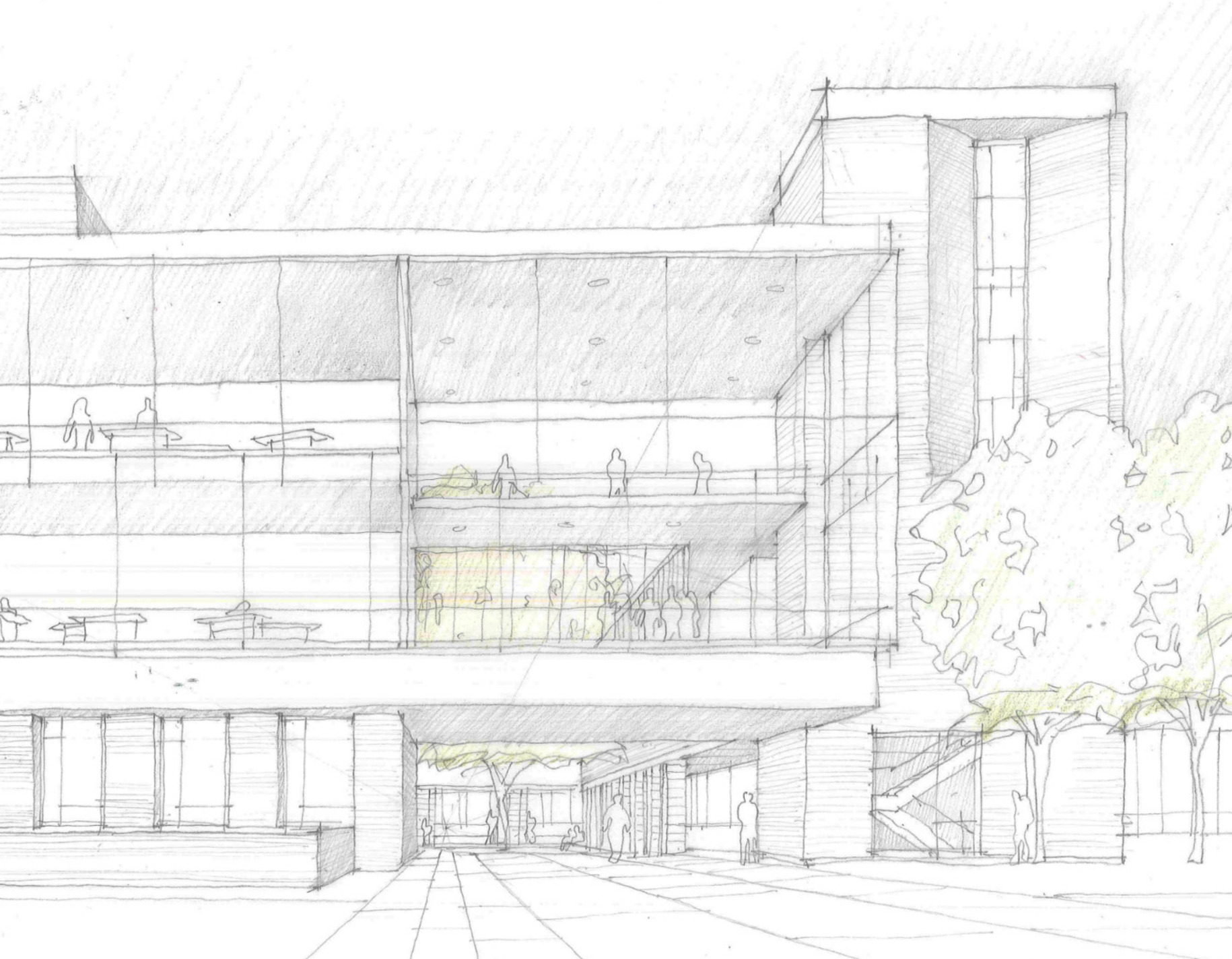
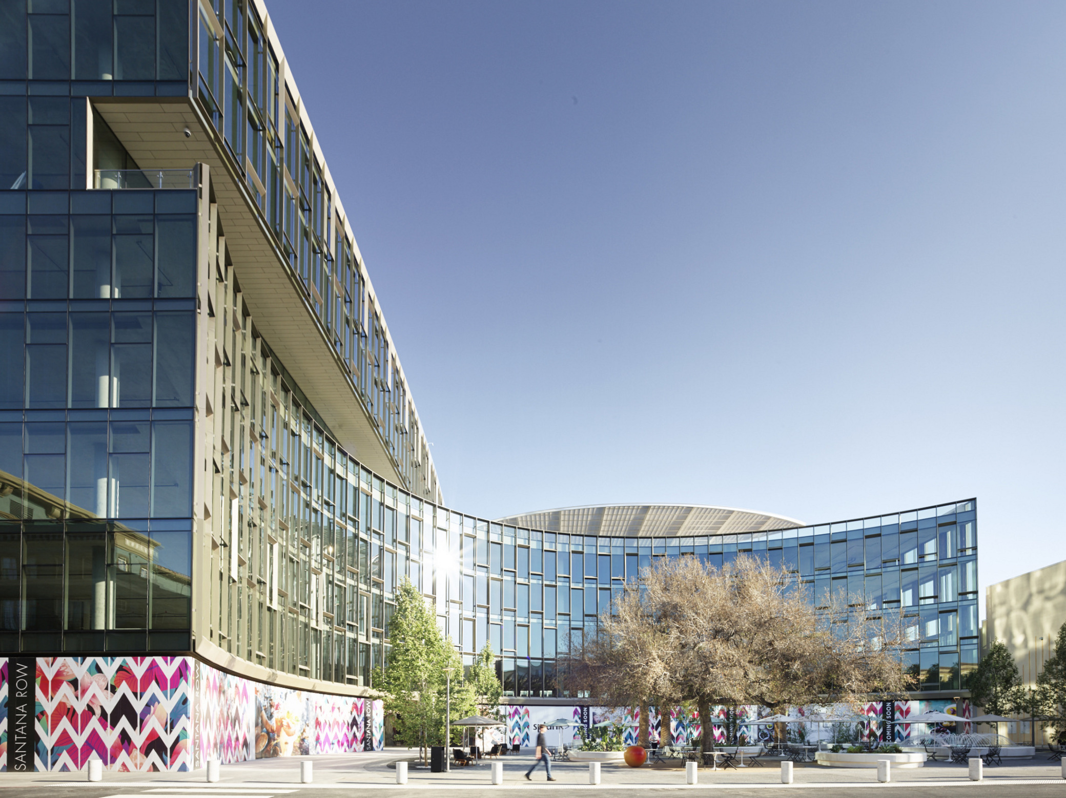
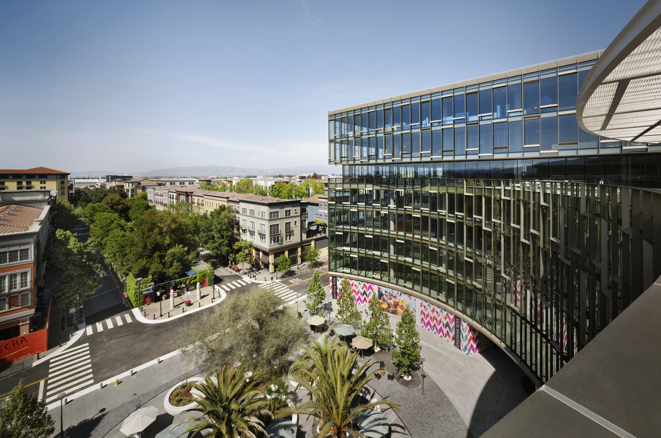
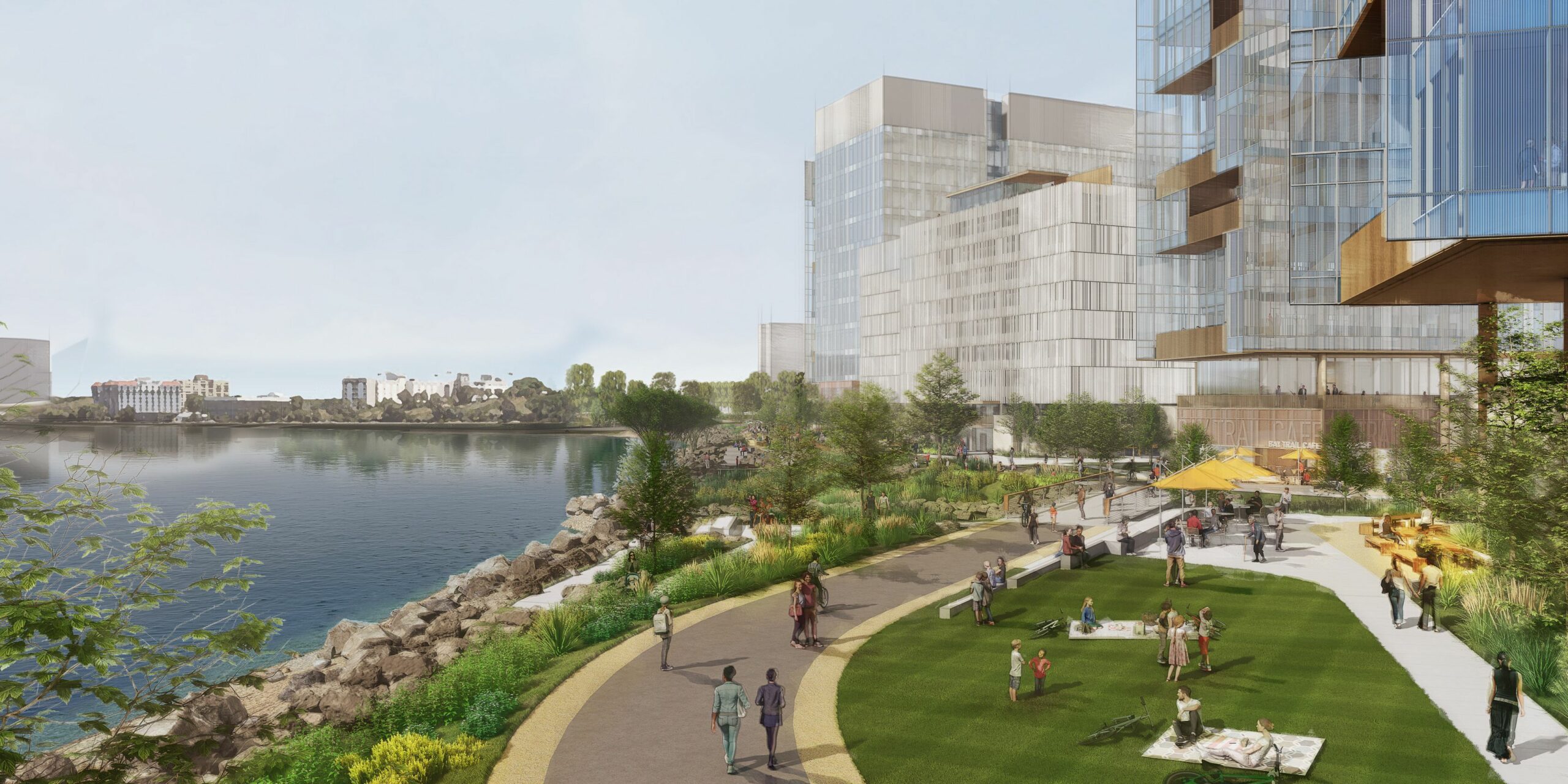
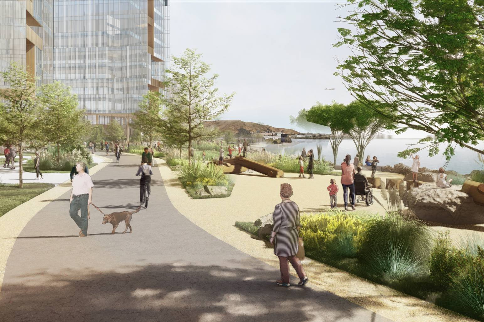
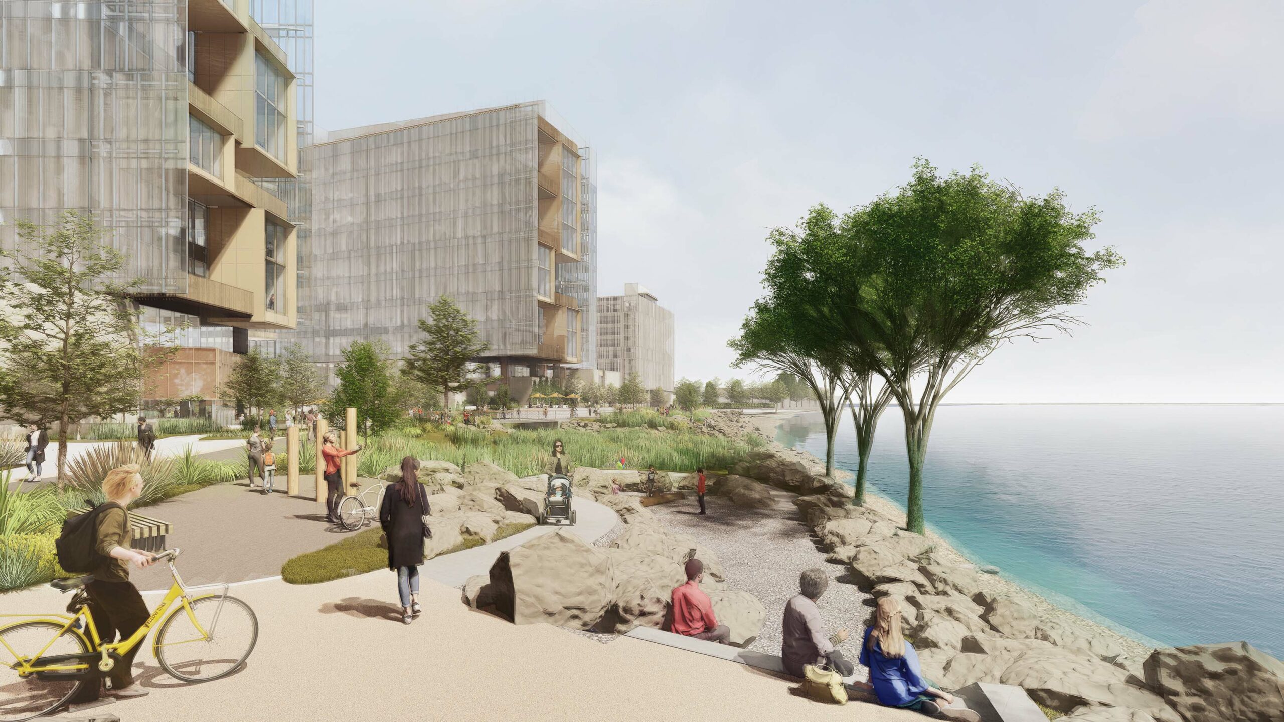
A connected public realm
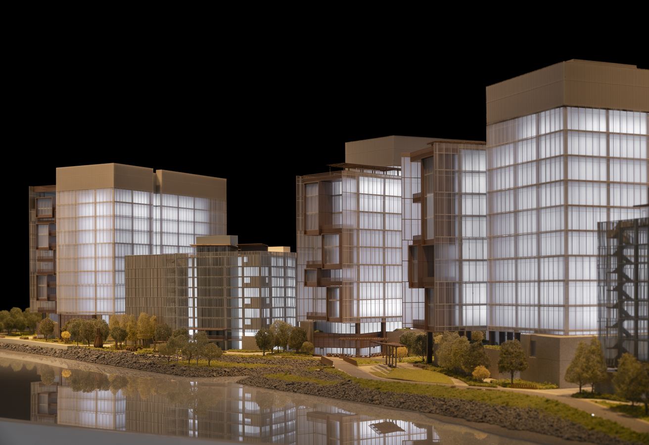
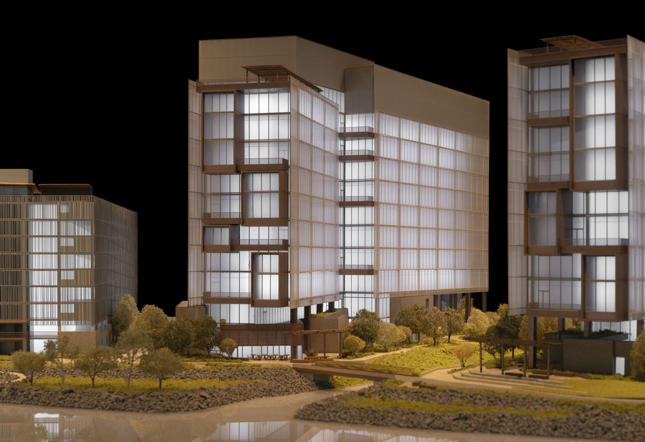
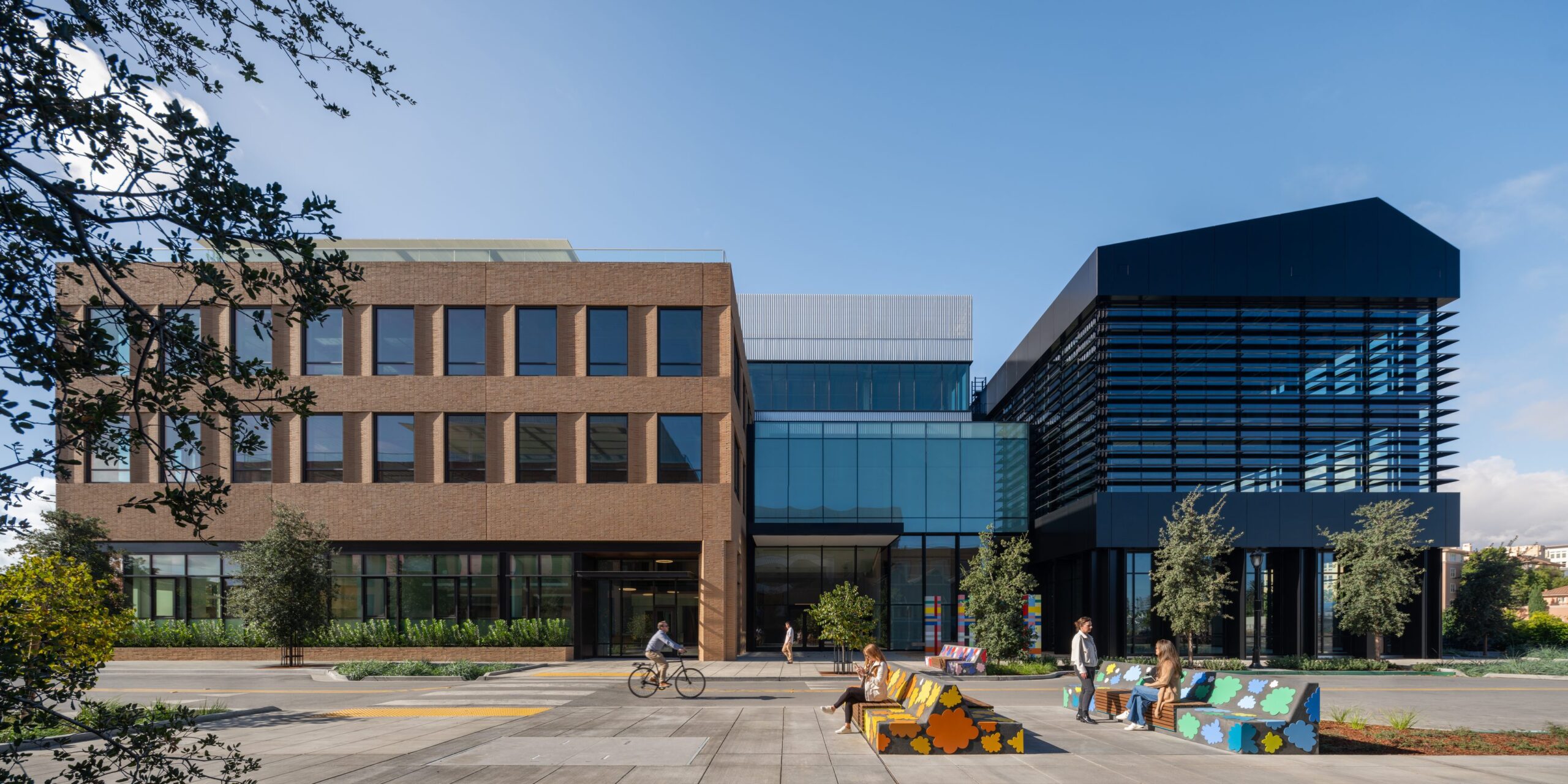
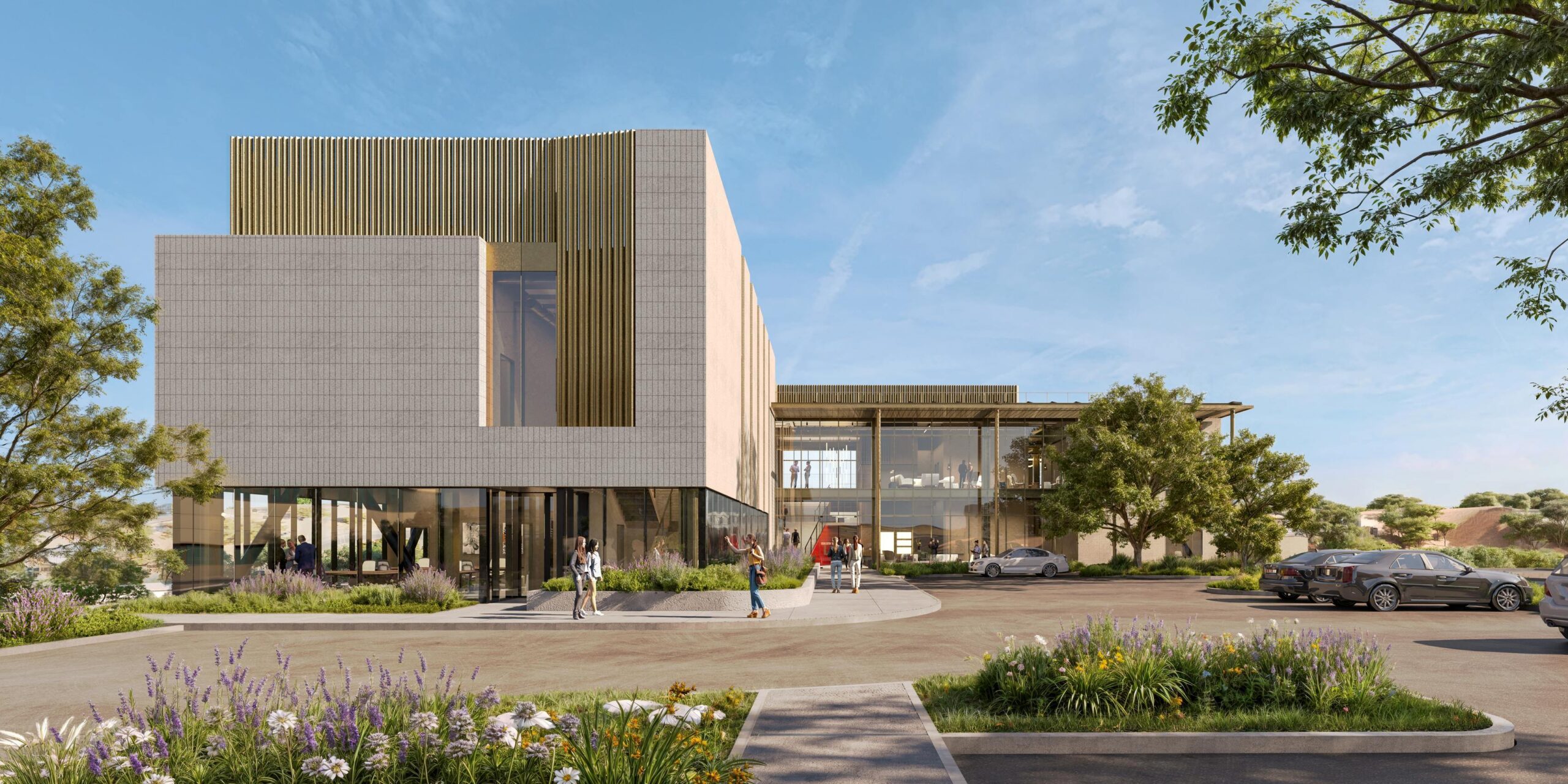
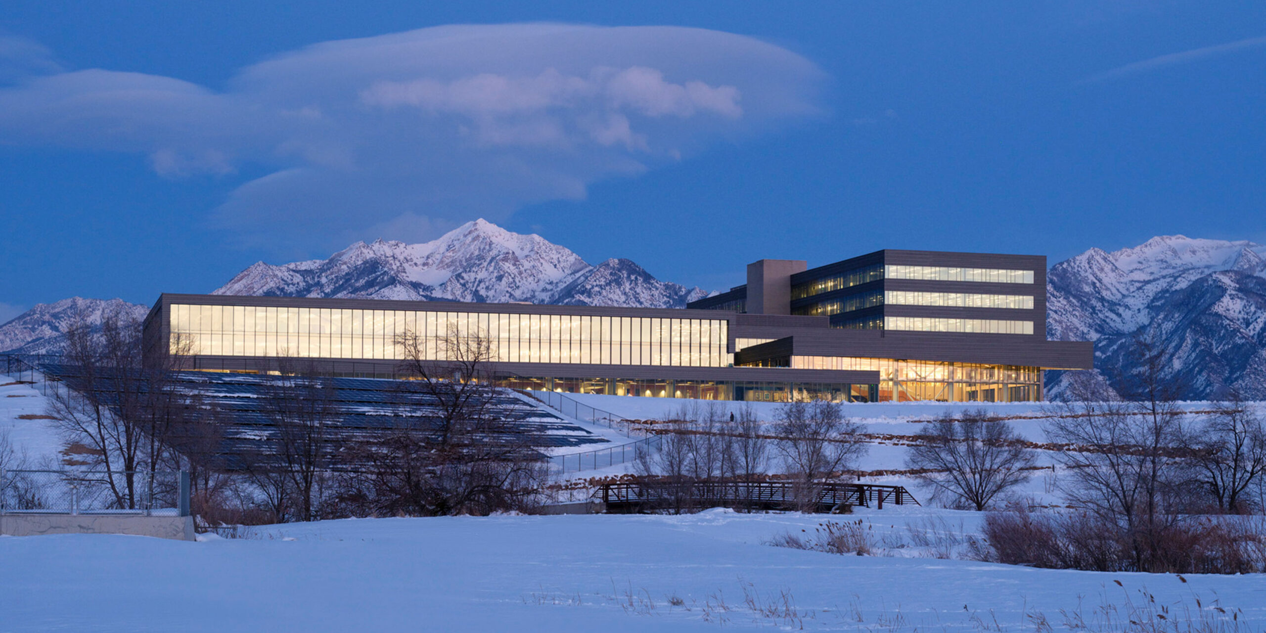
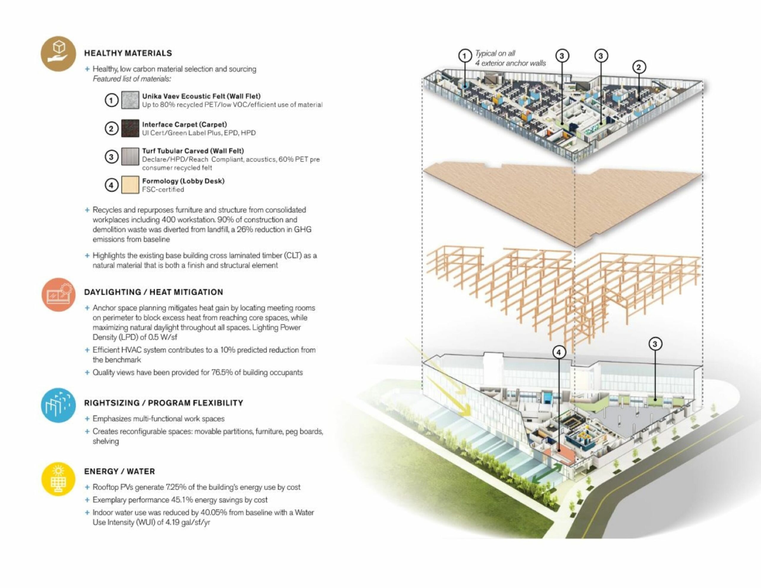
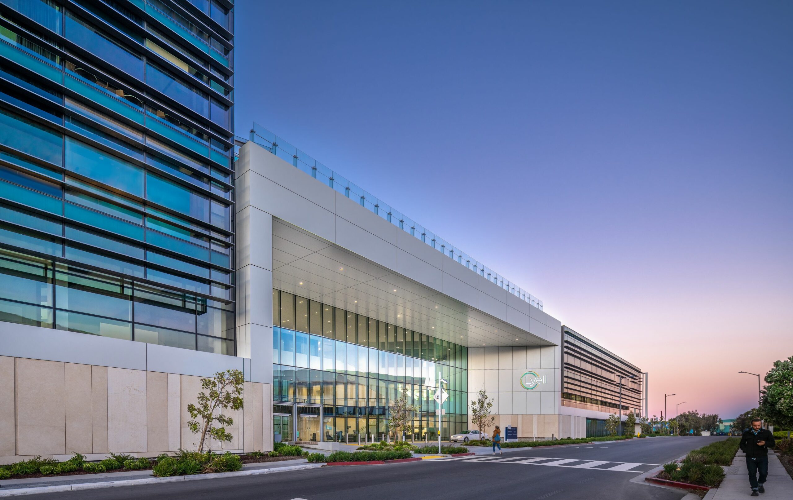
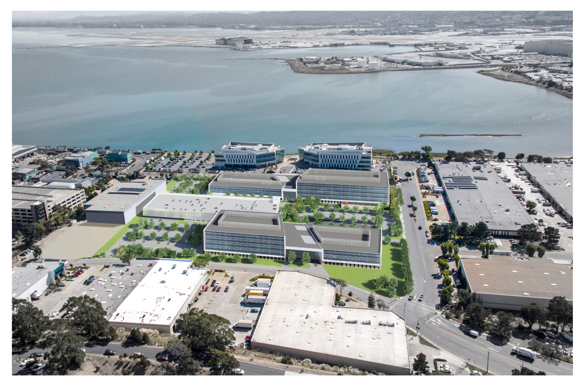
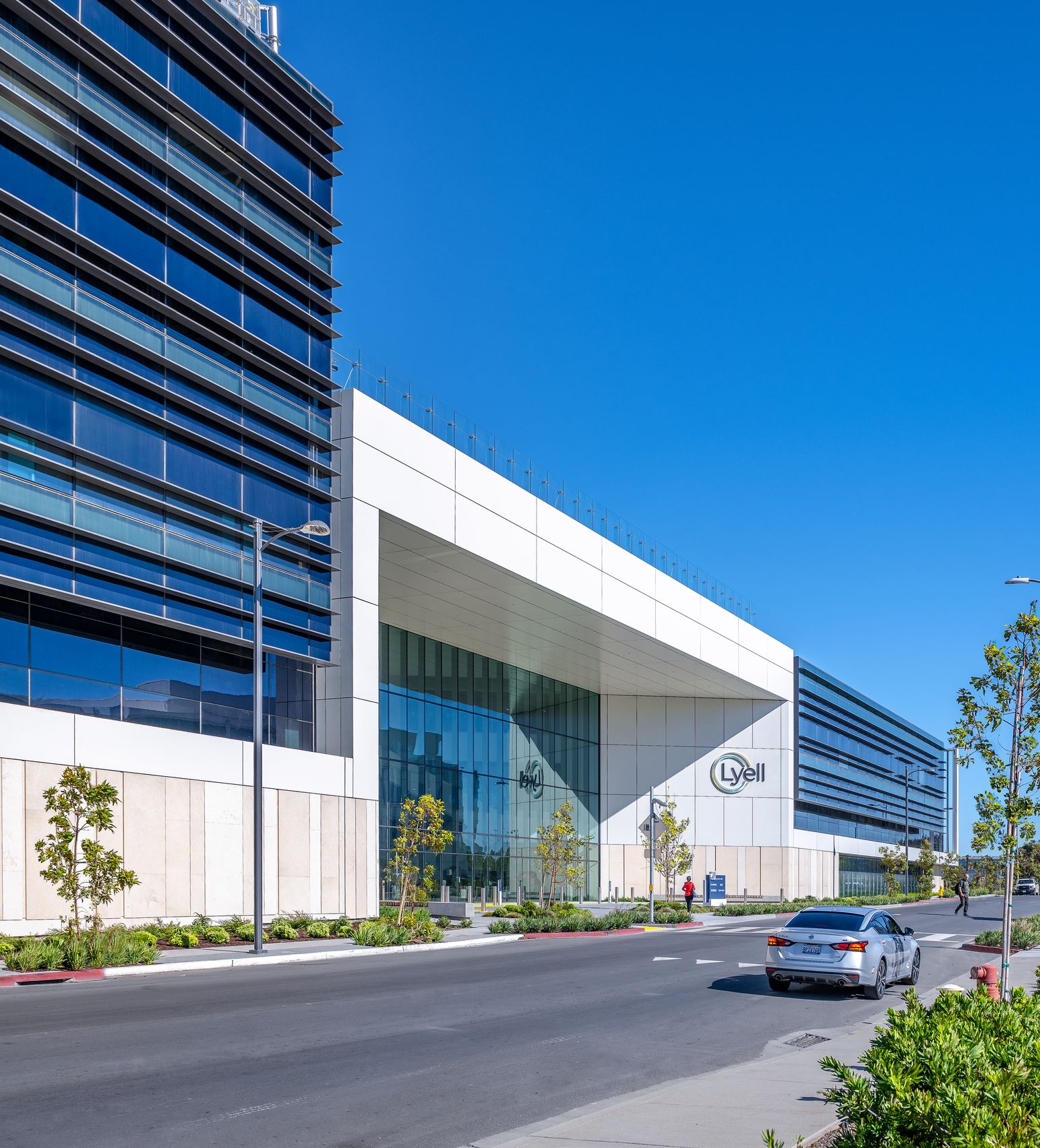
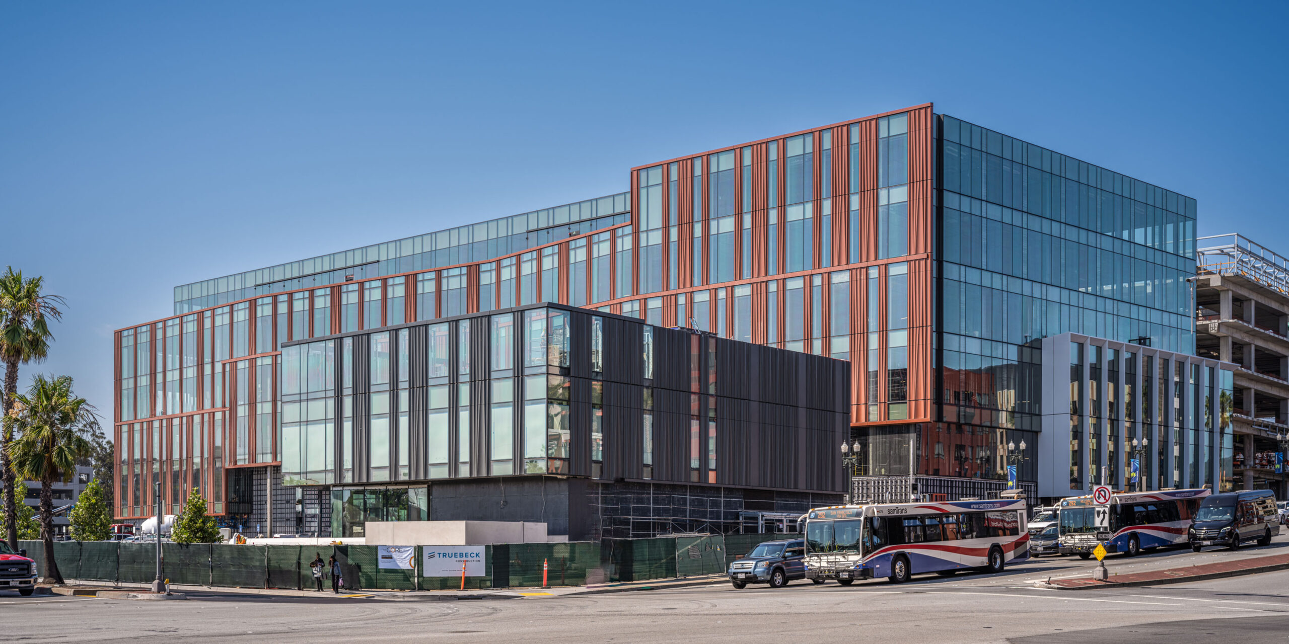
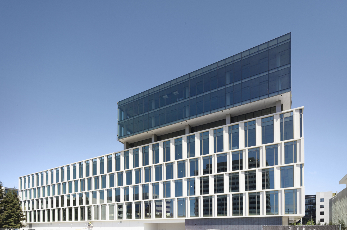
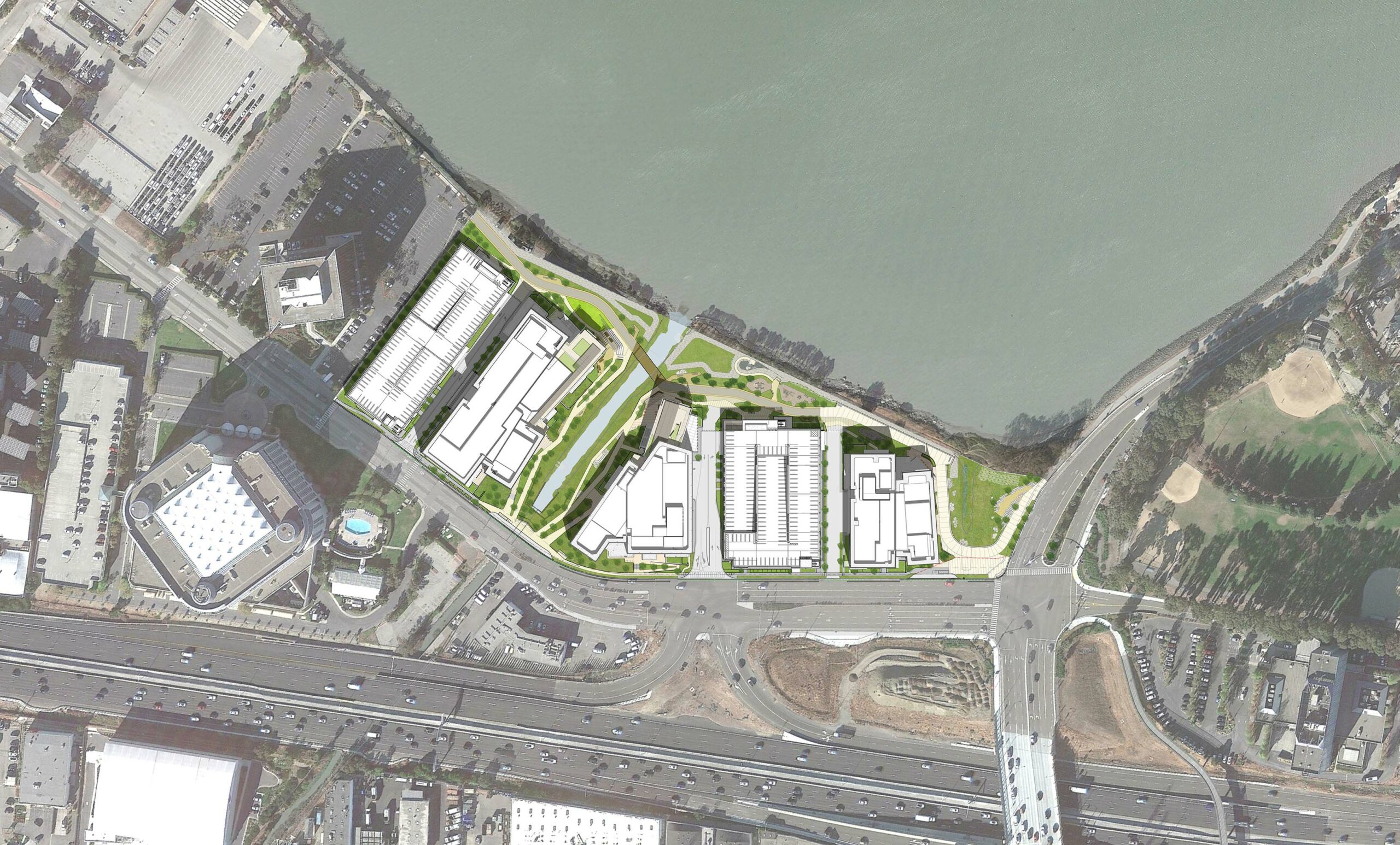
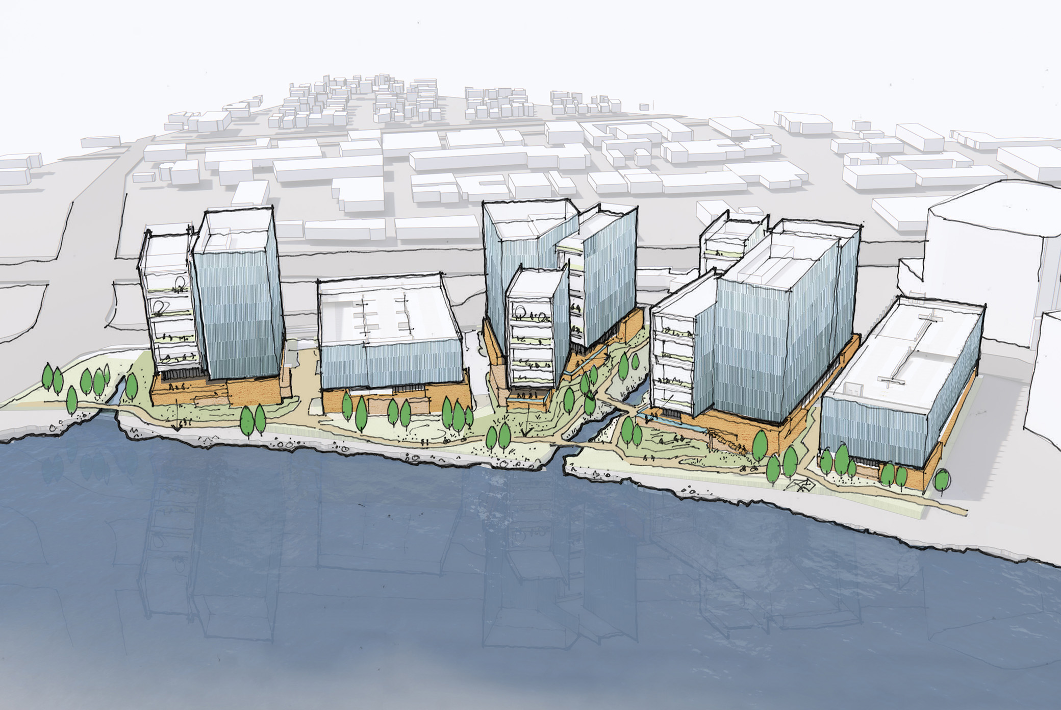
The buildings—three life science and office buildings and two parking structures totaling 1.42 million square feet—will pursue robust clean energy standards with primarily electric-powered buildings. The proposed project anticipates a 73% reduction in carbon emissions compared to typical, gas fueled lab buildings.
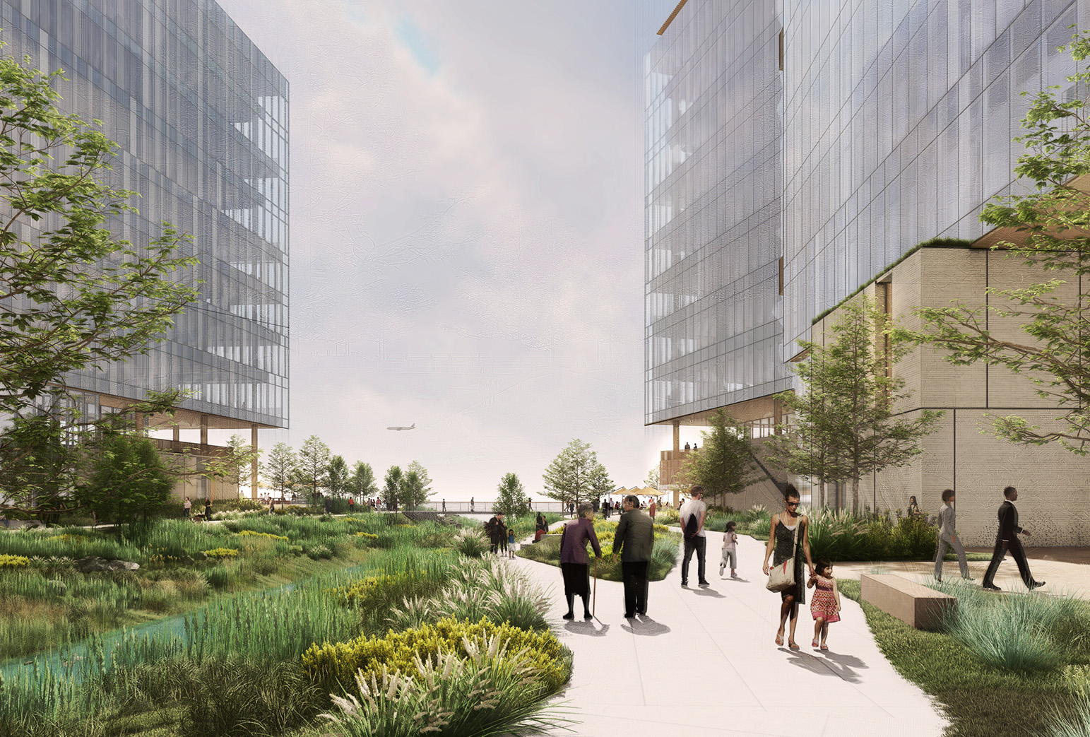
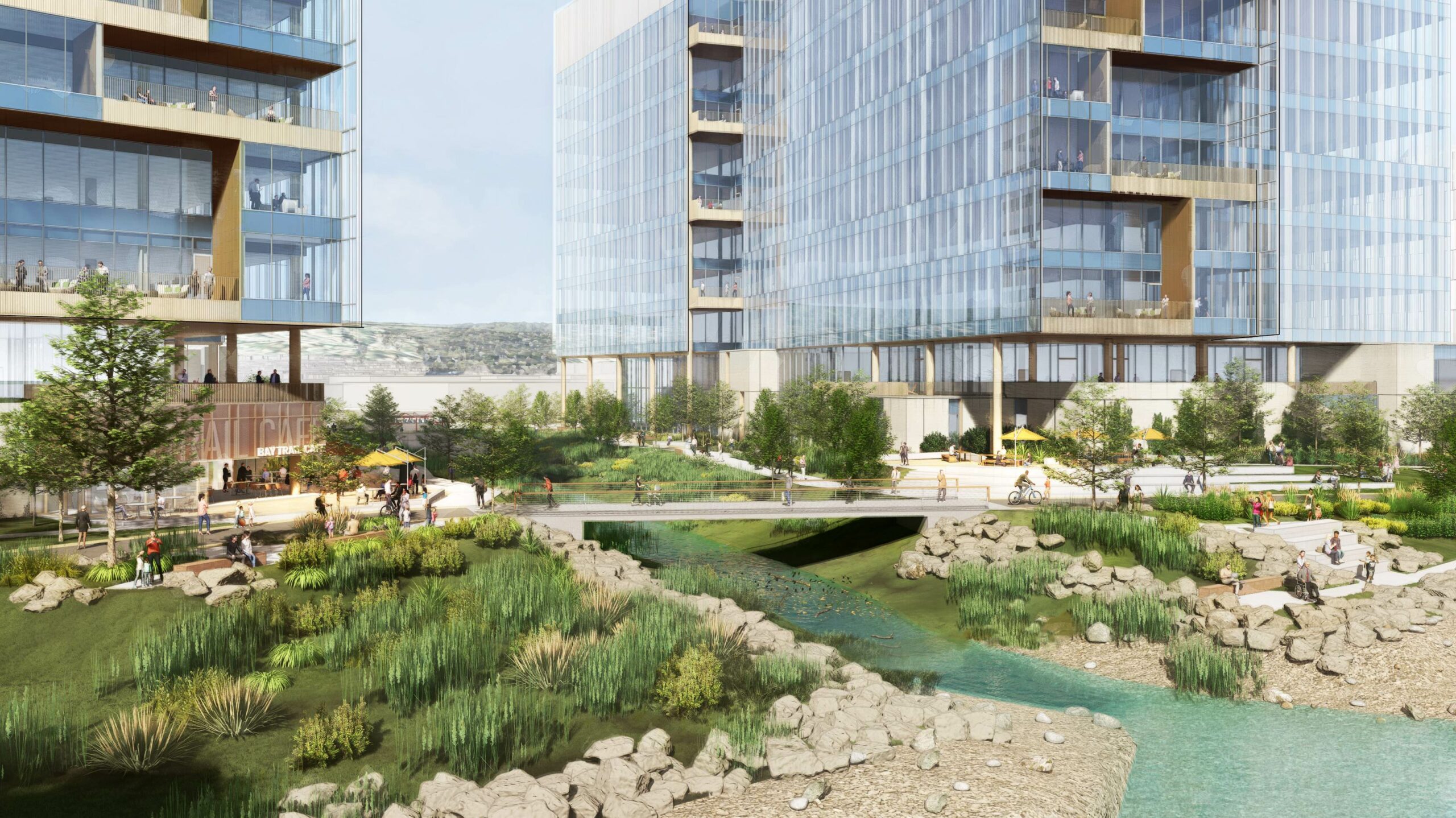
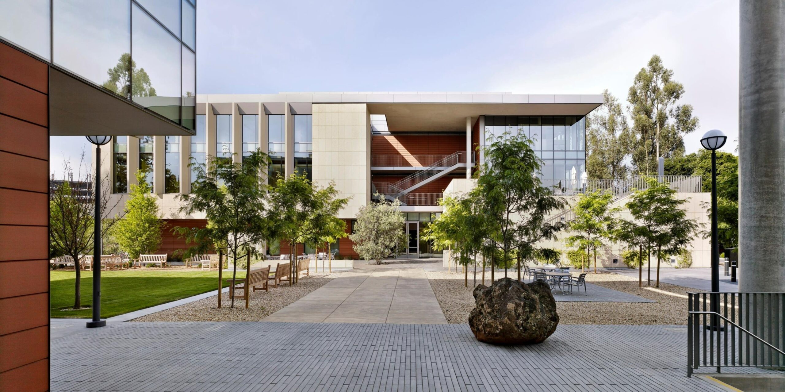
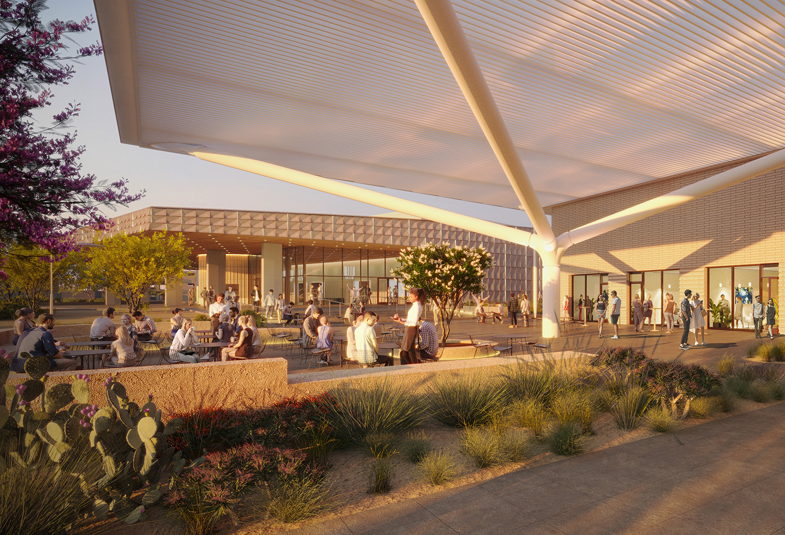
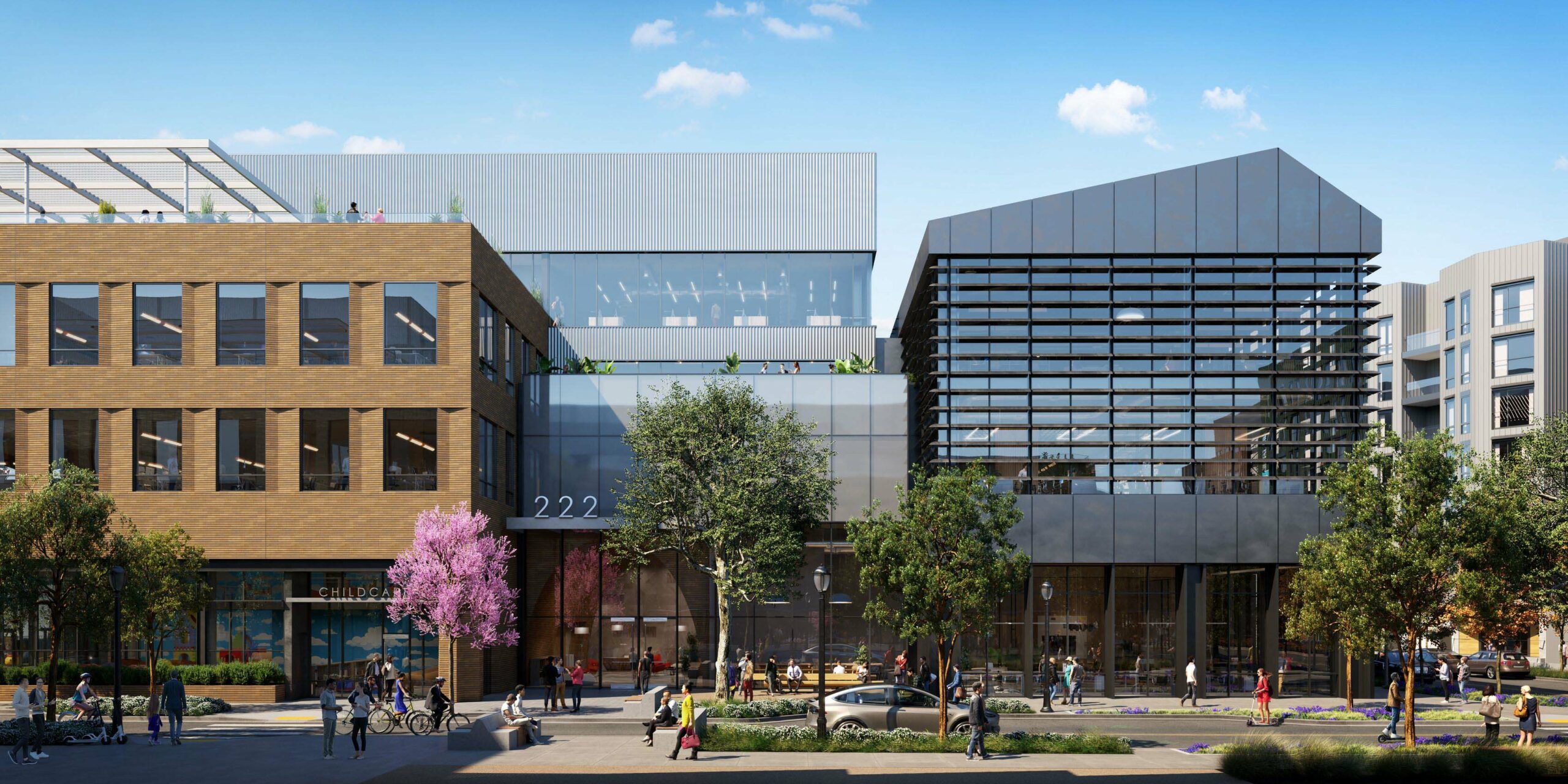
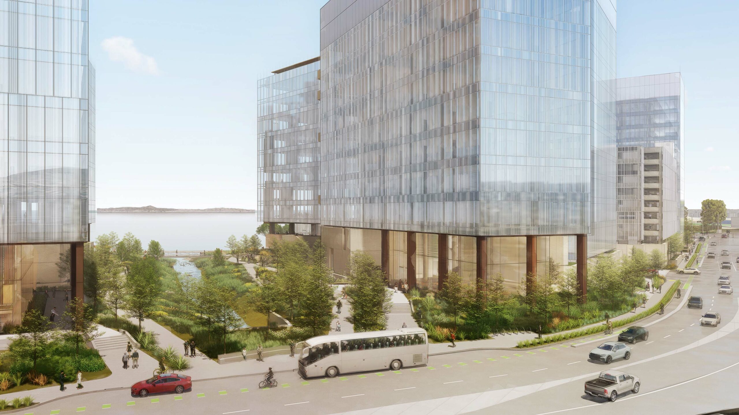
PX reimagines the Burlingame Bayfront as a thriving, resilient public realm featuring local retail, ample outdoor gathering areas, a restored creek and wetland, and new pedestrian and bicycle infrastructure. A network of landscaped pathways and open spaces will knit the site together, while abundant open and green spaces will cater to a variety of interests.
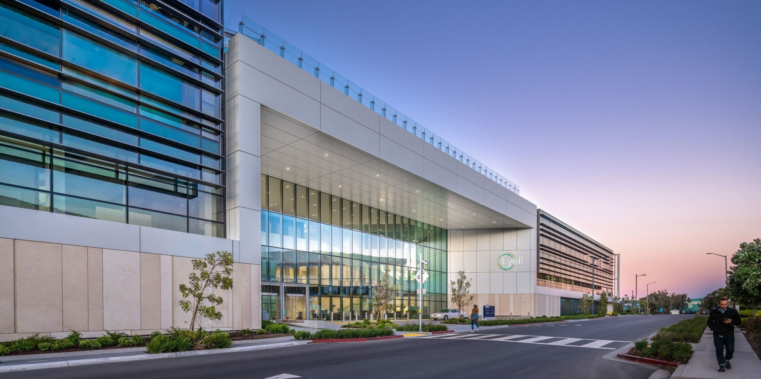
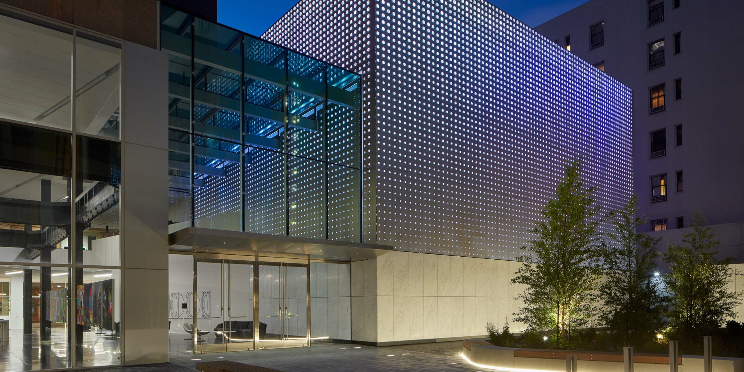
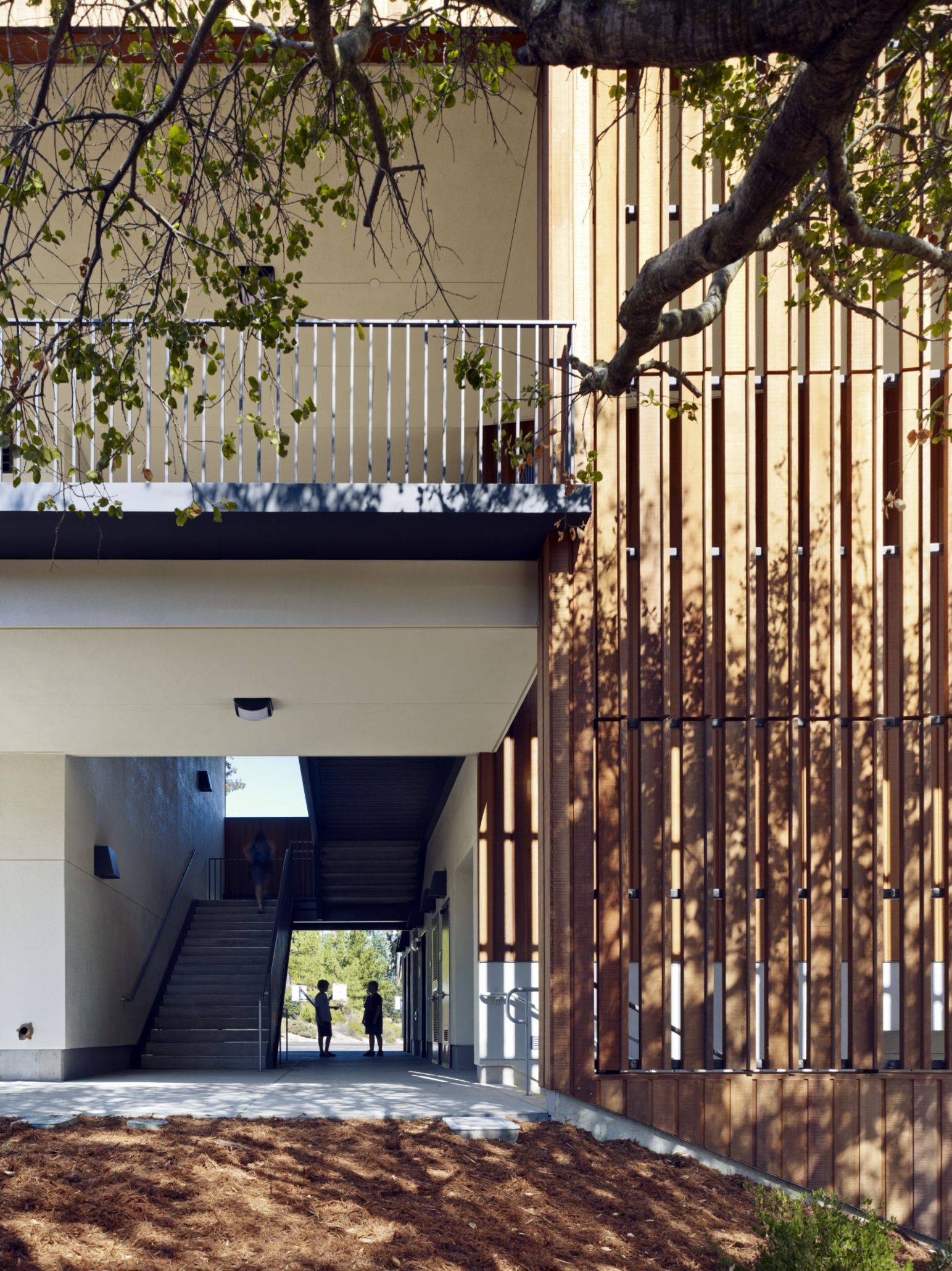
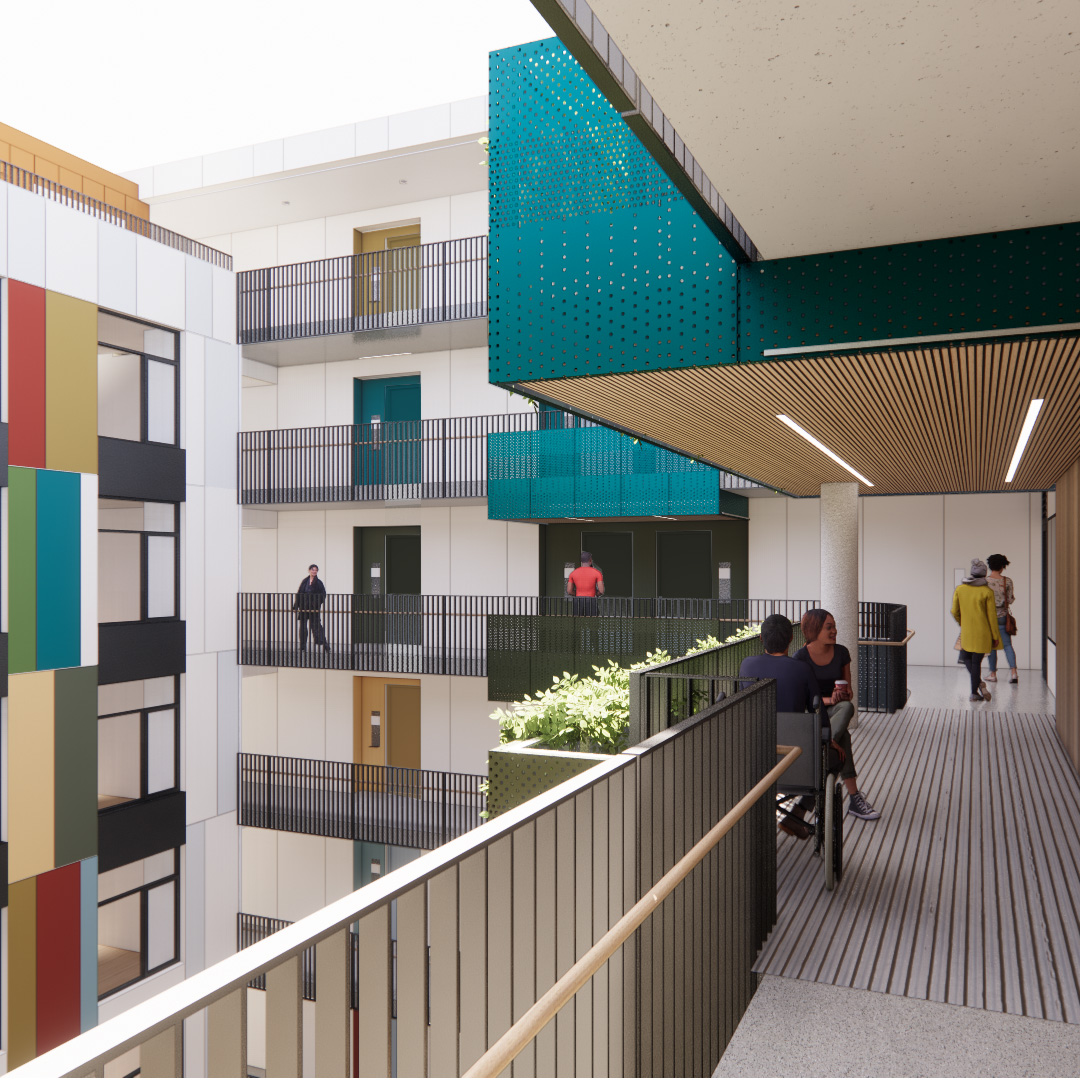
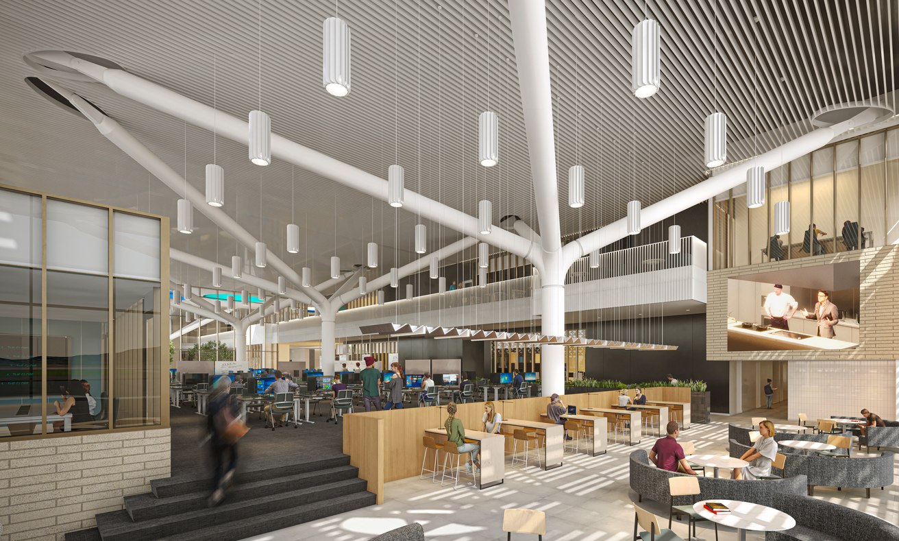
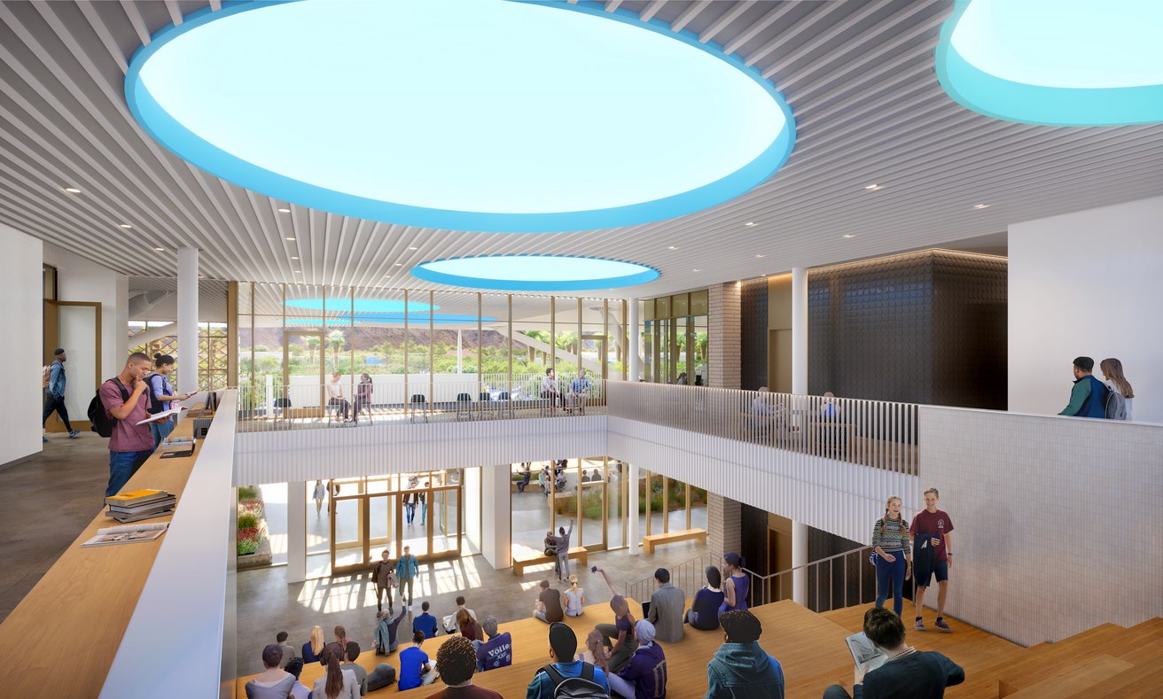
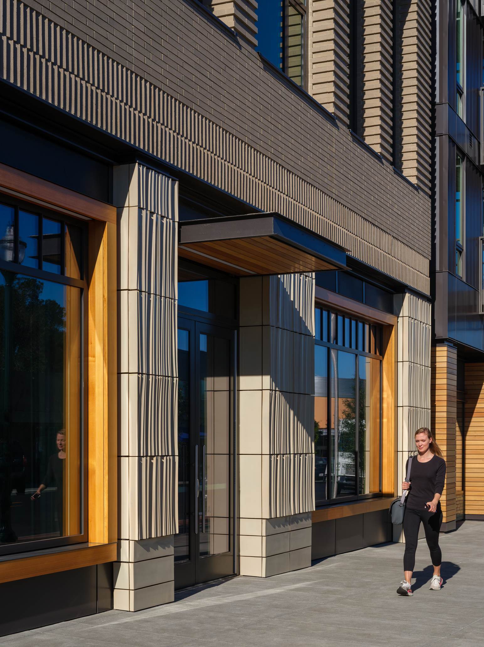
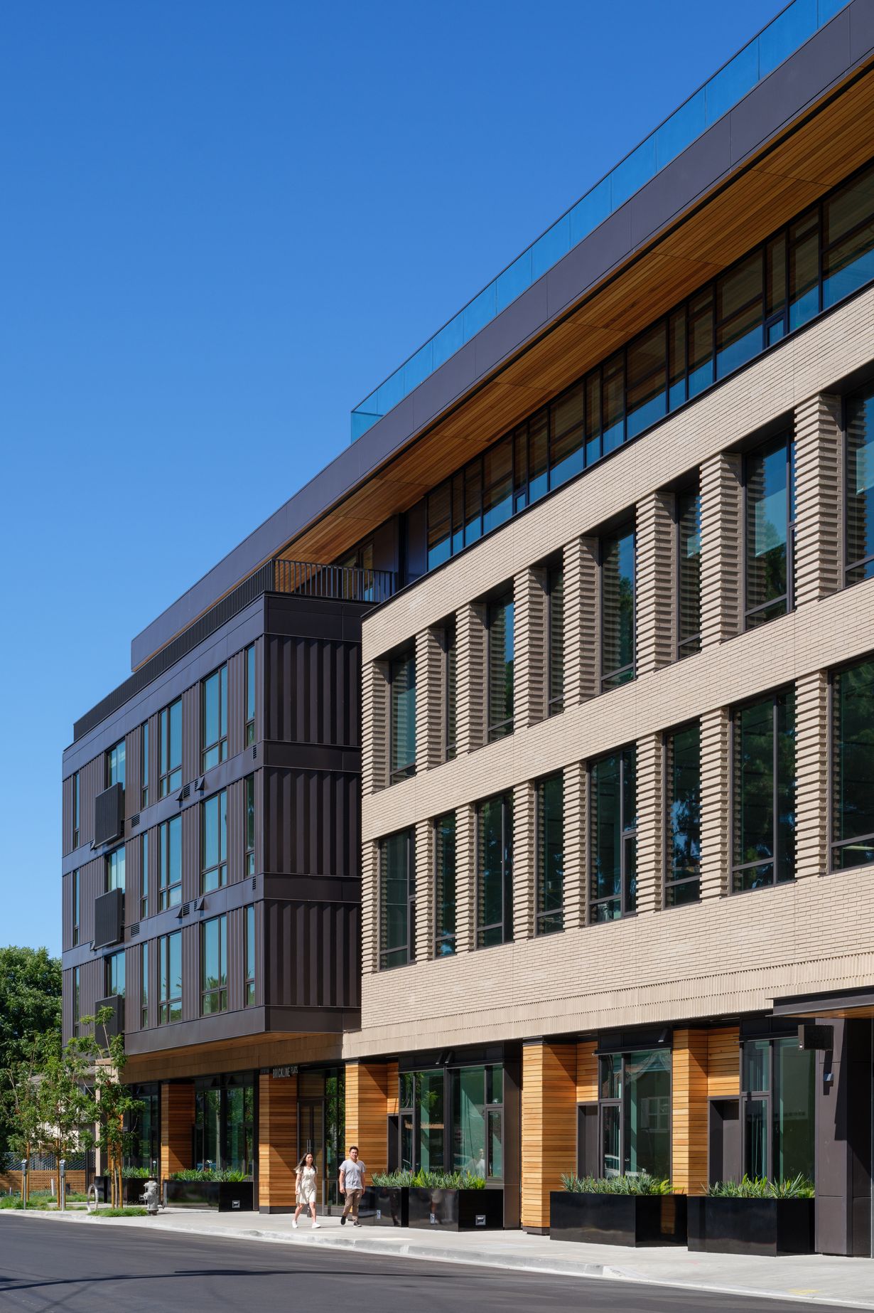
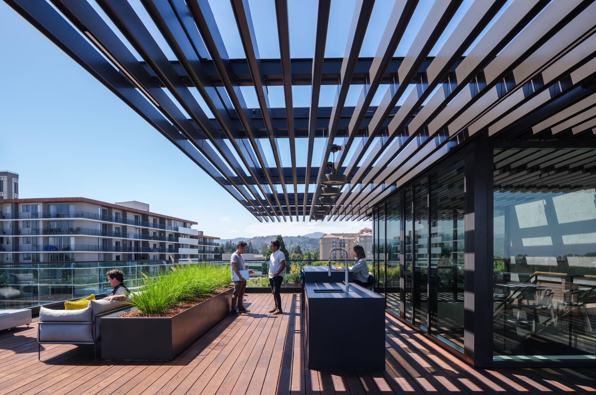
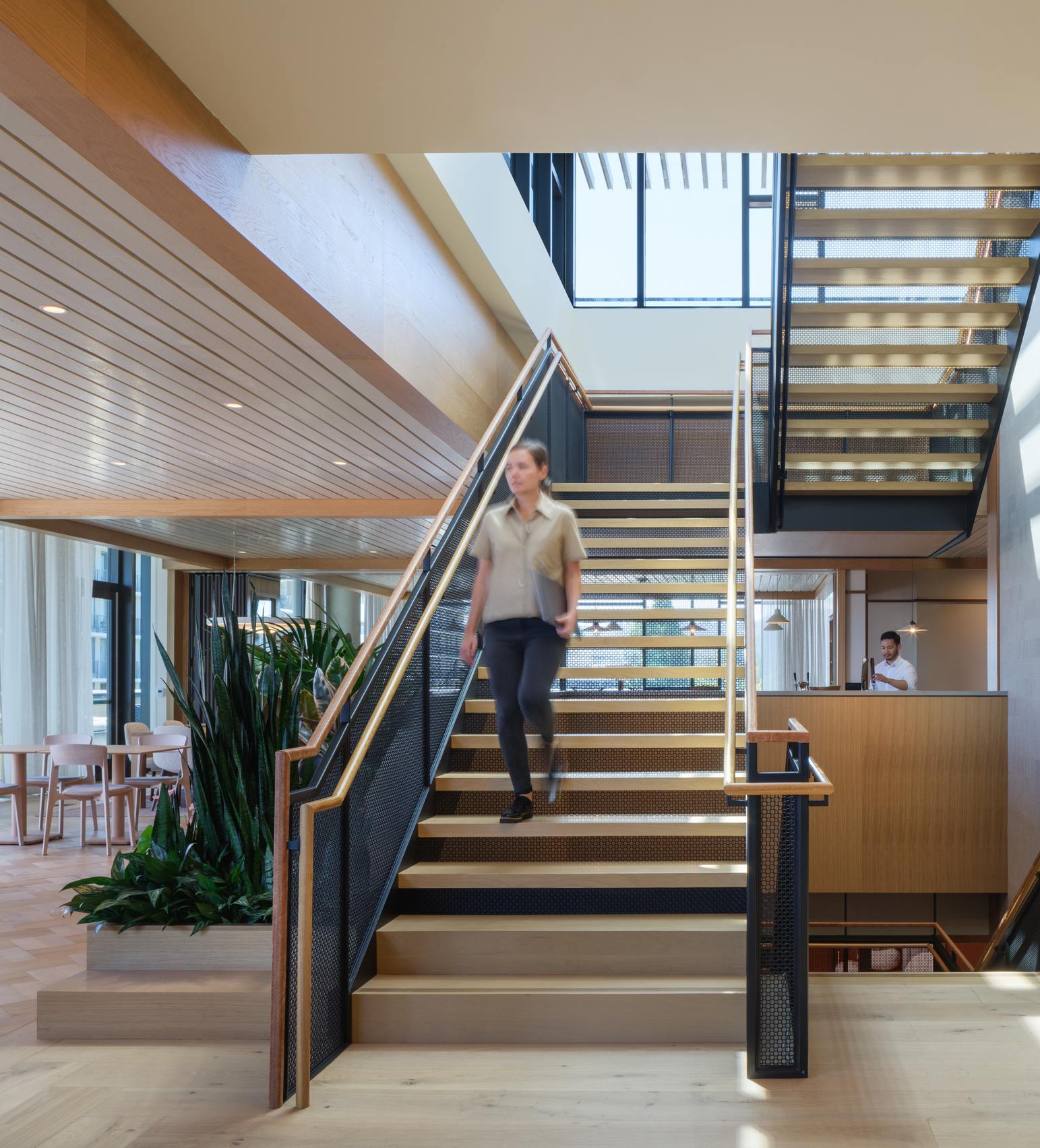
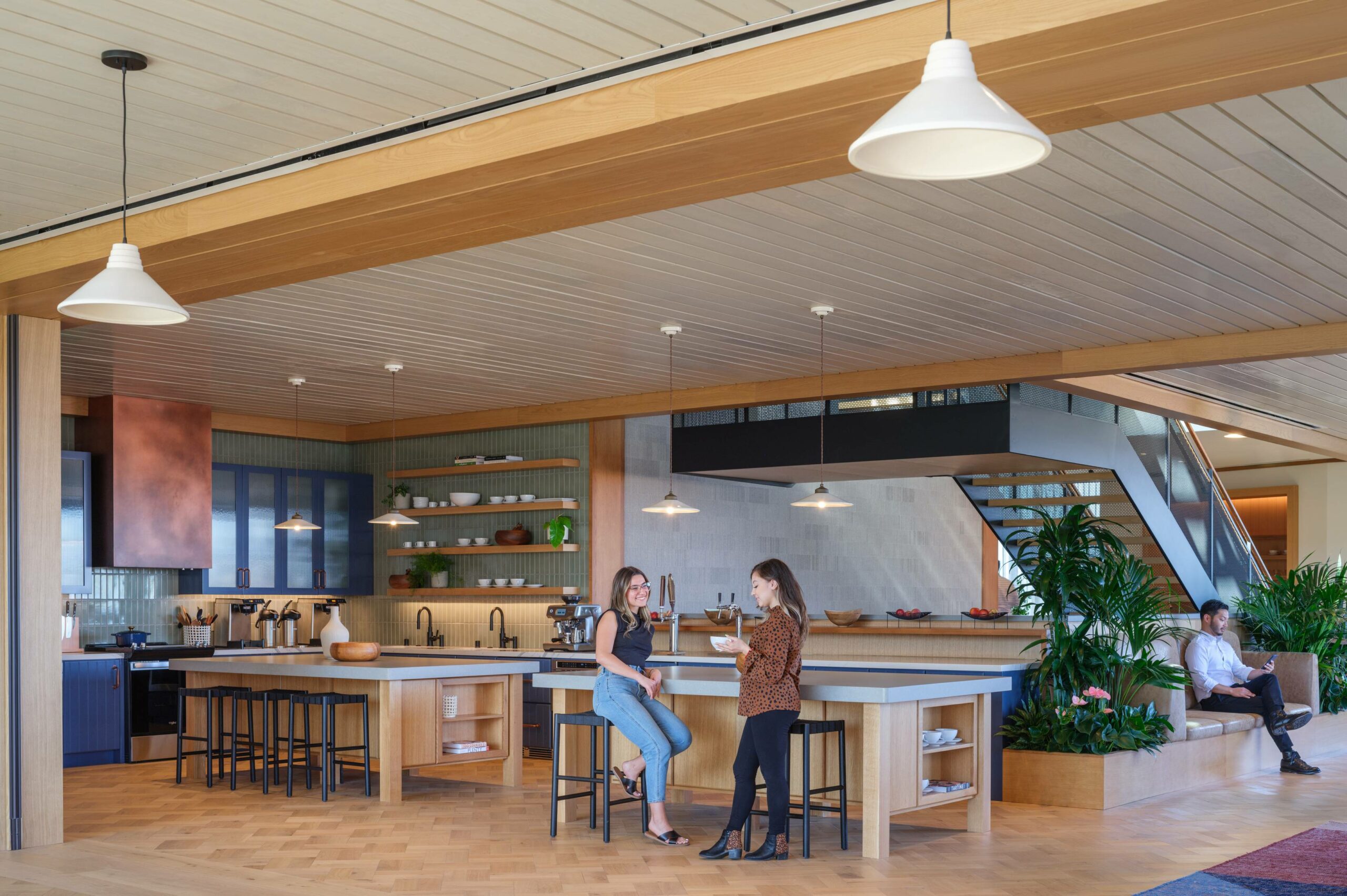
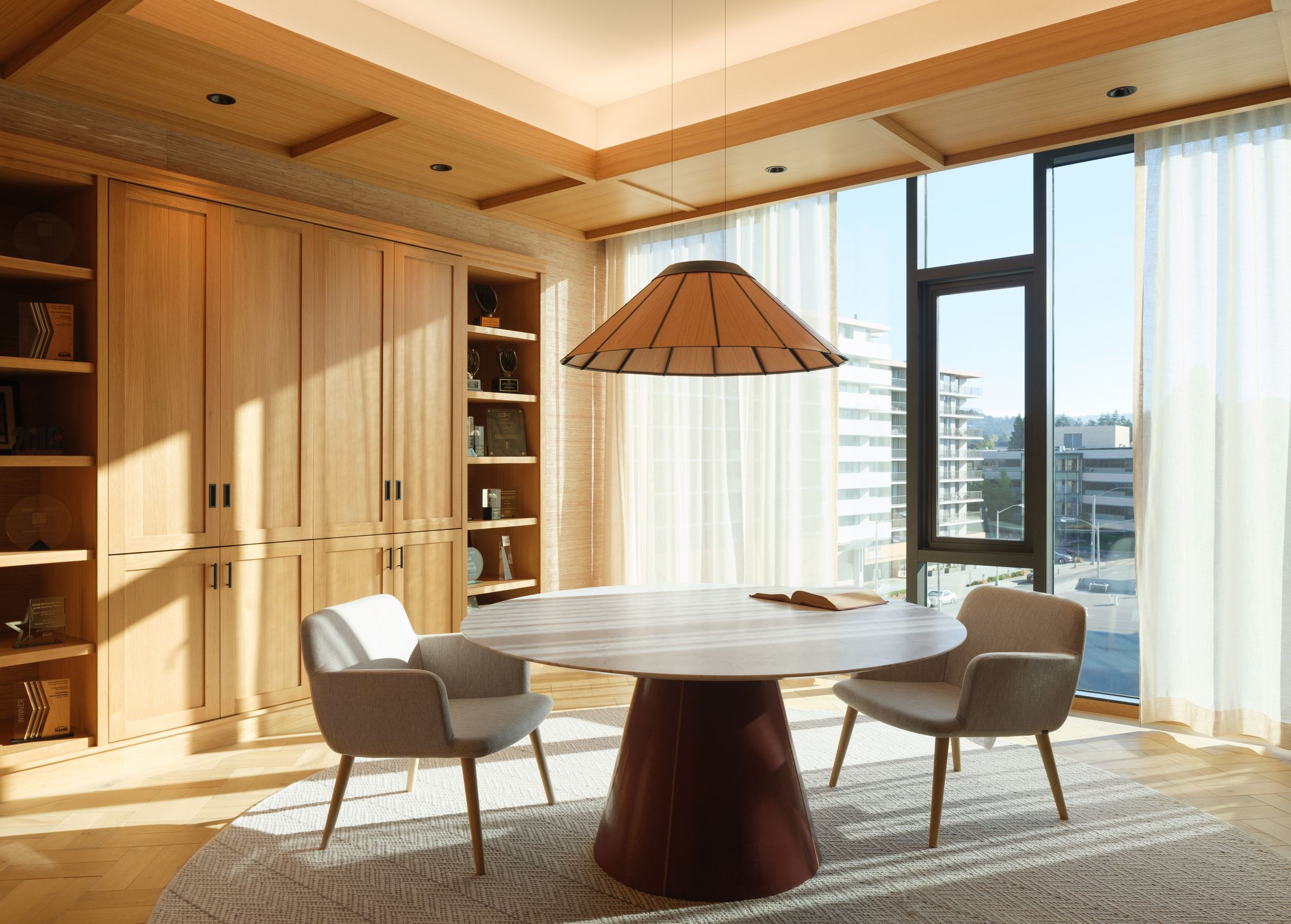
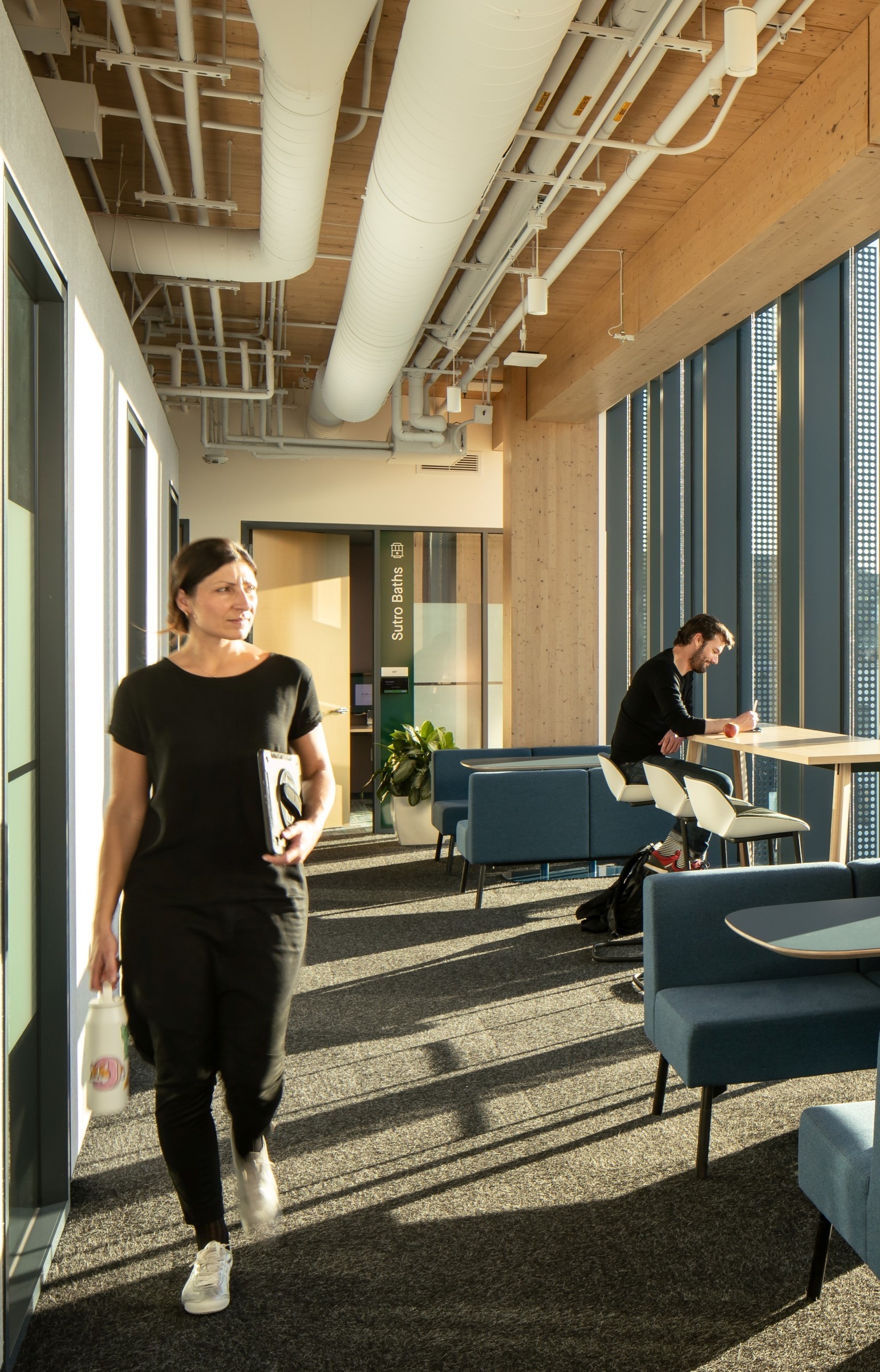
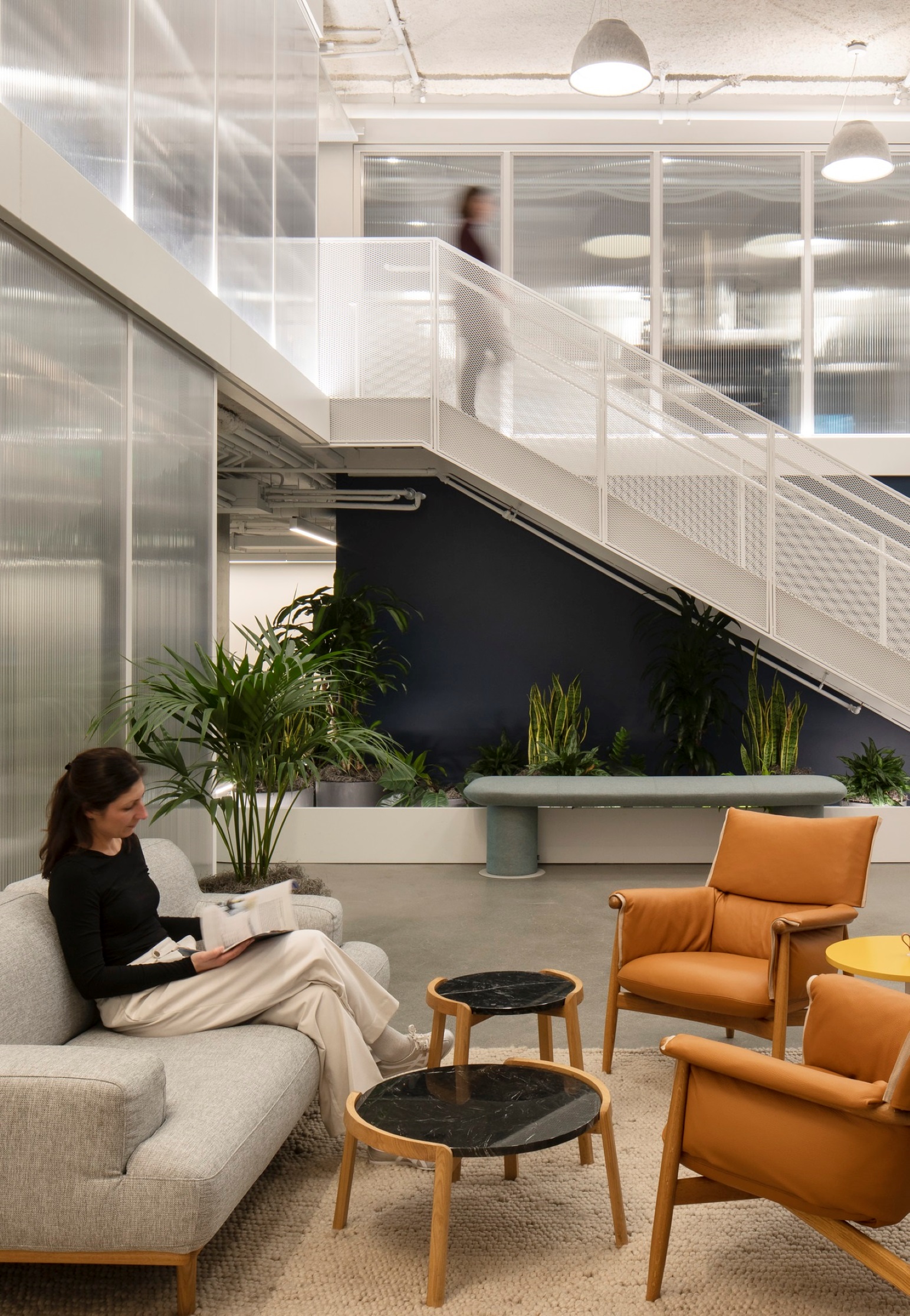
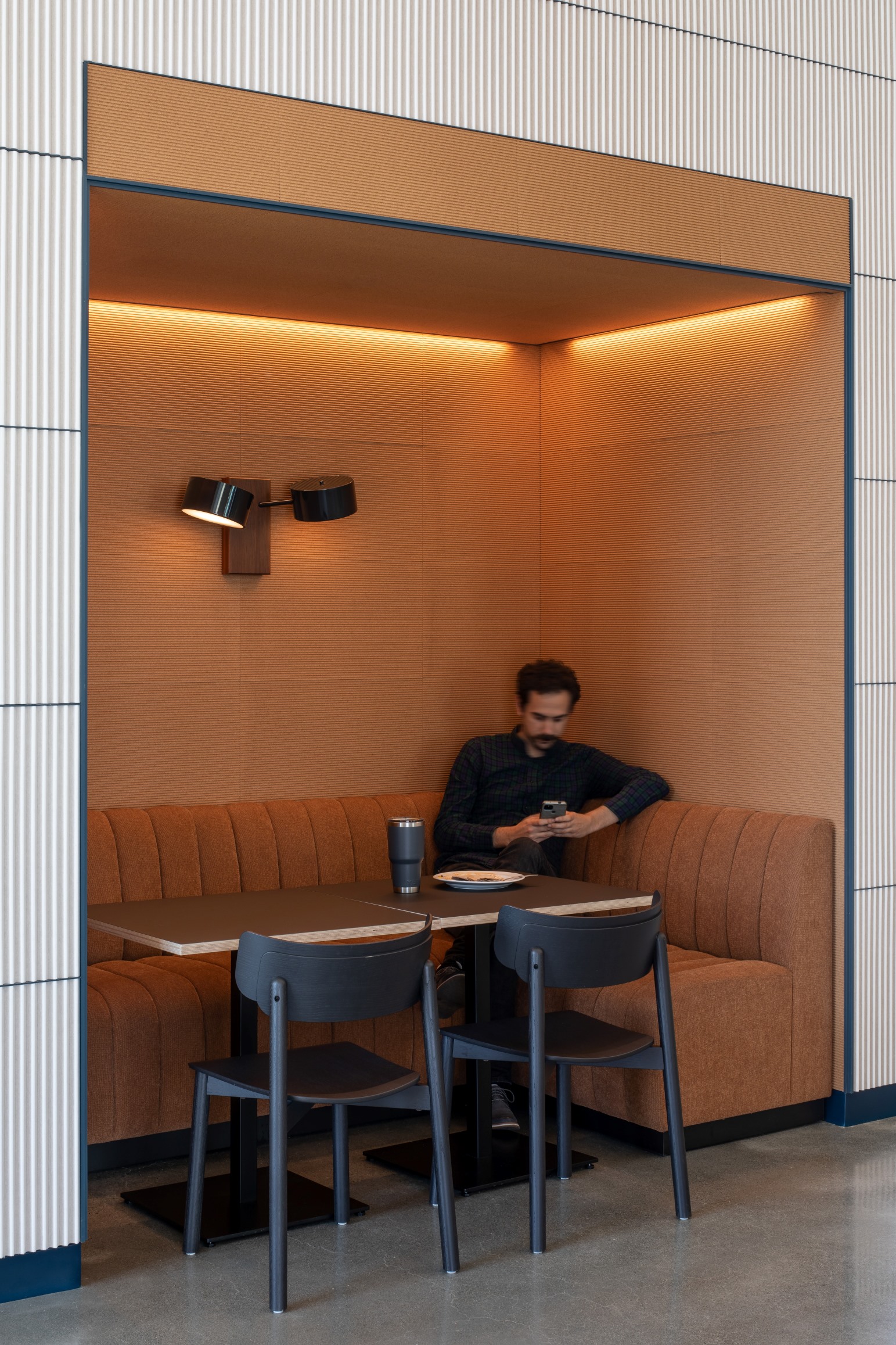
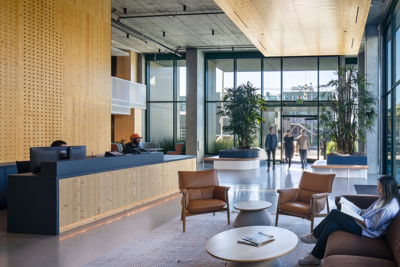
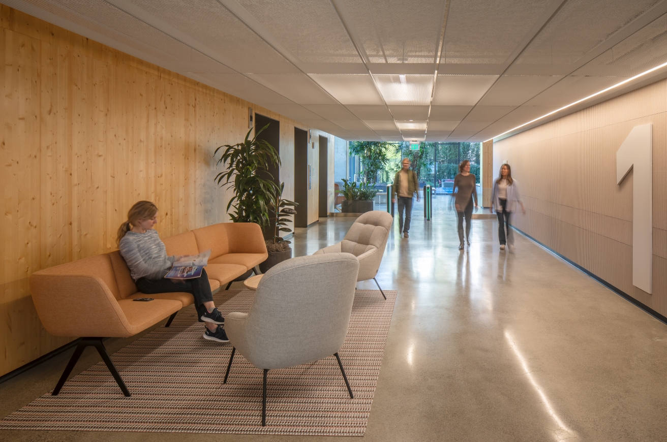
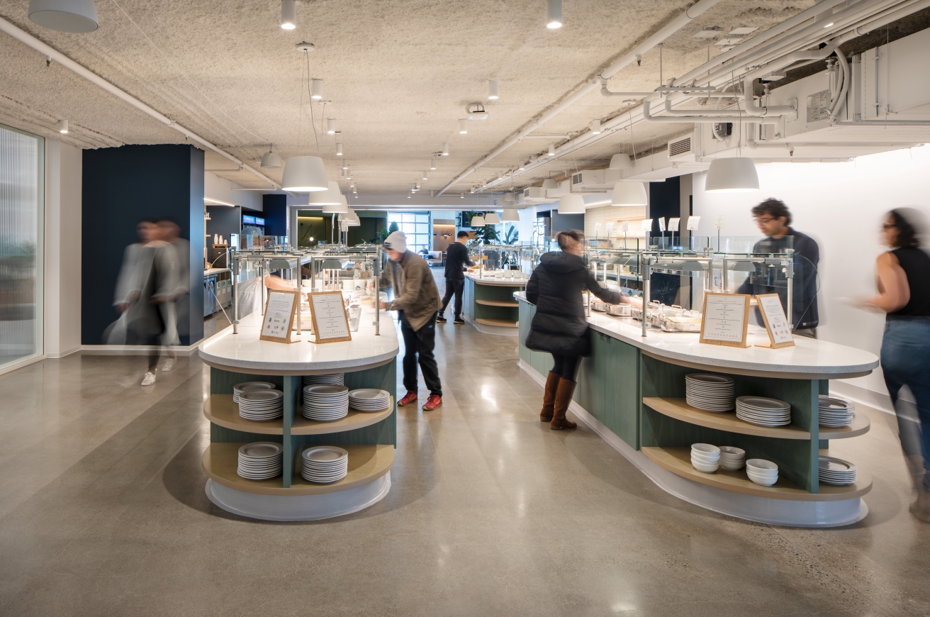
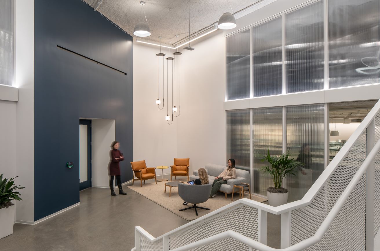
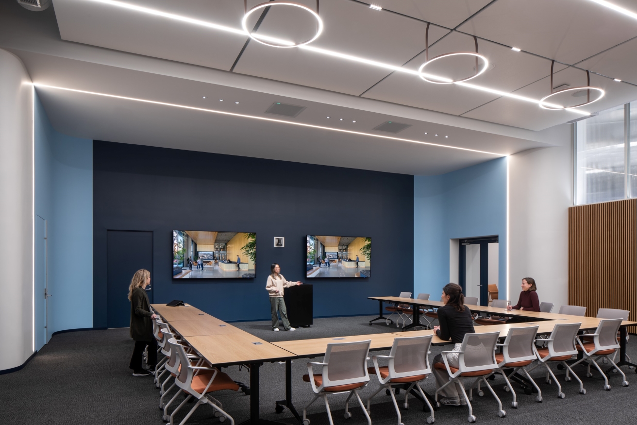
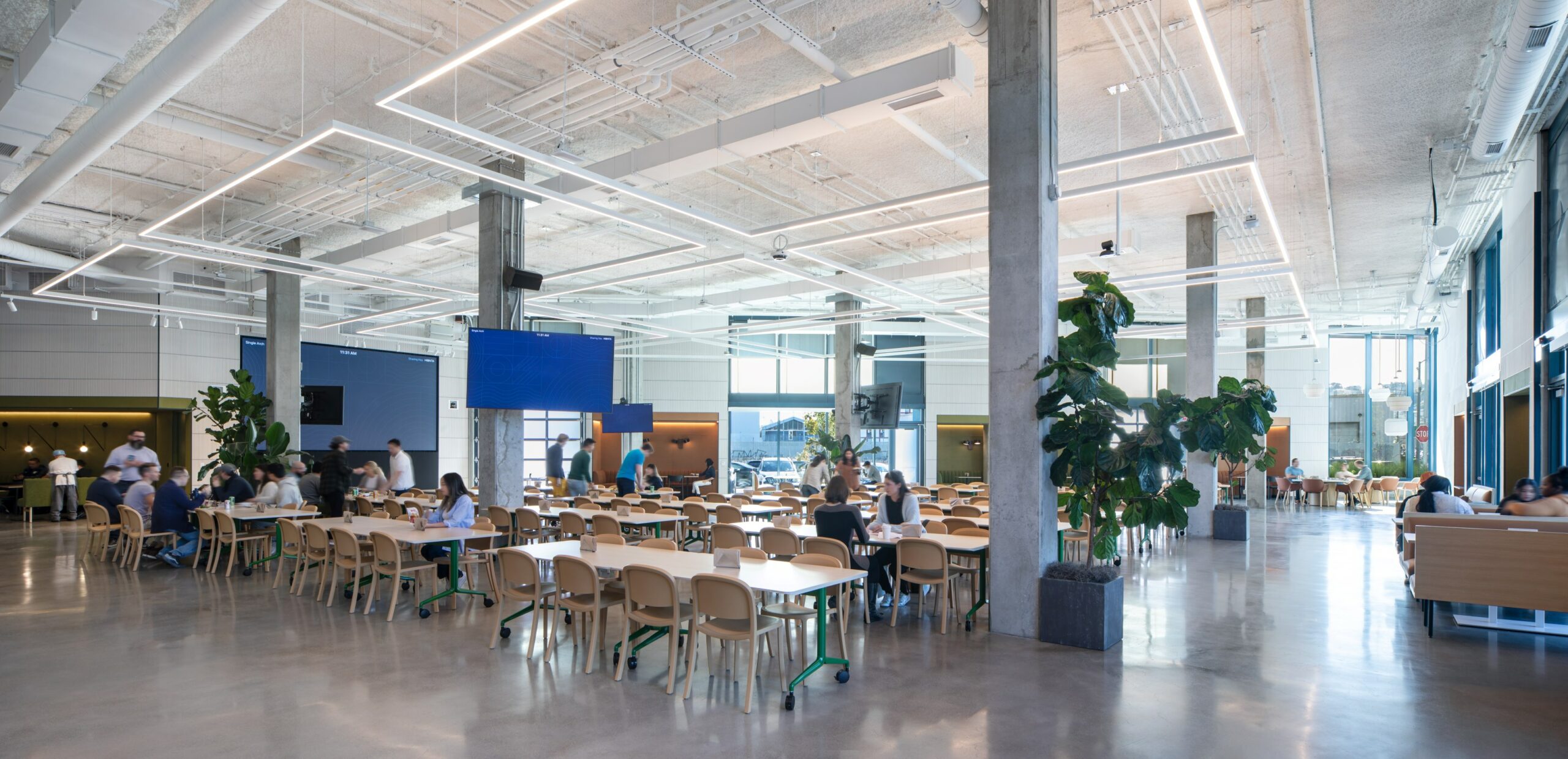
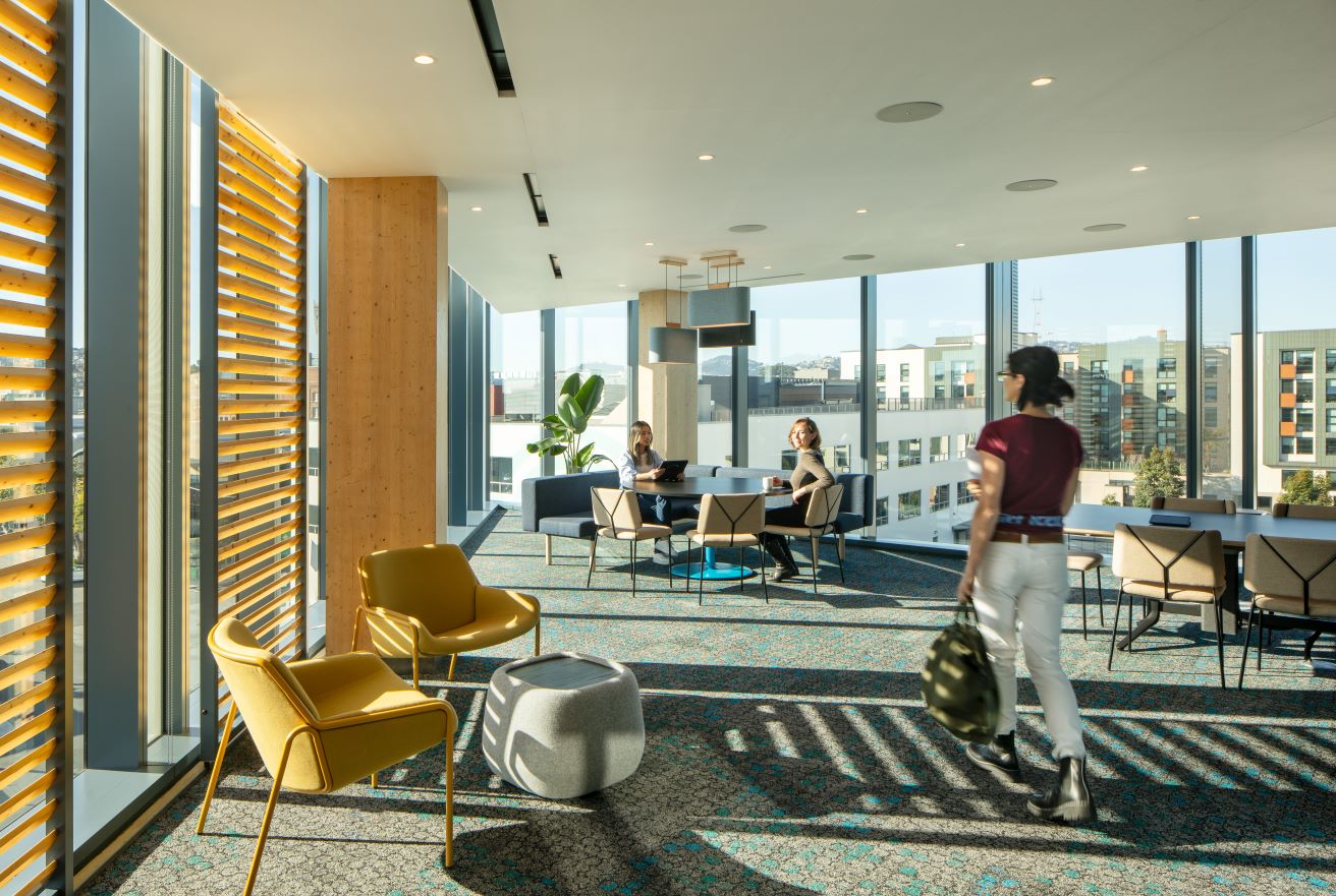
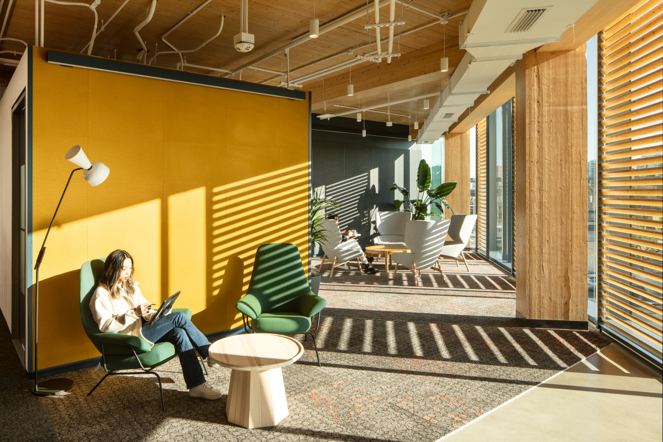
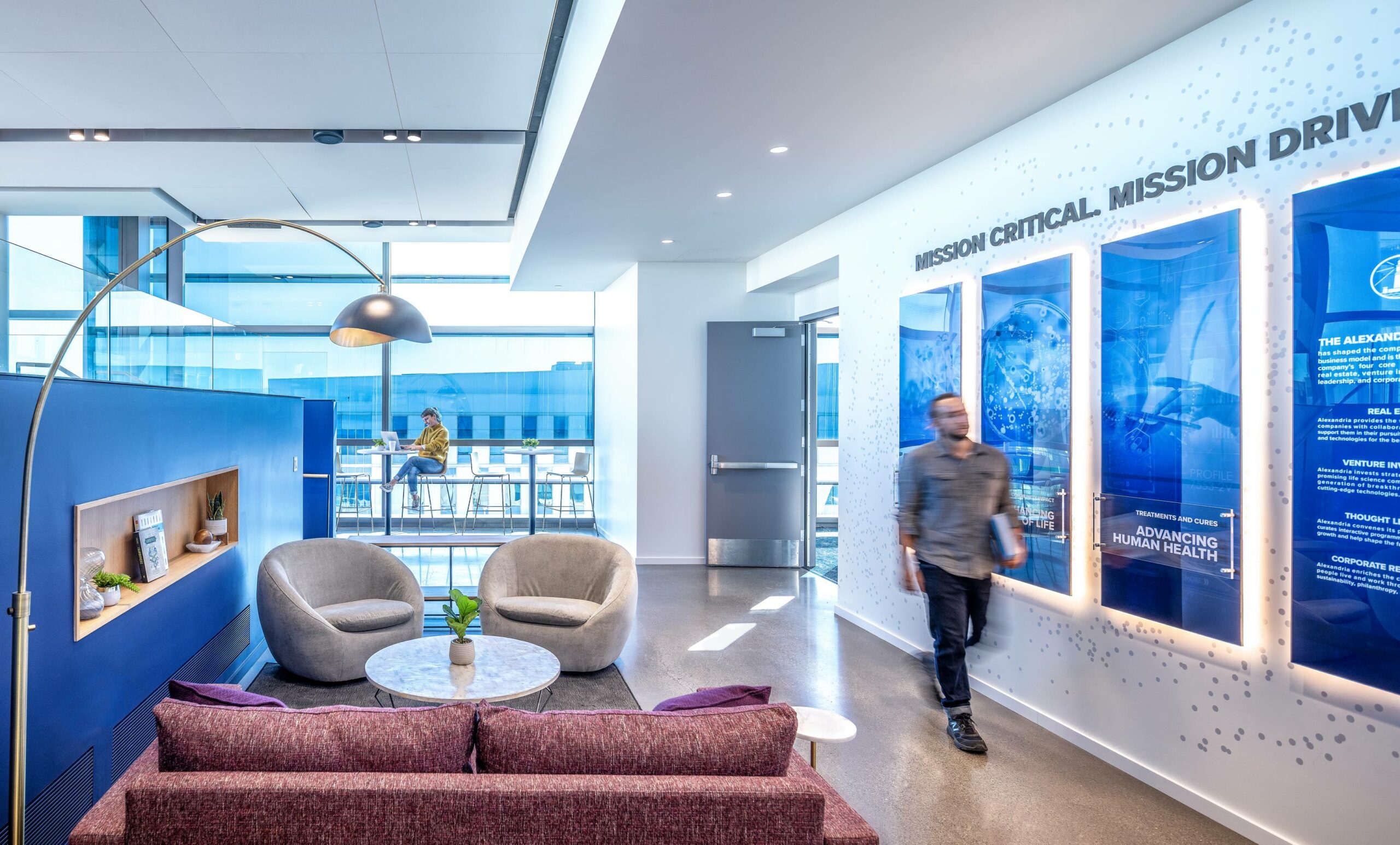
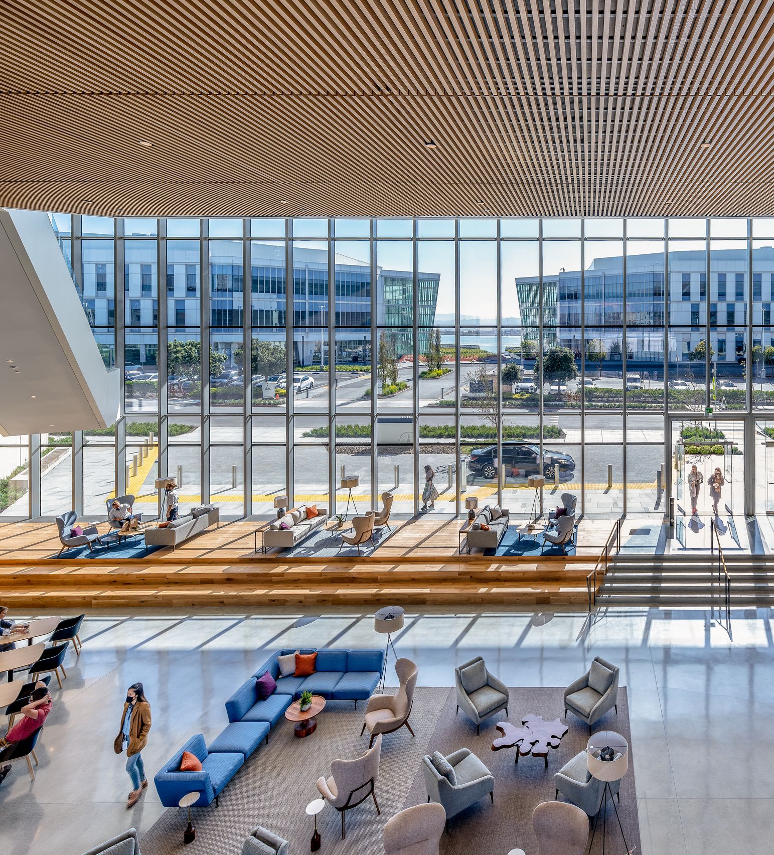
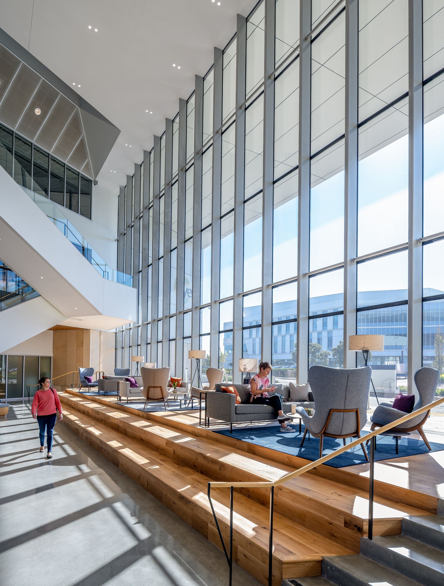
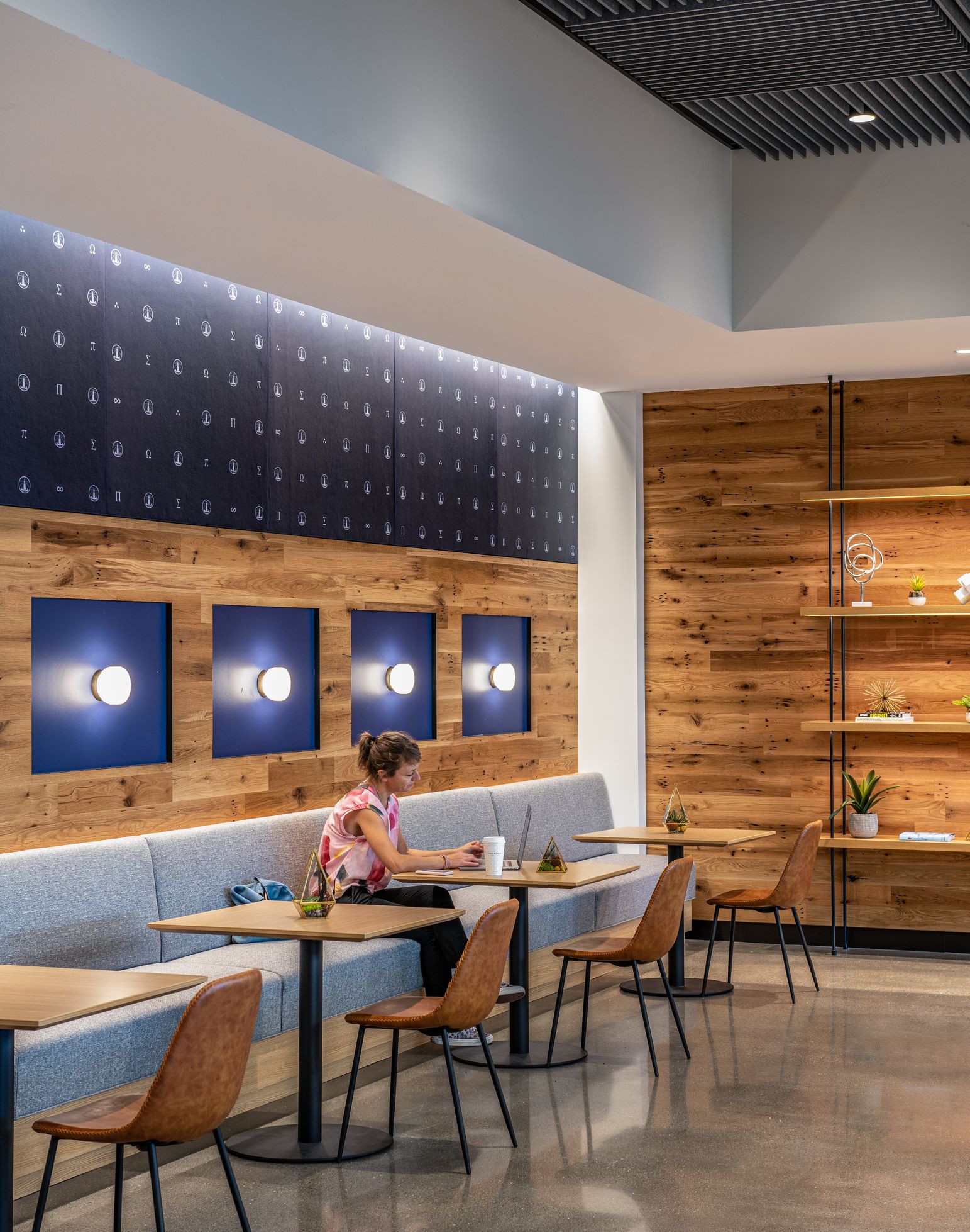
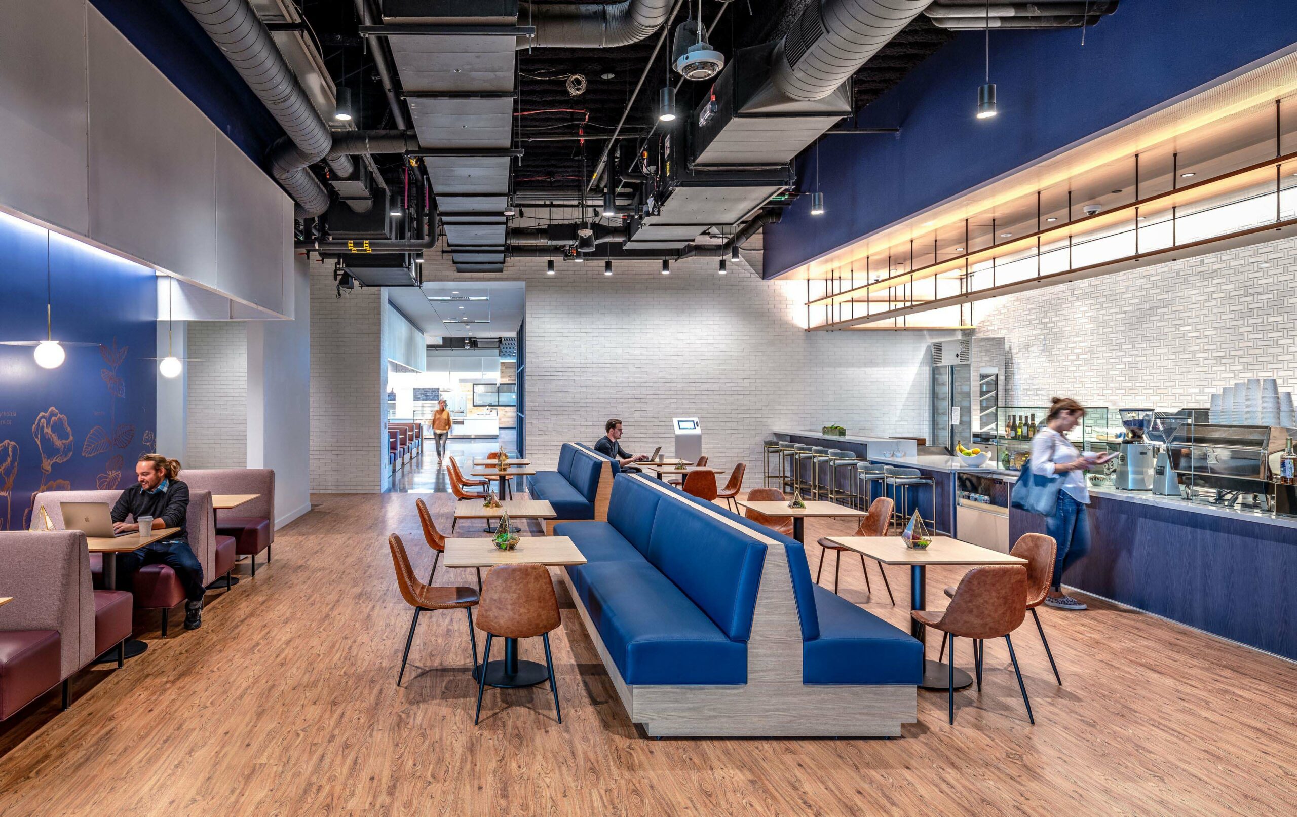
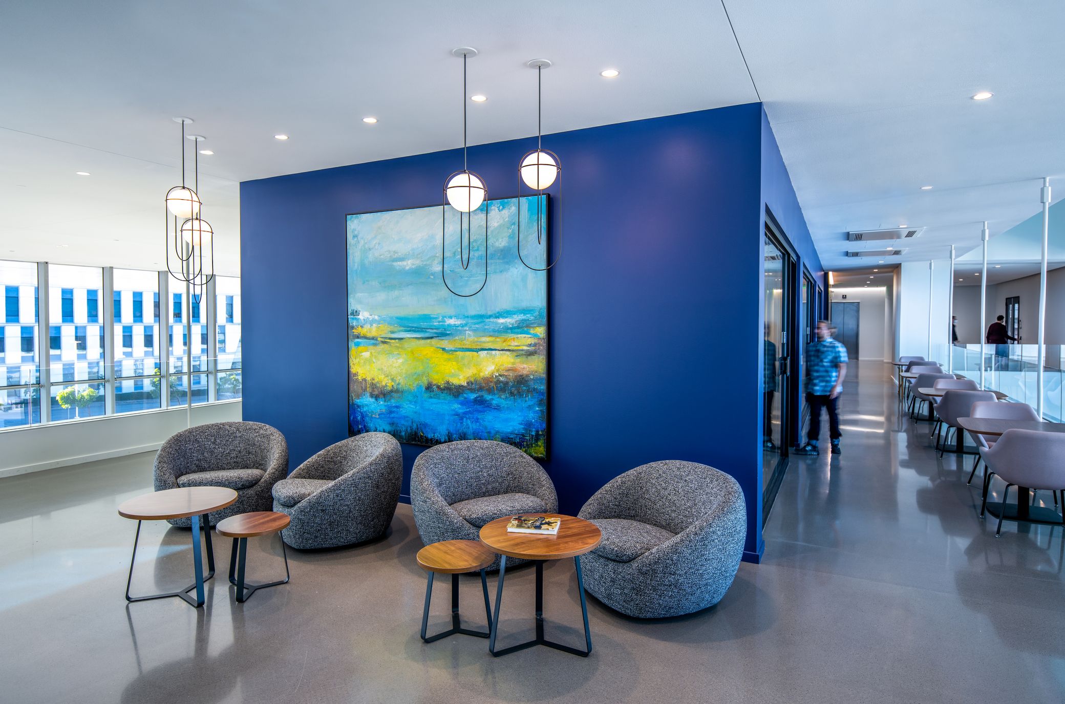
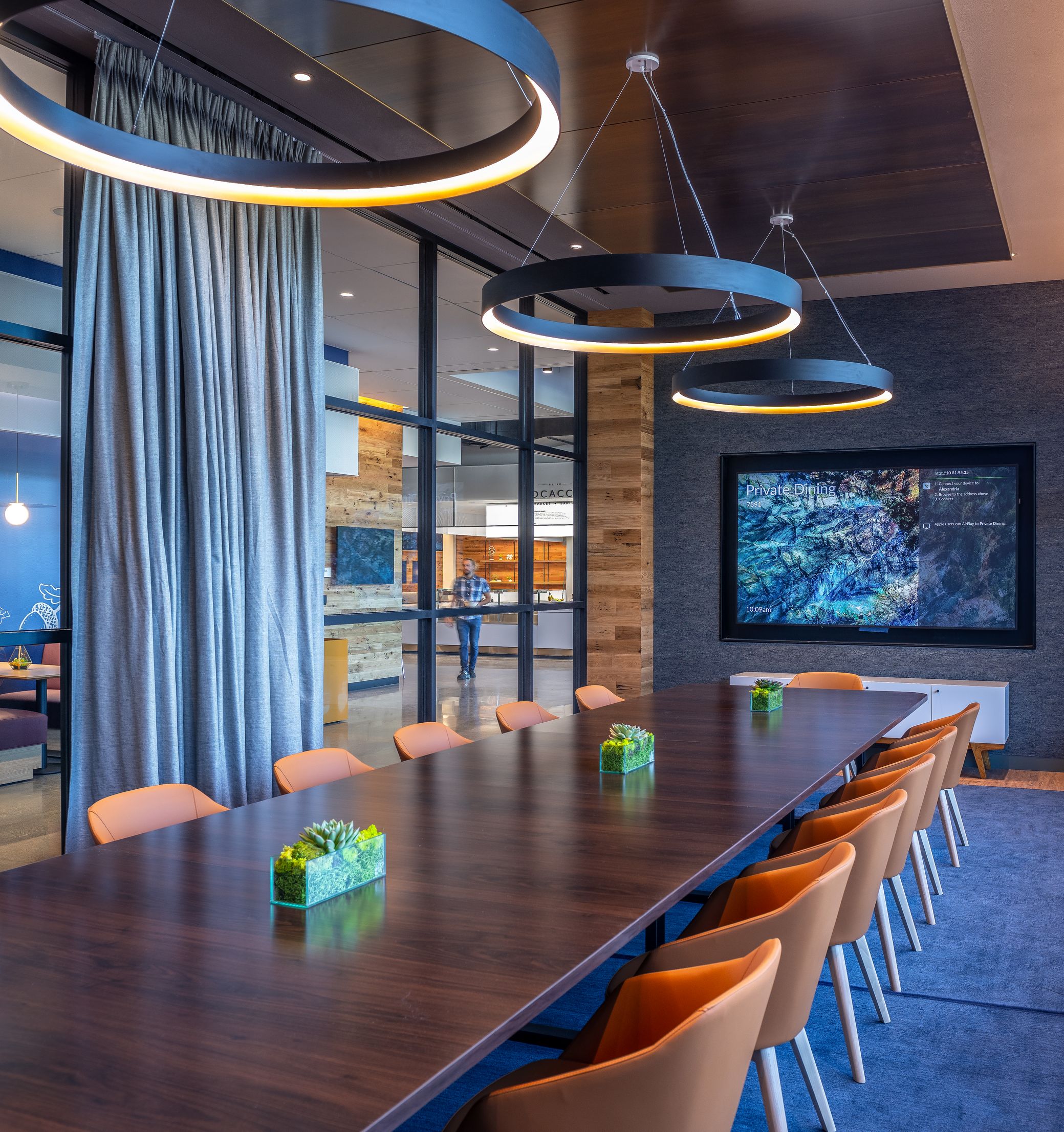
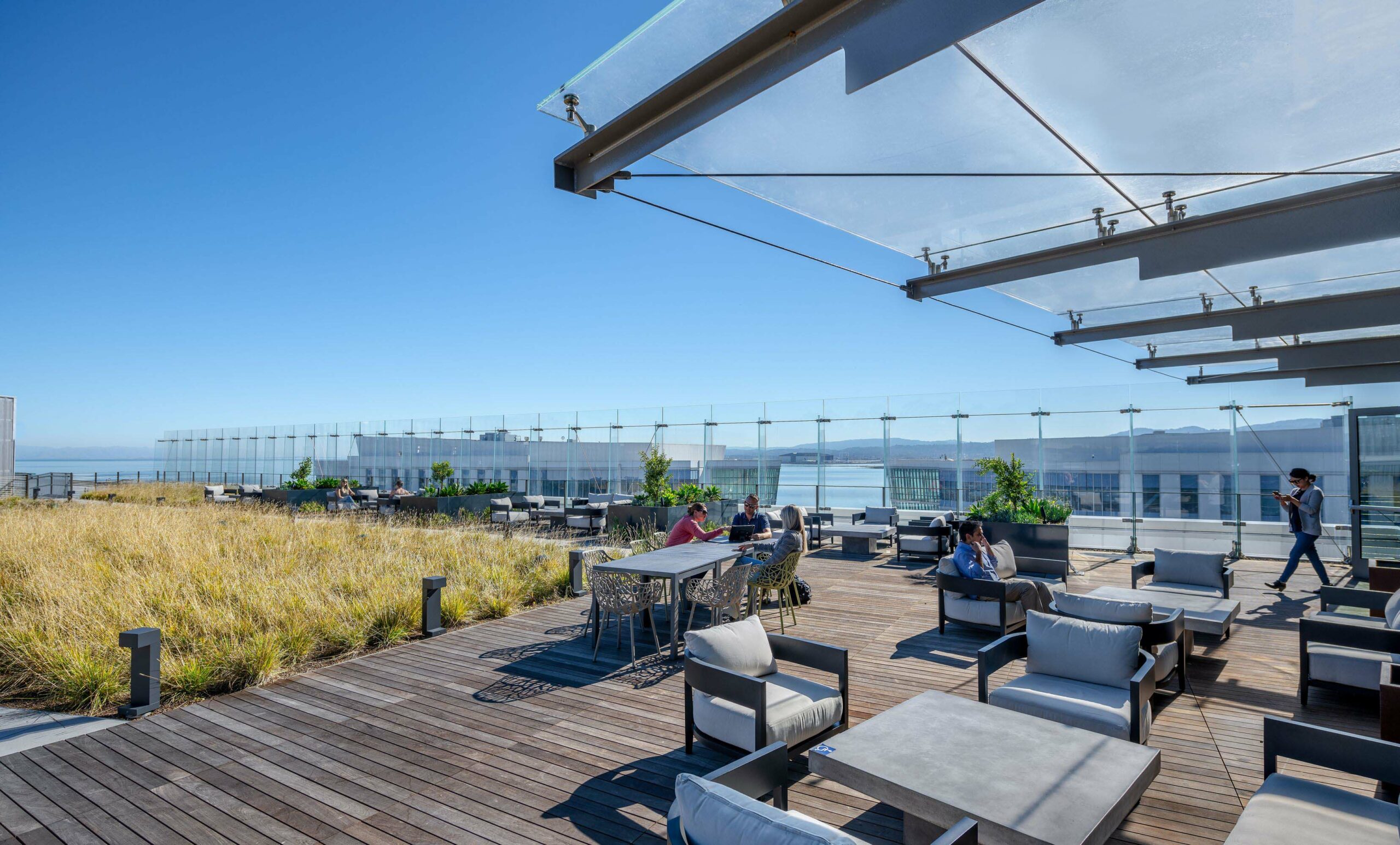
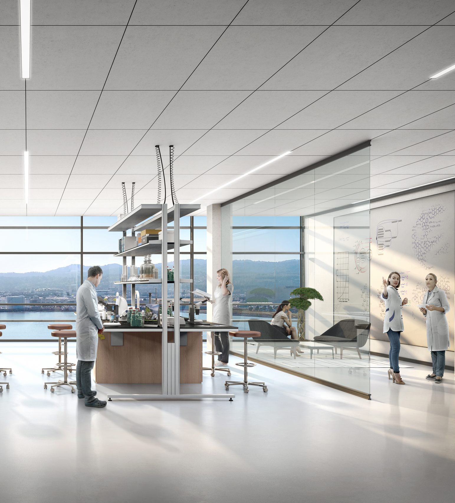
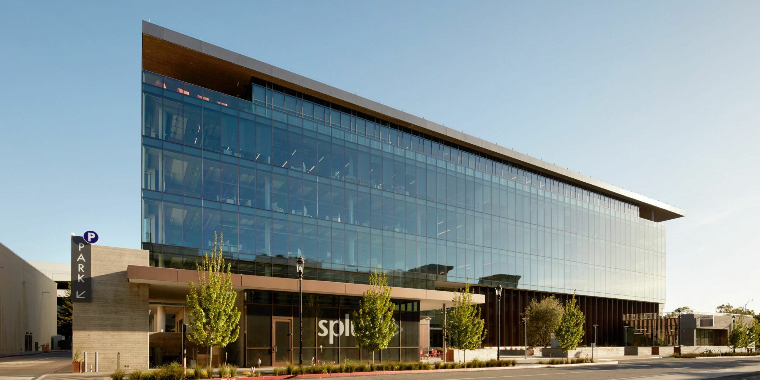
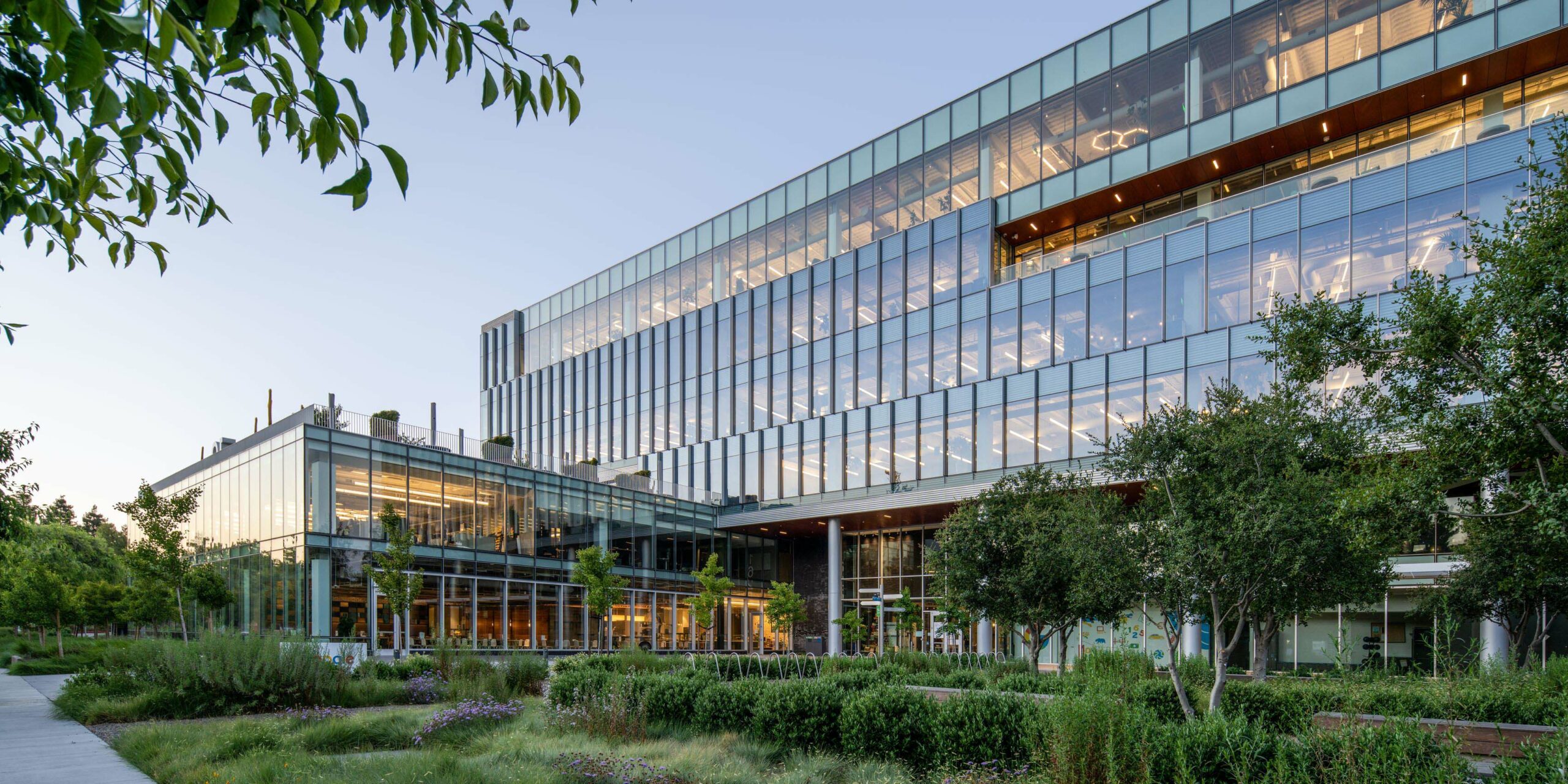
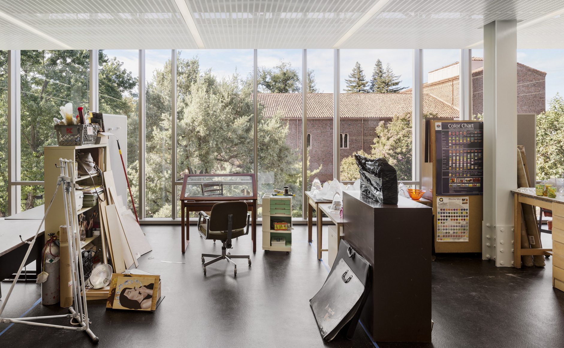
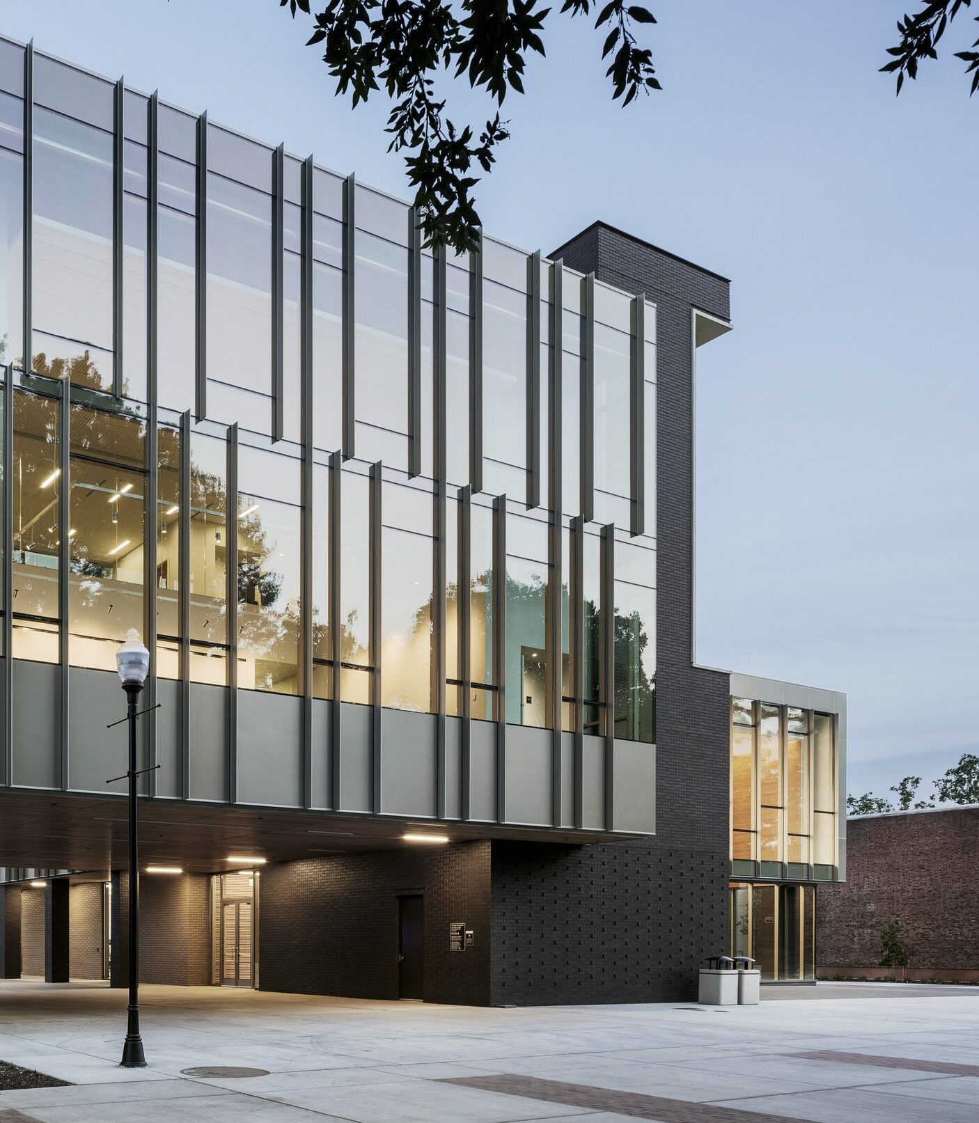
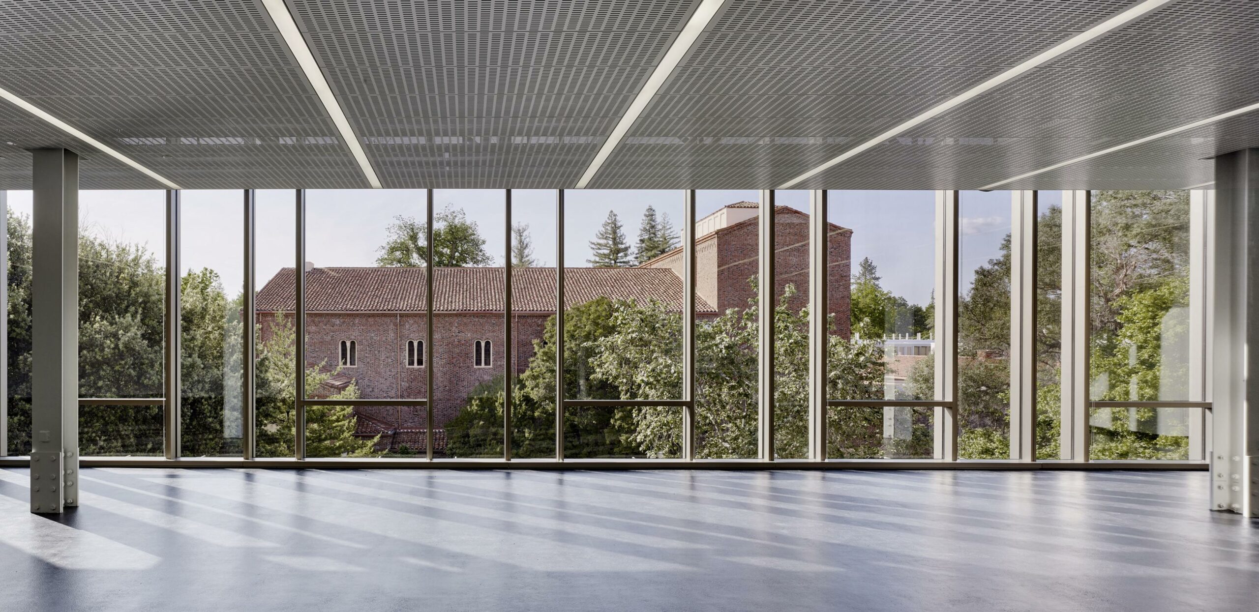
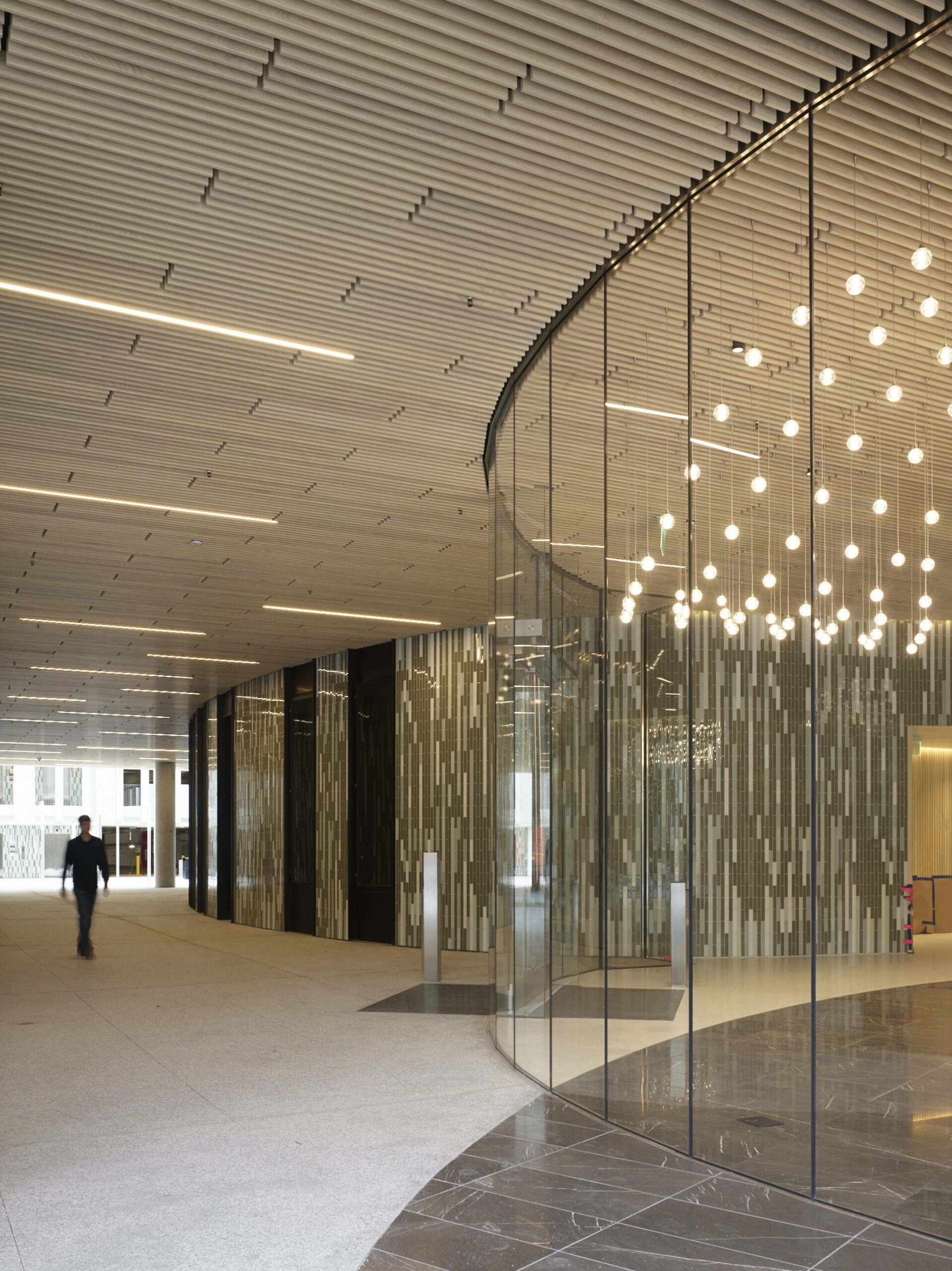
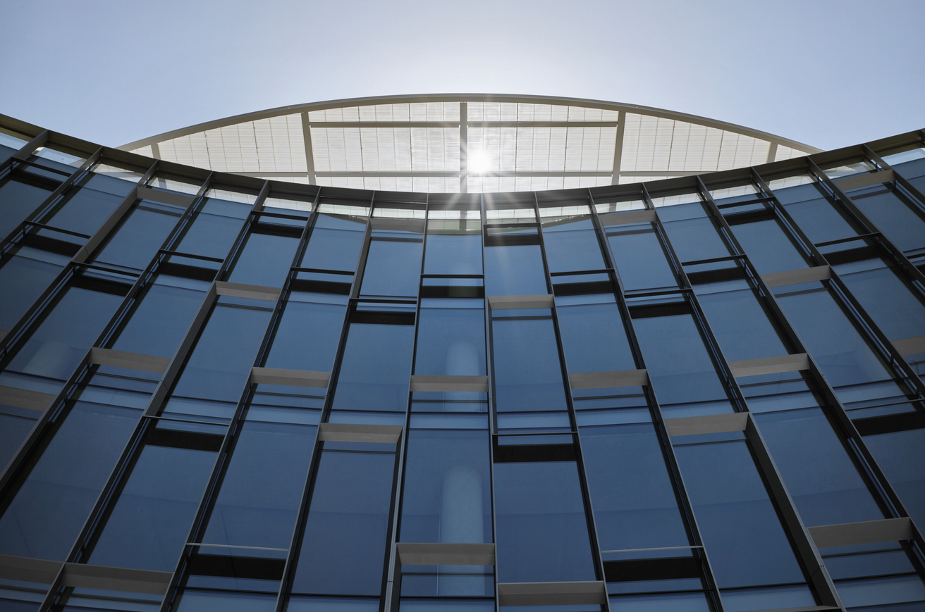
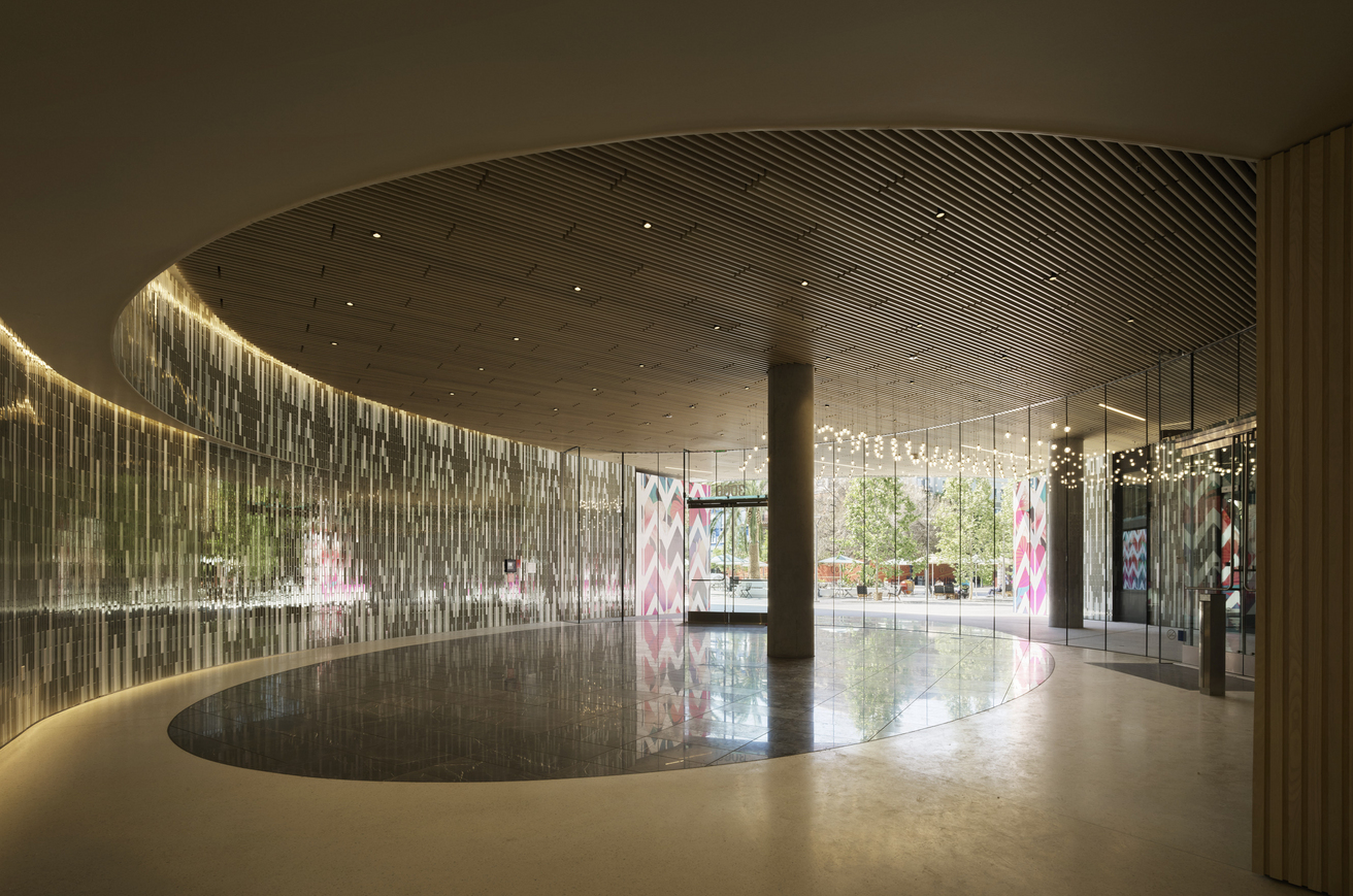
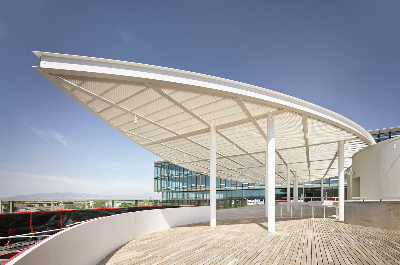
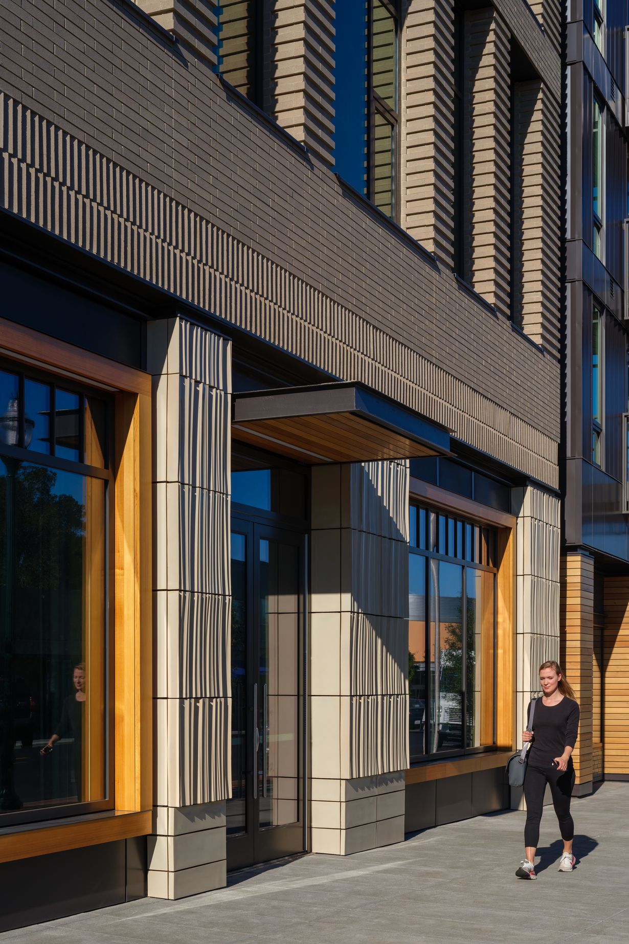
Welcoming entrances with transparent, double-height lobbies connect to a network of trails, open spaces, and amenities. Balconies, meeting rooms, cafeterias, event spaces, fitness, restaurants, and retail are situated along the building perimeters, energizing the site.
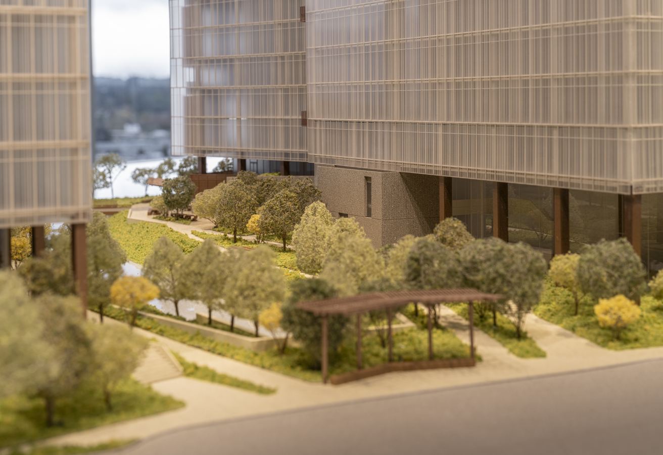
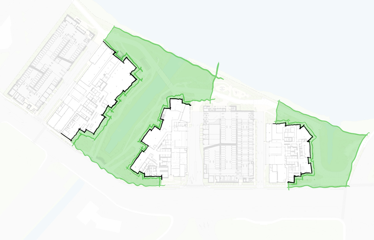
Sea level rise and resilience
The resilience strategy raises grades up to seven feet above current high tide levels. Engineered earthwork is carefully integrated within a terraced landscape design, reintroducing vital habitat zones and drought-tolerant native plantings. The landscape will adapt to rising tides, with planted areas transforming into marshes that absorb storm surges. This elegant and technical approach contrasts sharply with the typical concrete sea walls often installed along sensitive shorelines.
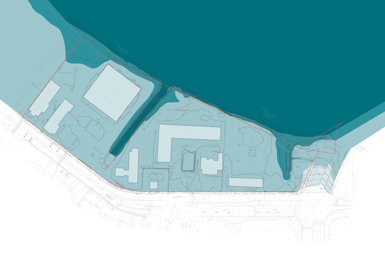
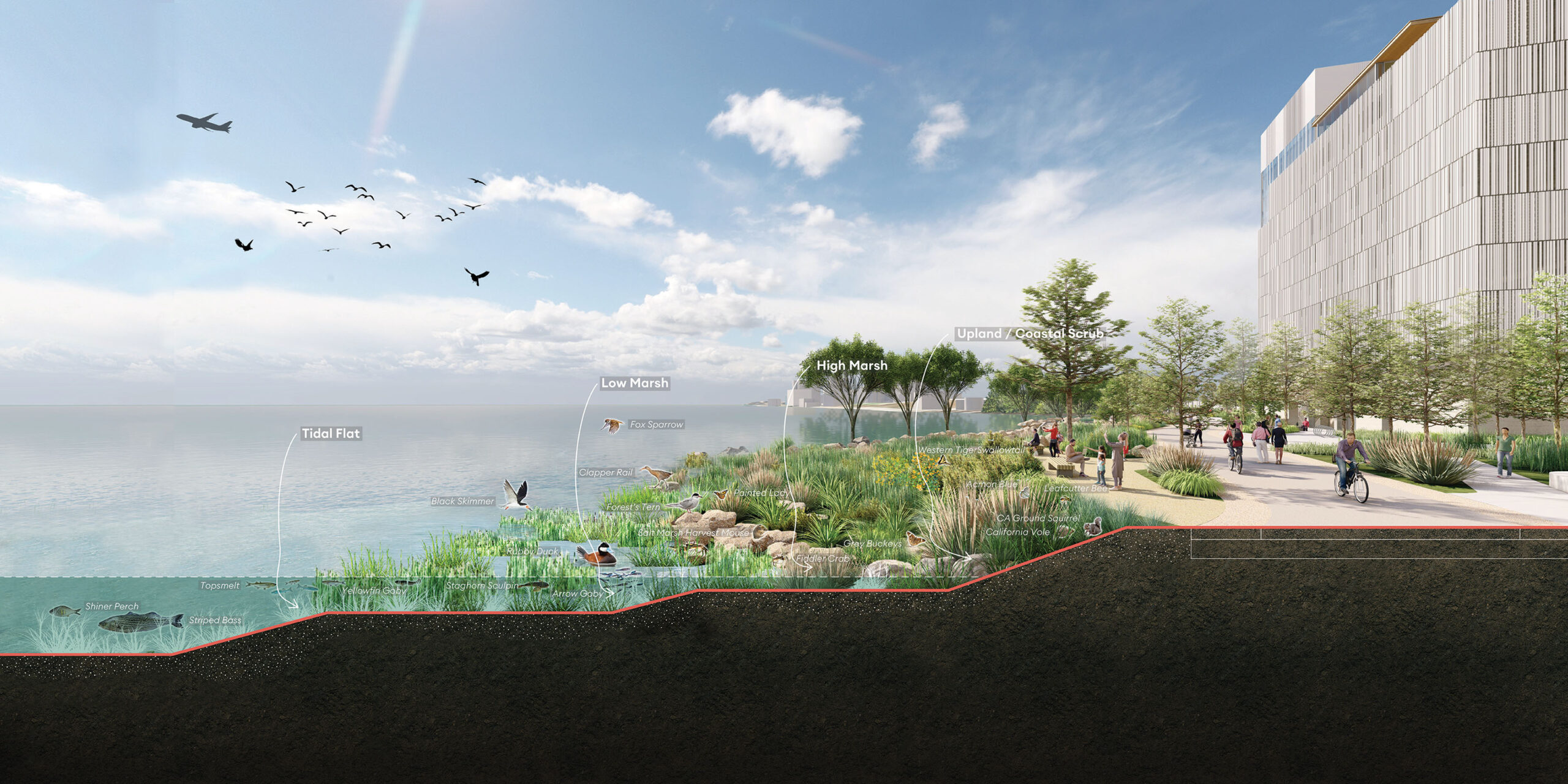
Landscape-Integrated Sea Level Rise Protection: 2070
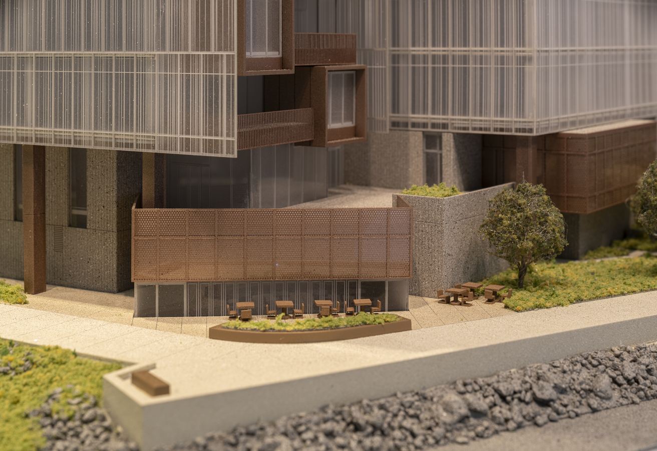
Physical Model

Photo: Celso Rojas