1. Marine Way Office Building 2. Bayshore Office Building 3 & 4 Parking Garages
High visibility atria in the office buildings were key to creating a more vibrant, functional campus for Intuit. These centrally located all-hands spaces had to do many things: reinforce and lend definition to campus patterns, welcome up to 500+ people at a time, and serve different events with varying light, sound, and capacity needs. As the lead corporate campus architect, WRNS Studio had proposed vast clerestory windows in the atria that filled the low, wide floor plates (up to 60,000 sq ft) with natural light and a connection to the sky — key to the experience of beauty and delight favored by the design team. When it came time to execute the design for the first new Marine Way office building on the campus, however, it took a deep dive into Design Development to uncover a viable technical solution for the clerestory windows.
Challenges
Suspended four floors above the deck, with a 60-foot span, the atrium clerestory windows presented no shortage of challenges: We wanted the atrium to be an uplifting, light-filled space, with the clerestories lending texture to scale down its capaciousness. The long span condition, an aesthetic and experiential imperative, could not be broken up by structure; the clerestory windows had to support themselves. In addition to pulling daylight into the interior, the clerestories needed to be controllable, allowing the atrium to darken for presentations, and to transition back easily, supporting supplemental artificial lighting. Likewise, the clerestories needed to integrate with the building’s other systems, helping to balance sound (large atria can get loud), embed fire sprinklers, and act as a passive smoke exhaust system. A strategy for cleaning the windows and general maintenance was required. Then there was constructability: How could we avoid installing a ton of expensive scaffolding?
Certainly not a first for WRNS — initial sketches to solve this head-scratcher happened late at night over wine, progressing to a solution that is at once detailed and expansive.
Pre-cast to the Rescue
After many iterations, we landed on a pre-cast clerestory beam system. The advantages were many: pre-cast beams would allow for the integration of vertical clerestory glazing, which would be much easier to maintain and present fewer waterproofing concerns compared with skylights. We knew the beams could span structurally (we’d designed them in parking structures), and they’d arrive on the site with a finished surface crafted at the shop, good for schedule and quality control. The pre-cast solution would allow us to create a custom shape to meet our objectives for drama and texture of light, sound absorption, and views of the sky.
But could we actually do it? The span was long (60 feet!). The beams would have to be deep and heavy. Thankfully, Willis Construction was on the job. Of the many advantages to using a pre-cast system, we could work with our fabricator in real time to prototype and test ideas for shaping the beam, carving, and bending light to our needs.
Collaborate, Iterate
The pre-cast clerestory beam in Willis Construction Yard
The pre-cast clerestory beam solution was a true collaboration with Willis Construction: design aesthetic meets engineering, structural analysis, and physical testing. Development of the beam’s shape and geometry was a lengthy and detailed dialogue: Willis conducted full-size, 6’ x 8’ mockups at their yard, which we reviewed together for shape and finish. These mockups complemented WRNS’ in-house computer model. We also sent a model of the pre-cast system to our acoustical consultant, who did a thorough analysis looking at ways that the beams’ shape and surface treatment might mitigate sound reflection within the large space.
Panoramic rendering iterations
In all, eight iterations were explored, each investigating the beam’s specific shape, density, and rotation. The different versions were illustrated as interactive panoramic renderings and presented to Intuit as part of a holistic analysis focused largely on the qualities of light in the atrium. The selected solution was further studied in a virtual reality simulation and presented to Intuit.
Detail Diagram
Detail
This section of the pre-cast beam illustrates its form, structure, and integration with the building’s MEP systems — optimizing the shape to address every aspect, from structure to acoustics, to address specific needs. Intuit wanted their new workplace to be raw and informal, robust and monumental. As an integral part of the structure, the pre-cast beams allowed for a consistent and strong, but elegant surface. The beams were hoisted high above the roof, and slowly lowered between the cast-in-place concrete girder walls, then telescoping steel tubes were extended to take the primary gravity loads. Initial discussions focused on access and the ability for maintenance staff to walk across and service the roof & glazing safely, and we shaped the beams accordingly. Electrochromic glass used for the vertical clerestory glazing allows for easy dimming or darkening via controls. An acoustic plaster fascia panel on the inside face of each beam houses sprinklers and attachment points for multiple pendant tube-lamp fixtures.
Light and shadow
In early iterations, the clerestory windows were facing north, until our resident building technologies sage Moses Vaughan, got involved. We were about to ask our client to invest heavily in an engineering feat — integrating these large, heavy beams into the overall systems approach to the atrium — when it was brought to our attention that the light we’d be pulling in from the north would be beautiful, but soft. Based on observation of similar clerestory windows we had researched, it became apparent we were missing an opportunity to capture the kind of strong direct sunlight that would make for dynamic shadow play traversing daily across the all-hands space. Moving through the space, the beams might appear to “unfold” as they bend light inward. By reversing the orientation of the clerestory lights from north to south-facing, we maximized the spatial drama through light, shadow, and texture.
Constructability
The pre-cast, clerestory beam portion of the project was technically a design-build effort, anticipating not only the design and engineering but also how we were going to fabricate, transport, and insert the beams into the structure. Significant engineering went into just the installation process itself. Given the individual beam weight (each at 88,000 lbs) we needed a heavy-duty crane with serious capacity. One of two cranes on the west coast rated for 80 tons was rented, pushing us to an even bigger “100-ton crane.” This added power brought its own structural and safety challenges, as the only site on campus that made sense for locating the crane was directly atop an existing culvert. This culvert services all of the Mountain View greenbelts, so the operation was understandably sensitive. We shored up the foundation around the culvert to ensure the crane’s weight was distributed on either side of the tunnel, ensuring it wouldn’t fall through.
The weight of one beam is equivalent to that of an adult humpback whale or railway boxcar.
Tectonics + Identity
The atrium is the ultimate connector: building to campus (as a mid-block crossing), interior to exterior, ground to sky, and people to one another. With the beams installed, it became immediately apparent that the pre-cast clerestory beams would indeed conjure the kind of airy texture — light and shadow drifting down from above and playing off of the atrium’s surfaces throughout the day — that would endow the space with that timeless, inspirational quality we recognize in really good buildings. If place marks and reflects identity, then the spaces in which we come together as a community have the opportunity to put a fine point on aspiration. As the atrium advances coherence and vibrancy at the campus scale, so do its tectonics — and specifically, the innovative approach to pre-cast clerestory beams — make possible the atrium’s success on the programmatic scale as a multi-use, all-hands community space that reflects Intuit’s identity and aspiration.
“Today, history represents neither an oppressive past that modernism tried to discard nor a retrograde mind-set against unbridled progress. Instead, at a time when there is too much information and not enough attention — when a general collective amnesia perpetuates a state of eternal presentness — understanding the channels through which history moves and is shaped by architecture is more important than ever.” –Chicago Biennial
Last fall I spent three days in Chicago, taking in the Chicago Architecture Biennial. Make New History was the theme and participants — 140 architects and artists from around the globe — contributed a range of exhibits, from dioramas to live performances, to explore how history can be invoked to inform new ideas and forms in architecture. The Biennial was held in the Chicago Cultural Center (a grand former library built in 1897 and host to the world’s largest Tiffany stained-glass dome), with associated events throughout the city, and it took place from September, 2017 through January, 2018.
“Vertical City,” 2017 Chicago Architecture Biennial: Make New History
Of the many thought-provoking exibits, I was most taken with “Vertical City,” a contemporary take on the 1922 Chicago Tribune Tower Competition. With the charge by the Tribune’s publisher Colonel Robert R. McCormick to make “the most beautiful and distinctive office building in the world,” the original competition attracted entries from over 260 architects, including Walter Gropius, Adolf Loos, and Eliel Saarinen (who took second). The wildly contrasting ideas influenced generations of architects to come. Resurrected in 1980 by Stanley Tigerman under the guise of “Late Entries,” the Tribune Tower competition (it was actually an invited submittal for a publication) once again attracted some of architecture’s biggest thinkers — Frank Gehry, Tadao Ando, Bernard Tschumi, and Tod Williams and Billie Tsien.
If the 1922 competition made evident a pivot point in architecture toward modernism, and the “Late Entries,” of 1980 turned largely on postmodernist metaphor, fun and sarcasm, how might we understand the “Vertical City” of 2017?
The architects practicing today revealed delightfully varied ideas, represented as scaled models that reimagine the landmark tower. The Cultural Center’s Yates Hall, a large expanse of a room with floor to ceiling windows that pull the city into the space, was given over to the exhibition, fusing the experience with meta. Wandering amid the towers, I felt myself inside a diorama of alternative histories of a building and of a city in which I could, in real time, hear the taxis honking below and feel the glare of the sun moving across the glaze of adjacent buildings.
Of the 16 entries, I found myself sparked by the ones that directly addressed core drivers of the innovation economy: work / life integration, community, connection to the public realm, and non-hierarchy.
Big Bang Tower by Ensamble Studio (far right) and Biennial Project by Kéré Architecture (second from right)
Big Bang Tower: A Column of Columns for the Chicago Tribune by Ensamble Studio
Noting that “an office can be a cubicle and also an open co-working area, a cafe, a lounge, a lab, a multipurpose room, virtual substance in the cloud, a room in your house, and much more,” Ensamble Studio imagined “A Column of Columns” tied together with horizontal structures that vary their positions, heights and areas to frame the city and connect interior spaces. With cores pulled to the sides and located within the envelope (atypical in a traditional high rise) and the asymmetric columns resolving both vertical structure and infrastructure, the floor plates are open to receive a diverse and evolving program. The structure is one in which knowledge workers, who expect work / life integration, might just as easily take in a film as write a creative brief.
“In alignment with current trends, the design forecasts that people will value a balanced work and life ratio while retaining real and meaningful connections with each other and with the places that they live.” Inspired by the Tower of Babel metaphor of a community working together in shared aspiration, Kéré Architecture’s proposal anticipates a mix of housing, workplace, commerce, and recreation in one building. To free up the interior for a variety of amenities and opportunities to connect with community, the cores are pulled outward. Segmented blocks with central voids allow for more private functions, like housing, to be consolidated and located higher up, with more communal activities happening on the ground floor to support integration with the public realm. The proposal offers a microcosm of a neighborhood or a city, a one-stop live/work shop in a tower of the future.
“If the primary source of derivation for modern architecture is classicism, what would an architecture that is derived from a non-Western historical tradition be?” With its design inspired by ancient Chinese architecture’s central organizing concept of the pavilion, and with pavilions stacked vertically to form a pagoda, this proposal offers a structure freed from hierarchical organization, with spaces defined in relation to one another. “The spaces of this new vertical city are attuned to the nature of the knowledge economy and the contemporary media environment where performance dominates, flexibility sets value, and well-being is the ultimate cause. Pavilions frame theaters, meeting zones, restful landscapes, and hedonistic gardens: the true productive spaces for today’s media workers. This is architecture with a language not rooted in Western thought and with a history outside of the narratives of modernism.”
This was the model to which I returned, walking around it, staring into its corners, wanting to step inside and make myself at home.
Does the “Vertical City” — this third festival of ideas centered on iconic American skyscraper — offer a touchpoint, some indication of where urban architecture is going in response to changes in how we work to propel the innovation economy? If so, I’d take note of the Ensamble, Kéré, and Serie entries.
WRNS defines its work as being about beauty, sustainability, and the public realm. What do these concepts mean to you?
Daniel Johnson: In my opinion, architecture is useless without people, and for me, architecture that extends its experience to the public realm is probably one of the most exciting potential offerings of architecture. Buildings that are primarily private almost seem like giant rocks in a stream redirecting the flow of water, whereas publicly infused architecture is more akin to bridge, and I would prefer to build bridges versus dams. Metaphors aside, some of my favorite works of architecture have incredible public experiences – the modern entry plaza to the Reina Sofia Museum in Madrid by Jean Nouvel had a profound impact on my understanding of the power of architecture and the public realm. Not only did the architecture create an interesting relationship to the historical building it was attached to but the way Nouvel created drama from the sky to the plaza was a magical experience that opened my eyes to how architecture not only shelters and defines space, but creates phenomenal connections between earth and sky. When you mix in a flowing stream of people into an experience like architectural value becomes truly evident.
Emily Jones: Beauty, to me, is a moment (usually fleeting) that is prompted by an experience of place. As an observer and a designer, I seek to both experience and create beauty; however, I have found that, in attempting to create beauty through architecture, it is essential to acknowledge and utilize the beauty found in nature. Therefore, for me, architectural beauty is a deliberate and skillful composition of natural elements of beauty translated through design that, when successful, evokes a visceral experience of place. Consequently, for me, beauty and sustainability are inextricably linked as sustainable design strives to preserve what, to me, is an essential element of beautiful design – nature.
Ben Mickus: While all buildings occupy a space necessarily, it is the interaction of a building with the surrounding space that transforms into place. This is what excites me about architecture: a building and the space around it fusing into something more than any of the constituent parts, and becoming a piece of the ever-changing public realm. While the public realm as an abstract concept is fluid, dynamic and buzzing with energy, it is architecture in the public realm that somehow channels that energy, allowing it to be experienced through the creation of views, moments, sequences, tactile interactions, and relations to context. We create a unique experience of a place.
What do you think makes a good leader?
Dan Sakai: I have a toddler who likes to lead me around. Her inclinations rarely coincide with the rest of the family’s, but she enjoys a song called Head, Shoulders, Knees and Toes – you may know it – which provides a useful mnemonic for leadership in grown-up organizations.
Head: Clear thinking leads to insight and level headed decisions.
Shoulders: Sharing the load inspires and builds team cohesion.
Knees and toes: Dynamism requires nimble responses and flexibility to address changing markets and individual project and team needs.
The verse repeats and the children touch the different body parts as they sing along. Then there is a bridge including:
Eyes: Vision requires a long view and hawk-eyes for shortcomings and opportunities.
Ears and Mouth: A strong communicator is both articulate and a good listener.
Nose: Integrity is crucial; when something fails the smell test, action is taken.
I am not suggesting adults need to be able to touch their toes, but leadership touchstones are central to effective, inspirational organizations. Getting my daughter pointed in the right direction is another matter.
What drew you to WRNS when you first came? What made you want to stay?
Daniel Johnson: It sounds obvious, but the work is what drew me to WRNS. There was a clear point of view – architecture that was tuned to its context, composed thoughtfully, and used materials in ways that were modern and sophisticated. Additionally I was very impressed and intrigued by the fact that WRNS grew the practice through a terrible recession, and some great work came out of that period of time, which to me signaled that this was a company that knew how to run a successful business, a trait I was very interested in learning. What makes me stay is all of the above but with an added layer, the staff and leadership is incredible. I feel like I can be myself here, and I am surrounded by a bunch of really smart, creative, interesting and idiosyncratic people who have given so much to my professional and personal life. As much as they are my colleagues they are (for better or worse) becoming my family.
Lily Weeks: The work at WRNS is what drew me first. I wanted to be a part of the growing interior design practice in an architecture firm, after all, my education is in architecture and my experience in interior design – it was a great fit for me. What made me stay was the studio environment that I can only describe as a rigorous creative hive with some of the most talented people you will meet, what else could I ask for?
What are you excited about in architecture right now?
Hattie Stroud: The way in which social responsibility is becoming an important part of practice is really great. I’m a big fan of offices like MASS Design Group that really champion the ways design can be beautiful but also smart, sustainable, and supportive of its community. This isn’t about community process dictating a design – it’s about architecture that is responsive to its context.
Where do you see WRNS in the next five years? How do you want to see us grow?
Ben Mickus: As WRNS grows, the design profile of the firm–as defined by the caliber of projects we pursue–should grow with it. The diversity of projects in the office has been so strong since the inception of WRNS, and I hope it will continue to be a defining strength, as we deepen our experience across so many practice areas.
What are your inspirations outside of architecture?
Dan Sakai: Autonomous vehicles are super-exciting. As economies of scale incentivise ride-sharing over personal vehicle ownership, tremendous amounts of land currently used to store empty cars may become available in places we care about: along our streets, on the ground immediately surrounding many destinations, and in robust structures in high land-value areas. Extensive use of ride-shared autonomous vehicles may actually align incentives for congestion pricing, change commute patterns and public transit paradigms and radically shift development and planning patterns (for better or worse). There is a lot at stake for urban communities and the environment.
Lily Weeks: Art & fashion. Every morning I walk to work, 30 minutes downhill – I walk past the merchandise displays of Prada, Valentino, Dior & Britex Fabrics. These brief but constant glimpses of human centered design, textiles, and pattern play give me my first creative jump start to the day. In moments of creative daze I have taken a short respite to SFMOMA, just a few blocks from the office, to visit a favorite piece, wander a new exhibit or sit & reflect on a balcony.
Dia:Beacon
The early morning sky and the beat of the steel pull my gaze to the Hudson’s flat surface, the fawn landscape. It swishes by. I’m headed up to Beacon, a small leafy town just over an hour’s train ride out of Manhattan. From the station, I walk through the gathering heat, up a small hill, and around a bend to a low-slung brick structure surrounded by quiet, ordered grounds and trees. I pass through a dark, compressed entry and into the museum and I stop — that sense of quiet and awe that happens to me in a great place. There’s just so much light. Skylights pull in the blue from above and the landscape is in every window. My skin is warm and illuminated. I run my fingers along a rough-hewn wall. I wander.
Art + Architecture
I can see why Robert Irwin, who has spent much of his career exploring spatial relations and the subtleties of perception, wanted to help reimagine how an old Nabisco box-printing factory built in 1929 might be transformed into a museum housing art from the 60’s and 70’s. Irwin designed the master plan, grounds, and windows at Dia:Beacon — his own contribution to the ethos of permanent installation, or art as created, installed, and experienced within a site-specific context. The raw beauty and honest construction of industrial architecture — broad, day lit spans set to brick, steel, concrete, and glass — make the building itself feel like art. And much like the works it houses — Donald Judd’s wood boxes or Sol LeWitt’s patterns — this place leaves the story up to you. It’s like you’re the point.
An Excursus
I find Irwin’s Excursus: Homage to the Square³ — sixteen interconnected, square(ish) spaces constructed of translucent, white scrim and illuminated by vertical fluorescent tubes. Originally installed at the Dia Center for the Arts in Chelsea in 1998 and site-adapted for Dia:Beacon, Homage to the Square³ invokes Joseph Albers’ seminal inquiry into the subjective experience of color.
Walking through the space, I imagine falling into an Albers painting, his squares tilted upright and organized into a maze. As I move through the chambers, the colors, vibrant in the hands of Irwin, shift to the peripheral. There is daylight and warmth. Ghostly figures pass through the scrim. Footsteps on the soft wood. Trains rumble up the Hudson, making the sounds of industry, past and present. After a while, Albers recedes, Irwin falls away, and it’s just the daylight, the space, and me — playful, pensive, and ethereal. It seems like a good idea to just lie down on that luscious wood floor and stare up at the sky.
But West Texas awaits: a large-scale installation, Irwin’s first and only ground up building, has opened at the Chinati. His exploration of the phenomena of perception through the mediums of light and space in the Chihuahuan Desert is something I need to experience.
Marfa
It’s a bit mind-blowing to wake up to the taxis, stilettos, and steam of a summer day in New York and fall asleep under the black lit silence of a West Texan desert. As the white noise of the city gives way to the thunderous silence of the land — the bark of a dog, the steel grind of a train — my senses hone.
The Chihuahuan desert is situated atop a highland plane called the Marfa Plateau, punctuated by low-slung mountains under a sky that curves all around you. The grassland, cacti, dirt, rocks, and adobe meet the sky to make a variable brown-blue palette that changes throughout the day.
Like many of the buildings in Marfa — modest, straightforward adobe and concrete structures that defer to the geography and climate — Irwin’s modern, concrete building is a quietly elegant portal into the unexpected. U-shaped and organized around a landscaped garden, untitled (dawn to dusk), 2016 sits within the footprint of an old Fort D.A. Russell hospital originally constructed in 1921. It is approximately 10,000 square feet.
when things start to get super untitled
A kid who seems strangely serene for someone who appears to be 15 lets us in. My friend and I managed to miss the scheduled tour (desert distractions abound, I tell you), and so it’s just the two of us. It’s late in the day, but the sun rides high. The land and the light and the sky follow us through a tall and generous sequence of windows. We’ve been asked not to take pictures inside the space.
Again, the scrims: white and black panels, veins running up the building arms, divide the structure into light and dark, intersecting at the crux. We immediately grow quiet and separate, our footsteps on the concrete. The building’s original use is with me — I imagine the people who came through, living and dying. I walk the length of the white scrims, watching the landscape through the sequence of windows, light and space given shape.
In his fantastic book, seeing is forgetting the name of the thing one sees, Lawrence Weschler writes of Irwin’s artwork, “Perhaps the central concern of all these installations has been their presence — temporal, spatial — such that any descriptive report of their character or intention necessarily betrays their essential nature.” And yet, the procession:
I turn into the crux of the U. The darkness is sudden, dissonant. The contrast a jolt. I slow my pace through the dark side and reach the end. I turn back and walk slowly through the black scrims. I feel weightless and heady. The landscape, the sunlight, the sky recede as I move through the space, the clarity, and the blur.
Each scrim a thunk at my chest, a slow pulse. I pass through something and something passes through me, and it has weight and energy and a beat.
My friend and I lock eyes.
“I know, right?” she says.
There are tears in her eyes. Mine too.
She can’t know what I feel, nor I her. But as we leave in silence, I think we carry something out — a sense of our own consciousness. And perhaps we are closer to knowing the profound and beautiful difference of that in all of us.
How did you get into architecture?
I spent the summer of 1994 studying the delicate protein folds of a little virus called P22 in a refrigerated laboratory in Massachusetts. After a miserable day in the cold room, I would spend my evenings walking around the humid streets of Boston and marveling at a built environment that was about as different as could be from the urban fringes of LA where I had grown up. By the end of that summer, my interest in microscopic protein had been eclipsed by the textures of Sever Hall, the hush of Pinckney Street, and the shape-shifting simplicity of the Hancock Tower.
What's your approach to architecture?
Multivalent. I tend to triangulate design problems in a way that is almost clinically straight-forward — listing out all the criteria for success, iterating design concepts, and testing those concepts against the criteria. I say “almost” because the criteria can range from highly objective (cost per square foot, FAR, net-zero water use) to totally subjective (“lightness,” “fun,” “views to the sky”). What matters is, first, that these criteria are meaningful to our clients and to the larger community, and second, that we satisfy the criteria in a way that is elegant, timeless, and seemingly effortless.
What are you excited about in architecture right now?
All the latent design possibilities of emerging construction technologies such as cross-laminated timber, hybrid rammed earth, and 3D-printed concrete are exciting to me in that they fuse analog and digital approaches to craft. These technologies help compress the distance between architect and builder. Similarly, the use of tactile regionally-specific materials and building processes can help us engage more directly with the work we do and the places we make.
I remain excited about hand drawing and physical modelling. We do our best work when we can collaborate in a direct and visceral way during the design process. At the same time, I am excited about the coming shift to an all-digital workflow for design review and construction. Plan checkers, field inspectors, general contractors and the construction trades will very soon be working off the same 3D computer model. Apart from saving reams of paper, this will simplify communication and streamline pre-construction.
How do you hope to make an impact at WRNS in your new role?
I want to foster a scalable studio culture that can grow as the firm grows and keep that special sauce that makes WRNS, well WRNS. That means putting design first. That means promoting innovation around both project design and project delivery. And that means approaching every problem from the standpoint of a novice: with an open mind and critical eye.
What do you want to teach the next generation of WRNSers?
We are at a moment of generational transition: from architects trained to draw by hand to modeling exclusively on a computer; from an enmeshed ownership economy to spawning a sharing economy; from valuing individualism and status (the age of the “starchitect”) to authenticity and connectedness becoming design bellwethers. I think the next generation of WRNSers has much to teach the firm.
As one of the younger partners at WRNS, I hope to be a transitional figure, building bridges between these groups to keep us moving forward.
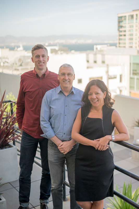
New Partners Tim Morshead, Russell Sherman, and Lilian Asperin
Currently, more than sixty-five million Americans are living in areas where access to primary care is limited, and they suffer from higher rates of chronic health problems, disease, and death. In addition to the insufficient supply and poor distribution of care, many of these residents face additional barriers when they do get care, including communication challenges, lack of privacy and comfort in clinics, and inconvenient hours and locations.
The Firehouse Clinics are an innovative step towards bridging that gap. Spearheaded by the County of Alameda and Public Architecture as part of their 1% Solution, “Firehouse Clinics are an innovation in community health care focused on serving vulnerable, low-income, and uninsured individuals and families. Leveraging the trust and expertise of emergency medical services (EMS) and local Fire Departments in the pre-hospital care system, Firehouse Clinics are designed to be conveniently located at neighborhood fire stations where there is critical need for access to health care services.” (visit the website for more information).
Public Architecture approached WRNS Studio to provide a clinic prototype, a conceptual design, and a set of guiding principles for a 1,200 square foot clinic adjacent to a firehouse.
The result is a clinic that is welcoming, easy to access, and dignified. Nothing about it says “low income” or “free clinic.” Located near public transit and the neighborhoods it will serve, the clinic is intended to reflect the values and aspirations of its community. With its adaptable and easy-to-execute prototype, Alameda plans to open clinics throughout the county. The hope is that other communities will follow suit.
The design is easy to build, efficient, and materials can be chosen specifically to match the surrounding neighborhood. The entry is visible from the street, inviting patrons in. Patients walk through gardens to check in at a kiosk and wait for their appointment in a waiting room that feels comfortable and “at home.”
GLS Landscape | Architecture designed surrounding wellness gardens that will be visible from within exam rooms, providing a calm, beautiful alternative to fluorescent lights and sterile white rooms. A green roof and gardens increase the welcoming, natural feel of the clinic. The roof’s plantings will be adapted to the neighborhood, making the building of its place — implying holistic wellness to passersby.
So, why co-locate with firehouses? They are centrally located, accessible, and plentiful (even in neighborhoods that lack other resources). People’s trust in firefighters often outweighs their faith in law enforcement, perhaps because firefighters’ sole purpose is to do good for the community. The hope is that this inherent trust will bleed over into the neighboring clinic, bridging the divide for residents who are suspicious of healthcare providers or unfamiliar with navigating a clinic. Having a group of EMTs next-door also serves a practical purpose in cases of emergency.
Leveraging the neighboring firehouse and people’s generally positive association with it, these clinics will provide a new model for community-based care, one that is appropriate and culturally relevant. The clinics will become a resource hub for health education, wellness, health insurance enrollment, and referrals to specialty care.
Armed with a promotional website and an executable design, Public Architecture and Alameda County Health Care Services Agency are sharing the vision for the firehouse clinics with communities across the nation. The dream that began in Alameda County of providing efficient, culturally relevant care to people who have historically gone without has the potential to really catch fire.
Founded in the 1880’s as a train-stop in the farthest western border corner of Texas, Marfa has become a rite of passage for design lovers curious about Donald Judd’s escape from New York (he needed space) and the making of this place. I’d wanted to visit since friends returned with tall tales of dancing with cowboys and running through concrete boxes under the desert sky.
The mind-clearing road in and out of Marfa: It pretty much looks like this for 200 miles. And there’s a lot of rail. Photos by Bruce Damonte.
Roughly paved, ghost-towny and quietly brimming with artists and tourists, Marfa has been “found.” A quick internet search will land you in the archives of Vanity Fair, Dwell, the New York Times and endless blogs that care about modern architecture and art. Still, it’s a massive trek to get there — with a four hour flight from San Francisco to El Paso, followed by a three hour drive through rolling, empty desert, you’re looking at a solid day of travel on either end — and once you arrive, it kinda feels like you’ve landed on another planet. The Chihuahuan desert plays no small part in this other-worldliness. Situated atop a highland plane called the Marfa Plateau, the town has an earthy palate of variable browns made of dirt, rocks, and adobe, and blues from the low-slung mountains and the endless sky that makes a curve all around you. There’s also a lot of grassland and cacti. With sparse, mostly single-level homes and few visible signs of commerce or humans from the two-lane highway that runs through this one stoplight town, it would be easy to sneeze and miss Marfa. So, in many ways it still feels super off-radar.
My friends and I arrived late on a Tuesday and went straight to bed. On my first morning, I ventured out solo for coffee. Living in a city for the past 20 years, I expected, naively, to find a cappuccino within a two-minute walk. I crossed the interstate (which sounds dramatic given how few cars pass) and happily found a hand-painted wooden sign propped on the street that read “coffee,” but which led me to a dirt lot with an abandoned school bus that recalled a horror film I’d seen too young. There were no obvious stores or restaurants, just houses and a field. My pale skin was starting to tingle. Things were bright and flat. A train rumbled by, making its big steel noise. I wondered quite seriously where I was.
Photos by Bruce Damonte.
My coffee dependence is real, like I might get a migraine and go fetal in the dust, real, so I asked a man working on the roof of an adobe house what to do. After a few minutes of chitchat (turns out he’d spent a good chunk of his life in San Francisco’s North Beach before moving to Marfa in the late 90’s), he pointed me to single story building of indiscriminate use, and boom! it was like I’d stepped through a magical portal to design-lover land — concrete floor, high ceilings, natural light, beautifully crafted books about design and architecture, all arranged very neatly. A nice man who looks like my dad after too much tequila (wild white hair and a grimace that’s actually friendly) told me I’d find coffee on the other side of the train tracks.
Train whistles and steel grind are the sounds of Marfa, punctuating the desert silence. Being on foot here is about crossing the tracks, which run through the center of town. Did Judd ponder the trains, notice their repetition and symmetry, simple form and use? Images top and bottom, Molly Thomas. Middle: Bruce Damonte.
Disoriented, slightly irritated, I stepped back out into the sun and took a breath. I reminded myself that I was operating under a different set of parameters. I needed to chill and go with the flow. It was in this state of mind that I was joined by my friends who were already in Marfa mode — by this I mean they were unconcerned about any kind of agenda. We found the coffee, but not before stumbling upon a shop and talking to a woman who let us see what she said were Judd sketches hanging on the wall of her studio. And this experience seemed to unfold into others. We might be headed for a sandwich and end up talking to a gallery owner for two hours, who, realizing how into his shop we were, took us into his home to show us more art. It seemed like everything — galleries, restaurants, the Chinati – took place on foot, under the hot sun, meandering past buildings with unclear uses, cutting over dirt that led to diversions of the best kind.
That initial mixed-bag feeling of disorientation, mild discomfort, curiosity and intrigue — experienced on every trip I’ve ever taken, but sharpened by the flat, hot, wide-open landscape — stayed with me throughout the trip. Indeed, it was my first and constant experience of the place. Part of me wanted to dive in, part of me wanted to bail, like every time I’ve ever put pen to paper when an idea first strikes and I free-write out of curiosity and angst. It’s about being open. And being open in Marfa is deeply connected to its canvas-like landscape, terrain at once rugged in the foreground and velvet in the distance, inviting you you fill it with your own stories, and to take in its mysteries, which brings me to Judd’s concrete boxes at the Chinati Foundation.
Judd’s 15 untitled works in concrete, 1980-1984 were cast and assembled onsite over a four year period in a field at the Chinati Foundation, a contemporary art museum which Judd founded. Each unit is 2.5 x 2.5 x 5 meters, made of concrete slabs that are 25 centimeters thick. Photos by Bruce Damonte.
“The specific intention of Chinati is to preserve and present to the public permanent large-scale installations by a limited number of artists. The emphasis is on works in which art and the surrounding landscape are inextricably linked.” – Chinati Foundation
There was, in Marfa, the metaphorical wander of the loose agenda: the quiet, the lack of distraction, the realness of people not face-screening. Like much of Marfa, where circulation is unsanctioned (the desert seems to assert itself over the built environment) and the programming deeply unclear, Judd’s concrete boxes in the grasslands running the perimeter of the Chinati pulled us into their world of play. I’d heard people talk about the big Texan sky. And the nights were a spectacle; stars haven’t twinkled like that since I was a kid staring up at them from a mountain called Ladyface. But it wasn’t until I walked through the concrete boxes that I saw the Marfa sky truly embrace the land in a slow dance. The big sky and the magnificent light hitting a flat golden earth seem to have provided Judd the space he needed to create and define his art, and for his art to craft space.
One of the people I met in Marfa, not an art lover, said he thought the boxes looked like an unfinished building project, like someone laid foundations and ran out of money. Strangely and unspeakably in that moment, their foundational simplicity was exactly what I enjoyed; the box, for me, elicits our innate need for shelter. In constructing shelter, we alter the landscape, the sky. We can bring them together or tear them apart. Or we can respect, celebrate and experience new things in the land and the sky that could only happen in a specific place — if we’re open to it.
Trekking through dirt and grasslands, wandering through the boxes, the art a kind of canvas for my own experience of wonder and confusion, and joy in all of it — this is how it felt to be in Marfa as a whole, where the circulation is mostly unclear and the programming is up to you. Photos by Bruce Damonte.
As designers, being on the cusp of technological advances is critical. It’s why we adopted BIM and REVIT early, and why we’re tinkering under the hood to make it even better. We’re constantly trying new software and technology, like VR, to see how we might add to our spectrum of tools (while still using pencil and trace too). However, this rapidly evolving landscape isn’t just digital — there’s hardware involved. That means forging ahead can result in letting go of old equipment, a process that can be incredibly wasteful.
As an SF Green Business and a signatory to the AIA 2030 Commitment, we’re a firm that cares deeply about the impact of our work on the environment. In the end, we cycle out about 10 – 15 computers a year, and we need to find those older models new homes. It turns out that 81% of a computer’s use is in the making of it, not the use, so repurposing older models is far more sustainable than recycling.
That’s where TechExchange comes in. They’re a non-profit in Oakland that works with low-income households, local schools, and organizations to offer discounted internet, free refurbished desktops, inexpensive used Mac and PC laptops, volunteer-to-earn-a-computer options, and free training.
Now our retired models are helping TechExchange in their mission to provide computer access to the 50% of low-income families currently going without. We are humbled to support the incredible work they’re doing and happy to know our old desktops and laptops are still doing good work.
“We are relentless in our pursuit of excellence — this means we engage at the deepest level with the work and the people it will impact to realize a project’s highest and best potential,” says WRNS Founding Partner, Sam Nunes. “The new associates are mentoring younger staff and making sure our drawings are as good as our name. They’re bringing in new relationships and strengthening existing ones. They’re helping to shape our workplace experience and they’re out there advancing the practice of architecture by teaching, speaking and writing. We look to the future and we see them.”
EIGHT ASSOCIATES, THREE OFFICES, ONE STUDIO
Lilian Asperin AIA, LEED AP BD+C / Associate, Project Director, San Francisco
A licensed Architect, leader within the Society for College and University Planning and Co-Chair of AIA San Francisco’s Equity by Design Committee, Lilian fosters strong relationships between the architectural and educational communities.
Dale Diener AIA, LEED AP / Associate, Project Architect, San Francisco
A project architect with 20 years of experience, Dale translates designs into building solutions that stand the test of time. His portfolio includes a new integrated medical office building at El Camino Hospital and the Willie L. Brown Jr. Middle School.
Douglas Hoffelt AIA / Associate, Senior Architect, San Francisco
With 30 years of experience, Doug brings technical expertise matched by few. His portfolio includes the SF State Mashouf Wellness Center, the UC Davis Segundo Student Services Center, and a new office building at SLAC National Accelerator Laboratory.
Stephen Kelley Associate, Studio Director, New York
Stephen joins WRNS’ newly established New York office to help bring the firm’s spirit of innovation east. With a diverse portfolio spanning coasts, he has worked with Studios Architecture and Handel Architects. Stephen also built and managed his own successful practice, focused on residential and community spaces.
Rochelle Nagata-Wu AIA, LEED AP / Associate, Project Architect, Honolulu
A leader within the Honolulu office, Rochelle is helping deliver a diversity of sustainable, community-forward projects for The University of Hawaii at Manoa, the Department of Education, The Michaels Organization and Kamehameha Schools. Read more in the Pacific Business News, People on the Move.
John McGill LEED AP BD+C / Associate, Project Designer, New York
Formerly a designer in our San Francisco office, John’s portfolio includes a new workplace campus for Adobe in Utah and several university and urban mixed-use projects. He joins WRNS’ newly established New York office from FXFOWLE.
Lynn Soleski AIA, LEED AP / Associate, Senior Architect, San Francisco
A project manager with 25 years of experience, Lynn’s work includes a new behavioral health building at El Camino Hospital in Mountain View, and numerous projects at Orange County Great Park which converted a Marine Air Corps Station into a hub of civic life.
Wulff Piotraschke Associate, Project Architect, San Francisco
Wulff is currently serving as Project Architect for Silicon Valley Campus expansion. His portfolio includes a new arts and humanities building at CSU, Chico and the California Academy of Sciences.
ABOUT WRNS STUDIO
Today’s most transformative organizations have entrusted WRNS Studio with stewarding their brands in what has arguably become the world’s center of innovation. Working with game-changing research institutions, entrepreneurs and social impact groups has allowed us to explore our own curiosities and bring a distinct spirit of innovation to a national clientele. With offices in San Francisco, New York, and Honolulu, our staff of 115 works in creative shed-like studios across typologies: workplace, education, civic, residential, and urban mixed-use. Recognized for sustainable, identity-rich, site-specific design at any scale, we bring to each new project a point of view informed by all the other work in which we engage, resulting in fresh ideas that push us and our clients to imagine what’s possible.


 The mind-clearing road in and out of Marfa: It pretty much looks like this for 200 miles. And there’s a lot of rail. Photos by


 Judd’s 15 untitled works in concrete, 1980-1984 were cast and assembled onsite over a four year period in a field at the Chinati Foundation, a contemporary art museum which Judd founded. Each unit is 2.5 x 2.5 x 5 meters, made of concrete slabs that are 25 centimeters thick. Photos by Bruce Damonte.


 Trekking through dirt and grasslands, wandering through the boxes, the art a kind of canvas for my own experience of wonder and confusion, and joy in all of it — this is how it felt to be in Marfa as a whole, where the circulation is mostly unclear and the programming is up to you. Photos by Bruce Damonte.

