Edwin Halim: You have to lead by example. That’s really the most important thing. Your actions should set the tone.
David Gutzler: You need to trust and depend on your team. We hire good people at WRNS, so I know my team will perform. Along the way, it’s important to give people the opportunity to own things and grow. It should never feel like you’re just giving orders all day.
How do you hope to mentor others as they grow within the firm?
Annelise DeVore: Leadership and mentorship happen together; they’re synonymous. That’s why teaching is really important to me. I try to help people learn things outside of their job description so they can grow and try something new. It helps that we have a very inquisitive staff. They ask why, and that often prompts you to ask yourself the same question. Inevitably, you begin thinking about how you could do it better.
Edwin Halim: Letting people know we are available to answer questions is really important, even if it’s not directly related to the work. I’m always available to talk about the licensure process, code information, etc.
What drew you to WRNS when you first joined? What made you stay?
David Gutzler: WRNS’ body of work really spoke to me — that’s what convinced me to join and a big reason why I’m still here.
Rodney Leach: There’s a real balance here — both in our diversity of projects and work/life flexibility. Other firms can be pretty rigid about the way the workday and the design approach is structured. It creates siloes. WRNS isn’t like that.
Edwin Halim: I love that it’s a studio environment. You work with everyone from interns to owners; everyone’s opinion matters.
John Schlueter: The projects are well crafted and have stories that tie them to their place and purpose. It was evident that there is a depth of discussion and playful discovery that is part of the work.
Where do you see WRNS in the next five years? How do you hope we’ll grow?
Annelise DeVore: The New York studio is exciting, because there is still a lot of room to grow and expand. In San Francisco, we’ve grown significantly in the time I’ve been here. It will be interesting to see how that will impact our culture, but I’m not too worried. WRNS has always held culture as a core, explicit value. I don’t see that changing.
Rodney Leach: Our culture is really important, and I hope we can achieve the right balance to maintain it over the next five years. People often call us WRNS Studios, but that irks me a bit. We’re one studio — that’s important to who we are.
John Schlueter: The studio has grown in size, project complexity, and expertise. Balancing this growth with the same dedication to quality of work and team mentality will be the goal.
How do you hope to make an impact within WRNS in the years ahead?
Annelise DeVore: My philosophy is work smarter, not harder. I’m hoping to streamline as many of our processes as possible so we’re spending less time on administrative tasks and more time on architecture.
David Gutzler: I feel optimistic about the future. We’ve only been around for a little over 10 years, and we’ve accomplished a lot in that time. The client relationships we’ve built over the last 10 years and the work we’ve done with them is special.
Working to ensure a green school for everyone in this generation is a critical opportunity for all of us, not only because schools account for a lot of resources, but because they house our future—they are places where students learn. Being able to teach students early about resource conservation and helping them build good habits at a young age is key to furthering the movement.
One of our core beliefs at WRNS Studio is that we need to approach educational design holistically—thinking about design at the policy level, as part of the curriculum, and as an educational tool for the community at large.
We are shifting green from a movement to a lifestyle by working with the states of California and Hawai’i. Last year, we worked with California’s Division of the State Architect’s 7x7x7 initiative to help 10,000 existing K–12 public schools reduce energy and water usage. We are continuing our work with Northern California school districts—whether it is designing LEED-targeted master plans or healthier classrooms. We are also working with the Hawaii Department of Education to green 256 existing campuses, developing templated strategies that can be deployed at every aspect of development.
On a national level, we have worked with Pacific Gas and Electric Company on their Zero Net Energy Pilot Project, which includes the Stevens Library at Sacred Heart Schools in Atherton, California—the first library in the United States and the first school building in California to achieve Net Zero Energy Building Certification from the International Future Living Institute (ILFI). In addition to partnering with ILFI on the Stevens Library, we are currently assisting them with five Living Building Challenge programs.
Our aim is to not only transform schools into healthier environments, but to create inspired places of learning and to support the growth and development of our planet’s future stewards, policymakers, business people, and community members. I have been blessed to be mentored and challenged by the sustainable community and am humbled to be recognized by the Best of Green Schools program as a partner in this pursuit.
In lockstep with the overall vision for the Bridge, to “spur the commercialization of new products and technologies by bringing together the best in academia and industry,” Two Sigma conceived their new 9,200 square foot space as a cultural crossroads for unexpected connections between students, venture-funded entrepreneurs, and engineers. The program was, appropriately, open-ended; who would inhabit the space—unknown. As one of the first projects to be led out of our New York office, we couldn’t imagine a better occasion to bring our distinct spirit of innovation—cultivated through many years of working with today’s most transformative organizations in Silicon Valley—east.
Similar to Two Sigma’s advanced use of data learning to improve investment management, we undertook a deep investigation into potential user groups, program opportunities, and service requirements. We questioned: what design considerations prompt interaction? What is the relationship between user groups—technically, socially, and spatially? Which service adjacencies can we leverage for operational efficiencies? Are security concerns universal? What is the balance between individual and group work?
Informed by our experience designing innovative workplaces for companies like Airbnb, Meta, Google, and Adobe, (and bolstered by Two Sigma’s iterative, research-based approach) we dove into the specific concerns of Two Sigma stakeholders via interviews, observations, and working sessions. Scenario flow charts were developed to represent early analyses and to generate conversations that reconciled our strategic thinking with Two Sigma’s tactical desires. The goal was to generate an ideal mix of spaces that would be vital in achieving a Collision Lab.
Each scenario flow chart graphically aligned specific programs and services to operational functions. For instance, advanced knowledge typically exchanged or accessed through fabrication and event spaces indicated the need for hacker lab environments, while active relationships between financial and entrepreneurial support called for incubator spaces. Content was synthesized into a graphic style and language intended to engage Two Sigma stakeholders. However, the siloed approach (distinct program areas with diffuse separations) presented hierarchical schemes that struggled to integrate program alternatives or encourage the spontaneity of ideas.
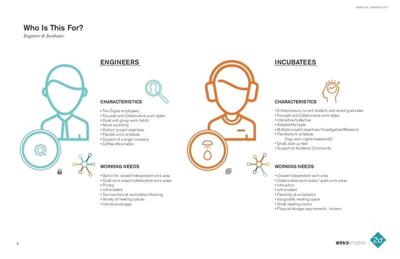
Furthering our insight into potential user groups, including engineers (Two Sigma employees), venture-funded entrepreneurs, and students (incubatees), we developed unique user profiles to typify workplace characteristics and needs. The natural pairing of engineers and incubatees became a unifying direction for the Collision Lab, with the goal of bringing them into proximity for the cross-pollination of ideas. Programming likewise required that we bring their different needs into balance: engineers enjoy the patronage of a larger company but require an advanced security network. The semi-autonomous incubatees may come from Cornell Tech or from a Two Sigma Venture backed-enterprise, necessitating a flexible schedule that may include nights and weekends. Additionally, adaptable and agile workspaces were required to accommodate the growth potential of start-ups. These two user groups also expected characteristics typical of broader workplace trends, including access to both focus and collaborative work areas and robust connectivity.
Our programming research culminated with a radial diagram that illustrated potential programmatic affiliations and the complex stimulants that could spur ideas into reality. The core user groups of engineers and incubatees were presented, hierarchically, as nodes. Corresponding areas like the pantry, meeting rooms, and lounge spaces, were encircled, representing shared spaces while services exclusive to each user group “spoked off” of each node. Secondary and tertiary user groups, such as marketers and recruiters, demarcated further exchanges of people, services, and information in concentric circles and spokes; connecting ultimately to the base of Cornell Tech and Two Sigma. The diagram became crucial to decision-making and to ensure alignment with the vision of the Collision Lab.
In response, the Collision Lab is envisioned as a 24-hour hub with an open floorplan bisected by a central community table. A sequential row of conference rooms trims the north wall while a complementary south pavilion flanks the central gathering platform, helping to mask auxiliary spaces and demarcate independent work areas from collaborative spaces. The conference rooms range in size and formality – from a seven-person war room to an intimate ‘crawl’ space. The team developed the concept as a departure from Two Sigma’s existing office portfolio and as a testing ground for future workspaces.
The Collision Lab, located on the top floor of the Bridge at Cornell Tech, is set to open Winter 2018. We’re excited to find out how Two Sigma inhabits this visionary new workplace and how this burgeoning technology hub becomes “the Birthplace of What’s Next.”
For more on our thinking about workplace design, please visit our recent publication: Workplace + Public Realm.
In your role at WRNS studio, what is your experience with displacement in San Francisco?
Many of us at WRNS Studio have lived and worked in San Francisco for decades — we’ve never seen anything like what’s currently happening in terms of gentrification and displacement. As an architectural practice driven by place and embedded in the communities in which we work, it’s disheartening to watch our city lose its already tenuous grip on socio-economic diversity. Cities do better when the people who make them run and the people who make them interesting — teachers, firefighters, artists, and many more — are connected and able to afford living in them. What happens, for instance, when our teachers leave the public schools that some of us have been lucky enough to “win the lottery” by getting into? What does teacher turnover do to academic performance? How many of our families then decide to move away so that our kids can get a good education? There’s real displacement (the neighbors we all see moving away), and then there’s this ethos of imminent second-degree displacement that we think many of us live with that erodes community. Why would we invest in this place when we might be gone?
As a business, we engage in projects that have strong social and economic justice components because we want to use our talents in service of the community, and for many of us, this is a deeply personal endeavor. Most architects don’t earn the kind of income needed to make a life in San Francisco these days; we’re looking at about half of our workforce commuting in from nearby cities. So while we’re not in fear of being displaced as a business, we as a collective of individuals working together live with the economic squeeze and displacement all around us, symptoms of the deepening economic inequity and the collapse of the middle class.
This was a very long way of getting to WRNS Studio’s first-hand experience with displacement in San Francisco, which happened when Molly Wertz, Executive Director at Tandem called us looking for help finding a new workplace for her nonprofit organization which was being forced out of its space.
How did you come into contact with Tandem?
Molly found us through the directory on Public Architecture’s 1+ Program, which we’ve been involved with since 2007. The 1+ Program asks architects to commit at least 1% of their working hours to pro bono services, with the goal of inspiring more than the minimum. We typically do 2-3% in a given year and we mostly work with organizations focused on making education and the public realm better.
It was through the 1+ Program that we linked up years ago with the Trust for Public Land, which worked in close partnership with the City of San Francisco Department of Recreation and Parks to update Hayes Valley Playground. That project led to Boeddeker Park, which transformed a formerly unsafe park in the Tenderloin to a place that hums all day long. Other pro bono projects include an expansion to the Bridge School, which helps integrate kids with certain disabilities into the conventional school systems and the Firehouse Clinics (with Public Architecture), intended to help bring health care to vulnerable, low income, and uninsured people.
What was the goal of the project with Tandem? Why did you want to help?
Tandem’s focus is on early literacy. They work with families and communities in support of early learning and future success. What they’re trying to do — spark joy in learning, foster long-term academic success and close the opportunity gap — strikes at the very heart of inequity, the lack of a quality education.
Tandem needed help finding a new home, and this effort morphed into helping them craft a functional, comfortable place in their new digs. They’d been operating out of an office on Third and Stillman, just a few blocks from our office. With commercial rents at an all-time high and all eyes on South of Market, their landlord saw the opportunity to lease Tandem’s space for much more than what they’d been paying. When Molly Wertz reached out, she was evaluating three different spaces and needed help deciding which one would work, and quickly, as she had to sign a lease within a few weeks. To her landlord’s credit, Tandem was offered another office in their existing building; however, it was a dim and uninspired space that lacked functionality.
We think that education should be a right, not a privilege. If a nonprofit organization trying to improve students’ chances at success in public education (already falling through the cracks) can’t afford to operate in the community it serves, where are we headed as a city? As a culture? Helping Tandem find the right space to rent and working with them to make their space functional and comfortable was the least we could do. It was an honor.
Can you describe the outcome of that project?
Our team — Kyle Elliott, Edwin Halim, Stephanie Hebert, and Francesca Martin — looked at different sites with Molly, conducted test fits and code analyses, landed on a space in the Bayview and helped negotiate the tenant improvement allowance. We also provided basic interior design and branding services, including space layout, lighting and paint, and color selection. We had furniture to spare from a recent tenant improvement of our own, and we donated conference tables and chairs.
Located close to MUNI, just off of 3rd Street, Tandem’s new office has a lot of space to engage with the community through their book-sharing program, community meetings, and family workshops.
Do you see WRNS working with other nonprofits in the future to address the displacement issue?
Ideally we wouldn’t have to because we don’t want to see other nonprofits get displaced, but yes, I could see being approached by other nonprofits in similar situations to that of Tandem.
What, do you think, does the future hold for nonprofits/foundations/ philanthropy in the Bay Area?
With the economic upswing, we’re busier than we’ve ever been. You’d think that when companies are doing well, they’d give more, but when what you’re donating is your services, engaging in pro bono work becomes a pressing question of resources. So ironically, it becomes more challenging to give when we’re doing well. But we’re committed. Engaging in pro bono work reminds many of the architects here of that thing that drove them to become architects to begin with — to craft places that make people’s lives better.
This was originally published on the Foundation Center’s website here.
Since our founding in 2005, WRNS Studio has cultivated a design-forward practice amidst continued, sometimes rapid growth—and 2017 was no different. Last year, our staff grew from 132 to 172, our net revenue went up 19%, and we opened a fourth office, expanding from San Francisco, New York, and Honolulu to Seattle. To guide us through this growth, we identified three ideals to which WRNS Studio strives in every project: beauty, sustainability, and a positive contribution to the public realm. It is the relentless pursuit of these ideals, carried out over a diversity of project types, scales, and contexts, that accounts in large part for our success.
As we consider our performance in the calendar year 2017, we look to the five stand-out projects included in our Design Portfolio: 1) A workplace campus inspired by the beauty and honesty drawn from a focus on functionality, proportion, quality of light and space, and raw, honest materials. 2) One of the nation's handful of collegiate recreation/aquatic centers tracking for LEED Platinum in a project type that historically consumes large amounts of energy and water. 3) A high school "guild and commons" that celebrates the symbiotic nature of human, environmental, and economic health. This project, a 2018 AIA COTE Top Ten Award winner and model of holistic sustainable design, is seeking LEED Platinum, ZNE, WELL Education Pilot, and LBC Petal certification. 4) A small screening room located off San Francisco's bustling Market Street that respectfully and delightfully threads brand with urban design to activate the public realm, and 5) an innovation lab designed to harness the vision for Cornell Tech's new campus on Roosevelt Island: "to spur the commercialization of new products and technologies by bringing together the best in academia and industry." These projects illustrate the myriad ways we translate beauty, sustainability, and a positive contribution to the public realm into site-sensitive, identity-rich design.
Sonoma Academy Janet Durgin Guild & Commons
San Francisco State University Mashouf Wellness Center
Collision Lab at Cornell Tech
Dolby Headquarters Screening Room
While our ideals guide us, it is our people that truly make WRNS Studio excellent. We've learned from working with some of the world's most transformative organizations that the most important thing we can do, as a business whose process and product is about innovation and creativity, is to attract, cultivate, and nurture talented people who share our values. At all experience levels, our people are leading the critical discourse—teaching, writing, advocating for equity, and advancing sustainable practice, to name a few. Likewise, the culture at WRNS is strong and distinct, with interests focused on craft, technology, education, and pro-bono work. We have a thriving scholarship program that promotes inspiration and critical thinking in design and architecture, with topics ranging from rammed earth construction to Robert Irwin's explorations of light and space. An informal mentorship program complements our scholarship program with construction site visits, technology workshops, and licensure advising. With several careerlong educators at the helm, our work is bracketed by a vigorous culture of education, linking academia with practice to advance architectural excellence.
WRNS Studio, San Francisco
In closing, we truly "walk the talk." WRNS Studio was the first architecture firm with headquarters in California, and is one of less than 26 architecture firms nationwide, to achieve the International Living Futures Institute's JUST Label. This "nutrition label" encourages companies to disclose their commitments to a range of equity indicators including diversity, equity, safety, worker benefit, local benefit, and stewardship. Our decision to pursue the JUST Label is part of WRNS Studio's broader effort to do our part to promote equity, transparency, and holistic sustainability. It complements our commitment to the 2030 challenge, our pursuit of the WELL Building certificate for our firm, and initiatives like the Health Product Declaration, LEED, and the Living Building Challenge. We are currently pursuing Living Building Challenge Petal Certification for expansions and tenant improvements to our San Francisco, Honolulu, and Seattle offices, as well as WELL Building certification for our New York office.
“Today, history represents neither an oppressive past that modernism tried to discard nor a retrograde mind-set against unbridled progress. Instead, at a time when there is too much information and not enough attention — when a general collective amnesia perpetuates a state of eternal presentness — understanding the channels through which history moves and is shaped by architecture is more important than ever.” –Chicago Biennial
Last fall I spent three days in Chicago, taking in the Chicago Architecture Biennial. Make New History was the theme and participants — 140 architects and artists from around the globe — contributed a range of exhibits, from dioramas to live performances, to explore how history can be invoked to inform new ideas and forms in architecture. The Biennial was held in the Chicago Cultural Center (a grand former library built in 1897 and host to the world’s largest Tiffany stained-glass dome), with associated events throughout the city, and it took place from September, 2017 through January, 2018.
“Vertical City,” 2017 Chicago Architecture Biennial: Make New History
Of the many thought-provoking exibits, I was most taken with “Vertical City,” a contemporary take on the 1922 Chicago Tribune Tower Competition. With the charge by the Tribune’s publisher Colonel Robert R. McCormick to make “the most beautiful and distinctive office building in the world,” the original competition attracted entries from over 260 architects, including Walter Gropius, Adolf Loos, and Eliel Saarinen (who took second). The wildly contrasting ideas influenced generations of architects to come. Resurrected in 1980 by Stanley Tigerman under the guise of “Late Entries,” the Tribune Tower competition (it was actually an invited submittal for a publication) once again attracted some of architecture’s biggest thinkers — Frank Gehry, Tadao Ando, Bernard Tschumi, and Tod Williams and Billie Tsien.
If the 1922 competition made evident a pivot point in architecture toward modernism, and the “Late Entries,” of 1980 turned largely on postmodernist metaphor, fun and sarcasm, how might we understand the “Vertical City” of 2017?
The architects practicing today revealed delightfully varied ideas, represented as scaled models that reimagine the landmark tower. The Cultural Center’s Yates Hall, a large expanse of a room with floor to ceiling windows that pull the city into the space, was given over to the exhibition, fusing the experience with meta. Wandering amid the towers, I felt myself inside a diorama of alternative histories of a building and of a city in which I could, in real time, hear the taxis honking below and feel the glare of the sun moving across the glaze of adjacent buildings.
Of the 16 entries, I found myself sparked by the ones that directly addressed core drivers of the innovation economy: work / life integration, community, connection to the public realm, and non-hierarchy.
Big Bang Tower by Ensamble Studio (far right) and Biennial Project by Kéré Architecture (second from right)
Big Bang Tower: A Column of Columns for the Chicago Tribune by Ensamble Studio
Noting that “an office can be a cubicle and also an open co-working area, a cafe, a lounge, a lab, a multipurpose room, virtual substance in the cloud, a room in your house, and much more,” Ensamble Studio imagined “A Column of Columns” tied together with horizontal structures that vary their positions, heights and areas to frame the city and connect interior spaces. With cores pulled to the sides and located within the envelope (atypical in a traditional high rise) and the asymmetric columns resolving both vertical structure and infrastructure, the floor plates are open to receive a diverse and evolving program. The structure is one in which knowledge workers, who expect work / life integration, might just as easily take in a film as write a creative brief.
“In alignment with current trends, the design forecasts that people will value a balanced work and life ratio while retaining real and meaningful connections with each other and with the places that they live.” Inspired by the Tower of Babel metaphor of a community working together in shared aspiration, Kéré Architecture’s proposal anticipates a mix of housing, workplace, commerce, and recreation in one building. To free up the interior for a variety of amenities and opportunities to connect with community, the cores are pulled outward. Segmented blocks with central voids allow for more private functions, like housing, to be consolidated and located higher up, with more communal activities happening on the ground floor to support integration with the public realm. The proposal offers a microcosm of a neighborhood or a city, a one-stop live/work shop in a tower of the future.
“If the primary source of derivation for modern architecture is classicism, what would an architecture that is derived from a non-Western historical tradition be?” With its design inspired by ancient Chinese architecture’s central organizing concept of the pavilion, and with pavilions stacked vertically to form a pagoda, this proposal offers a structure freed from hierarchical organization, with spaces defined in relation to one another. “The spaces of this new vertical city are attuned to the nature of the knowledge economy and the contemporary media environment where performance dominates, flexibility sets value, and well-being is the ultimate cause. Pavilions frame theaters, meeting zones, restful landscapes, and hedonistic gardens: the true productive spaces for today’s media workers. This is architecture with a language not rooted in Western thought and with a history outside of the narratives of modernism.”
This was the model to which I returned, walking around it, staring into its corners, wanting to step inside and make myself at home.
Does the “Vertical City” — this third festival of ideas centered on iconic American skyscraper — offer a touchpoint, some indication of where urban architecture is going in response to changes in how we work to propel the innovation economy? If so, I’d take note of the Ensamble, Kéré, and Serie entries.
First, why did you become an architect?
My father was a business owner in the hospitality industry and frequently worked with a Japanese architect who would make beautiful models and hand-sketched renderings. I had always loved art, so the profession intrigued me, but seeing the model of a double-height atrium of a restaurant was really the seed that implanted this career path into my head as a child. By the time I got to high school, I was already looking into the Doctorate program at University of Hawaii.
Your doctorate in architecture is still fairly new and rare in the industry—what made you want to further your studies?
I was one of the first classes to graduate with a Doctor of Architecture from the University of Hawaii at Manoa (UH). The 7-year program offered practicum with local and international firms, which I completed in Tokyo and London while working on my thesis. As a local girl who wanted to work in Hawaii, it was the ideal opportunity to attend the local university and build my foundation at home while still getting overseas exposure. Between practicum, I started working part time at a local firm, and after graduating I ended up working there for the next eight years, focusing on retail and restaurant designs with Japanese clientele.
The architecture industry here is quite small and interconnected as you can imagine, but Hawaii is also a global business hub in the Asian Pacific. The UH School of Architecture Doctorate program gave me both a door to the community and the opportunity for me to form strong international relationships and connections.
What are you excited about in the Hawaiian retail/hospitality world right now?
Hawaii’s architecture/interior design scene has changed drastically over the past several decades with a focus on design that transcends vernacular or Hawaii-themed architecture. While cultural sensibility will always be a key tenet of design, we’re looking for different ways to evoke our culture and history through the fundamentals of functionality, proportion, quality of light and space, and raw, honest materials. The Hawaii Regionalism and Tropical Modernism aesthetic that has consistently been at the forefront of our residential and commercial designs is now shifting to make more room for designer originality.
On the other hand, with a wide range of design ideas becoming much more accessible due to globalization and social media, clients often have more of a set vision in mind. The challenge in this comes from creating a cohesive design language from the collage of images they hand us—one that is authentic to both our practice and the mission of our client. All said, I’m excited for WRNS Hawaii to help usher in this new era of Hawaiian design!
What does a “successful” project mean to you?
Hawaii commercial projects are typically fast-tracked (with project duration of less than a year) due to exorbitant building costs and rents. Many projects end up sacrificing something—whether it’s budget, sustainability, time, or design. A successful project means figuring out the right equation to balance all these factors; we can’t always spend $500+/sf, but we also don’t want budget constraints to limit our design opportunities. I spend a lot of time with each client to make sure our visions are aligned so I can design to their best interests. For example, commercial clients usually want the most “bang for your buck” so it’s important to prioritize areas and create spatial features that draw customers. Building that trust is extremely rewarding, especially when the project initiates a long-term client relationship and we become their go-to designers.
What made you want to join WRNS?
A mutual friend introduced me to Adam Woltag, one of the partners leading the Hawaii office, who then introduced me to Jeff Warner, one of the founding partners. Their passion and vision towards the future of Hawaii’s architecture was refreshing, and their energy was contagious. The firm had great work nationally and was starting to make its mark in Hawaii, with WRNS Hawaii already engaged in prominent projects in the public sector. I thought I could help grow the private sector work with my experience and established clientele. Expanding the project types with something tangible to the general public and essential to the local economy seemed like a practical next step to further strengthen the firm’s Hawaii presence.
Other than my experience in Tokyo and London, I’ve always worked at small firms. The thought of joining a larger firm was a bit overwhelming at first, but I soon realized the magnitude of the benefits to Hawaii having access to the great leadership and resources on the mainland. The strong collaborative teamwork and supportive energy was also something I hadn’t seen in other offices, and I was excited to become a part of it.
How do you incorporate WRNS Studio’s core tenets of beauty, sustainability, and the public realm into your projects?
It’s much more difficult to convince clients to spend the extra dollar to be sustainable, especially in retail and hospitality projects. Thankfully, things are changing—people are taking the concept of Mālama ʻĀina more seriously, which roughly translates “to take care of the land so it can take care of you.” Local architectural products and materials are sparse, but people in Hawaii are becoming more conscious with salvaging/recycling materials, upgrading building efficiency, and implementing renewable energy. Although there is still a lot of new development, the majority of the commercial projects in Hawaii are tenant improvement/renovation projects, with adaptive reuse becoming more popular in historical sites such as Chinatown. I think there is a great opportunity for WRNS Hawaii to showcase our skills and talent to create something beautiful and significant while maintaining our historical assets.
What are your inspirations outside of architecture?
I don’t think I have a definitive answer because it’s always different! It can be a form and scale from nature to something as trendy as digital art or fashion to pick up a color palette. In terms of materiality, I get a lot of inspiration from simply researching both new and traditional finishes in the market and envisioning every possible use for them. Most importantly, I think moments of silence are good for me (as I work best after hours alone in the office) so I can connect all the little inspirations that come and go daily.
This year marks the 125th anniversary of the overthrow of the Kingdom of Hawaiʻi. A recent event in Honolulu commemorating this anniversary was attended by thousands of people, marching from the Hawaiʻian Royal Mausoleum (Mauna Ala) to the Iolani Palace, where Queen Liliʻuokalani — the Hawaiʻian Kingdom’s last reigning monarch — was forcibly removed from the throne.
Most Americans know Hawaiʻi as one of the planet’s great vacation spots, for its surfing, volcanoes, and Pearl Harbor. I can speak from personal experience that, at least via my own public school education, the version of Hawaiʻi’s history that I received was highly romanticized and biased, and as you can imagine, not in favor of native Hawaiʻians. I can vaguely remember back to 1959 when Hawaiʻi was admitted as our country’s 50th state. For many Americans it was cause for celebration and a statement of progress and great national optimism. But for others, not so much. There has lately been a concerted nationwide effort to revisit our history (not revise), to seek and recognize unbiased and unfiltered truth and in Hawaiʻi, this recognition has never been more evident.
Current anthropology points to the original settlement of the Hawaiʻian Islands by Polynesians from the South Pacific’s Marquesas Islands between 300 and 500 AD. A second wave of settlement followed between 900 and 1000 AD, this time from the Tahitian islands. Using their knowledge of the sea and the stars, the Tahitians navigated their double-hulled canoes some 3,500 miles north, landing first on the Big Island (the island of Hawaiʻi). These settlers came in waves, bringing most everything necessary for survival, including food crops and livestock — none of which were native to the Islands.
This community grew and flourished and by the time Europeans first made contact, the population was estimated between 800,000 to 1,000,000. Hawaiʻi was a completely self-sustaining, ecologically balanced community and by some accounts, one that enjoyed the highest standard of living of any human settlement on the planet. All of that began to change when the British Captain James Cook ran into the Islands during his third voyage to the Pacific. Commanding his sailing ships Resolution and Discovery, Cook first sighted the islands of Oʻahu, then Kauaʻi and Niʻihau and on January 20, 1778, landed in Waimea on the island of Kauaʻi. There are many accounts of ‘post-contact’ Hawaiʻian history, but I found Julia Flynn Siler’s book, Lost Kingdom, to be very clear, informative and most importantly, truthful.
Unlike many of its predecessors, Siler's book eschews the bias and historical perspective of Christian missionaries and their imperial counterparts to focus on the experience of native Hawaiʻians. Siting over 275 sources, Siler explores the degradation of Hawaiʻi's people, culture, and land, culminating in the forced abdication of Queen Liliʻuokalani's throne. For a good review / synopsis of the book, please find it here.
Queen Lili'uokalani
Formal annexation of sovereign territory happens and is internationally recognized through treaty, most often as a result of cessation of conflict (mostly armed). Not that all treaties are fair or are they honored — just look to many of those executed between Native American tribes and the US government — but a treaty between nations still represents an internationally recognized form of agreement and due-process. No such treaty was ever executed between Queen Liliʻuokalani, the Kingdom of Hawaiʻi and the United States Government and thus, the status of Hawaiʻi is not entirely clear. A ruling coming out of an arbitrated case in the Hague’s International Court of Justice and its Permanent Court of explicitly recognizes the Hawaiʻian Kingdom as a State and the acting Government (the current State Government) as its representative, which is also recognition that the Hawaiʻian Kingdom was never formally annexed by the United States, but rather illegally occupied since the Spanish-American War in 1898. So what does this all mean? Well, according to this ruling and the legal minds associated with it, Hawaiʻi is an occupied territory and not really part of the United States.
The overthrow of Queen Liliʻuokalani and all that has transpired in Hawaiʻi since has, over time, precipitated many groups and movements that have advocated for a wide range of outcomes, from varying levels of Hawaiʻian sovereignty to outright succession from the Union. One of the current and very significant sovereignty movements is the Aloha ʻAina Party. This political party is working to assure social, economic, and environmental justice for the peoples of Hawaiʻi. Their foundational principles are expressed as follows and note, I’ve condensed and summarized:
Aloha ke Akua: acknowledgment of the existence of a higher, spiritual power, and the freedom for all to worship and seek guidance as their conscience moves them;
Aloha Kānaka: love for all the people, regardless of race, color, creed, or national origin;
Mālama ʻĀina: respect for the land and recognition that the relationship between the well-being of the land and the well-being of the people are inextricably linked;
Government Accountability and Transparency: strong belief that the government must truly be of the People, by the People, and for the People and must be transparent and accountable;
Hoʻoponopono: To make right what is wrong, specifically as related to the overthrow of the Kingdom of Hawaiʻi in 1893 – something that must be addressed and rectified.
The principle of Mālama ʻĀina is perhaps the one that most resonates with those of us at WRNS as we celebrate our five year anniversary in the State. One would think that by virtue of its geography, cultural history, and unique physical environment, Hawaiʻi would still — as it once was — be on the forefront when it comes to creating an environmentally sustainable community. Nothing, unfortunately, could be further from the truth.
Located almost in the center of the Pacific Ocean, Hawaiʻi is one of the most geographically isolated places on earth. Within 30 miles on the big island of Hawaiʻi alone, ecosystems range from marine coral reefs to snow-capped mountains. The world's wettest spot, Mt. Waialeale on the island of Kauai, receives over 430 inches of rain per year. Hundreds of different soil types are spread across the islands’ 6,400 square miles and the islands possess a combined 750-mile coastline — one almost as long as that of California. While this isolation has supported the evolution of diverse environments for flora and fauna found nowhere else on earth, it has also enabled a multitude of serious local environmental issues.
The most critical of these concern Hawaiʻi's unique biodiversity and the associated threats caused by introduced, invasive species. While Miconia weed, the coqui frog, and dengue fever spread by mosquitoes have received publicity most recently (and btw, mosquitos are not native to Hawaiʻi), they represent just a few of the thousands of species of animals, insects, plants, and organisms that have been introduced on the islands — many of which have turned invasive, wreaking environmental havoc. Unchecked and poorly planned development has caused the contamination of ground water with organic chemicals, and pollution of coastal waters with sediments and pathogens from both urban and agricultural runoff. The presence of numerous chemicals in active and former military sites represent an additional set of serious environmental challenges. The result of all this is Hawaiʻi’s dubious title as the "extinction capital of the world", with almost 40% of the endangered species in the United States being Hawai`ian species and nearly 75% of all U.S. extinctions occurring in Hawaiʻi. It is within this context that the Aloha ‘Aina Party is advancing the principle of Mālama ʻĀina as one of its key tenets. Mālama ʻĀina — respect for the land — has encouraged a wave of new thinking and activism as related to conservation, energy generation, energy consumption, waste and water management, and agricultural practice. All of it inspired by native Hawaiʻian tradition.
As WRNS celebrates our fifth year in Hawaiʻi, we draw inspiration from Mālama ʻĀina. One of the catalysts for opening a practice here, in addition to personal histories and connections, was our understanding of the State’s critical need for a higher level of sustainability-driven planning and design. We have witnessed in many of Hawaiʻi's residents, both native and local, a great desire to help redirect the state from a continued trajectory that could result, once again, in peril. Of course architecture is only one piece of the puzzle, but crafting buildings and environments that help solve contemporary problems — in ways that are respectful and authentic to the islands’ environment and cultural history — is fundamental to our approach. And we’ve found great need for more of it.
We arrived on-island at an interesting time, as the political will of the people and institutions were beginning to mount a serious campaign to create a place that can be an inspiration and example to the rest of the world. By virtue of its unique geography and cultural history, Hawaiʻi is, in a sense, the ‘canary in the coal mine’ as it relates to the rest of the planet (that is, how Hawaiʻi goes, so goes the planet). Based on our relationships, our point-of-view and our experience, Hawaiʻi represented a natural opportunity in which to participate in the discussions shaping Hawaiʻi's future.
We have been honored to be a part of the following projects:
Planning for cultural gardens at Kamehameha Schools;
Sustainability Advisors to the State Department of Education (DOE);
Development of an Infrastructure Master Plan for the University of Hawaiʻi’s Manoa Campus (a framework to meet net-zero energy and water goals and a plan for resiliency);
Designers for the conversion of a historic UH Manoa gymnasium into one of the campus’ first net-zero buildings;
Developing a master plan for the Kuhio Park public housing community (creating a place of dignity for Pacific Islanders displaced by the US Governments atomic testing in Micronesia);
Designers for a green, high-rise urban school (Pohukaina) that will help create community in a new high-density urban development;
Designers for a high-rise, senior housing and community center project to help fill the acute need for affordable housing for a poorly served population.
In various ways, these projects strive to support the precepts of Mālama ʻĀina as well as Hoʻoponopono — to help right what is wrong. We didn’t come to Hawaiʻi to design buildings that could be anywhere. We came to apply the best of our thinking to help right the ways in which Hawai’I has been wronged — at least as related to planning and design. While the overthrow of the Kingdom of Hawaiʻi represented the end of what was — at one time — a self-sufficient, self-reliant, sustainable community, the event’s 125th anniversary represents somewhat of a re-birth of the notion that Hawaiʻi can and should get back on the path leading to what it once was. WRNS, by virtue of our point-of-view, experience, and deep relationship with Hawaiʻi, hopes to humbly assist.
As Hawaiʻi goes, so goes the Earth: The Hawaiʻian islands as seen from the International Space Station on January 18, 2014; source.
Please refer to the link http://www.hsso.org/kd/wp-content/uploads/2016/10/Hawaii-Invasive-Species-Official-List-%E2%80%93-2017-rev2.pdf for a list of Official Hawaiʻi Invasive Species. Note that there is a distinction between "introduced" and "invasive." There are many more species than listed here that have been "introduced" in Hawaiʻi (e.g. the pineapple), but left to their own devices they won't become environmentally "invasive." That is, they cannot exist untended in the wild and thus, present minimum environmental risk. However — and specifically in the case of the pineapple — it could be argued that its introduction as a major agricultural crop was highly invasive and destructive from an environmental, social, and cultural perspective.
wil·der·ness noun /ˈwildərnəs/
(1) a tract or region uncultivated and uninhabited by human beings (2) an area essentially undisturbed by human activity together with its naturally developed life community
——————————————————
I’ll be retiring as an active partner of WRNS at the end of this year and as I prepare for this change, I’ve been thinking more and more about wilderness (yup…that’s right, wilderness) – my history with it, what defines it, where it still exists, how much remains, and how our profession, so focused on building and transforming the environment, can serve to protect it. So, this feels like a good time to record – through personal experience and a couple of stories – some thoughts on the subject (accompanied by a few photos, of course).
If by reading this you get to thinking about wilderness, great. If by reading it you’re inspired to take more direct action, even better. The country needs a new conservation movement, and you are all more qualified than most to join it. At the least, I hope the following is informative and mildly entertaining…
I grew up in Downey, California – a blue-collar town smack in the middle of Los Angeles’ post-WW II sprawl, where I had little exposure to wilderness. As I got older, occasional trips to the Southern California desert and even more occasionally, trips to Yosemite, introduced me to the concept of “uncultivated regions.” Both the desert and Yosemite, at least those areas I was able to access, were fairly well-trodden and actively managed – not real wilderness by any current definition – but I tried my best to venture out to their edges whenever possible. While hiking, discovering places where there was little or no evidence of human habitation became a passion.
My interest in wilderness grew after entering Berkeley in the 70’s. It was a great time to study architecture, as the environmental movement was in full swing. Architects were re-discovering links between long-term ecological thinking (which evolved into sustainable design) and the act of conservation, and their work was beginning to reflect it (think ‘Sea Ranch’). Being at Berkeley, we were also assaulted by a new wave of dire predictions focused on the unsustainability of our modern civilization: unchecked population growth, pollution, nuclear proliferation, the squandering of natural resources, and the horrors of war (Vietnam in particular, which was finally just ending) all pointed to the end of our species and the planet as we knew it. As architecture students, we became convinced that employing the power of sustainable design and enacting sound environmental public policy could save the earth. It was heady times.
My architecture professors at Berkeley were inspiring, but didn’t come close to influencing me to the extent a couple other professors did. The first was Daniel Luten. A chemist turned environmentalist, he was one of our country’s foremost authorities on wilderness and the importance of its preservation. I remember him best for proposing half-jokingly, half-longingly, the creation of a National Migratory Buffalo Pathway – a 200-mile wide swath of land stretching from the Canadian border to the Texas panhandle — where the once-great American Bison herds could be reinstated and then left to migrate freely along their ancestral pathways. Wow. The second was Starker Leopold. Son of Aldo Leopold (author of The Sand County Almanac and one of the great voices of the American conservation movement), Starker Leopold was a professor of Forestry and Zoology, a member of the National Academy of Sciences, and a special advisor to the National Park Service. His class in wildlife biology, more than any class I’d ever taken, changed the course of my studies and to a large extent, my outlook on life.
I can trace this change to a class field trip. On a cold, overcast winter day, Professor Leopold led us on a trip into the Sacramento Valley and up to the Gray Lodge State Wildlife Refuge, about a two-hour drive northeast from San Francisco. A 9,100-acre reserve flanking the Sutter Buttes, Gray Lodge protects a riparian and wetlands ecosystem that once encompassed the entirety of California’s Central Valley and now serves as a critical stop for migratory birds travelling the Pacific Flyway. While growing up I’d seen an occasional v-shaped skein of migrating waterfowl fly through the Southern California skies, but never anything like I experienced at Gray Lodge. Imagine over a million migratory waterfowl (ducks, geese, swans) flying in and out of the refuge area in groups of all sizes, at every elevation, to and from every direction. It was chaotic and powerful. I was a bit overwhelmed, fumbling with my camera, trying to capture some images of meaning, when I heard the call of a flight of birds completely new and unfamiliar to me. Sandhill Cranes. A very old species with fossil records dating back over 10,000,000 years, the cranes were flying high over the refuge, well above the cacophony below. Listening to that ghostly call — a sound that hit me in my spine — connected me with the stretch of time and the concept of wilderness like nothing I’d ever experienced. Luckily, I was standing right next to Professor Leopold and quickly asked him where those birds were coming from. He looked at me and smiled, “The sandhills? Why, they’re flying south from their breeding grounds in the arctic…they’re coming from Alaska.”
Grey Lodge State Wildlife Refuge, Sacramento Valley
From then on I had one important goal in mind – to get to Alaska and to the greatest extent possible, experience what our country must have looked like before colonists obliterated it and more importantly, to see the wilderness those cranes had come from. I continued my studies in architecture, but modified my curriculum to earn a Minor in Wildlife Biology. I read every book on Alaska, the arctic, and the subject of wilderness I could find. I applied for a job as a National Park Service seasonal ‘Ranger/Naturalist’ in Mt. McKinley National Park (now “Denali National Park and Preserve”), got the job, accelerated my graduation so I wouldn’t miss any part of my first season in Denali, and in May 1974, I took off in my 1964 Ford Econoline Van (“The White Iron”) and headed north.
It was a 3,000 + mile trip, and a good portion of the drive took place on the mostly unpaved Alcan Highway. I quickly became immersed in the lore and history of Alaska and the Park, and worked hard to offer that knowledge to the visitors who’d travelled from so far away to visit it. Midway into the season, I was able to transfer to the Park’s concessioner as a Naturalist/Guide, helping me to earn a bit more money to support upcoming grad school. As well, the job was free of many of the political constraints that came with Federal employment: the small group of Naturalist/Guides had greater flexibility regarding what we could share with the Park’s visitors. We were all young, idealistic, committed, completely immune to differing points-of-view (that is, a little naive and self-righteous) and even as relative newcomers, we were fiercely protective of Alaska, its wilderness, and the Park that we were growing to love beyond all description.
View to terminus of Muldrow Glacier, Alaska Range, Denali National Park
I recall a couple of days during that first season as if they happened last week. 99% of the visitors to Denali experience the Park only from the seat of a bus (which from the Park’s perspective and its sustainability, is a blessing). The Park’s only road, with just the first 15 miles paved and the remainder gravel, stretches 90 miles from its entry at the state highway, past Wonder Lake to the end of the road at the Kantishna, once a gold-mining encampment but now home to a couple of notable wilderness lodges. The typical day trip is about eight hours, travelling sixty miles into the Park before turning around and heading back. As a Naturalist/Guide, it was my job to take a daily group of 40 visitors on these day long journeys, help them spot wildlife and points of interest, and enlighten them on the Park’s geology, natural history, cultural history, wildlife, biology, etc. The first of those two days was a disaster. My group had all travelled a long way and gotten up at 4:00 am for this journey but unfortunately, saw virtually nothing during the eight-hour trip but the rear end of a wet moose. I couldn’t help but feel responsible for their extreme disappointment. It rained all day, and low fog obscured even the lower peaks of the north expanse of the Alaska Range. They had no chance to see even a glimpse of Denali. As well, no grizzly bears, no caribou, no Dall sheep, no golden eagles, and not even a marmot or a pika.
True to form and the vagaries of weather and wilderness, the next day was unbelievably magnificent. Clear and relatively warm, we had a bonanza of wildlife sightings – numerous moose; over thirteen-hundred caribou (a good portion of the small ‘McKinley’ herd); eighteen individual grizzly bears including three sows, each with two yearling cubs; over fifty Dall sheep in several distinct groups; golden eagles and several species of hawks. We also glimpsed a Canadian lynx (a rare siting) and most fortunately, a grey wolf from afar (a very rare siting). As for Denali, the day was clear and cloudless from sunrise with its summit in alpen glow (from around eighty miles away), to the mountain in its entirety from thirty miles away later in the day (the mountain rises three miles from its base, and thirty miles from that base is its closest distance from the Park road).
At the end of this day and back at the Park entry, my very tired but appreciative, mostly elderly passengers disembarked, having had what I believe was one of the most memorable days of their lives. As most of them disembarked, rushing to secure their baggage and quickly get to the train depot for their six-hour ride to Anchorage, one woman came off the bus and took me aside. She told me her husband had recently passed and they had planned this once-in-a lifetime trip together. As difficult as it was for her, she still came in spite of his passing, hoping to honor his memory. She was absolutely sure that the rare nature of the day and the things she was able to see were the doings of her husband’s spirit, and that she felt him next to her the entire trip. I often still hear and feel her words.
Towards the end of each trip into the Park, I used to implore visitors – most of whom were only in the Park that one day in their entire lives – to remember what they had seen and to take those memories back home with them, seek the wilderness still existing in their own communities, and then work hard to protect and conserve it. If my message resonated with at least a couple visitors out of the 40 or so I’d guided through the Park on any given day, I’d consider it a success. Certainly that message resonated on that most memorable day.
Denali – tallest mountain in North America, Denali National Park
Note: The annotated photographs throughout this post and Part Two comprise of a few digitized copies of 40+ year-old slides (so please, excuse the quality). Some of the best photographs were graciously ‘loaned’ to me by Kenny Bahr, a semi-professional photographer and one of the members of our Gates of the Arctic party. If you’re at all compelled to share any of these in any form, please refrain from sharing Kenny’s, as they represent a good portion of his livelihood (you can, of course, contact him to purchase: kennybahr@ofmlive.net).
WRNS defines its work as being about beauty, sustainability, and the public realm. What do these concepts mean to you?
Daniel Johnson: In my opinion, architecture is useless without people, and for me, architecture that extends its experience to the public realm is probably one of the most exciting potential offerings of architecture. Buildings that are primarily private almost seem like giant rocks in a stream redirecting the flow of water, whereas publicly infused architecture is more akin to bridge, and I would prefer to build bridges versus dams. Metaphors aside, some of my favorite works of architecture have incredible public experiences – the modern entry plaza to the Reina Sofia Museum in Madrid by Jean Nouvel had a profound impact on my understanding of the power of architecture and the public realm. Not only did the architecture create an interesting relationship to the historical building it was attached to but the way Nouvel created drama from the sky to the plaza was a magical experience that opened my eyes to how architecture not only shelters and defines space, but creates phenomenal connections between earth and sky. When you mix in a flowing stream of people into an experience like architectural value becomes truly evident.
Emily Jones: Beauty, to me, is a moment (usually fleeting) that is prompted by an experience of place. As an observer and a designer, I seek to both experience and create beauty; however, I have found that, in attempting to create beauty through architecture, it is essential to acknowledge and utilize the beauty found in nature. Therefore, for me, architectural beauty is a deliberate and skillful composition of natural elements of beauty translated through design that, when successful, evokes a visceral experience of place. Consequently, for me, beauty and sustainability are inextricably linked as sustainable design strives to preserve what, to me, is an essential element of beautiful design – nature.
Ben Mickus: While all buildings occupy a space necessarily, it is the interaction of a building with the surrounding space that transforms into place. This is what excites me about architecture: a building and the space around it fusing into something more than any of the constituent parts, and becoming a piece of the ever-changing public realm. While the public realm as an abstract concept is fluid, dynamic and buzzing with energy, it is architecture in the public realm that somehow channels that energy, allowing it to be experienced through the creation of views, moments, sequences, tactile interactions, and relations to context. We create a unique experience of a place.
What do you think makes a good leader?
Dan Sakai: I have a toddler who likes to lead me around. Her inclinations rarely coincide with the rest of the family’s, but she enjoys a song called Head, Shoulders, Knees and Toes – you may know it – which provides a useful mnemonic for leadership in grown-up organizations.
Head: Clear thinking leads to insight and level headed decisions.
Shoulders: Sharing the load inspires and builds team cohesion.
Knees and toes: Dynamism requires nimble responses and flexibility to address changing markets and individual project and team needs.
The verse repeats and the children touch the different body parts as they sing along. Then there is a bridge including:
Eyes: Vision requires a long view and hawk-eyes for shortcomings and opportunities.
Ears and Mouth: A strong communicator is both articulate and a good listener.
Nose: Integrity is crucial; when something fails the smell test, action is taken.
I am not suggesting adults need to be able to touch their toes, but leadership touchstones are central to effective, inspirational organizations. Getting my daughter pointed in the right direction is another matter.
What drew you to WRNS when you first came? What made you want to stay?
Daniel Johnson: It sounds obvious, but the work is what drew me to WRNS. There was a clear point of view – architecture that was tuned to its context, composed thoughtfully, and used materials in ways that were modern and sophisticated. Additionally I was very impressed and intrigued by the fact that WRNS grew the practice through a terrible recession, and some great work came out of that period of time, which to me signaled that this was a company that knew how to run a successful business, a trait I was very interested in learning. What makes me stay is all of the above but with an added layer, the staff and leadership is incredible. I feel like I can be myself here, and I am surrounded by a bunch of really smart, creative, interesting and idiosyncratic people who have given so much to my professional and personal life. As much as they are my colleagues they are (for better or worse) becoming my family.
Lily Weeks: The work at WRNS is what drew me first. I wanted to be a part of the growing interior design practice in an architecture firm, after all, my education is in architecture and my experience in interior design – it was a great fit for me. What made me stay was the studio environment that I can only describe as a rigorous creative hive with some of the most talented people you will meet, what else could I ask for?
What are you excited about in architecture right now?
Hattie Stroud: The way in which social responsibility is becoming an important part of practice is really great. I’m a big fan of offices like MASS Design Group that really champion the ways design can be beautiful but also smart, sustainable, and supportive of its community. This isn’t about community process dictating a design – it’s about architecture that is responsive to its context.
Where do you see WRNS in the next five years? How do you want to see us grow?
Ben Mickus: As WRNS grows, the design profile of the firm–as defined by the caliber of projects we pursue–should grow with it. The diversity of projects in the office has been so strong since the inception of WRNS, and I hope it will continue to be a defining strength, as we deepen our experience across so many practice areas.
What are your inspirations outside of architecture?
Dan Sakai: Autonomous vehicles are super-exciting. As economies of scale incentivise ride-sharing over personal vehicle ownership, tremendous amounts of land currently used to store empty cars may become available in places we care about: along our streets, on the ground immediately surrounding many destinations, and in robust structures in high land-value areas. Extensive use of ride-shared autonomous vehicles may actually align incentives for congestion pricing, change commute patterns and public transit paradigms and radically shift development and planning patterns (for better or worse). There is a lot at stake for urban communities and the environment.
Lily Weeks: Art & fashion. Every morning I walk to work, 30 minutes downhill – I walk past the merchandise displays of Prada, Valentino, Dior & Britex Fabrics. These brief but constant glimpses of human centered design, textiles, and pattern play give me my first creative jump start to the day. In moments of creative daze I have taken a short respite to SFMOMA, just a few blocks from the office, to visit a favorite piece, wander a new exhibit or sit & reflect on a balcony.


 Sonoma Academy Janet Durgin Guild & Commons
 San Francisco State University Mashouf Wellness Center
 Collision Lab at Cornell Tech
 Dolby Headquarters Screening Room
 WRNS Studio, San Francisco


 As Hawai

