“When we look forward five, ten, or fifteen years, we ask ourselves who will carry the legacy of place-based, critical design forward. Our new leaders bring the kind of plurality of talents and interests that have always defined WRNS, whether it’s the ability to draw beautifully, curate place, advocate for equity, craft an exquisite building skin, or execute in a way that maintains design intent,” says founding partner, Bryan Shiles.
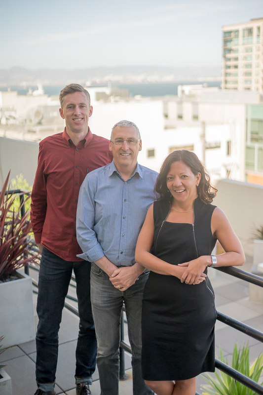
The three new partners are Lilian Asperin, Tim Morshead, and Russell Sherman. A leader within our higher education practice, Lilian was recently elected to a three-year term as the Society for College and University Planning’s Pacific Regional Council Chair. She is also a Board Director of AIA San Francisco and Co-Chair of the Equity by Design Committee. One of the studio’s lead designers, Tim Morshead’s portfolio includes an expansion to Microsoft’s Silicon Valley campus and the Betty Irene Moore School of Nursing at UC Davis Medical Center. Russell Sherman, who has been with WRNS since 2006, is recognized for his ability to steward projects through the most complex of processes, contributing greatly to the firm’s reputation for matching design excellence with hands-on, client-focused delivery. Sherman is responsible for two recent projects that auger in a more sustainable, publicly-engaged workplace experience for San Jose’s Santana Row.
Partners Tim Morshead, Lilian Asperin, and Russell Sherman
Moses Vaughan, Molly Thomas, and Stephen Kelley have been named senior associates, a new role within WRNS, created to expand our ability to serve clients, manage growth, and cultivate the next generation of firm leaders. Stephen helped start WRNS Studio’s New York office. His design portfolio includes the recently completed Collision Lab at Cornell Tech and numerous projects for Facebook and Microsoft. As our marketing and communications director, Molly Thomas has played a critical role in landing the firm’s most transformative projects, and she recently co-authored a research publication, Workplace + Public Realm. Moses Vaughan brings a particular focus on craft, having developed innovative building technologies for projects serving Adobe, UCSF, and Intuit.
Senior Associates Moses Vaughan and Molly Thomas
Senior Associate Stephen Kelley and Associate Dan Sakai
The twelve new associates include Daniel Johnson, Tim Jonas, Emily Jones, Jonas Kellner, Jon Kershner, Natalie Kittner, Crispin Lazarit, Eric Lilhanand, Ben Mikus, Dan Sakai, Hattie Stroud, and Lily Weeks.
“Our new associates are teaching, leading projects, mentoring staff, making our culture strong and fun, and introducing new tools, technologies, and ways of working. They elevate their peers and our leadership, bringing out the best in all of us,” says WRNS Studio partner Melinda Rosenberg. The new associates have been responsible for some of the firm’s most innovative projects, including the Dolby Headquarters Screening Room in San Francisco and Sonoma Academy’s AIA COTE award-winning Janet Durgin Guild & Commons.
Associates Daniel Johnson, Lily Weeks, Tim Jonas, Natalie Kittner, Jonas Kellner, Hattie Stroud, Ben Mickus, Emily Jones, Eric Lilhanand, and Crispin Lazarit
Associate Jon Kershner
Associates Hattie Stroud and Crispin Lazarit
Partner Lilian Asperin and Associate Hattie Stroud
Associates Lily Weeks and Emily Jones, Senior Associate Molly Thomas, and Associate Laura Stedman
Associates Daniel Johnson and Lily Weeks
Associates Jonas Kellner and Ben Mickus
1. Marine Way Office Building 2. Bayshore Office Building 3 & 4 Parking Garages
High visibility atria in the office buildings were key to creating a more vibrant, functional campus for Intuit. These centrally located all-hands spaces had to do many things: reinforce and lend definition to campus patterns, welcome up to 500+ people at a time, and serve different events with varying light, sound, and capacity needs. As the lead corporate campus architect, WRNS Studio had proposed vast clerestory windows in the atria that filled the low, wide floor plates (up to 60,000 sq ft) with natural light and a connection to the sky — key to the experience of beauty and delight favored by the design team. When it came time to execute the design for the first new Marine Way office building on the campus, however, it took a deep dive into Design Development to uncover a viable technical solution for the clerestory windows.
Challenges
Suspended four floors above the deck, with a 60-foot span, the atrium clerestory windows presented no shortage of challenges: We wanted the atrium to be an uplifting, light-filled space, with the clerestories lending texture to scale down its capaciousness. The long span condition, an aesthetic and experiential imperative, could not be broken up by structure; the clerestory windows had to support themselves. In addition to pulling daylight into the interior, the clerestories needed to be controllable, allowing the atrium to darken for presentations, and to transition back easily, supporting supplemental artificial lighting. Likewise, the clerestories needed to integrate with the building’s other systems, helping to balance sound (large atria can get loud), embed fire sprinklers, and act as a passive smoke exhaust system. A strategy for cleaning the windows and general maintenance was required. Then there was constructability: How could we avoid installing a ton of expensive scaffolding?
Certainly not a first for WRNS — initial sketches to solve this head-scratcher happened late at night over wine, progressing to a solution that is at once detailed and expansive.
Pre-cast to the Rescue
After many iterations, we landed on a pre-cast clerestory beam system. The advantages were many: pre-cast beams would allow for the integration of vertical clerestory glazing, which would be much easier to maintain and present fewer waterproofing concerns compared with skylights. We knew the beams could span structurally (we’d designed them in parking structures), and they’d arrive on the site with a finished surface crafted at the shop, good for schedule and quality control. The pre-cast solution would allow us to create a custom shape to meet our objectives for drama and texture of light, sound absorption, and views of the sky.
But could we actually do it? The span was long (60 feet!). The beams would have to be deep and heavy. Thankfully, Willis Construction was on the job. Of the many advantages to using a pre-cast system, we could work with our fabricator in real time to prototype and test ideas for shaping the beam, carving, and bending light to our needs.
Collaborate, Iterate
The pre-cast clerestory beam in Willis Construction Yard
The pre-cast clerestory beam solution was a true collaboration with Willis Construction: design aesthetic meets engineering, structural analysis, and physical testing. Development of the beam’s shape and geometry was a lengthy and detailed dialogue: Willis conducted full-size, 6’ x 8’ mockups at their yard, which we reviewed together for shape and finish. These mockups complemented WRNS’ in-house computer model. We also sent a model of the pre-cast system to our acoustical consultant, who did a thorough analysis looking at ways that the beams’ shape and surface treatment might mitigate sound reflection within the large space.
Panoramic rendering iterations
In all, eight iterations were explored, each investigating the beam’s specific shape, density, and rotation. The different versions were illustrated as interactive panoramic renderings and presented to Intuit as part of a holistic analysis focused largely on the qualities of light in the atrium. The selected solution was further studied in a virtual reality simulation and presented to Intuit.
Detail Diagram
Detail
This section of the pre-cast beam illustrates its form, structure, and integration with the building’s MEP systems — optimizing the shape to address every aspect, from structure to acoustics, to address specific needs. Intuit wanted their new workplace to be raw and informal, robust and monumental. As an integral part of the structure, the pre-cast beams allowed for a consistent and strong, but elegant surface. The beams were hoisted high above the roof, and slowly lowered between the cast-in-place concrete girder walls, then telescoping steel tubes were extended to take the primary gravity loads. Initial discussions focused on access and the ability for maintenance staff to walk across and service the roof & glazing safely, and we shaped the beams accordingly. Electrochromic glass used for the vertical clerestory glazing allows for easy dimming or darkening via controls. An acoustic plaster fascia panel on the inside face of each beam houses sprinklers and attachment points for multiple pendant tube-lamp fixtures.
Light and shadow
In early iterations, the clerestory windows were facing north, until our resident building technologies sage Moses Vaughan, got involved. We were about to ask our client to invest heavily in an engineering feat — integrating these large, heavy beams into the overall systems approach to the atrium — when it was brought to our attention that the light we’d be pulling in from the north would be beautiful, but soft. Based on observation of similar clerestory windows we had researched, it became apparent we were missing an opportunity to capture the kind of strong direct sunlight that would make for dynamic shadow play traversing daily across the all-hands space. Moving through the space, the beams might appear to “unfold” as they bend light inward. By reversing the orientation of the clerestory lights from north to south-facing, we maximized the spatial drama through light, shadow, and texture.
Constructability
The pre-cast, clerestory beam portion of the project was technically a design-build effort, anticipating not only the design and engineering but also how we were going to fabricate, transport, and insert the beams into the structure. Significant engineering went into just the installation process itself. Given the individual beam weight (each at 88,000 lbs) we needed a heavy-duty crane with serious capacity. One of two cranes on the west coast rated for 80 tons was rented, pushing us to an even bigger “100-ton crane.” This added power brought its own structural and safety challenges, as the only site on campus that made sense for locating the crane was directly atop an existing culvert. This culvert services all of the Mountain View greenbelts, so the operation was understandably sensitive. We shored up the foundation around the culvert to ensure the crane’s weight was distributed on either side of the tunnel, ensuring it wouldn’t fall through.
The weight of one beam is equivalent to that of an adult humpback whale or railway boxcar.
Tectonics + Identity
The atrium is the ultimate connector: building to campus (as a mid-block crossing), interior to exterior, ground to sky, and people to one another. With the beams installed, it became immediately apparent that the pre-cast clerestory beams would indeed conjure the kind of airy texture — light and shadow drifting down from above and playing off of the atrium’s surfaces throughout the day — that would endow the space with that timeless, inspirational quality we recognize in really good buildings. If place marks and reflects identity, then the spaces in which we come together as a community have the opportunity to put a fine point on aspiration. As the atrium advances coherence and vibrancy at the campus scale, so do its tectonics — and specifically, the innovative approach to pre-cast clerestory beams — make possible the atrium’s success on the programmatic scale as a multi-use, all-hands community space that reflects Intuit’s identity and aspiration.
Q: How did you get involved with Boeddeker Park?
Jennifer: The Trust for Public Land’s mission is to create places that support healthy, livable communities for generations to come. In the Bay Area, our Parks for People program is working in underserved urban neighborhoods to help give everyone a vibrant, quality park within walking distance of their home. Boeddeker Park has been on our radar since about 2006. Over fifty thousand people live within a half-mile radius of the park, and over 10,000 of those are living below the poverty line. The need in the Tenderloin was so great, and the park had such potential to thrive.
We frequently partner with the Recreation and Parks Department, which manages over 4,000 acres of land, 34 recreation centers, nine swimming pools and is the City’s largest provider of the Trust for Public Land’s services. In 2007, we began a San Francisco initiative to rebuild three parks in high-need areas, catalyzed by the generosity of five lead donors: Banana Republic, Levi Strauss Foundation, McKesson, Pacific Gas and Electric Company, and Wells Fargo. Working with the City, we leveraged their initial $5 million into $16.5 million of public and private funding. That money enabled us to work with Recreation and Parks to completely redesign and re-build three parks: Hayes Valley Playground (also with WRNS), Balboa Park, and Boeddeker Park. We knew from the start that Boeddeker would be the most complex.
Brian: As for WRNS, we had signed up with Public Architecture’s 1% pro bono program to provide design assistance to nonprofit organizations. The Trust for Public Land contacted us about helping with the design of Hayes Valley Playground. We donated a couple of phases of work, and then for the rest of that project, as was the case with Boeddeker Park, we essentially provided all of our work at cost, donating our overhead and profit.
Q: What were your impressions the first time you visited Boeddeker Park?
Brian: In the old park, you would walk down a main walkway, and it would feel like you were cut off from all the programmatic activities. There were raised benches and low walls on either side of that walkway that divided the green space, the basketball court, the playground. You had to walk around these walls to get into many of the spaces. So it took a lot of effort to participate in the park. And because the entry to the park was a good distance from the clubhouse, it was difficult for the recreation director to watch what was going on while running programs from the building. The building itself had a nice, voluminous space. But its walls had a sawtooth configuration that alternated solid walls with glass, cutting off sight lines, and the main level of the building was 4 feet underground, which further separated it from the park.
Previous Site Condition
Q: What was the community process for redesigning Boeddeker like?
Jennifer: We conducted extensive community outreach, holding public meetings and forums where everyone could come together to join in what we call ‘participatory design’. We invited people to the site and we also had focus groups at various places—youth centers, senior centers, churches—wherever local people were likely to come. Residents from the Tenderloin participated, as well as representatives of service organizations like the YMCA, Boys & Girls Club, Youth with a Mission, and City Academy. Key decisions were made at those community forums.
Brian: There is a lot of housing for seniors in the neighborhood. And the Tenderloin population has one of the highest percentages of children in San Francisco. But the kids and the families and the seniors weren’t using the park very much. We needed to create a space where adults could enjoy the park on their own or with children, while also making room for kids with their families or in groups. The park had to allow people of all ages to coexist at the same time, while also providing a safe space. This is the kind of issue that came out at the community meetings and informed our design response.
Q: What surprised you the most about what the community wanted?
Brian: The northern end in the existing park was a beautiful, quiet space in the middle of a busy urban area. I was surprised at the great reception from the community for nurturing that and keeping it as a quiet area for community gardening, senior activities, and adult fitness.
Jennifer: At one of the first meetings, a hand shot up and a participant asked, “Can we have solar panels on the roof? Can we be off the grid? Can we have a community garden?” I hadn’t expected that the principles of sustainability would have been such a priority.
Q: This was one of the first projects in the Sustainable SITES Initiative, is that correct?
Jennifer: That’s right. The park has pervious concrete and bioswales and a stormwater infiltration system under the lawn. The plant palette has a lot of California natives, which we’re excited about, because the Tenderloin has a lot of new immigrants to California. So the park gives them a little taste of California.
Brian: A signage program throughout the park indicates sustainable elements, and a key map at the front door to the clubhouse explains each element. The clubhouse is completely heated by a geothermal system—it’s one of the first public projects in San Francisco to implement geothermal. About eight cores under the basketball court go down about 200 feet, and they extract heat from the earth and transfer that into heating which feeds radiant tubing in the concrete slabs. The main spaces in the building have no air conditioning. The cathedral-like space in the main recreation room makes use of the stack effect to bring air through and up, so there’s no need for ceiling fans in that space. In the meeting room, we didn’t quite have that volume, but there are operable windows all around and a ceiling fan. Only a couple of offices have air conditioning.
Q: How did you address security concerns?
Brian: Security was a big issue. The community appreciated the idea of creating safety through transparency rather than through gates and enclosures and walls. Now, once you enter the park, you can access lots of different places from one point. You don’t have to go through a playground to get to the lawn, for example.
Jennifer: During a meeting with the Boys & Girls Club, we asked what would make the kids feel comfortable in the park, and one teenage boy said, “I want to know that I am seen by an adult when I come into the park.” We shifted the entry so that everyone has to walk right past the new clubhouse.
Brian: The old clubhouse was sunk four feet below grade, so rec directors couldn’t see from the building to the park. The new one is raised, and it’s all glass, so when people walk in, the recreation director is going to notice them. Elevating the clubhouse enables building program activities to be visible from the street, which promotes this as a safe center of the community. Also, we took down heavy, wrought iron fences and put in new, visually lighter fencing around the park. It’s still secure, but you can see through it.
Jennifer: From the very beginning of the project, we told the community, “Design is only going to be part of the solution.” The other part is going to be working together with the Recreation and Parks Department, with the police department, and with all of the different user groups to make sure that the operations, maintenance, stewardship, and programming are working together well. This park is going to be opening at a time in which the social fabric around it is a lot stronger and more cohesive than when we started design. Boeddeker is a place where different groups can unite. The park will have a lot more programming than it used to.
Brian: This kind of project doesn’t come up very often in historic urban neighborhoods that have a great need for open space. It is just a wonderful opportunity to make something better.
“FREESPACE encourages reviewing ways of thinking, new ways of seeing the world, of inventing solutions where architecture provides for the well-being and dignity of each citizen of this fragile planet.” – Biennale Architettura 2018
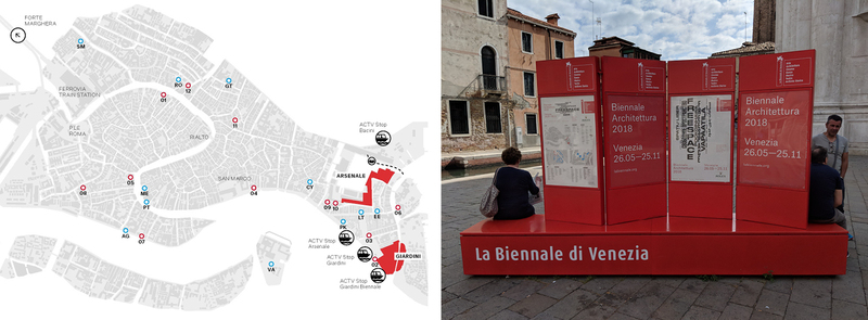
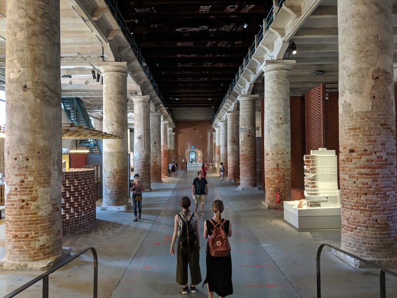
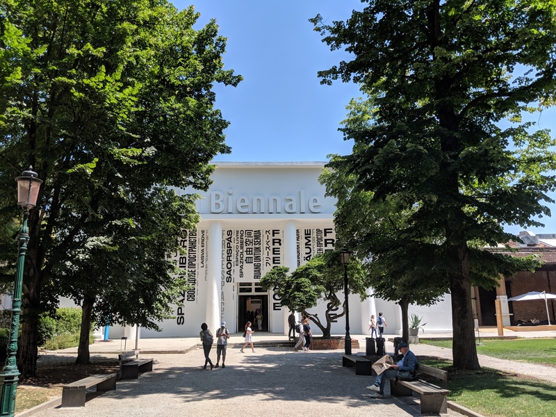
This past July, I spent three days exploring the Venice Biennale, or La Biennale Architettura as it is officially called. For nearly six months, 63 participating countries and over 70 individual architects from around the world come together for perhaps one of the most important platforms for dialog between architects and between architects and the public. With their prompt of “Freespace,” the curators of the 2018 exhibition Yvonne Farrell and Shelly McNamara, founding directors of Grafton Architects based in Dublin Ireland, have chosen design content which “celebrates architecture’s capacity to find unexpected generosity in each project.” They have highlighted projects with an almost primal focus on the quality of space itself. The exhibition emphasizes the “free” gifts of light, air, gravity and materials masterfully put into play in the commercially restrictive environment in which architecture is often created.
Map of La Biennale di Venezia
The exhibition expands beyond the boundaries of any single venue to create the feeling of being coterminous with the city of Venice. Installations are sprinkled across the city; often encountered by surprise as guerilla pop-ups of architectural delight. The individual entries, likewise, broaden the definition of an exhibit to include much more than just content on display. As a point of entry into the comprehensive nature of the Biennale, it is worth pointing out some of the creative and unexpected approaches to each aspect of an exhibit: the venue housing a particular exhibit, the manifesto describing the intent, the techniques used to create the display, and of course the actual content on display. Let me explain with some memorable examples.
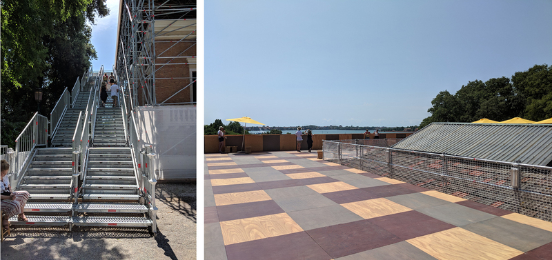
“Island” at the British Pavilion
VENUE
It is a special case when a participant can critique or even provide an alternative to the site they are given for their entry into the exhibition. The British Pavilion took this route with one of several early 20th century buildings purpose-built for Biennale events in the Giardini. The entire building interior was left intentionally empty—completely untouched with even some visible residue from previous British exhibitions. Instead, a massive scaffolding wraps around and over the roof, containing a stair and elevator to direct visitors up to the roof. The installation called “Island” is designed by architecture firm Caruso St. John and Marcus Taylor to provide a place of both refuge and exile, inspired in no small way by Brexit and the impending exit from the European Union. The wooden platform viscerally connects with the city of Venice providing nearly 360-degree views. The platform also doubled as an event space, holding various performances, lectures, and events.
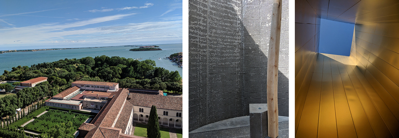
The Pavilion of the Holy See
Another radical take on venue was the Vatican, whose inaugural and ambitious entry commissioned 10 world-renowned architects (including two Pritzker Prize winners) each to design a unique chapel in a wooded forest on San Giorgio Maggiore Island, across the lagoon from Piazza San Marco. The number 10 came from the ten commandments, while the architectural brief was to create a new interpretation of Gunnar Asplund’s 1920 Woodland Chapel design. Exploring this single entry became a small journey in itself, first to find the somewhat hidden forest and then to follow the route through the forest to visit each structure.
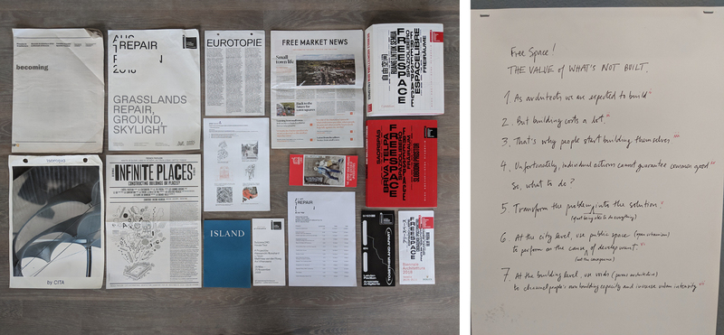
“Free Space: The Value of What’s Not Built” by ELEMENTAL
MANIFESTO
Far from letting an installation speak for itself, many participants provided some sort of written document to explain or propagandize their purpose. These documents varied widely throughout the exhibition from whimsical newspapers and postcards, to posters glued on walls, reminiscent of rock concert or political advertisements. Several followed a more traditional brochure format, but there is nearly as much to read as there was to see. Pritzker Prize winner Alejandro Aravena’s manifesto stood apart as a concise and witty explanation of his approach to engaging communities into the architectural process, and why it benefits our profession overall.
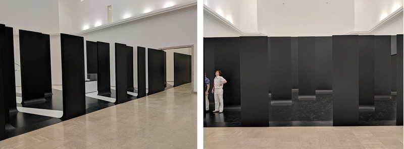
“Unbuilding Walls” at the German Pavillion
DISPLAY
The Biennale’s theme of “Freespace” encouraged each participant to approach their entry as a one-stop exhibition unto itself. For the German Pavilion, human rights activist Marianne Birthler led a curatorial and design team to create “Unbuilding Walls,” a stark, black wall viewed straight-on upon entry into their pavilion. However when stepping to either side, the viewer realizes it isn’t an impenetrable surface but rather an optical illusion of multiple vertical panels offset from each other executed with perspectival accuracy to cleverly conceal individual exhibits on the opposite side.
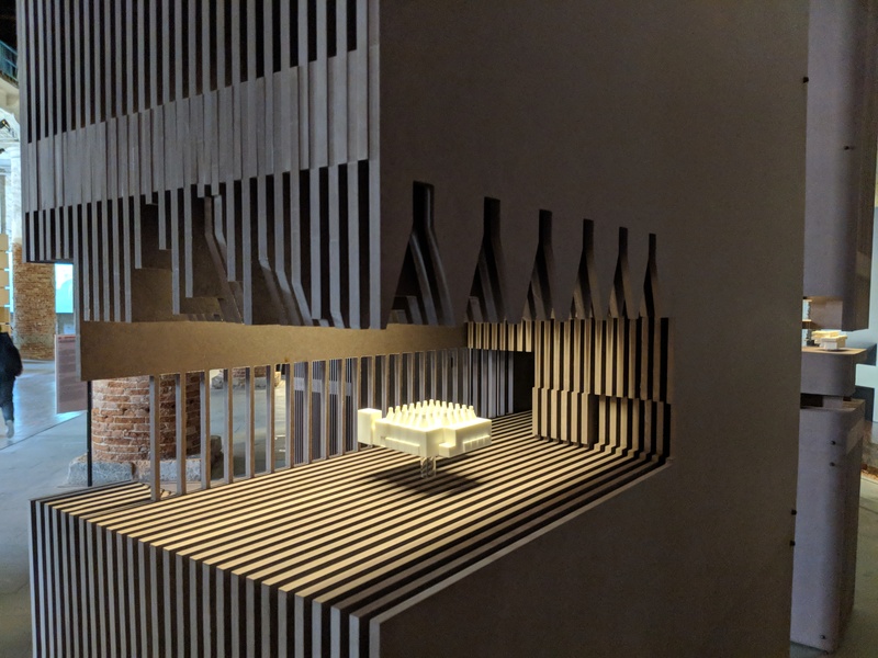
Display by Paredes Pedrosa Arquitectos
The Spanish firm Paredes Pedrosa Arquitectos crafted layered section models as the pedestals to display a selection of physical models of public buildings. The voids carved out of the solid boards aimed to demonstrate a type of “convex” space, viewed from the outside as defined by light and air.
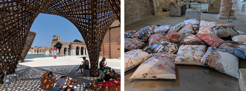
Weaving Architecture by Benedetta Tagliabue
Benedetta Tagliabue, another Spanish architect, playfully displayed their architectural ideas on fabric pillows casually strewn across the floor. Meanwhile, VTN Architects from Vietnam built a stunning bamboo shade structure midway between exhibits in the Arsenale. Refreshingly placed along a calm lagoon in the center of the former 12th century naval shipyard, the shade provided a pleasant respite to recharge before the next segment of the exhibition.
The Arsenale
CONTENT
As I explored the distinct zones of the Biennale, the brackets of conceptual thought were set wider apart than anything I had experienced. Perhaps this was the intent of “Freespace” as a prompt: to encourage an open and unconfined exploration of architectural thought. Also, the Biennale did not group the exhibits by anything other than the participating country or participating architect’s name. But I did notice some recurring themes and trends that can be drawn out of the massive installation. Some of the most memorable and well-executed entries fell into the categories of transportation, urban futures, sustainability, experiential/immersive displays, explorations of craft, and of course individual building types.
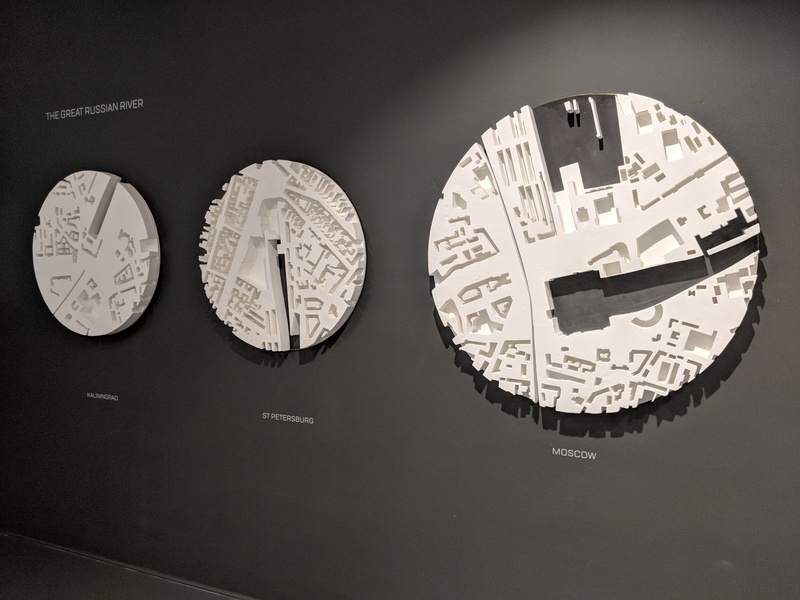
“Station Russia” at the Russian Pavillion
TRANSPORTATION: The Russian Pavilion considered the possibilities of how space might be freed up at the center of cities if railway stations are no longer needed. A series of plaster cast models of Moscow, St. Petersburg, and Kaliningrad show dramatic voids where the main railway station has been removed creating literal “freespace” for new architectural possibilities on the empty lots.
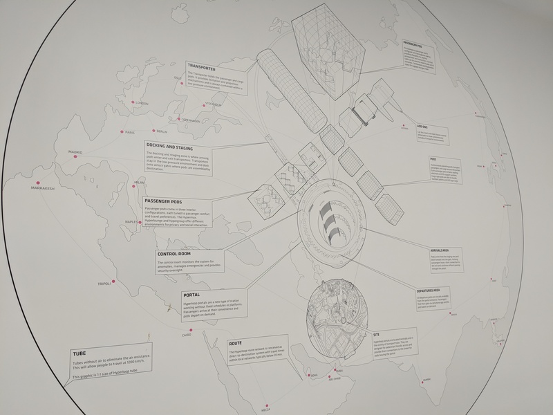
Virgin hyperloop one by BIG, Part of “Possible Spaces – Sustainable Development Through Collaborative Innovations” at the Danish Pavilion
The Danish Pavilion included one exhibit by BIG partnered with Virgin to explain the Hyperloop One concept. Taking Elon Musk’s idea of a passenger pod pushed by pressurized air in a sealed tube, BIG conceptualized a new global transportation network, including ideas for stations, and the transport pods themselves. Virgin began testing the concept in 2016 in the Nevada desert. Virgin and BIG pointed out the serial disruptions of the transportation industry of centuries past, alluding to the hyperloop as the next imminent transportation revolution. Maybe.
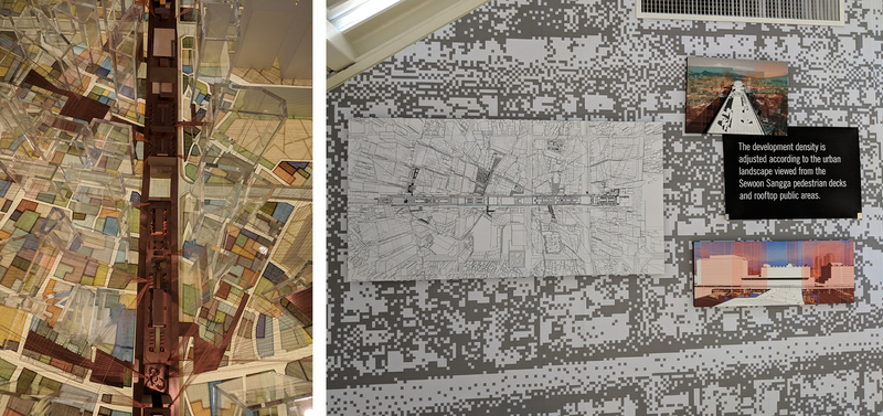
“The City of Radical Shift” at the Korean Pavilion
URBAN FUTURES: Many participating architects and countries took on the question of what becomes of our cities in the near future. The Korean Pavilion held a competition to reconsider the 1960’s Sewoon Sangga complex, a shopping, residential, and industrial mega structure at the heart of Seoul. It has been called the first mixed-use building in Korea. The winning entry by Sungwoo Kim of N.E.E.D Architecture acknowledged the value of the cluster of resources and infrastructure in a city center, while reconceptualizing the complex to add more visual openness, public space, and connections to the landscape. The thesis of the design is to strike a better balance between public and private development interests while maintaining the vitality of downtown areas which have often succumbed to overbuilding by private sector companies. The series of models, drawings, and diagrams made a compelling case.
The entry by Saudi Arabia, designed by local firm Bricklab, offered a simplified, but equally compelling case to think about our urban future through a series of time-lapse-animated line drawings. Each drawing showed an abstracted street map of a different Saudi city, starting from the earliest record of developed roads and extending year-by-year to the present day. The illustration of massive urban growth and the different models of urban organization, even within a single country, was powerfully clear.
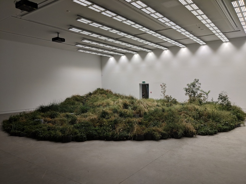
“Repair” at the Australian Pavilion
SUSTAINABILITY: The Australian Pavilion, titled “Repair,” focused on the critical role of architecture to utilize and deploy ecological systems. Taking the focus away from architecture as object and replacing it with operational context, Australian artist Linda Tegg partnered with Baracco+Wright Architects to install a living grassland within the pavilion building. While the sensory impact of walking into this room—especially the refreshing smells of nature—are hard to translate into words, the message was clear: architecture has an important role in the environmental, social, and cultural repair of the places it is a part of.
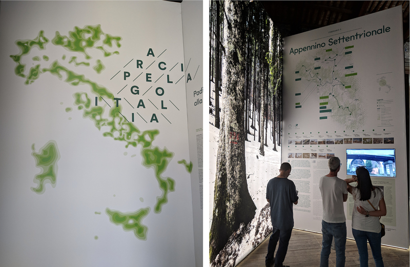
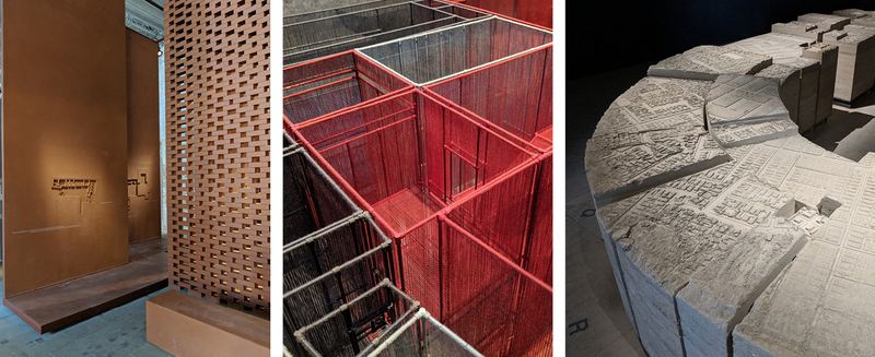
“Archipelago Italia” at the Italian Pavilion
The Italian Pavilion, curated by Mario Cucinella Architects, is titled “Archipelago Italia.” It focused on the spaces in between its urban areas as its most important cultural resource and its differentiating feature as a nation. The comprehensive survey of the Italian landscape encompassed several rooms within the Arsenale. (Apparently the host country gets a little extra space to work with) The idea that landscape becomes its own island in between the cities was illustrated with gradated maps of each territory. While public / private boundaries in cities are often rigid, the exhibition called out the natural features and moments in the countryside when the public and private boundaries are blurred or entirely absent.
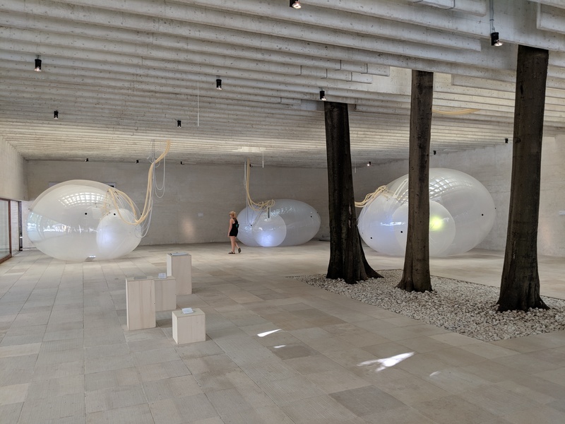
“Another Generosity” at the Nordic Pavilion
EXPERIENTIAL/IMMERSIVE: While many pavilions provided evocative content to look at, some went even further to provide an experience that visitors could literally step into and through. The Nordic Pavilion, representing Norway, Sweden, and Finland, also focused on the concept of sustainability but executed their ideas with a group of inflatable structures large enough to walk into. Juulia Kaste, the director of the Finnish Museum of Architecture led a design team including Lunden Architecture Company, Buro Happold Engineering, and Pneumocell Fabrication. They illustrate the connection between air and water, the two elements which mediate between the natural and built environment. As the temperature and humidity change inside and outside of each cellular structure the structure itself expands and relaxes in a constantly changing balance. The effect felt like a living organism “breathing” all around you. The intent was to show how architecture can facilitate a symbiotic relationship between nature and the built environment.
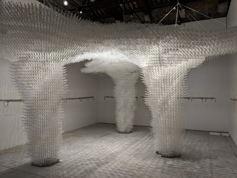
“Cloud Pergola” at the Croatian Pavilion
The Croatian Pavilion combined visual, aural, and experiential elements with their “Cloud Pergola.” The installation had three interwoven parts. Alisa Andrašek, in collaboration with Bruno Juričić, created a “spatial drawing” of thousands of 3D-printed segments forming a cloud-shaped structure resting on three expansive legs. Under the pergola, Vlatka Horvat utilizes bare feet on paper to develop an abstract commentary on the idea of movement and journey. At the same time a sound installation by Maja Kuzmanović creates the ambiance of convivial gatherings under a pergola. In all the installation was an impressive multi-sensory experience.
“House Tour” at the Swiss Pavilion
The Swiss Pavilion was conceived by a design team including Alessandro Bosshard, Li Tavor, Matthew van der Ploeg and Ani Vihervaara. In a playful surprise, they created a house tour where all elements found in the typical swiss home (beautifully minimalist is de rigeur) were dramatically enlarged in scale. Even the door handles.
L-R: “Unveil the Hidden” by Maruša Zorec of Arrea Architecture; “Z33 House for Contemporary Art” by Francesca Torzo Architetto; Chile Pavilion curated by Alejandra Celedon
EXPLORATIONS OF CRAFT: Walking through the Arsenale, many of the entries by individual architects and participating nations showcased exquisite craft through different media and techniques used to create the architectural models on display. Maruša Zorec of Arrea Architecture in Slovenia built a brick screen leading into a series of vertical panels where the floor plans of her selected buildings were executed in plaster bas relief. Francesca Torzo Architetto of Italy fused her passion for materiality and model-making with a physical model of a house for contemporary art in Belgium. In the model, the walls are woven from different colored yarn allowing the entire composition to read as a cohesive whole. Her intent was a choreography of spatial sequences moving through the building. The pavilion of Chile included a concrete cast of their national stadium filled with the layouts of shantytowns instead of bleachers. The intent was to tell a double story through a single medium. The stadium was the location of a 1979 operation where ownership was provided to tens of thousands of city dwellers living in fear of constant relocation. The event provided more stability to these city dwellers while acknowledging the close proximity and dissimilar conditions that often coexist in cities. In the medium of architectural model making, the two ideas come together.
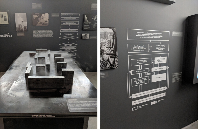
“Together and Apart: 100 Years of Living” at the Latvian Pavilion
BUILDING TYPOLOGIES: One final theme which appeared in several forms throughout the Biennale was building type studies. Libraries, stadiums, train stations and other building types were explored by different participants throughout the exhibition. The Latvia pavilion, curated by Matiss Groskaufmanis, stood apart with a comprehensive commentary on apartment building design and policy in their country since its independence from the USSR in the 90’s. Two-thirds of the Latvian population resides in apartments, making it the highest ratio in Europe and also a way of life for much of the country. The exhibition examined the political, architectural and technical aspects of different housing solutions that have been tested and deployed over the years. Diagrams illustrated the sometimes convoluted design/construction process and the dire statistics of failed mortgages in recent years while evocative physical models illustrated more technical issues such as maintaining warmth in an often cold country.
In summary, the Biennale was an inspiring roller-coaster ride of architectural possibilities at all scales. The emphasis on holistic thinking is something I connected with personally and have participated in frequently while at WRNS Studio. No matter what the project requirements, schedule, budget, and program demand of us we always take time to investigate deeper and question the spatial problems to reveal the embodied power of architecture and make a visceral connection to a place. The architects’ work on display demonstrate a masterful facility to explain complicated ideas in an original medium. I am proud to be a part of this rich and inventive discipline called architecture.
This year marks the 125th anniversary of the overthrow of the Kingdom of Hawaiʻi. A recent event in Honolulu commemorating this anniversary was attended by thousands of people, marching from the Hawaiʻian Royal Mausoleum (Mauna Ala) to the Iolani Palace, where Queen Liliʻuokalani — the Hawaiʻian Kingdom’s last reigning monarch — was forcibly removed from the throne.
Most Americans know Hawaiʻi as one of the planet’s great vacation spots, for its surfing, volcanoes, and Pearl Harbor. I can speak from personal experience that, at least via my own public school education, the version of Hawaiʻi’s history that I received was highly romanticized and biased, and as you can imagine, not in favor of native Hawaiʻians. I can vaguely remember back to 1959 when Hawaiʻi was admitted as our country’s 50th state. For many Americans it was cause for celebration and a statement of progress and great national optimism. But for others, not so much. There has lately been a concerted nationwide effort to revisit our history (not revise), to seek and recognize unbiased and unfiltered truth and in Hawaiʻi, this recognition has never been more evident.
Current anthropology points to the original settlement of the Hawaiʻian Islands by Polynesians from the South Pacific’s Marquesas Islands between 300 and 500 AD. A second wave of settlement followed between 900 and 1000 AD, this time from the Tahitian islands. Using their knowledge of the sea and the stars, the Tahitians navigated their double-hulled canoes some 3,500 miles north, landing first on the Big Island (the island of Hawaiʻi). These settlers came in waves, bringing most everything necessary for survival, including food crops and livestock — none of which were native to the Islands.
This community grew and flourished and by the time Europeans first made contact, the population was estimated between 800,000 to 1,000,000. Hawaiʻi was a completely self-sustaining, ecologically balanced community and by some accounts, one that enjoyed the highest standard of living of any human settlement on the planet. All of that began to change when the British Captain James Cook ran into the Islands during his third voyage to the Pacific. Commanding his sailing ships Resolution and Discovery, Cook first sighted the islands of Oʻahu, then Kauaʻi and Niʻihau and on January 20, 1778, landed in Waimea on the island of Kauaʻi. There are many accounts of ‘post-contact’ Hawaiʻian history, but I found Julia Flynn Siler’s book, Lost Kingdom, to be very clear, informative and most importantly, truthful.
Unlike many of its predecessors, Siler's book eschews the bias and historical perspective of Christian missionaries and their imperial counterparts to focus on the experience of native Hawaiʻians. Siting over 275 sources, Siler explores the degradation of Hawaiʻi's people, culture, and land, culminating in the forced abdication of Queen Liliʻuokalani's throne. For a good review / synopsis of the book, please find it here.
Queen Lili'uokalani
Formal annexation of sovereign territory happens and is internationally recognized through treaty, most often as a result of cessation of conflict (mostly armed). Not that all treaties are fair or are they honored — just look to many of those executed between Native American tribes and the US government — but a treaty between nations still represents an internationally recognized form of agreement and due-process. No such treaty was ever executed between Queen Liliʻuokalani, the Kingdom of Hawaiʻi and the United States Government and thus, the status of Hawaiʻi is not entirely clear. A ruling coming out of an arbitrated case in the Hague’s International Court of Justice and its Permanent Court of explicitly recognizes the Hawaiʻian Kingdom as a State and the acting Government (the current State Government) as its representative, which is also recognition that the Hawaiʻian Kingdom was never formally annexed by the United States, but rather illegally occupied since the Spanish-American War in 1898. So what does this all mean? Well, according to this ruling and the legal minds associated with it, Hawaiʻi is an occupied territory and not really part of the United States.
The overthrow of Queen Liliʻuokalani and all that has transpired in Hawaiʻi since has, over time, precipitated many groups and movements that have advocated for a wide range of outcomes, from varying levels of Hawaiʻian sovereignty to outright succession from the Union. One of the current and very significant sovereignty movements is the Aloha ʻAina Party. This political party is working to assure social, economic, and environmental justice for the peoples of Hawaiʻi. Their foundational principles are expressed as follows and note, I’ve condensed and summarized:
Aloha ke Akua: acknowledgment of the existence of a higher, spiritual power, and the freedom for all to worship and seek guidance as their conscience moves them;
Aloha Kānaka: love for all the people, regardless of race, color, creed, or national origin;
Mālama ʻĀina: respect for the land and recognition that the relationship between the well-being of the land and the well-being of the people are inextricably linked;
Government Accountability and Transparency: strong belief that the government must truly be of the People, by the People, and for the People and must be transparent and accountable;
Hoʻoponopono: To make right what is wrong, specifically as related to the overthrow of the Kingdom of Hawaiʻi in 1893 – something that must be addressed and rectified.
The principle of Mālama ʻĀina is perhaps the one that most resonates with those of us at WRNS as we celebrate our five year anniversary in the State. One would think that by virtue of its geography, cultural history, and unique physical environment, Hawaiʻi would still — as it once was — be on the forefront when it comes to creating an environmentally sustainable community. Nothing, unfortunately, could be further from the truth.
Located almost in the center of the Pacific Ocean, Hawaiʻi is one of the most geographically isolated places on earth. Within 30 miles on the big island of Hawaiʻi alone, ecosystems range from marine coral reefs to snow-capped mountains. The world's wettest spot, Mt. Waialeale on the island of Kauai, receives over 430 inches of rain per year. Hundreds of different soil types are spread across the islands’ 6,400 square miles and the islands possess a combined 750-mile coastline — one almost as long as that of California. While this isolation has supported the evolution of diverse environments for flora and fauna found nowhere else on earth, it has also enabled a multitude of serious local environmental issues.
The most critical of these concern Hawaiʻi's unique biodiversity and the associated threats caused by introduced, invasive species. While Miconia weed, the coqui frog, and dengue fever spread by mosquitoes have received publicity most recently (and btw, mosquitos are not native to Hawaiʻi), they represent just a few of the thousands of species of animals, insects, plants, and organisms that have been introduced on the islands — many of which have turned invasive, wreaking environmental havoc. Unchecked and poorly planned development has caused the contamination of ground water with organic chemicals, and pollution of coastal waters with sediments and pathogens from both urban and agricultural runoff. The presence of numerous chemicals in active and former military sites represent an additional set of serious environmental challenges. The result of all this is Hawaiʻi’s dubious title as the "extinction capital of the world", with almost 40% of the endangered species in the United States being Hawai`ian species and nearly 75% of all U.S. extinctions occurring in Hawaiʻi. It is within this context that the Aloha ‘Aina Party is advancing the principle of Mālama ʻĀina as one of its key tenets. Mālama ʻĀina — respect for the land — has encouraged a wave of new thinking and activism as related to conservation, energy generation, energy consumption, waste and water management, and agricultural practice. All of it inspired by native Hawaiʻian tradition.
As WRNS celebrates our fifth year in Hawaiʻi, we draw inspiration from Mālama ʻĀina. One of the catalysts for opening a practice here, in addition to personal histories and connections, was our understanding of the State’s critical need for a higher level of sustainability-driven planning and design. We have witnessed in many of Hawaiʻi's residents, both native and local, a great desire to help redirect the state from a continued trajectory that could result, once again, in peril. Of course architecture is only one piece of the puzzle, but crafting buildings and environments that help solve contemporary problems — in ways that are respectful and authentic to the islands’ environment and cultural history — is fundamental to our approach. And we’ve found great need for more of it.
We arrived on-island at an interesting time, as the political will of the people and institutions were beginning to mount a serious campaign to create a place that can be an inspiration and example to the rest of the world. By virtue of its unique geography and cultural history, Hawaiʻi is, in a sense, the ‘canary in the coal mine’ as it relates to the rest of the planet (that is, how Hawaiʻi goes, so goes the planet). Based on our relationships, our point-of-view and our experience, Hawaiʻi represented a natural opportunity in which to participate in the discussions shaping Hawaiʻi's future.
We have been honored to be a part of the following projects:
Planning for cultural gardens at Kamehameha Schools;
Sustainability Advisors to the State Department of Education (DOE);
Development of an Infrastructure Master Plan for the University of Hawaiʻi’s Manoa Campus (a framework to meet net-zero energy and water goals and a plan for resiliency);
Designers for the conversion of a historic UH Manoa gymnasium into one of the campus’ first net-zero buildings;
Developing a master plan for the Kuhio Park public housing community (creating a place of dignity for Pacific Islanders displaced by the US Governments atomic testing in Micronesia);
Designers for a green, high-rise urban school (Pohukaina) that will help create community in a new high-density urban development;
Designers for a high-rise, senior housing and community center project to help fill the acute need for affordable housing for a poorly served population.
In various ways, these projects strive to support the precepts of Mālama ʻĀina as well as Hoʻoponopono — to help right what is wrong. We didn’t come to Hawaiʻi to design buildings that could be anywhere. We came to apply the best of our thinking to help right the ways in which Hawai’I has been wronged — at least as related to planning and design. While the overthrow of the Kingdom of Hawaiʻi represented the end of what was — at one time — a self-sufficient, self-reliant, sustainable community, the event’s 125th anniversary represents somewhat of a re-birth of the notion that Hawaiʻi can and should get back on the path leading to what it once was. WRNS, by virtue of our point-of-view, experience, and deep relationship with Hawaiʻi, hopes to humbly assist.
As Hawaiʻi goes, so goes the Earth: The Hawaiʻian islands as seen from the International Space Station on January 18, 2014; source.
Please refer to the link http://www.hsso.org/kd/wp-content/uploads/2016/10/Hawaii-Invasive-Species-Official-List-%E2%80%93-2017-rev2.pdf for a list of Official Hawaiʻi Invasive Species. Note that there is a distinction between "introduced" and "invasive." There are many more species than listed here that have been "introduced" in Hawaiʻi (e.g. the pineapple), but left to their own devices they won't become environmentally "invasive." That is, they cannot exist untended in the wild and thus, present minimum environmental risk. However — and specifically in the case of the pineapple — it could be argued that its introduction as a major agricultural crop was highly invasive and destructive from an environmental, social, and cultural perspective.
Working to ensure a green school for everyone in this generation is a critical opportunity for all of us, not only because schools account for a lot of resources, but because they house our future—they are places where students learn. Being able to teach students early about resource conservation and helping them build good habits at a young age is key to furthering the movement.
One of our core beliefs at WRNS Studio is that we need to approach educational design holistically—thinking about design at the policy level, as part of the curriculum, and as an educational tool for the community at large.
We are shifting green from a movement to a lifestyle by working with the states of California and Hawai’i. Last year, we worked with California’s Division of the State Architect’s 7x7x7 initiative to help 10,000 existing K–12 public schools reduce energy and water usage. We are continuing our work with Northern California school districts—whether it is designing LEED-targeted master plans or healthier classrooms. We are also working with the Hawaii Department of Education to green 256 existing campuses, developing templated strategies that can be deployed at every aspect of development.
On a national level, we have worked with Pacific Gas and Electric Company on their Zero Net Energy Pilot Project, which includes the Stevens Library at Sacred Heart Schools in Atherton, California—the first library in the United States and the first school building in California to achieve Net Zero Energy Building Certification from the International Future Living Institute (ILFI). In addition to partnering with ILFI on the Stevens Library, we are currently assisting them with five Living Building Challenge programs.
Our aim is to not only transform schools into healthier environments, but to create inspired places of learning and to support the growth and development of our planet’s future stewards, policymakers, business people, and community members. I have been blessed to be mentored and challenged by the sustainable community and am humbled to be recognized by the Best of Green Schools program as a partner in this pursuit.
“Today, history represents neither an oppressive past that modernism tried to discard nor a retrograde mind-set against unbridled progress. Instead, at a time when there is too much information and not enough attention — when a general collective amnesia perpetuates a state of eternal presentness — understanding the channels through which history moves and is shaped by architecture is more important than ever.” –Chicago Biennial
Last fall I spent three days in Chicago, taking in the Chicago Architecture Biennial. Make New History was the theme and participants — 140 architects and artists from around the globe — contributed a range of exhibits, from dioramas to live performances, to explore how history can be invoked to inform new ideas and forms in architecture. The Biennial was held in the Chicago Cultural Center (a grand former library built in 1897 and host to the world’s largest Tiffany stained-glass dome), with associated events throughout the city, and it took place from September, 2017 through January, 2018.
“Vertical City,” 2017 Chicago Architecture Biennial: Make New History
Of the many thought-provoking exibits, I was most taken with “Vertical City,” a contemporary take on the 1922 Chicago Tribune Tower Competition. With the charge by the Tribune’s publisher Colonel Robert R. McCormick to make “the most beautiful and distinctive office building in the world,” the original competition attracted entries from over 260 architects, including Walter Gropius, Adolf Loos, and Eliel Saarinen (who took second). The wildly contrasting ideas influenced generations of architects to come. Resurrected in 1980 by Stanley Tigerman under the guise of “Late Entries,” the Tribune Tower competition (it was actually an invited submittal for a publication) once again attracted some of architecture’s biggest thinkers — Frank Gehry, Tadao Ando, Bernard Tschumi, and Tod Williams and Billie Tsien.
If the 1922 competition made evident a pivot point in architecture toward modernism, and the “Late Entries,” of 1980 turned largely on postmodernist metaphor, fun and sarcasm, how might we understand the “Vertical City” of 2017?
The architects practicing today revealed delightfully varied ideas, represented as scaled models that reimagine the landmark tower. The Cultural Center’s Yates Hall, a large expanse of a room with floor to ceiling windows that pull the city into the space, was given over to the exhibition, fusing the experience with meta. Wandering amid the towers, I felt myself inside a diorama of alternative histories of a building and of a city in which I could, in real time, hear the taxis honking below and feel the glare of the sun moving across the glaze of adjacent buildings.
Of the 16 entries, I found myself sparked by the ones that directly addressed core drivers of the innovation economy: work / life integration, community, connection to the public realm, and non-hierarchy.
Big Bang Tower by Ensamble Studio (far right) and Biennial Project by Kéré Architecture (second from right)
Big Bang Tower: A Column of Columns for the Chicago Tribune by Ensamble Studio
Noting that “an office can be a cubicle and also an open co-working area, a cafe, a lounge, a lab, a multipurpose room, virtual substance in the cloud, a room in your house, and much more,” Ensamble Studio imagined “A Column of Columns” tied together with horizontal structures that vary their positions, heights and areas to frame the city and connect interior spaces. With cores pulled to the sides and located within the envelope (atypical in a traditional high rise) and the asymmetric columns resolving both vertical structure and infrastructure, the floor plates are open to receive a diverse and evolving program. The structure is one in which knowledge workers, who expect work / life integration, might just as easily take in a film as write a creative brief.
“In alignment with current trends, the design forecasts that people will value a balanced work and life ratio while retaining real and meaningful connections with each other and with the places that they live.” Inspired by the Tower of Babel metaphor of a community working together in shared aspiration, Kéré Architecture’s proposal anticipates a mix of housing, workplace, commerce, and recreation in one building. To free up the interior for a variety of amenities and opportunities to connect with community, the cores are pulled outward. Segmented blocks with central voids allow for more private functions, like housing, to be consolidated and located higher up, with more communal activities happening on the ground floor to support integration with the public realm. The proposal offers a microcosm of a neighborhood or a city, a one-stop live/work shop in a tower of the future.
“If the primary source of derivation for modern architecture is classicism, what would an architecture that is derived from a non-Western historical tradition be?” With its design inspired by ancient Chinese architecture’s central organizing concept of the pavilion, and with pavilions stacked vertically to form a pagoda, this proposal offers a structure freed from hierarchical organization, with spaces defined in relation to one another. “The spaces of this new vertical city are attuned to the nature of the knowledge economy and the contemporary media environment where performance dominates, flexibility sets value, and well-being is the ultimate cause. Pavilions frame theaters, meeting zones, restful landscapes, and hedonistic gardens: the true productive spaces for today’s media workers. This is architecture with a language not rooted in Western thought and with a history outside of the narratives of modernism.”
This was the model to which I returned, walking around it, staring into its corners, wanting to step inside and make myself at home.
Does the “Vertical City” — this third festival of ideas centered on iconic American skyscraper — offer a touchpoint, some indication of where urban architecture is going in response to changes in how we work to propel the innovation economy? If so, I’d take note of the Ensamble, Kéré, and Serie entries.
Lightweight, Green, Efficient
Residing somewhere between stucco and French limestone there’s Glass Fiber Reinforced Concrete (GFRC), a building material typically associated with suburban office parks, less with distinguished architectural design. Yet, working with GFRC on several projects in recent years has helped us innovate, using common panelized materials while still addressing issues of scale, texture, rhythm, and even transparency and solar exposure. Produced with far less concrete than cast-in-place, or even pre-cast panels, GFRC is lightweight, cost-effective, and green.
UCSF Mission Hall Global Health Sciences Building
This 266,000 square foot project was initially a design competition requiring an early team commitment of Architects, Engineering Consultants, Contractor and sub-contractors to collaborate from day one to evolve the highest value solution, which was then delivered as a Guaranteed Maximum Price offering to the client. Working together, our team adopted construction strategies and committed to particular forms, materials, and fabrication techniques, inventing the production process alongside the design. Thanks to the early involvement of the builders and manufacturers, technological exploration and innovation became integral to the design vision.
Wanting to avoid a static or gridlocked aesthetic, we adopted a shifting-panel strategy likened to industrial metal mesh. Mission Hall’s skin required a variety of aperture densities and relationships, but it couldn’t be too complex given budget constraints and the need to limit panel types. Given our overall budget goals, we knew we would need large, repeating panel shapes and that the lightness of GFRC would be the most practical way to get there.
Past experience at smaller scales had shown that a material as prosaic as GFRC could be transformed into a cost-effective yet poetic signature feature; however, we had not yet found a way to dematerialize its basic wall-like nature. At UCSF, we wanted to re-invent GFRC as a trabeated wall assembly (column and lintel), not as a masonry wall with punched openings. Our partners, Walters & Wolf, helped us achieve this with a window-box truss system incorporating metal spandrel panels, allowing us to imply a much more open mesh framework than a strictly budget-driven panel wall would have allowed.
Panelization requirements led to a long truss (32” x 30 ft), which accommodated all four curtain wall versions, and streamlined both fabrication and erection. Built off-site, these panels amounted to significant savings for the client. The solution creates interest along the facades while still allowing for flexible and myriad programmatic options within. Because the South and West sides of the building experience stronger sunlight, we tightened the apertures to reduce heat gain, while the North side opened up more to admit diffused light and provide views toward Downtown San Francisco.
How We Got There
Specific patterns, textures, and materials were sampled, developed, and tested in mock-up form to nurture and test our ideas both before and during the production process. Darker Precast Concrete at the building base level along with typical off-white GFRC wall material mockups are shown above.
GFRC pilasters were presented in smooth and wash-board-shadow, and the proportions of specific wall fragments and adjacent window voids were adjusted for solar exposure, spatial and technical reasons, as well as façade-making.
Well ahead of production, we were making careful studies of texture and scale, guided by practical input from the designated panel manufacturers, to confirm we had it right prior to mock-up and production. The resulting panels vary between smooth and wash-board texture to provide shadow, scale, and variability. The light color of the GRFC also provides a contrast to the darker concrete at the base level. The GRFC appears as though it is a framework floating above the darker glass and metal elements underneath, creating the building’s outer “mesh” expression.
Working within parameters of efficient glass size, pushing limits of texture and relief, we arrived at a highly animated open-weave expression, completely free of panelized punched-wall expression with a limited amount of actual panel variation. Compositionally, every effort was made to view simple things in complex ways, to produce more visual interest through proportion, offsets of panels, mirror-reversals local adjacencies, and interrelationship of basic elements. Our tools were limited, but by careful composition, the solution rejects the grid-locked and static pitfalls typical of GFRC panel walls.
Where We’re Coming From
A core tenet of our approach is to tease the poetry out of the practical: to find ways to make an office building (or even a parking garage) beautiful and simple; elegant and functional; practical yet fresh, while improving our everyday experiences. Even the most seemingly mundane materials can be reinterpreted and optimized to provide an articulate and coherent architectural expression. We see something like GFRC not so much as a “budget material” but as the lighter side of concrete.
Dia:Beacon
The early morning sky and the beat of the steel pull my gaze to the Hudson’s flat surface, the fawn landscape. It swishes by. I’m headed up to Beacon, a small leafy town just over an hour’s train ride out of Manhattan. From the station, I walk through the gathering heat, up a small hill, and around a bend to a low-slung brick structure surrounded by quiet, ordered grounds and trees. I pass through a dark, compressed entry and into the museum and I stop — that sense of quiet and awe that happens to me in a great place. There’s just so much light. Skylights pull in the blue from above and the landscape is in every window. My skin is warm and illuminated. I run my fingers along a rough-hewn wall. I wander.
Art + Architecture
I can see why Robert Irwin, who has spent much of his career exploring spatial relations and the subtleties of perception, wanted to help reimagine how an old Nabisco box-printing factory built in 1929 might be transformed into a museum housing art from the 60’s and 70’s. Irwin designed the master plan, grounds, and windows at Dia:Beacon — his own contribution to the ethos of permanent installation, or art as created, installed, and experienced within a site-specific context. The raw beauty and honest construction of industrial architecture — broad, day lit spans set to brick, steel, concrete, and glass — make the building itself feel like art. And much like the works it houses — Donald Judd’s wood boxes or Sol LeWitt’s patterns — this place leaves the story up to you. It’s like you’re the point.
An Excursus
I find Irwin’s Excursus: Homage to the Square³ — sixteen interconnected, square(ish) spaces constructed of translucent, white scrim and illuminated by vertical fluorescent tubes. Originally installed at the Dia Center for the Arts in Chelsea in 1998 and site-adapted for Dia:Beacon, Homage to the Square³ invokes Joseph Albers’ seminal inquiry into the subjective experience of color.
Walking through the space, I imagine falling into an Albers painting, his squares tilted upright and organized into a maze. As I move through the chambers, the colors, vibrant in the hands of Irwin, shift to the peripheral. There is daylight and warmth. Ghostly figures pass through the scrim. Footsteps on the soft wood. Trains rumble up the Hudson, making the sounds of industry, past and present. After a while, Albers recedes, Irwin falls away, and it’s just the daylight, the space, and me — playful, pensive, and ethereal. It seems like a good idea to just lie down on that luscious wood floor and stare up at the sky.
But West Texas awaits: a large-scale installation, Irwin’s first and only ground up building, has opened at the Chinati. His exploration of the phenomena of perception through the mediums of light and space in the Chihuahuan Desert is something I need to experience.
Marfa
It’s a bit mind-blowing to wake up to the taxis, stilettos, and steam of a summer day in New York and fall asleep under the black lit silence of a West Texan desert. As the white noise of the city gives way to the thunderous silence of the land — the bark of a dog, the steel grind of a train — my senses hone.
The Chihuahuan desert is situated atop a highland plane called the Marfa Plateau, punctuated by low-slung mountains under a sky that curves all around you. The grassland, cacti, dirt, rocks, and adobe meet the sky to make a variable brown-blue palette that changes throughout the day.
Like many of the buildings in Marfa — modest, straightforward adobe and concrete structures that defer to the geography and climate — Irwin’s modern, concrete building is a quietly elegant portal into the unexpected. U-shaped and organized around a landscaped garden, untitled (dawn to dusk), 2016 sits within the footprint of an old Fort D.A. Russell hospital originally constructed in 1921. It is approximately 10,000 square feet.
when things start to get super untitled
A kid who seems strangely serene for someone who appears to be 15 lets us in. My friend and I managed to miss the scheduled tour (desert distractions abound, I tell you), and so it’s just the two of us. It’s late in the day, but the sun rides high. The land and the light and the sky follow us through a tall and generous sequence of windows. We’ve been asked not to take pictures inside the space.
Again, the scrims: white and black panels, veins running up the building arms, divide the structure into light and dark, intersecting at the crux. We immediately grow quiet and separate, our footsteps on the concrete. The building’s original use is with me — I imagine the people who came through, living and dying. I walk the length of the white scrims, watching the landscape through the sequence of windows, light and space given shape.
In his fantastic book, seeing is forgetting the name of the thing one sees, Lawrence Weschler writes of Irwin’s artwork, “Perhaps the central concern of all these installations has been their presence — temporal, spatial — such that any descriptive report of their character or intention necessarily betrays their essential nature.” And yet, the procession:
I turn into the crux of the U. The darkness is sudden, dissonant. The contrast a jolt. I slow my pace through the dark side and reach the end. I turn back and walk slowly through the black scrims. I feel weightless and heady. The landscape, the sunlight, the sky recede as I move through the space, the clarity, and the blur.
Each scrim a thunk at my chest, a slow pulse. I pass through something and something passes through me, and it has weight and energy and a beat.
My friend and I lock eyes.
“I know, right?” she says.
There are tears in her eyes. Mine too.
She can’t know what I feel, nor I her. But as we leave in silence, I think we carry something out — a sense of our own consciousness. And perhaps we are closer to knowing the profound and beautiful difference of that in all of us.
How did you get into architecture?
I spent the summer of 1994 studying the delicate protein folds of a little virus called P22 in a refrigerated laboratory in Massachusetts. After a miserable day in the cold room, I would spend my evenings walking around the humid streets of Boston and marveling at a built environment that was about as different as could be from the urban fringes of LA where I had grown up. By the end of that summer, my interest in microscopic protein had been eclipsed by the textures of Sever Hall, the hush of Pinckney Street, and the shape-shifting simplicity of the Hancock Tower.
What's your approach to architecture?
Multivalent. I tend to triangulate design problems in a way that is almost clinically straight-forward — listing out all the criteria for success, iterating design concepts, and testing those concepts against the criteria. I say “almost” because the criteria can range from highly objective (cost per square foot, FAR, net-zero water use) to totally subjective (“lightness,” “fun,” “views to the sky”). What matters is, first, that these criteria are meaningful to our clients and to the larger community, and second, that we satisfy the criteria in a way that is elegant, timeless, and seemingly effortless.
What are you excited about in architecture right now?
All the latent design possibilities of emerging construction technologies such as cross-laminated timber, hybrid rammed earth, and 3D-printed concrete are exciting to me in that they fuse analog and digital approaches to craft. These technologies help compress the distance between architect and builder. Similarly, the use of tactile regionally-specific materials and building processes can help us engage more directly with the work we do and the places we make.
I remain excited about hand drawing and physical modelling. We do our best work when we can collaborate in a direct and visceral way during the design process. At the same time, I am excited about the coming shift to an all-digital workflow for design review and construction. Plan checkers, field inspectors, general contractors and the construction trades will very soon be working off the same 3D computer model. Apart from saving reams of paper, this will simplify communication and streamline pre-construction.
How do you hope to make an impact at WRNS in your new role?
I want to foster a scalable studio culture that can grow as the firm grows and keep that special sauce that makes WRNS, well WRNS. That means putting design first. That means promoting innovation around both project design and project delivery. And that means approaching every problem from the standpoint of a novice: with an open mind and critical eye.
What do you want to teach the next generation of WRNSers?
We are at a moment of generational transition: from architects trained to draw by hand to modeling exclusively on a computer; from an enmeshed ownership economy to spawning a sharing economy; from valuing individualism and status (the age of the “starchitect”) to authenticity and connectedness becoming design bellwethers. I think the next generation of WRNSers has much to teach the firm.
As one of the younger partners at WRNS, I hope to be a transitional figure, building bridges between these groups to keep us moving forward.
New Partners Tim Morshead, Russell Sherman, and Lilian Asperin


 Associates Lily Weeks and Emily Jones, Senior Associate Molly Thomas, and Associate Laura Stedman
 Associates Daniel Johnson and Lily Weeks


 As Hawai