We are #6 in Architecture for giving new life to “obsolete” buildings. WRNS Studio embraces a spirit of reuse over replacement to honor the past while minimizing carbon and waste. Revitalizing aging infrastructure advances our mission to address the climate crisis by minimizing greenhouse gas emissions.
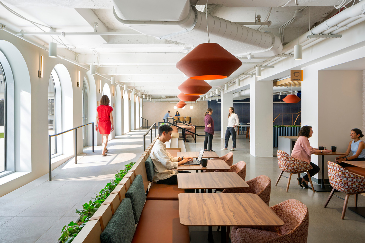
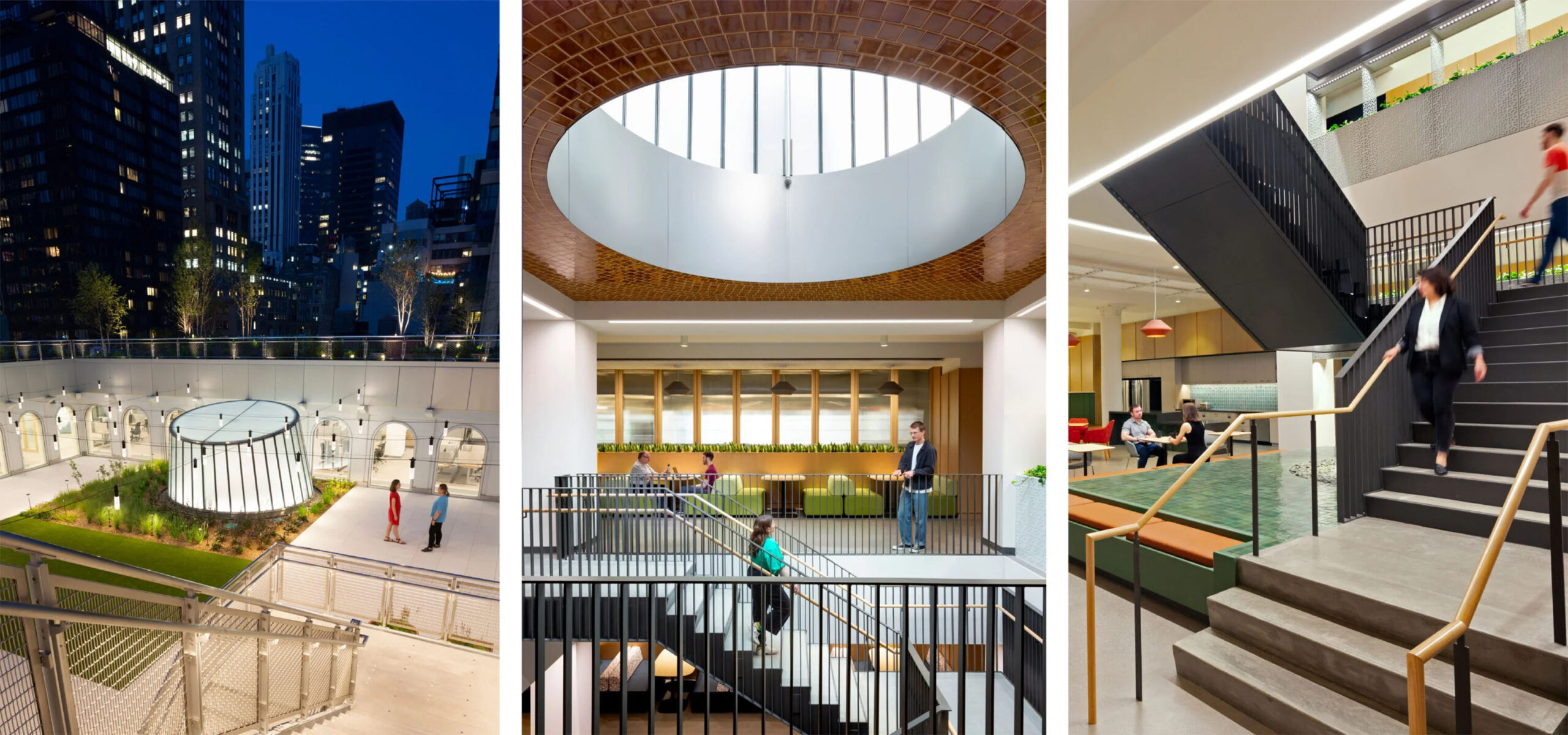
A New York landmark: from aging department store to modern workplace
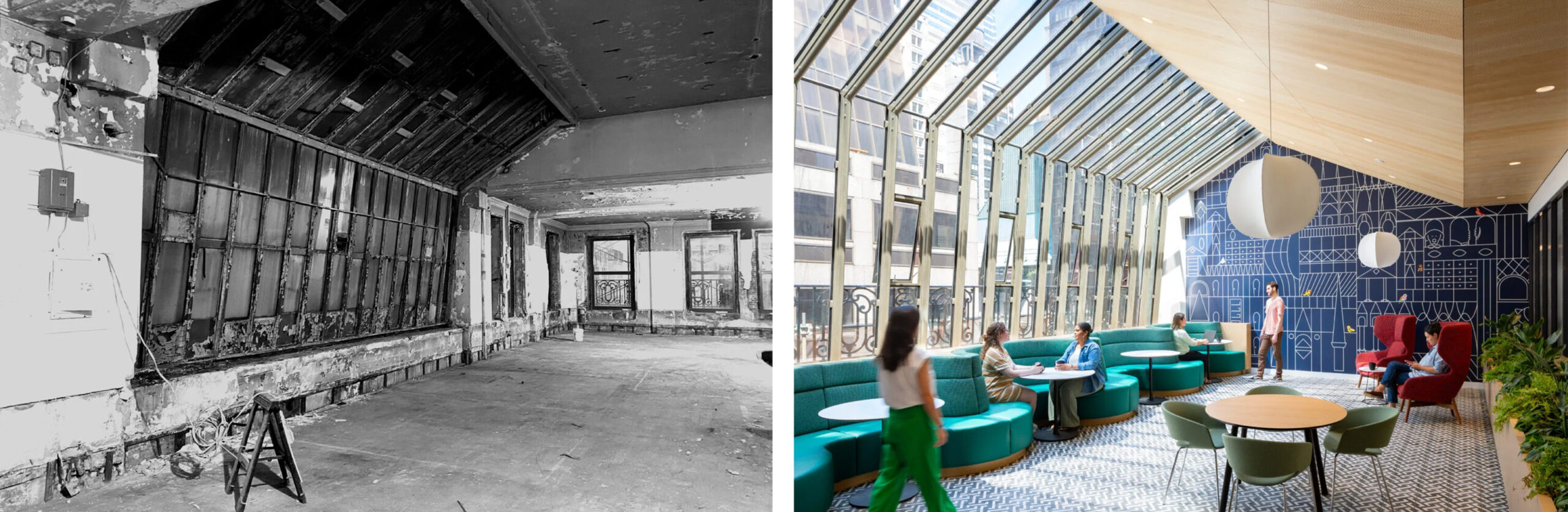
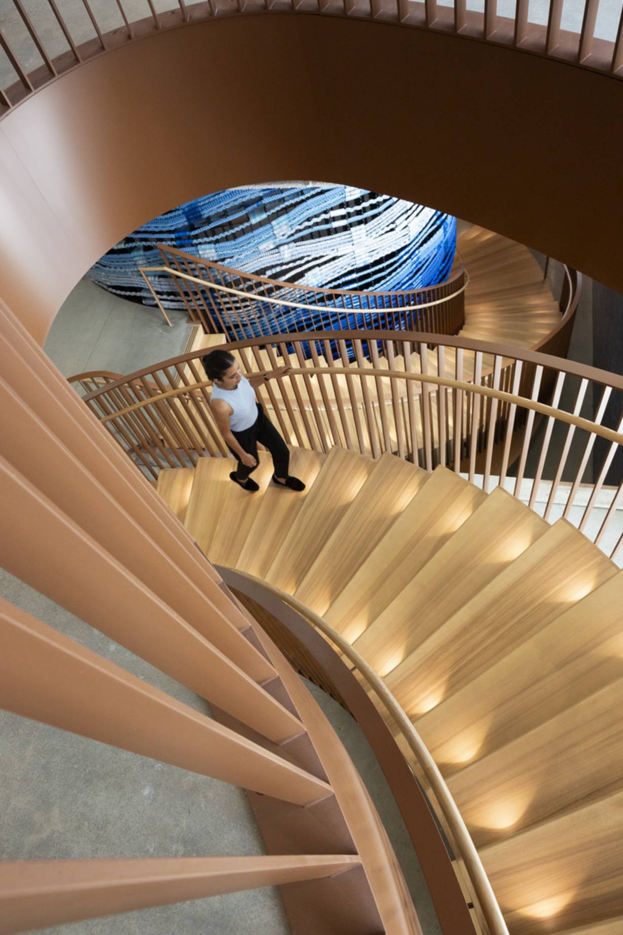
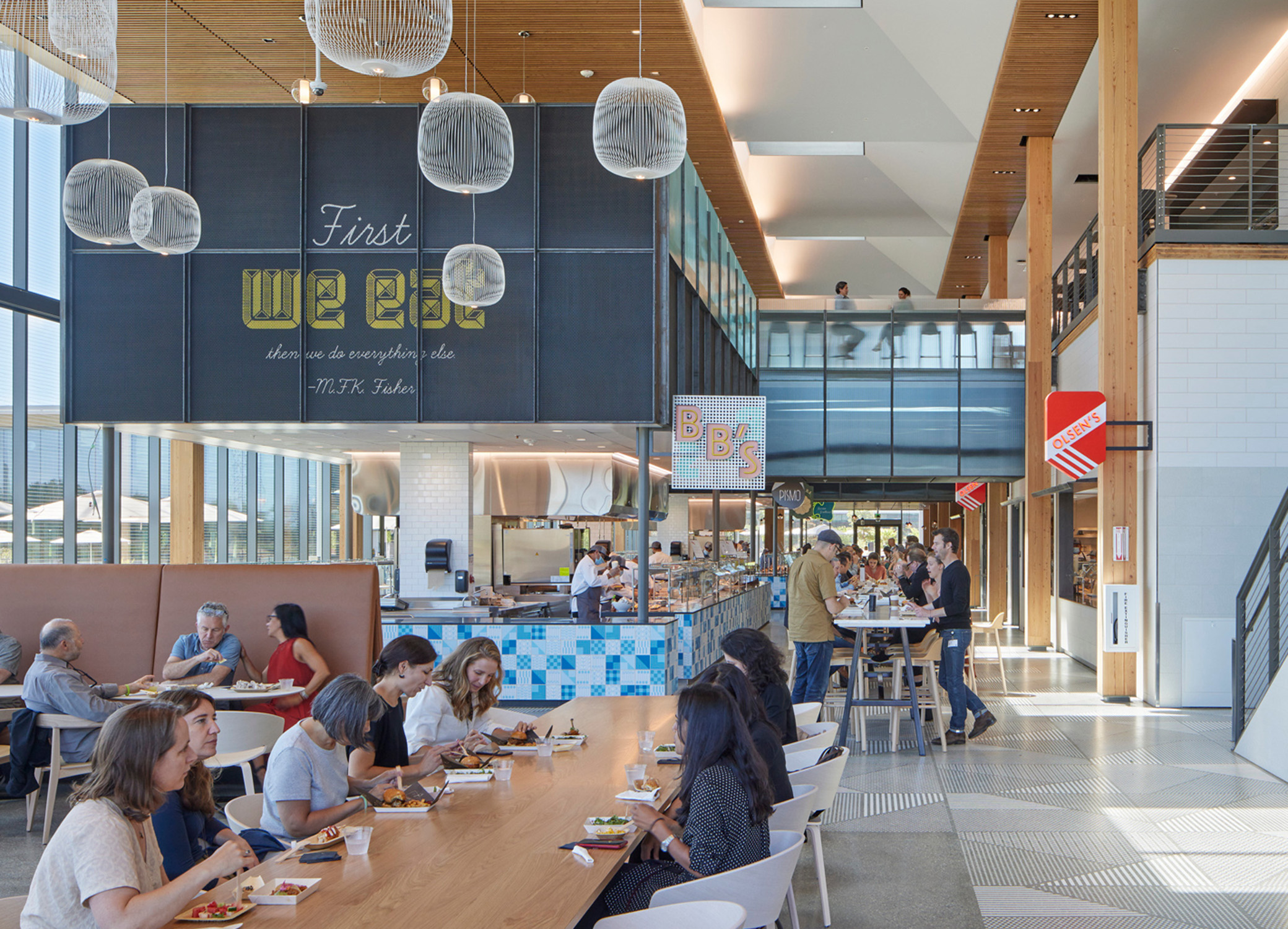
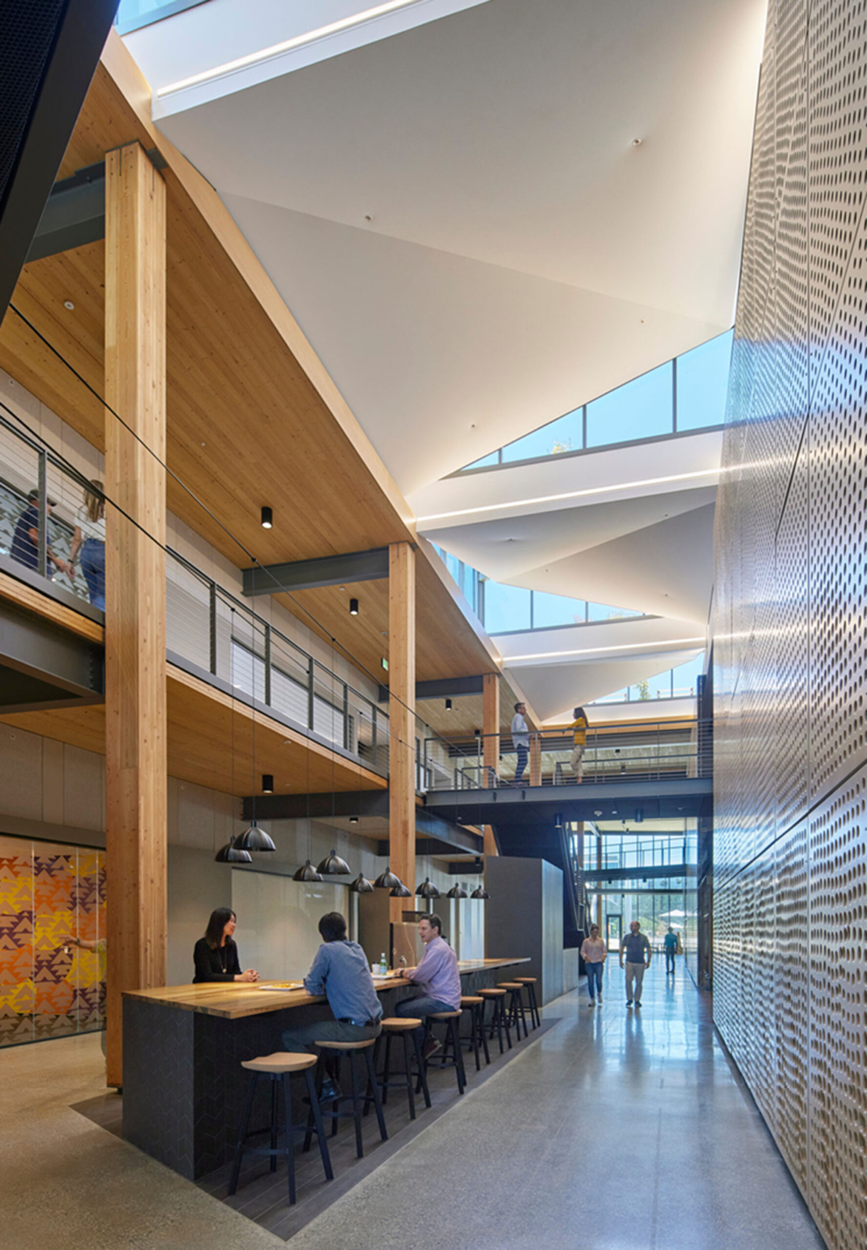
How does an aging department store—in this case, New York’s landmark Lord & Taylor Building—become a great modern workplace for Amazon? Department stores have large floor plates for a reason—to orchestrate a journey through their curated spaces, one that offers escape from everyday life into an experience of luxury and decadence. However, their large floor plates do not typically pull in a lot of daylight light and fresh air, key ingredients for a healthy, comfortable, and inspiring workplace that is also energy efficient and low carbon.
In response, WRNS Studio inserted a nine-story monumental stair that stretches from the second floor to the rooftop courtyard, capped by a transparent “lantern.” The stairwell repeats the footprint of the rooftop courtyard to channel natural light into the deep floor plates while encouraging employees to move about the building. The design team custom tailored a VS-1 system to produce this all-glass lantern volume within the historic rooftop courtyard and incorporated circadian lighting fixtures to enhance the sense of natural ambient sunlight. With operable windows and easy access to amenities, employees enjoy comfortable and personalized work environments that offer choice and a sense of domain.
Throughout the building, historic artifacts have been repurposed for new use. Tiles from the former flower market now frame the signage for a restaurant that pays homage to Dorothy (Dot) Shaver, the first woman to lead a major retail company in the United States. Wood panels originally imported from a Scottish castle grace a new fireplace and brass lintels salvaged from the old elevators are now part of a sculpture. Likewise, some historic elements have been revealed and given new life. Cast iron arches and glass windows that once framed the building entry now “fold” down into an arched banquette while the new solarium features a renewed original chamfered skylight. Terracotta found in the ceilings and column capitals, bearing layers of details, have been left exposed.
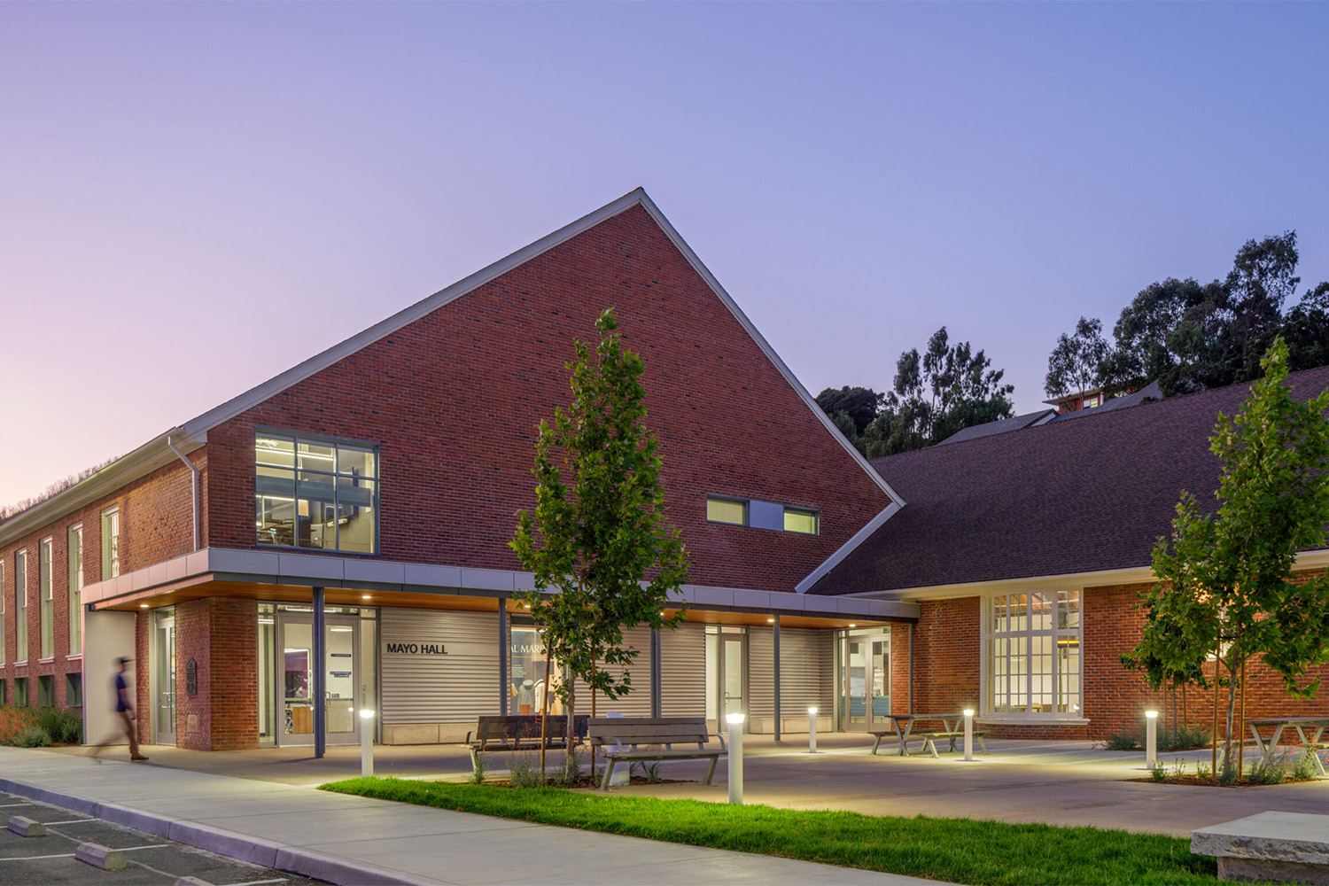
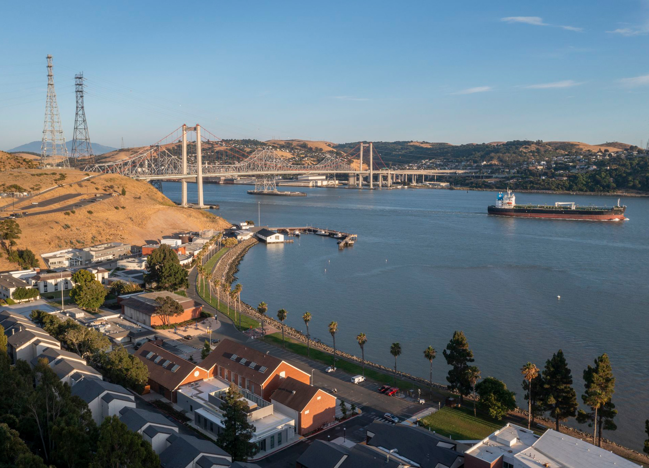
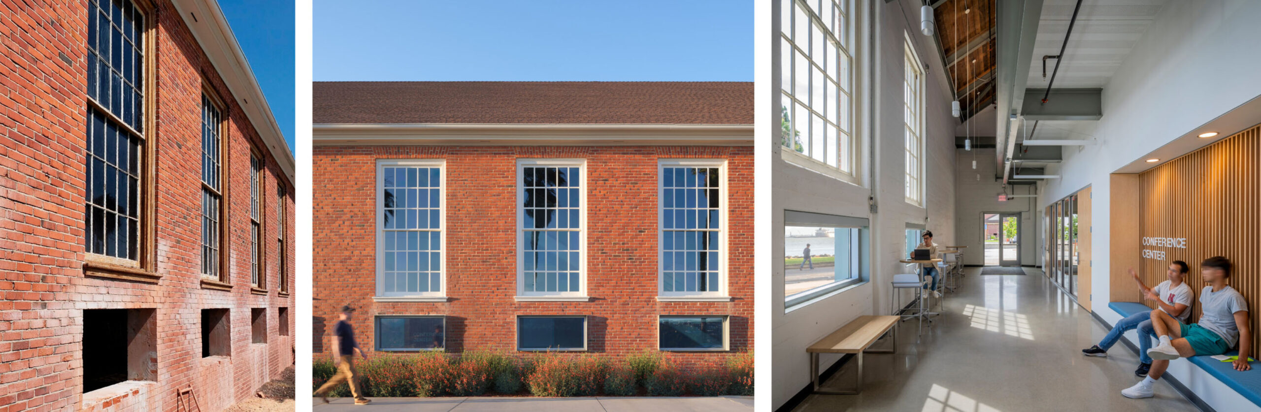
A dated campus treasure becomes a center of student life
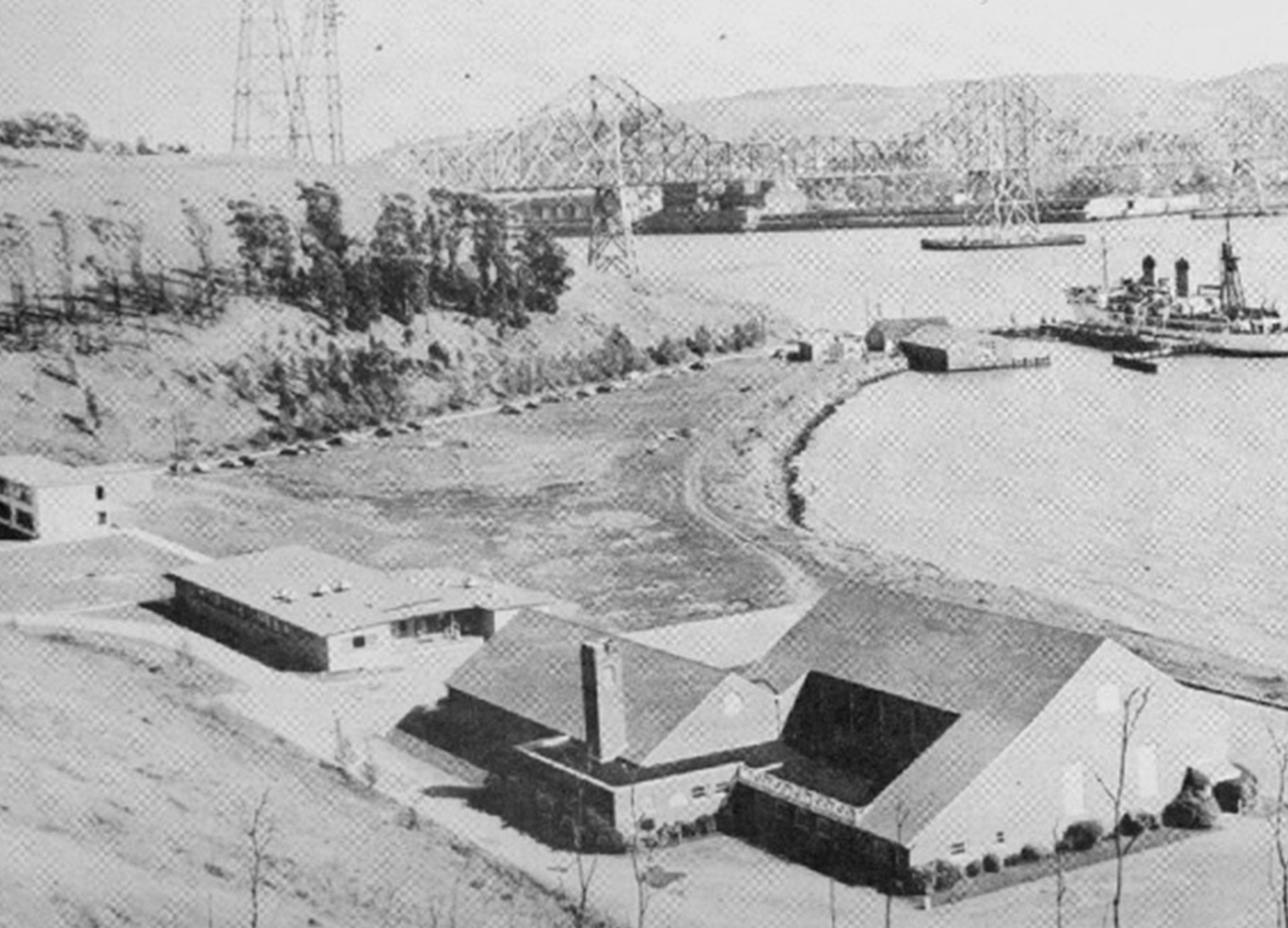
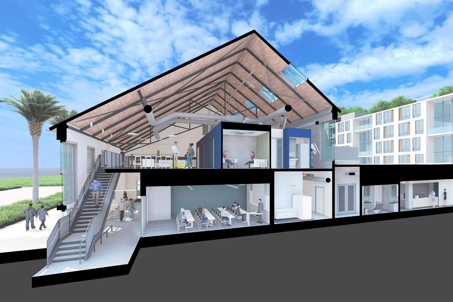
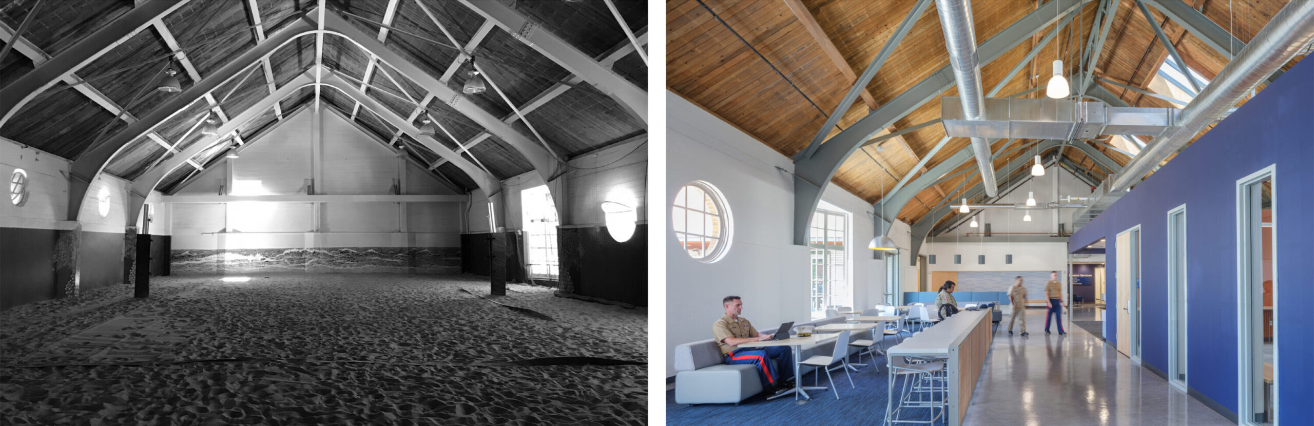
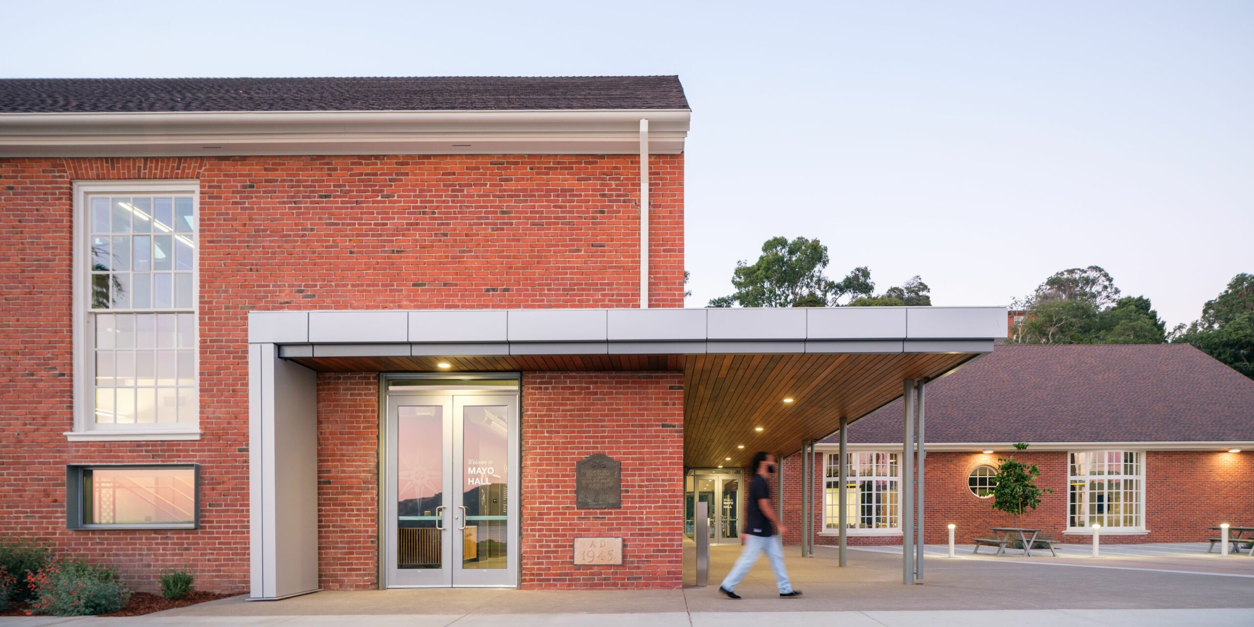
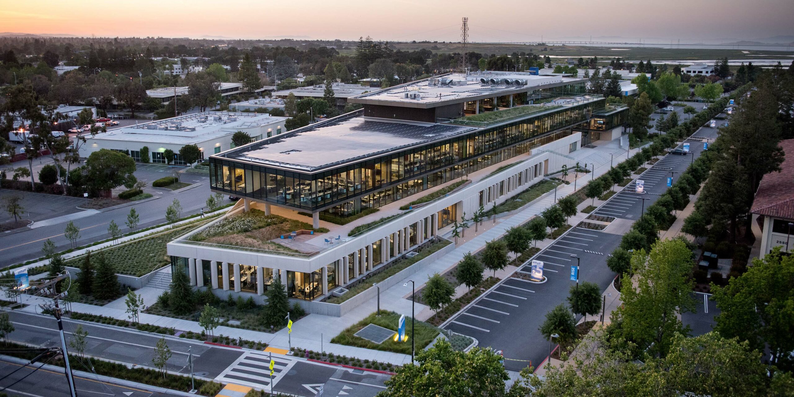
Mayo Hall is one of the most historic and beloved buildings on the California State University Maritime Academy (Cal Maritime) campus. It was constructed in 1945 as the Memorial Gymnasium to honor World War II’s fallen cadets. Before the renovation of Mayo Hall, cadets lacked ample spaces in which to hang out, socialize, collaborate, or simply unwind on this land-locked campus. The completion of Mayo Hall represents a pivotal moment in the campus’s evolution, offering invaluable college experiences and fostering a sense of belonging. The project retains the historic fabric of the existing structure while creating a new campus center for student life and services. The program includes lounge, study, meeting, leadership, and student services spaces—ample spots for cadets to make their own.
The project required a highly calibrated approach to meet carbon and energy goals while complying with the requirements of the Secretary of Interior’s Standards for Historic Rehabilitation and the State Historic Preservation Office. Key elements needed to remain intact, from window patterning and materiality to large-scale structural components. Likewise, technical intervention was required to make the building safe, energy-efficient, and comfortable.
After running a performance model, the design team determined that there was sufficient thermal mass in the existing concrete and brick walls to avoid additional insulation while meeting energy efficiency and waste reduction objectives. Approximately 80% of the interior finishes are composed of the existing concrete and wood structure. Likewise, the existing exposed wood deck was preserved in its original state and structurally insulated panels were added on top of the existing gabled roof deck to preserve the interior character of the exposed wood, providing an upgraded structural diaphragm and thermal insulation where it was most needed. 87% of construction and demolition waste was diverted from landfills.
The exterior of the building was modernized while retaining the building’s traditional Colonial Revival architectural style with red brick cladding, painted wood windows, and pitched roofs. A rebuilt roof features ridge vents, operable clerestory windows, and high-performance glazing to enhance natural ventilation, solar control, and reduce glare, contributing to an anticipated energy cost savings of 86.5%. New windows installed below the sill height of the existing windows (previously too high to look through) flood the interiors with natural light and offer views of the San Francisco Bay. This design allows the historic character of the original building to maintain its presence and integrity while providing a transition into the modern era.
A culture of wellbeing at a campus crossroads
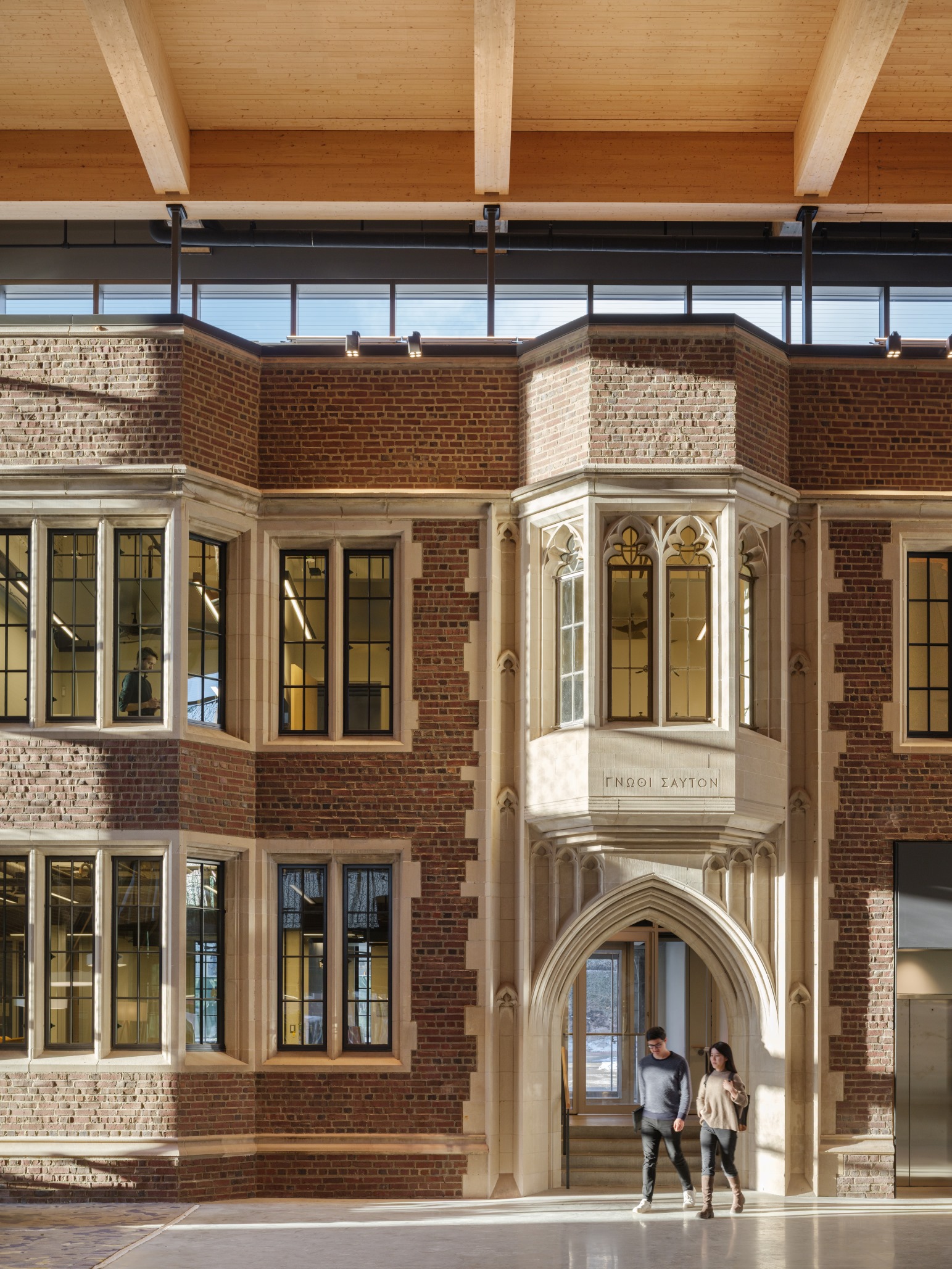
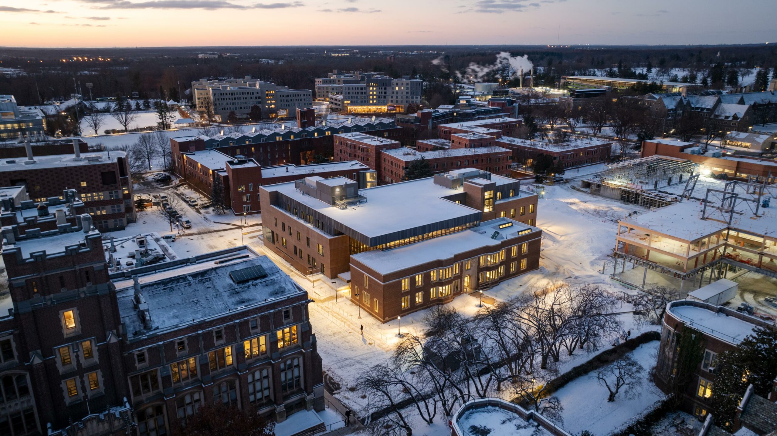
Currently under construction, the new Frist Health Center will help the University advance a culture of health and well-being on the Princeton campus.
The project includes both new construction and the adaptive reuse of a former laboratory building constructed in 1924, Eno Hall. Through the adaptive reuse of Eno Hall, the Frist Health Center integrates with the campus’s architectural legacy while extending two modern wings along key pedestrian routes.
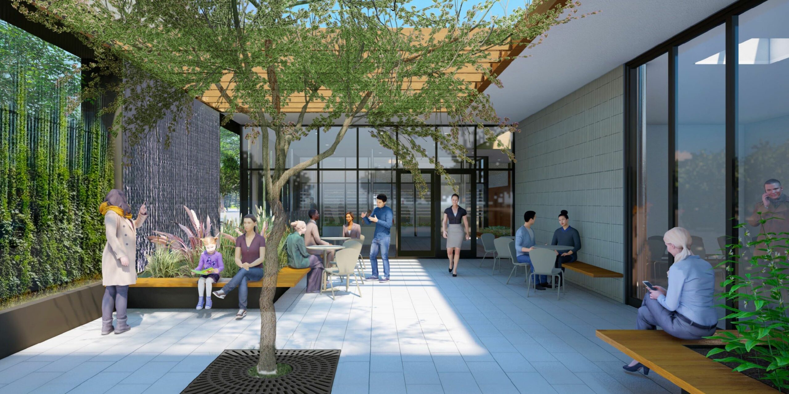
The heart of the Frist Health Center is an atrium. As the building’s main point of entry, accessible from three different sides, the atrium welcomes the campus community with a gracious lounge and informal social space. The interior of this triple-height space is distinguished by the former façade of Eno Hall, a Victorian Gothic building. The brick combines with the new mass timber construction to create a rich and warm material palette, imbuing the Frist Health Center with a residential feel.
Reuse of Eno Hall is part of a broader sustainability strategy to help Princeton University meet their goal for net-zero carbon emissions by 2046. Additional design strategies include a geothermal heating and cooling system, mass-timber framing, green roofs, and native plantings for storm water retention.
While we celebrate being named a Fast Company World’s Most Innovative Company, we’re particularly proud to be doing our small part to help address the climate crisis. We hope that our achievements, and those of our peers, raise the bar on what is expected from a good architecture firm.
WRNS Studio is proud to announce that Moses Vaughan has been elevated to the American Institute of Architects (AIA) College of Fellows. The College of Fellows honors members who have made significant contributions to the profession of architecture and society on a national level.
Moses conducts focused tectonic research to clarify and elevate architectural intent. Collaborating with artisans and manufacturers, he explores the potential of technology and materials, embedding precision and craft in high performance buildings that enhance the human experience. A committed mentor, Moses teaches future generations of designers how to deliver cost-efficient solutions rooted in research, innovation, and craft.
Clarifying and elevating design intent
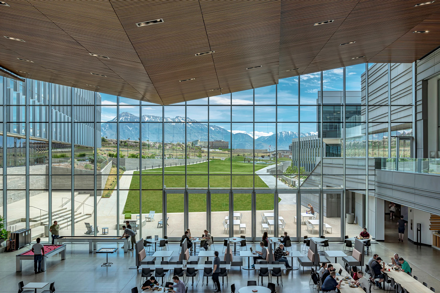
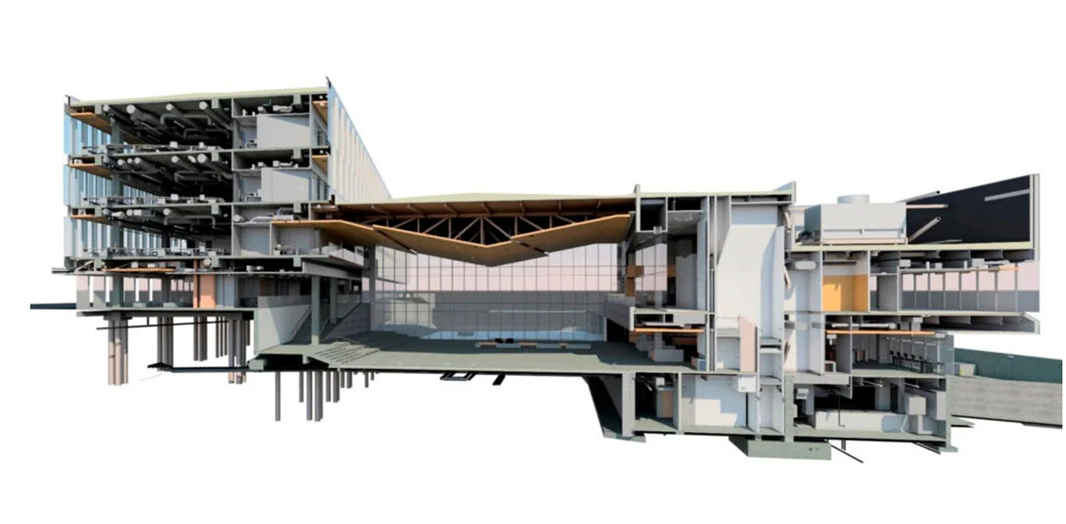
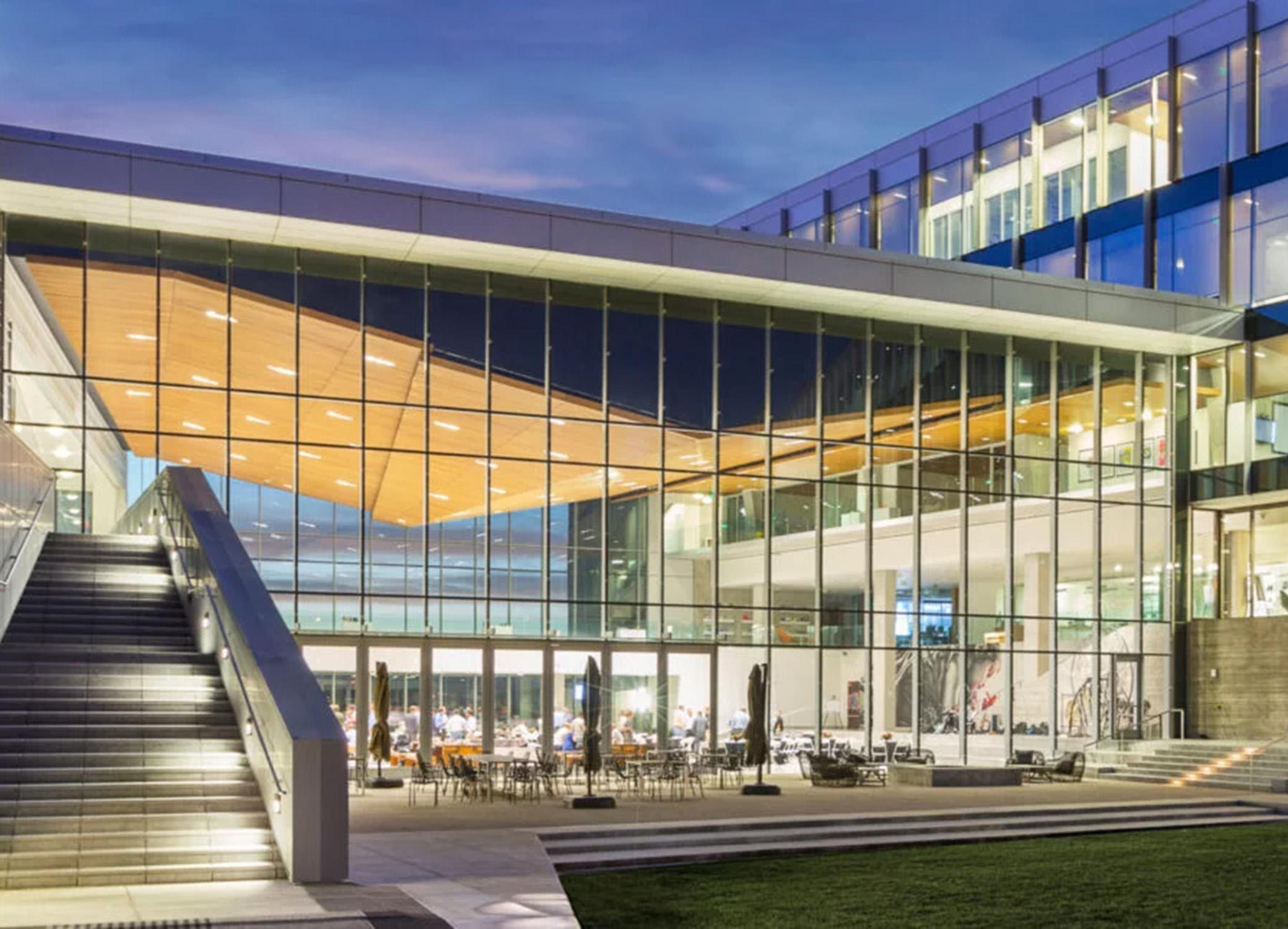
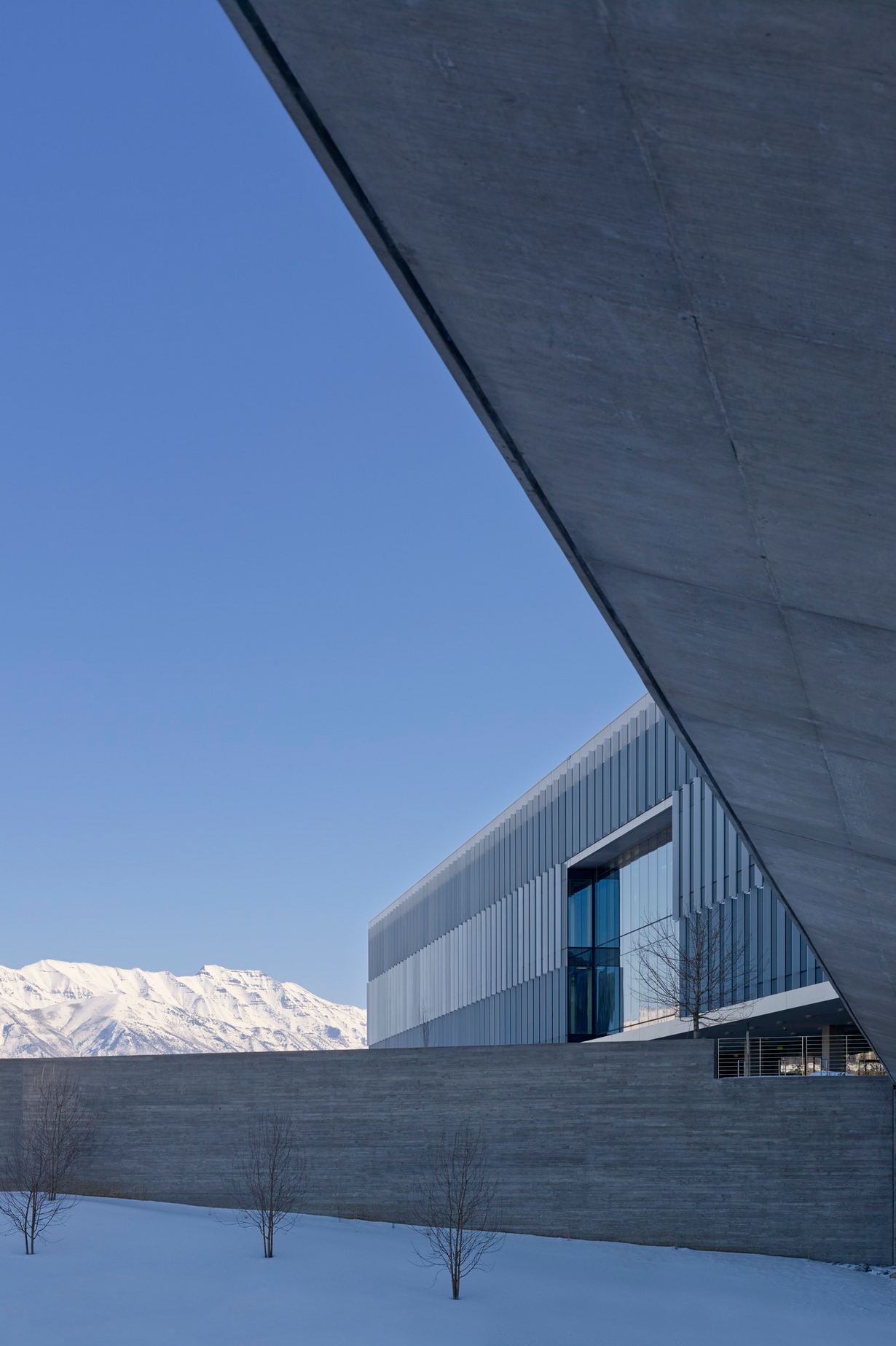
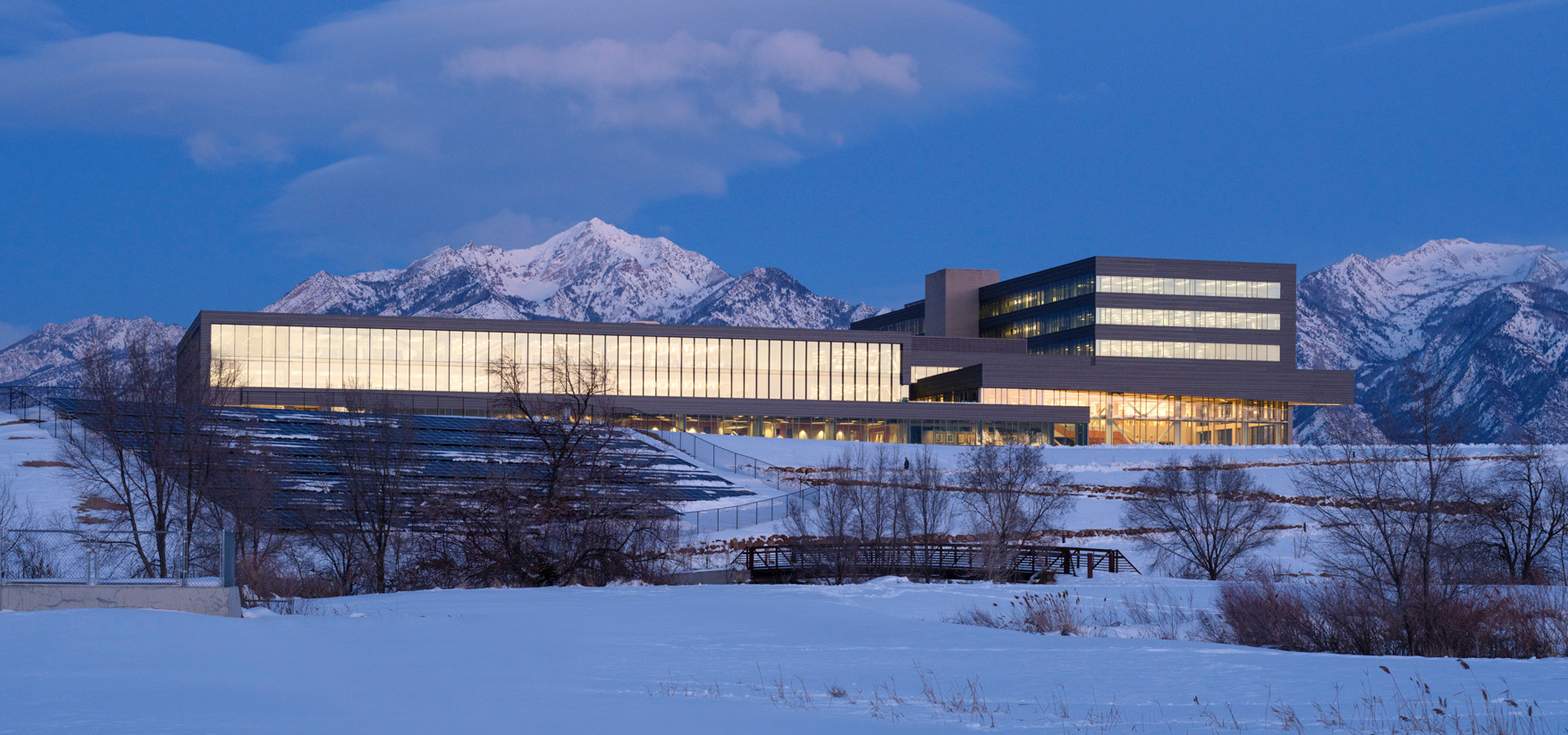
Through experimentation and collaborative research, Moses brings focus to each project’s design concepts, resulting in architecture that reflects and amplifies each unique place. For example, at Adobe’s Utah campus, the client requested visually unobstructed spaces with views to the Wasatch Range and Utah Valley while achieving high energy efficiency goals. In response, Moses collaborated with engineers to develop an inverted king truss, creating a 100-foot wide column-free atrium flanked to the east and west by monumental structural glass walls. Utilizing offset thermal breaks and triple-pane glazing, the 36-foot high facades provide outstanding thermal performance while linking the high desert views with the mountains beyond. The project helped define Lehi as Utah’s innovation hub and has contributed to the area’s alias as “Silicon Slopes.”
“At Adobe, Moses was critical in designing and delivering the key moment of the entire campus, the central atrium. Moses implemented the vision, despite multiple technical challenges—including 100 mph wind speeds, heavy snow loading, and high seismic requirements—with expertise, creativity and collaboration. No one is better.”
Collaboration to raise industry standards
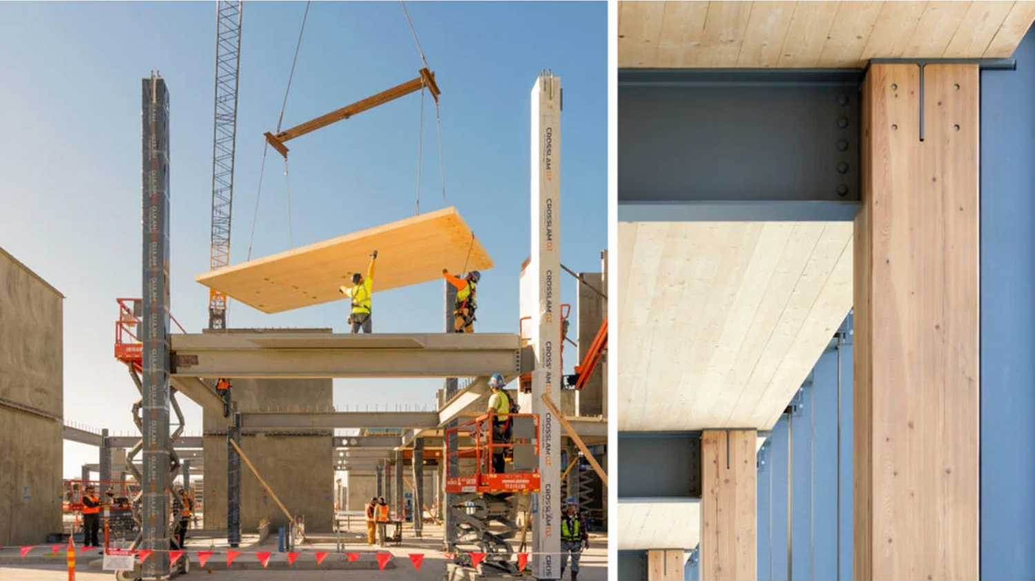
Moses has advanced industry practices through his dedication to craft and his collaborative approach to research and experimentation. By encouraging vendors, builders, and clients to innovate, he has normalized the adoption of new systems and materials that improve environmental, social, and economic performance. For example, on Silicon Valley Campus, Moses helped pioneer the commercial use of mass timber construction, showcasing the advantages of low-carbon and biophilic materials, while also benefiting rural economies and promoting forest health and resilience. Collaborating closely with the manufacturer and design team, Moses established dimensional and erection tolerance guidelines for integrating the cross-laminated timber deck elements with conventional steel framing metrics. He also guided the development of a multi-story mock-up to foster building trade coordination, refine detailing, and contribute to the mass-timber code conversation during the local permitting process.
“I really admired his ability to engage and collaborate with both the builder and structural engineer to find innovative and practical approaches to constructability issues that benefitted all parties. As the project lead for Confidential Tech Client, whenever I heard ‘Moses is on it’, I knew we were in good hands.”
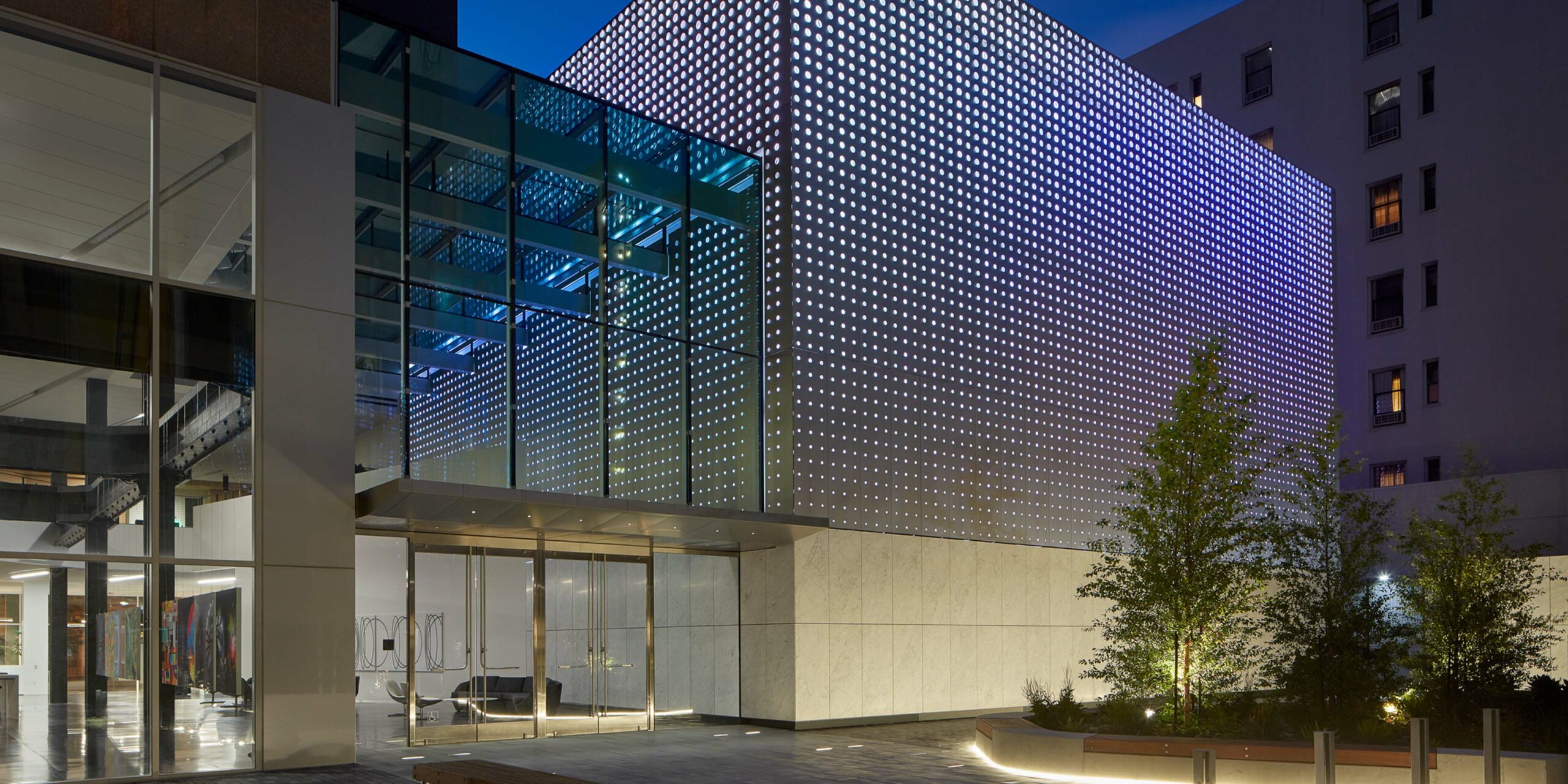
Craft that advances the public realm
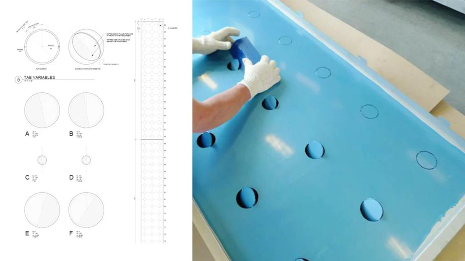
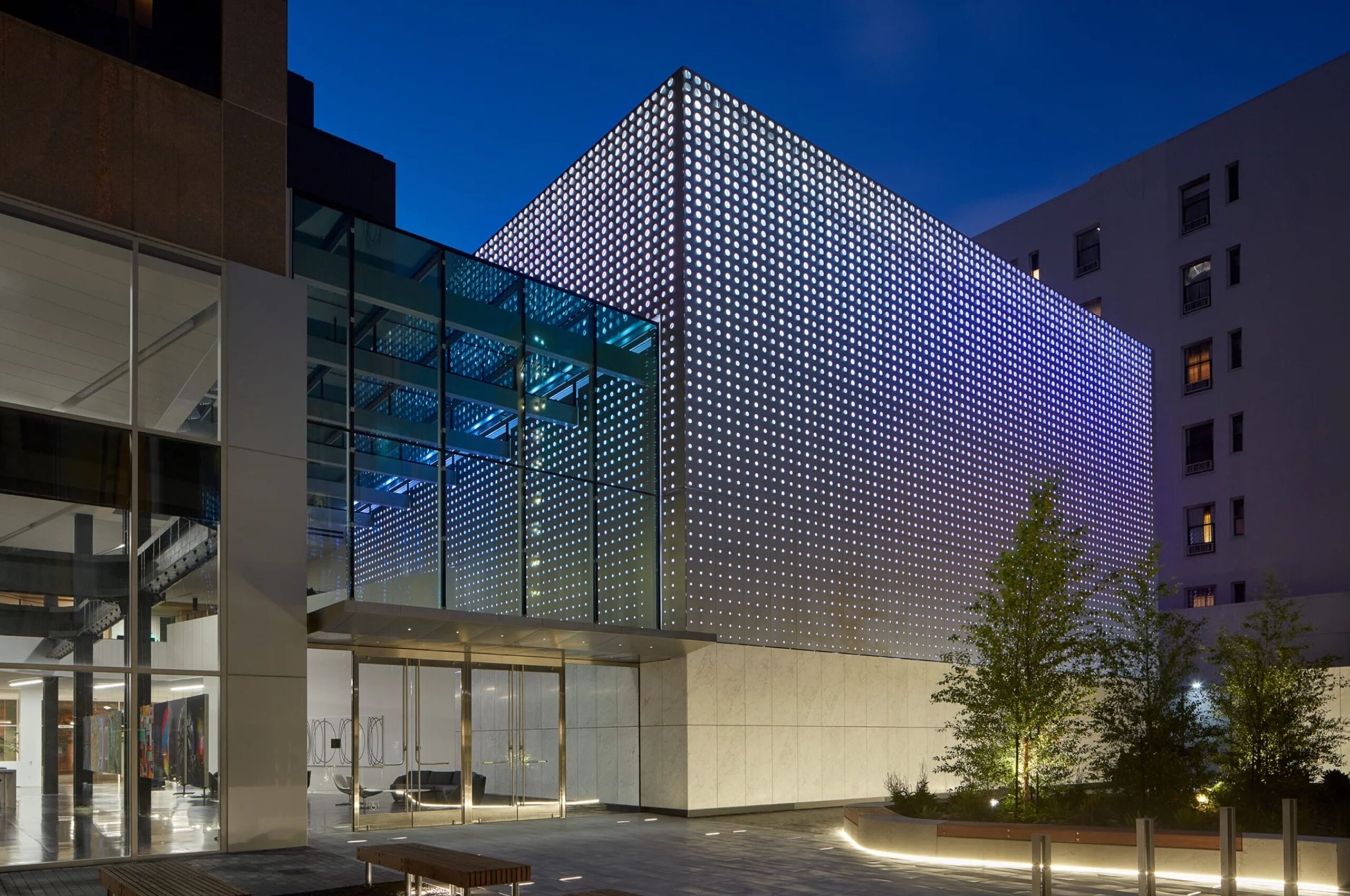
Craft is a vital aspect of the architect’s design role in responsibly shaping and sharing the built environment. Moses has methodically cultivated and discovered latent opportunities of materials and systems—a process resulting in optimized function, workability, durability and materiality to express the beauty and meaning of craft. Likewise, when client aspirations, a complex program, and constrained site combine, the challenges often become significant opportunities. For the Dolby Cinema at Dolby Headquarters, Moses collaborated with the A. Zahner Company to develop a novel “retained tab” stainless cladding system that features thousands of individually addressed LED back-lite elements. The resulting pixelated surface becomes a three-dimensional projection surface, thereby converting a windowless box into an illuminated cube capable of both static and dynamic displays. The cubic volume is enhanced by separation from the existing granite tower with an innovative VS-1 all-glass pre-function lobby. While the majority of the project remains in the private (corporate) realm, the views inward toward the cinema volume are deliberately revealed to the adjacent public sidewalks. The project visually opens and engages passersby with a vignette display of the creative process within.
“The design grew from a desire to reflect Dolby’s relentless pursuit of precision. The retained tab technology was a perfect manifestation of Dolby’s brand and how they wanted this project to engage the City.”
Education: paying it forward
Aware of how knowledge can become siloed to individuals or specific teams within a growing practice, Moses supports and provides guidance to future generations of architects through “WRNS U,” an umbrella term for WRNS Studio’s continuing education events, meetings, and focus areas. The program, in effect since 2010, supports WRNS Studio’s young designers, nurturing design excellence rooted in research, innovation, and craft. Moses regularly leads construction tours and luncheon lectures presenting building systems and materials with a focus on cost-efficient solutions while never sacrificing design quality. This mentoring process takes many forms: construction site tours, impromptu tech-talks, more formal in-house presentations, and periodic essays.
Thank you Moses, for putting the “architect” in architecture!
“There’s so much we learn from Moses each day. Thanks for making us better at what we do, individually and collectively.”
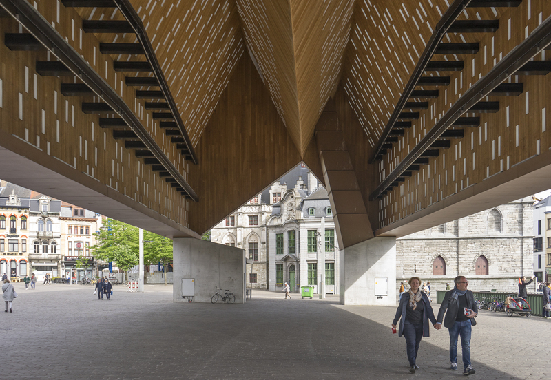
Set in the historic center of Ghent, the Market Hall is positioned in between buildings of monumental and residential scale and its design can be read as a combination of the two vernaculars. The form and proportion of the Market Hall mimic adjacent row houses, while its dramatic verticality recalls nearby cathedrals. Light-filtering fenestration follows the articulation of windows lining the street. Exterior wood is faded, cool, nearly stone-like — a textural nod to the surrounding masonry work. Interior wood is bright and warm — reminiscent of a more domestic atmosphere.
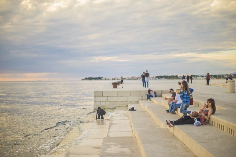
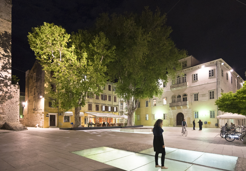
Sea Organ // Zadar, Croatia
Nikola Basič
This urban intervention sought to bring more personality to a reconstructed seafront following WWII. Designers found inspiration in the site’s natural splendor. Waves ebb and flow through a series of pipes producing a rhythmic hum heard along the quay. The low-profile offset steps gradually descend (or ascend) into (or out of) the sea — completely dissolving the border between land and sea. The project creates a richly sensorial and hypnotic experience: the touch of warm stone, the taste and fragrance of salty air, the undulation of the gentle tide, the calming resonance of the organ.
Petar Zoranic Square // Zadar, Croatia
Kostrencic-Krebel
The reconstruction of the Petar Zoranic Square led to the discovery of an ancient Roman ruin just beneath the surface of Zadar; foiling plans for the original design which called for the site’s complete excavation. Posed with a new design problem, the architects moved forward with a revised approach: design as little possible, prioritizing how the new intervention meets centuries-old artifacts. Patches of large glass tiles replace stone pavers, maintaining the continuity of the plaza plane and providing views of a civilization past.
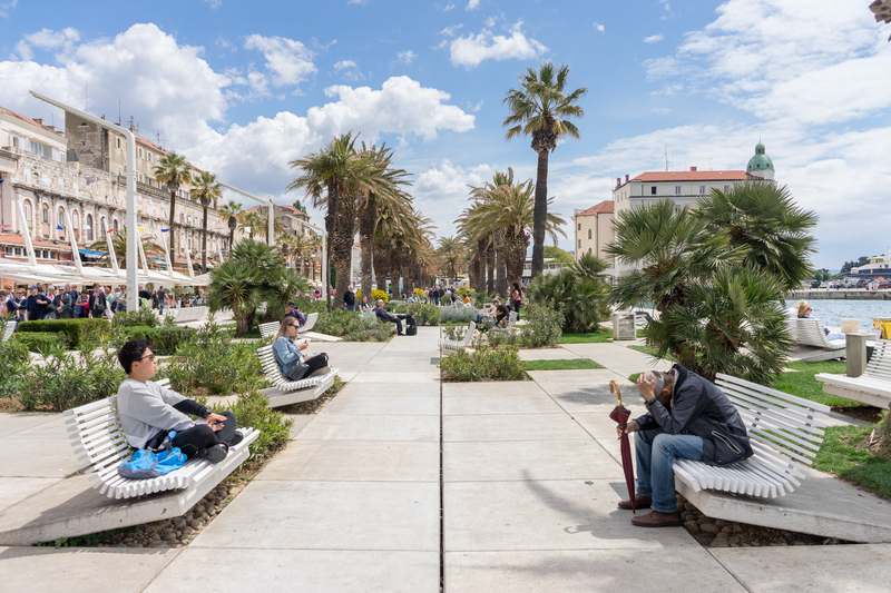
Riva Waterfront // Split, Croatia
Studio 3LHD
The Riva Waterfront is a popular destination in Split for locals and tourists — a hub of public life with cafés, restaurants, and bakeries. For its renovation, architects designed an open infrastructure that support this programmatic variety rather than specialized buildings. Organized by a grid of concrete pavers, a system of steel columns, lighting fixtures, and public benches allow the space to easily transform from outdoor concert venue to promenade to marketplace. Located in front of the Roman Emperor Diocletian’s Palace, the project’s thin appearance and muted palate is in reverence to the site’s cultural and historical heritage.
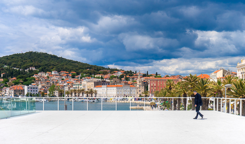
Mixed Use Building // Split, Croatia
Dean Stubnja
At the edge of the Riva Waterfront sits a mixed-use building and observation deck. Despite stunning views of the waterfront, Adriatic Sea, and the Split urbanscape, the original 1960s structure was underused and fell into disrepair. Its redesign uses the original architectural vocabulary of clean surfaces and simple forms, while a new materials — glass and stone — put the building in dialogue with the historical urban fabric and the renovated waterfront. The minimal design frames Split’s picturesque context and creates a functional platform for community events.
826 Valencia is a nonprofit that provides one-on-one tutoring for under-resourced students to improve writing skills and cultivate a love of learning. Starting in 2018, WRNS Studio has partnered with 826 Valencia in a series of inspiring pro-bono projects—from a standalone writing center in San Francisco’s Mission Bay neighborhood to in-school projects at the San Francisco International High School and, most recently, for the Charles Drew Elementary School. Each project has been meticulously crafted to foster imagination and inspire young writers while demonstrating the power of community engagement.
“Over many projects at our Centers and schools, the good people at WRNS Studio have created joyful learning environments that inspire creativity and engagement.” – Bita Nazarian, Executive Director, 826 Valencia
Mission Bay Center
The Mission Bay Center, located on the ground floor of a new development that offers 100% affordable housing, was 826 Valencia’s third writing center in San Francisco. 826 Valencia wanted their new tutoring center to be playful and whimsical, in keeping with one of the hallmarks of their programs: infusing learning with a spirit of inventiveness and adventure. At the Mission Bay Center, this happens in an ‘enchanted forest’—one that ties the transformative experience of learning to fantasy, creativity, and play. Various artists and craftspeople contributed their services pro-bono for this effort including BCCI as the general contractor and Office as the branding and products consultants.
San Francisco International High School Writers’ Room
Our second project for 826 Valencia—a Writers’ Room at San Francisco International High School—infused the same principles of adventure and inventiveness, whimsey and play into a school setting. The Writers’ Room serves as a valuable resource for teachers, who can request project-specific support from 826 Valencia’s team of volunteers. Thematically, the Writers’ Room transports “animal tourists” to local attractions around San Francisco, with graphic landmarks adorning the walls. Returning for this project, BCCI served as the general contractor.
Charles Drew Elementary School Writers’ Room
The completion of our third project for 826 Valencia, a Writers’ Room at Charles Drew Elementary School, immerses young writers in an enchanting world where the forest canopy reaches the sky. Drawing inspiration from the fog and foliage outside the classroom’s large windows, the Writers’ Room is an arboreal realm inhabited by friendly animals and fantastical creatures in the clouds. Novo Construction served as the general contractor.
“They built this magical room based on student ideas that was replete with giraffe bookshelves, panoramic murals filled with mythical creatures, and flying book clouds! Our students face many barriers to learning, yet every child wants to write and learn in this room.” – Bita Nazarian, Executive Director, 826 Valencia
Highlighting our collective dedication to providing essential resources and opportunities to underserved students, the design team found creative solutions to maximize the limited budget. We reached out to the local AEC community, securing donations in product and time from consultants, vendors, and friends. WRNS Studio staff dedicated their lunch hours to craft custom decorations for the Writers’ Room. Discarded books from the San Francisco Public Library, obtained through a public-request program, were upcycled into a ceiling installation resembling opened books with folded edges, evoking birds in flight. Team members also painted giraffe-shaped bookcases and fabricated voluptuous clouds from paper lanterns and cotton batting. The team came together for an intensive multi-day installation, transforming the space into a vibrant learning environment that fosters exploration and creativity.
WRNS Studio’s partnership with 826 Valencia stands as a testament to the enduring impact of pro bono collaborations in fostering educational equity and nurturing the next generation of creative thinkers.
Our staff share their thoughts on the importance of hand drawing as part of the design process.
How is sketching important to your design process?
Emily Jones: Sketching allows me to see if the concept passes the “squint test.” If the idea isn’t clear in a sketch, it’s not worth investing time into.
Tim Jonas: Sketching is simply the fastest way to throw noodles at the wall to test ideas. But it is also very useful for training your mind’s ability to visualize 3D objects and spaces. Sketching out in the wild makes you aware of how lines, edges, curves, and light produce what people see.
These sketches by Tim Jonas, Senior Associate, integrate topography with structure to explore a site-specific response.
Christopher Hunter: Sketching is the fastest way to test ideas and find inspiration. What I like about sketching is that it can flow seamlessly between streams of consciousness and focused composition. By making a single mark on the page, we are forced to think about the composition, the depth and character of the line and commit to our ideas.
Arman Hadilou: Sketching for me is the easiest and quickest form of visual communication and presentation. I can draw on the bus, in a park or on a plane. The communication of ideas between head and hand is more fluid and direct.
This sketch by Arman Hadilou, Associate, elucidates multiple façade options that intricately lace scale, proportion, and materiality into a cohesive design.
Kelly Shaw: Sketching gives me the freedom to suggest space and scale with a few lines or quick illustrations. I get to choose how my ideas are conveyed as they arise—whether it’s through an elevation, perspective, detail, or combination of something else entirely—and they can all co-exist on the same page.
These sketches by Kelly Shaw, Associate, convey a connecting stair concept and is an effective tool for communicating design ideas to the client.
How does hand sketching contrast with other tools, like 3D modeling?
Dale Diener: Sketching contrasts from 3D modeling as a tool as drawing is a representational act while modeling is building a virtual reality. Drawing allows you to think in the abstract as you develop an idea instead of committing to a final product from the get-go.
These sketches by Dale Diener, Senior Associate, illustrate a drainage sequence and how to taper the insulation to create peaks and valleys to direct the water flow.
Tim Jonas: Sketching is great because it gives you a lot of leeway to represent an idea. Creative license type leeway. But, that means a sketch can lie a bit in order to pitch its idea or feeling. 3D modeling picks up where that sketch left off and really tests those things that a flourishing, gestural sketch glossed over. I’m not saying hand sketching lacks because of this, rather the opposite – it allows that freedom to simplify an idea without getting bogged down in its execution.
Kelly Shaw: A hand-drawn line conveys a sense of looseness and softness not yet achievable with 3D modeling without post-production. In working with clients, particularly early on in the process—a sketched drawing helps to connect with the viewer by creating a starting point which everyone can understand and relate to. We are bringing the client on a design journey—one that starts with a concept and has a million possibilities rather than suggesting a single solution the more technical 3D world might imply.
Luke Wallace: Sketching allows me to be more explorative and free than other tools. Using 3D modeling is more like hardlining an idea for me. Although further iterations can happen with a modeling program, you have to have a concrete notion of what you are modeling or it’s a dead end. Sketching gets you to that point. Whenever I feel stuck with the 3D model or other tools, I know it’s time to return to sketching.
These sketches by Luke Wallace, Project Architect, experiment with various massing and façade options to study site conditions, user needs, and circulation.
Arman Hadilou: Unlike digital modeling, which requires an intermediary medium, hand sketching is direct, quick, and provides the creative freedom to visualize design concepts and ideas. I think hand drawing is a complementary tool to digital modeling. With all the things computers can do, it is easy to get caught up with the ability of tools at hand. But hand sketching allows me to focus on the core concepts and not get distracted by the abilities of the digital tools.
Emily Jones: The haptic pleasure of drawing with pen and ink puts me in the mindset to design for emotional experience. Computer-aided tools remind me to design an analytical response.
These sketches by Emily Jones, Senior Associate, portray a renovation and expansion by highlighting any relevant architectural features and alterations to the existing building.
What do you use to draw and where do you like to do it?
Dale Diener: I typically draw on white trace paper. I use a light red pencil to lay out construction lines and then use black ink with varying line weight to fill in the drawing. Sometimes I also use a wash of color to distinguish materiality.
Tim Jonas: I used to draw only on white trace, using tons of overlays, like layers in photoshop, then producing a final singular sketch. Very akin to old ink on mylar production. Very satisfying, very time consuming. Now I cannot recommend the iPad enough. It is so quick, editable, multimedia, it is invaluable to me now. It allows sketching while sitting in a park, plane, or desk. I personally like sketching work ideas at bars, which appears I need a better work life balance.
Christopher Hunter: I like to draw on any type of paper or surface, but prefer to draw at my office desk or home drawing table with trace paper. I like drawing in black ink on trace paper because of the smooth surface and I love to use Prismacolor markers to add and blend splashes of color.
These sketches by Christopher Hunter, Associate, represent an entry sequence and highlights interior finishes to advance a continuous design aesthetic.
Luke Wallace: I draw in a variety of mediums depending on the task at hand and/or source of inspiration; i.e. using charcoal for more whimsical concepts or early sketches. Though, my default choice is ink with some source of color (watercolor pen, colored markers, or colored pencil). Not sure I gravitate to one spot in particular to draw, though I prefer drawing either privately or with others all sketching together; I do not like sketching at my desk.
Arman Hadilou: I used to draw on trace paper or in my sketchbook until a couple of years ago when I got an iPad. Now I am using Morpholio, which allows me to trace more often to quickly visualize and communicate ideas and concepts.
Each material, whether natural or man-made, used in our work can be processed or crafted in many different ways to deliver a uniqueness inherent to it. Stone is one such material that can be used on its own in large formats or combined with other smaller stones that are in-laid or embossed to create an entirely new product. The craft of ‘stone in-lay’ has fascinated me since I was a kid as my father and I would play on a stone in-lay marble chess board he’d got from Agra and I’d think to myself—‘I can’t believe this is handcrafted. How did someone actually make this?’ My curiosity from 35 yrs ago led me to this scholarship.
Stone In-Lay aka Pietra Dura or Parchin-Kari
The origins of stone in-lay work go back to the 16th century when it started as ‘Pietra Dura’ in Florence at the peak of the Renaissance under the Medici’s. Hard and semi-precious stones were crafted into intricate shapes and fused together. The technique was often known as ‘painting in stone’, similar yet distinct from mosaics. The floor of Santa Maria del Fiore is the greatest work of the craft in Europe. By the 17th century, this craft spread all the way to the Indian subcontinent where it was enhanced into ‘Parchin Kari’ by the Persian and Mughal artisans. It was here that the true ‘in-lay’ technique was discovered where a hard stone like marble or granite was used as a base and hand carved to fit in semi-precious colored stones, often in floral patterns. The Taj Mahal in India is the most opulent showcase of this in-lay technique and thousands of artisans still keep this ancient craft alive today in the city of Agra.
The Ancient Technique
The 14th generation of the artisans skilled in Parchin-Kari, who are descents of the original craftsmen from 1633 that built the Taj Mahal, use the same tools, process, materials, and recipe even today. Semi-precious stones are cut into thin veneers that are then sanded into delicate shapes using a hand-powered grinder called ‘Saan and Kamaani. The delicate shapes are then arranged in their desired design, usually floral patterns, on a base white marble that has already been cut to shape for its intended final use. The base marble is covered with a contrasting ‘organic henna’ paint before the floral pattern is etched onto it to make it easy for the craftsmen to trace the design while carving.
The semi-precious pieces are then placed aside and the chiseling begins. The artisans spend days hand carving out the floral patterns from the base white marble. The depth of the carving is just enough to set the stone veneers. Simple hand tools are used. Once carving is complete, the semi-precious stones are arranged back into the dry carved base before being individually stuck. The glue is an organic paste made from sugar cane, bees wax, honey, lemon juice, marble dust, and lentils—a recipe that hasn’t changed for centuries. Its consistency is a bit thicker than the typical adhesive glue and hence it takes time to dry and set the stone in place. Once dry, the surface is sanded for a smooth and glowing finish. The most intricate flowers have almost 60 small pieces.
Craftsmen Culture
The artisans work together as a cooperative. Each artisan family specializes in one particular type of floral design and hence, they create work opportunities for each other by collaboration vs competition. Handicraft manufacturers reach out to multiple craftsman families depending on the design. Individual artists retain complete creative freedom for each of their pieces. Design is always radial and symmetrical following the principles of Mughal art and architecture.
In-lay at the Taj
The Taj Mahal was built by the great Mughal emperor Shahjahan in 1632, in memory of his wife Mumtaz, who died giving birth to their fourteenth child. To create it, 22,000 skilled architects, inlay craftsmen, calligraphers, stone-carvers, and masons were called from all across India and lands as distant as Persia and Turkey. Because the Islamic faith forbids the use of human faces or imagery in decoration, the surface of the mausoleum relied on symbolism to reflect both natural beauty and divinity. Abstract geometric forms, calligraphy, and floral designs were used to ornate the structure. Flowers were especially considered natural symbols of the divine realm.
The main structure of the Taj Mahal is made from brick and the white ‘Makrana’ marble was applied as a stone veneer. It was brought in from nearly 500 miles away, transported via bullock carts and elephants and contrasts with the red sandstone of the surrounding buildings and walls. The white marble provided a neutral and pure base for a variety of in-lay work. The color of the white marble shifts with the hours of the day: orangish-pink in the rising sun, bright white in strong daylight, golden-hued at sunset, and a mellow glowing white under the moonlight; accentuating the in-lay work within it differently at different times of the day.
The gemstones used at the Taj Mahal came from as far as Afghanistan, Turkey, and China and were picked for their lustrous colors—the blue of lapis lazuli, the green of jade, the red of jasper, the brownish red of carnelian, and the white glittering mother of pearl, among many others. Some of these stones were so precious that they had been looted by invading enemies over the years and have now been restored with faux alternates. One in particular was the red jasper that had the unique quality of glowing when light shined upon it. It is said, the original Taj Mahal would not only glow white on a full moon night but also red, glittering its jasper stones. The calligraphy inlay, in contrast, was always black onyx as it helped the Islamic teachings be visible anytime of the day/night against the white marble.
In addition to all the uniqueness of the stone in-lays at the Taj Mahal— the patterning, symmetry, color compositions, etc—the design application that amazed me the most was the use of the in-lay designs to created 3-dimensional perspectives on the facades of the structure. A herringbone pattern was used at the corner minarets to give the impression that the surface was 8-sides vs 4-sided. The calligraphic writing was smaller at the base and enlarged as the height went up to make sure it was evenly legible from afar.
Truly, the Taj Mahal and its use of the stone in-lay is extraordinary, one has to see it for themselves to understand the craft and the craftsmen. Words and photographs can’t capture it holistically, but i hope you get the idea!
Nine decades later, the building has found new life as a home for tech, design, and media companies who are attracted to the cluster of activity and businesses around South Park and AT&T Park. Our fourth-floor suite started as 8,300 square feet in 2006, grew to almost 10,000 square feet in 2013, and is now nearly 15,000 square feet, or roughly two-thirds of the fourth floor. Our staff and visitors enjoy sweeping views toward Mission Bay and Twin Peaks as well as terrific access to the Bay Bridge, the Embarcadero waterfront, and the larger South of Market (SoMA) neighborhood. The robust concrete frame and exposed slabs speak to the building’s industrial history and provide interior finishes with an authentic character and richness, as well as a wide open floor plan that supports our collaborative studio culture.
When we began our search for a home in New York City, it was important to us that we find a space and a building that had a real sense of local flavor and history, but we didn’t know if that would mean a former printing plant in Brooklyn, a mid-century modern highrise in Midtown, or a 1920s art deco tower in Lower Manhattan. Upon entering the lobby of 26 Broadway, the former headquarters of Standard Oil and once the most famous business address in the world, we knew that we had found a special place. And when we first entered the eleventh-floor suite that is now our new home, with its pockmarked plaster ceiling moldings and double-hung windows overlooking the narrow New Street and one of the building’s two interior light wells, that feeling was confirmed. While the specifics of materials and details and even the quality of light were very different from our San Francisco studio, the proportions of the space were similarly conducive to an open, collaborative workspace. We were hooked.
Just as South Park has adapted to an influx of tech companies from a history based in industrial uses, Lower Manhattan has similarly evolved in recent years to encompass industries other than its traditional financial core – tech, design, and media firms have become ubiquitous. As the World Trade Center site has been reconstructed over the last fifteen years the sheer volume of brand new, Class-A office space has led to the repositioning of older properties with comparatively attractive rents. Architecture firms including SOM, Handel, BIG, Snøhetta and SHoP now call the same stretch of Lower Broadway their home, and WRNS Studio is proud to be the newest addition to the neighborhood.
For a firm that prides itself on a deep commitment to sustainability and environmental stewardship there is a certain irony in adopting the former Standard Oil headquarters as our home. Once a gleaming beacon visible to all ships entering the harbor, the building was very much intended to convey a sense of industrial might. If Manhattan were a ship, 26 Broadway was once its prow, with the kerosene torch at its pyramidal top visible for miles.
Architecturally, 26 Broadway has a complex and fascinating history. It was once the site of a home where Alexander Hamilton hung his hat, and was later where the first Standard Oil building was begun in 1884 after John D. Rockefeller relocated the company from Cleveland. The building designed by Ebenezer L. Roberts was initially only ten stories tall but was expanded in 1895 by Kimball & Thompson to include an additional six floors and an extension on the north side. In 1920, still a formidable operation but reorganized following the historic antitrust decision of 1911, the company embarked upon nearly a decade of construction to expand the building and further increase its prominence. The work, designed by Carrère & Hastings, was conducted in phases and lasted nearly a decade, as retail tenants moved out and adjacent parcels were acquired. Innovators of skyscraper massing in the years following the adoption of the 1916 Zoning Resolution that mandated setbacks for tall buildings, two of the architects who worked on 26 Broadway (Richmond Shreve and William Lamb) later went on to found the office that would design the Empire State Building.
Much of the original building was incorporated into the new construction, including the portion of the façade along New Street within which our suite is located – notably, it remains brick, unlike the more ornate limestone of the rest of the exterior. The result is a sort of architectural palimpsest, with the original building encased within a larger, more imposing structure. The highly unusual plan shape of the lower 16 stories (the base of the building famously follows the curve of Broadway) gives way to a slender 13-story tower that reconciles itself to the wider city by aligning with the regular Manhattan street gird to the North, not the more idiosyncratic set of streets found around Bowling Green. Entering our suite, one passes through an original exterior wall, as the stone floor gives way to wood, the transition clearly evident in the thickness of the wall. The history becomes an important part of the spatial experience of entering the suite.
Rather than replicating exactly the look and feel of the San Francisco studio, our New York space borrows from its function while adapting to a new physical and historical context. The analogs are everywhere: while San Francisco staff can enjoy their lunch in South Park (at least once the current renovation is complete), their counterparts in Lower Manhattan can visit Bowling Green – a century older but providing similarly welcome relief from the dense surrounding urban fabric.
Other tenants at 26 Broadway include The New York Film Academy, The Cornell College of Architecture, Art and Planning, and three New York City public schools comprising the Broadway Education Campus, as well as a number of creative digital agencies. We are delighted to be surrounded by creativity, curiosity, and innovation.
When WRNS approaches any new project, we always begin with a serious investigation and analysis of place in the broadest possible sense. In opening our New York office, we employed that approach as rigorously as ever.
When I imagined a Caribbean Island I thought of blue skies, white sandy beaches, and turquoise waters. My first trip to the Caribbean, specifically the country of Barbados, felt like the perfect opportunity to finally try my hand at oil painting. The richness of color made me feel like I could ease into painting with a slight advantage—beautiful beachscapes. The landscape did not disappoint and over the course of my oil painting adventure I came to enjoy the flexibility that the medium presented me, in particular the textures I could create, both additive and subtractive to evoke the rough waves crashing on the shore or the crystal-clear waters that revealed marine life and coral beneath.
During my visit I had the great fortune to traverse the island and get to know all sides of the country from the bustling city of Bridgetown and the cultural richness of music and dance to the wilder rugged eastern and northern coasts.
The name Barbados originates from the Portuguese term ‘Bearded Man’ when it was first claimed by the Portuguese in 1533. After a long and arduous past of European invasion and occupation (primarily by the British), Barbados finally established their republic just a few short years ago in 2021.
George Washington House
This yellow house (painted below) was visited in 1751 by George Washington, the only location outside of the United States he ever visited. Today the structure is a museum. Perhaps most interestingly, the grounds sit above some 10,000 feet of tunnels that were built after Washington’s visit in the 19th Century. Today, the tunnels are part of the historic Bridgetown UNESCO World Heritage Site.
Sugar Industry
In the 1640s, largely in part to the European demand for sugar, the sugarcane industry in Barbados became the primary economic driver under British rule. However, the drink ‘rumbullion’—today known as rum—made from sugarcane and molasses also gained popularity. Like sugarcane, rum became highly sought after by the British, largely in part to the rum rations they provided their Navy with in the 18 and 19th centuries. The little structure (painted below) resides on the Foursquare Distillery property. The oldest building on the site is a windmill from 1737, which once aided in the molasses-to-rum making process. Today, the factory boasts an incredibly sustainable cycle that includes a waste management plant on site to reuse fermentation mash for animal consumption or fertilizer, and energy conservation that includes both heat capture and solar energy to fuel their run production. The company sets an excellent example for being a sustainably responsible business in the modern day.
Seafood
Bajan food, being a Caribbean island, is very seafood focused. One of the most popular and readily available fish is the flying fish. They can be seen soaring through the air in the ocean. One highlight of the island is the Oistins Fish Market, located in the fishing town of Oistins, it comes alive every night as locals fill the market at night for the fish fry. Although my favorite local snack was a flying fish cutter, a food truck sat opposite the dock (painted below) and served up the salad bread sandwiches loaded with fish, tomato, egg, cheese, and hot sauce.
Eastern Coast
The beach scene most unlike the collection I painted was of the Eastern coast of Barbados. Despite being a small island of just under 170 sq. miles, the eastern side of the country remains rugged, partly due to the windswept coastline, which makes for a less relaxing visit. That said, the drive along the coast was stunningly beautiful and is home to the most famous surf break in the country, The Soup Bowl. The waves are so good that surfing legend Kelly Slater once called it one of his top three waves in the world. While I did get to surf during my visit in Barbados it was in the calmer, gentler waters to the West side of the island.
Caribbean Georgian Architecture
The European influence is immediately evident in the architecture of Barbados and its colorful houses. While artistically crafted with Georgian room orientations and layouts, they are recognizable as Caribbean due to their vivid paint selections. One major difference in Bajan architecture is the structural materials. Particularly the use of coral as it was in abundance and could be made into building blocks.
All in all, it was a beautiful island, and I could not have selected a better location to practice oil painting and, I might add, learn to enjoy oil painting.
“At WRNS Studio, leaders emerge in various and overlapping ways—by elevating firm culture, modeling a spirit of craft and experimentation, teaching and sharing ideas, and excelling in technical problem-solving or management. Some draw with a kind of poetry, beauty, and nuance that truly captures the essence and potential of a place. This group of leaders bring these talents and more; each embodies that ‘thing’ that makes our studio tick.” – Adam Woltag, Partner.
Our new Senior Associates and Associates share their thoughts on adaptive reuse, hospitality-inspired interiors, musical influences, learning new things, and the value of architecture in this era of distraction.
Which project or initiative makes you proud?
Melissa Babb, AIA LEED AP BD+C, Senior Associate Adaptive reuse of existing spaces is one of the most sustainable and responsible approaches we can take as architects and designers, and is particularly relevant here in New York City. As the project architect for Amazon JFK27 and a native New Yorker with vivid memories of the Lord and Taylor building, it was a joy to bring new life to a building that was beyond its use as a department store yet has such a rich history that deserves to be celebrated. A major design goal was to create spaces that encourage folks to come to the office and collaborate with colleagues while also drawing design inspiration from the building’s unique past. I’m very proud to be a part of the team that helped write the next chapter of such an iconic building in NYC.
Zoe Demple, NCARB, Associate Over the past two years, I have been working on a ten-story medical office tower called the Valley Health Center in San Jose. Currently, the building is under construction, meaning my day-to-day is mostly quick problem-solving and jumping from one thing to another. I’m enjoying the process and truly learning what it takes to construct a building of this magnitude. Although challenging, witnessing the final product come to fruition has been incredibly rewarding. What excites me the most about this project is that the future tenant, Santa Clara Valley Healthcare, is a public healthcare organization dedicated to providing essential services and healthcare to the surrounding communities, which will have a lasting, positive impact on the underserved population.
What are you excited about right now in architecture?
Alexander Key, AIA, LEED AP, Senior Associate In an era of distraction, when so much is felt and perceived through the ice-slick surface of a touch screen, I am most excited by the simple fact that our work, as architects, rests in the physical world. Active street life, the memory of a historic façade, the patina of time acting upon a material, the elemental feel of a tactile surface, the every-changing passing of light–these are the irreplaceable building blocks of the human experience, the original interface, the cauldron shaping our deepest memories. It is through the study and shaping the physical world, whether for the intimacy of close face-to-face interaction or the publicity of a civic forum, that we demonstrate and deliver value and which serves as the ultimate test of our work. It is work demanding of patience and perseverance, sculpted a myriad of perspectives, irreducible, messy and exposed.
Alexander Arizala, NCARB, AIA, Associate The trend toward residential and hospitality-inspired interior architecture across all project typologies, especially in the more utilitarian leaning healthcare and life science sectors. One of the questions that arose during the pandemic era was how the pandemic would affect the built environment moving forward, and during various return-to-office studies we found that occupants greatly valued the comfort and intimacy provided by their surroundings whilst working remotely. Taking that into account, we have been able to incorporate more domestic attributes into project design, which has resulted in more hospitable spaces that feel more like an extension of one’s home rather than stark workaday spaces. This can be seen in recent WRNS Studio projects, such as the Prometheus Headquarters at Brickline and the Elco Yards Mixed-Use Life Science development.
What are your inspirations outside of architecture?
Daniel Johnson, Senior Associate Though it may seem clichéd, music profoundly inspires me beyond the realm of architecture. It serves not only as a means to reset my mind during stressful periods but also as a vital creative outlet. The conceptual overlap between these two disciplines is so striking for me; music shapes time with sound, while architecture sculpts space with form. Together, they continuously engage my thoughts on structure, form, phenomena, sequence, space, place, material, and the human experience. Music also deeply informs the lyricism of my work and architecture enriches my spatial imagination as I listen. In this harmonious interplay, I find a perpetual source of inspiration, where the rhythm of one art form enhances the resonance of the other.
Jennifer Poepoe, AIA, Associate I love the feeling of learning something new. How in the beginning everything is unknown and fuzzy in my mind. Then as I gain understanding the picture becomes clearer. I find this in many places in architecture and life—at the start of a new project when the pieces are everywhere and it slowly takes shape and connections are made, as I master a new MTB skill, learn to speak Italian, or become a more efficient cyclist, swimmer, runner. Every day brings new opportunities.
With feelings of loneliness and isolation on the rise, how can design promote social interaction and participation?
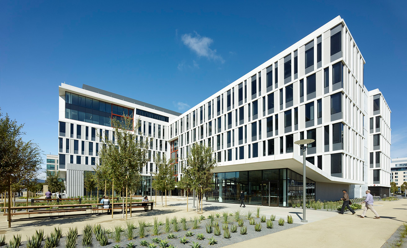
University of California San Franicsco, Mission Hall Global Health & Clinical Sciences Building
Social Connection
Throughout campuses, both inside and outside buildings, we can establish a network of gathering spaces for students to be alone amongst others and together in groups; we can give them the ability to regulate their own levels of engagement and, through design, address issues of loneliness. Increasing proximity and accessibility through physical layouts and circulation systems, like common areas with flexible seating in high-traffic locations where people naturally convene, help to nurture our social side.
Choice and Control
We can also reinforce students’ sense of control by giving them the opportunity to observe activities taking place inside of rooms before committing to spending any time in one. Open lines of sight to common areas and use of transparent walls reduce the anxious anticipation of making “the right choice.”
University of California Davis, Betty Irene Moore School of Nursing
Wellness
Just as long walks help to clear the mind, circulation paths within a building that interconnect with public spaces and inspire exploration can have the same effect. Thoughtful organization of the building program can encourage walking between destinations and simultaneously strengthen social connections among building occupants. Wellness can be integrated into the campus fabric with programmed outdoor spaces that act as building extensions, active design strategies that encourage movement, while supporting engagement with others.
San Francisco State University, Mashouf Wellness Center
Repose
The intensity of college life and the constant exposure to new people and ideas can feel overwhelming. In the transition from high school to college some students feel lost in the crowd, so it is important to provide space where individuals can just “be.” Tranquil settings with low sensory stimulation, visual / aural privacy, as well as exposure to nature, help us to replenish cognitive energy and gather peace of mind. New types of space devoted to therapeutic use – from quiet rooms, to rest zones, personalized immersive environments, and sleep pods – provide respite for overstimulated, anxious, or sleep-deprived students.
Collision Lab at Cornell Tech
Connection to Nature
Likewise, biophilic design attributes that captivate our senses, stimulate the mind, and serve as positive distractions can also boost our psychological well-being. Access to daylight, views of nature, calming color palettes, natural materials, displays of art, greenery, and patterns with organic form, are just some of elements within the built environment that can enhance our restorative processes and help us relax.
Sonoma Academy Janet Durgin Guild & Commons
As students develop long term healthy lifestyles, they learn and take inspiration from buildings and landscapes that embody sustainable design principles. The interdependence of people and place necessitates improving the health of both if we are to support a culture of well-being on campus. Planners and architects can’t control for all the physiological and environmental factors that impact human behavior, but we can bring awareness of how design affects us on a biological and psychological level to our campus clients.
1 – In a National College Health Assessment conducted in 2017 by the American College Health Association, half of all students reported that at some point in the survey year they felt “very lonely” and that “things were hopeless.” More than 80 percent felt “overwhelmed” and “exhausted.”


 University of California San Franicsco, Mission Hall Global Health & Clinical Sciences Building
 University of California Davis, Betty Irene Moore School of Nursing
 San Francisco State University, Mashouf Wellness Center
 Sonoma Academy Janet Durgin Guild & Commons